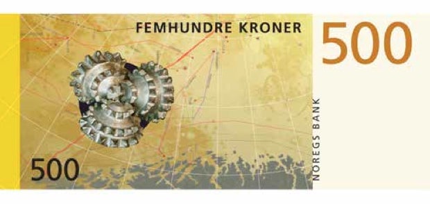
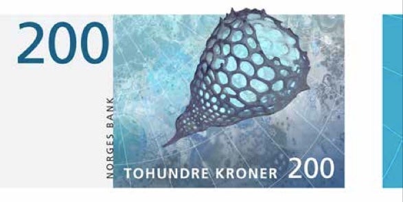
The central bank of Norway has decided on the design of its next bank notes after a competition, based on the theme of “The Sea.” And—unsurprisingly, given Scandinavia’s reputation for beautiful design—they are pretty special.
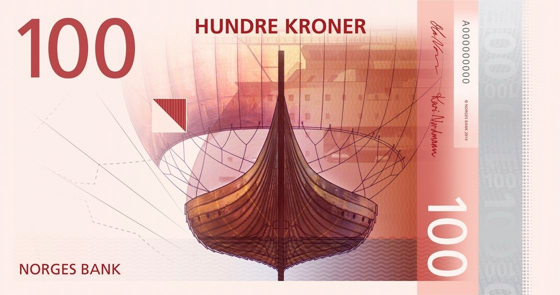
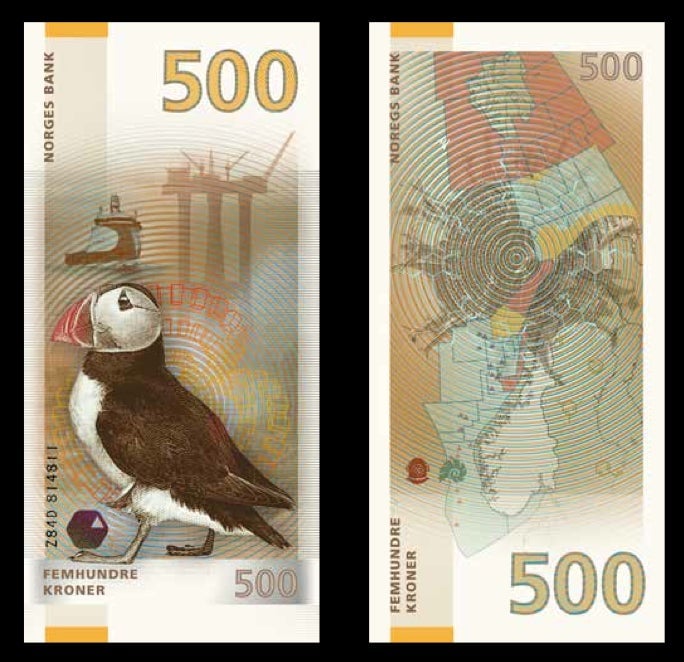
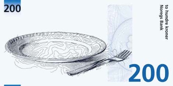
One side of the new notes, to enter circulation in 2017, will show off designs by the Metric System and Terje Tønnessen, which Norges Bank described as ”open, light and typically Nordic.”
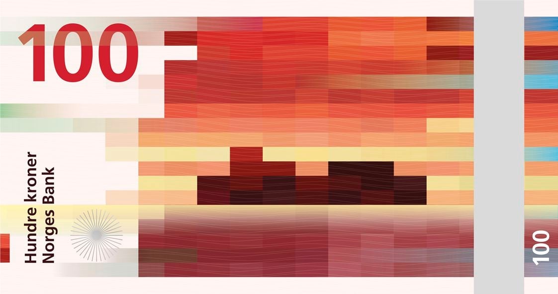
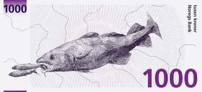
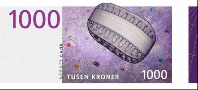
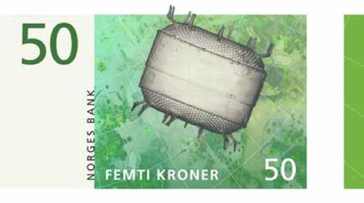
On the reverse of the note will be a beautiful pixellated design by Snøhetta Design. The studio said: “When contrasts come together, as when soft meets hard or digital meets analog, a dynamic is created. Our cubical pattern first of all represents pixels; our times’ visual language.”
There were eight participants shortlisted by the jury for the competition. All the entries can be found here (pdf).
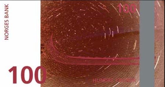
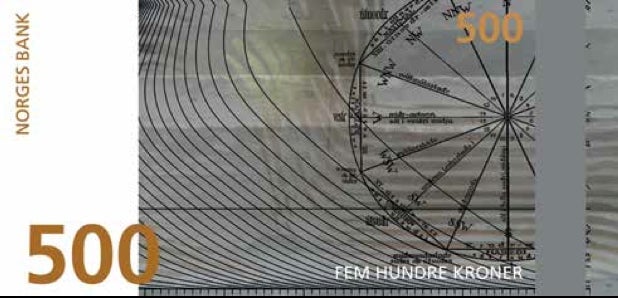
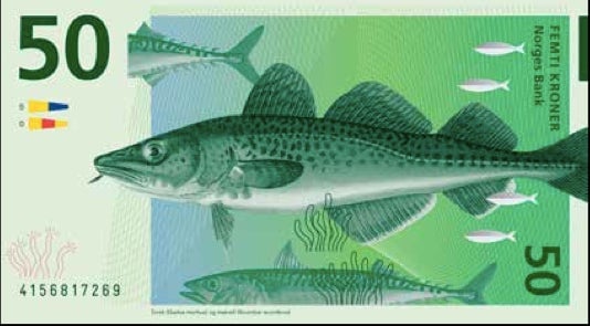
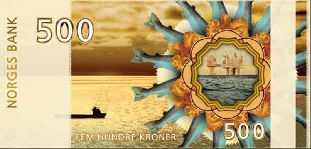
And the quality of the work showed why Scandinavian design is admired across the world. Any of the entrants could have won. In fact, one of the other designers did win—Enzo Finger’s entries were judged by the bank’s jury as the best of the competition, though that apparently was not enough to actually get on the notes:
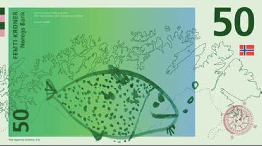
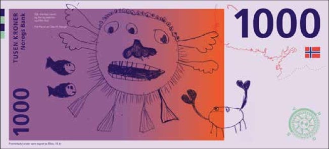
Other entries included these from the designer Aslak Gurholt Rønsen, who included the drawings by children:
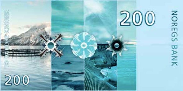
These are by Blæst Design, based on the idea of expanded horizons:
Christian Messel and Pati Passero, working with a theme of anonymous portraiture in contrast to stereotypical images of the Great Men who shaped history:
Ellen Karin Mæhlum looked at the “microscopic, beautiful and unicellular plankton that form the basis for life in the sea:”
And the visual artists May Elin Eikaas Bjerck wanted to highlight the coast: