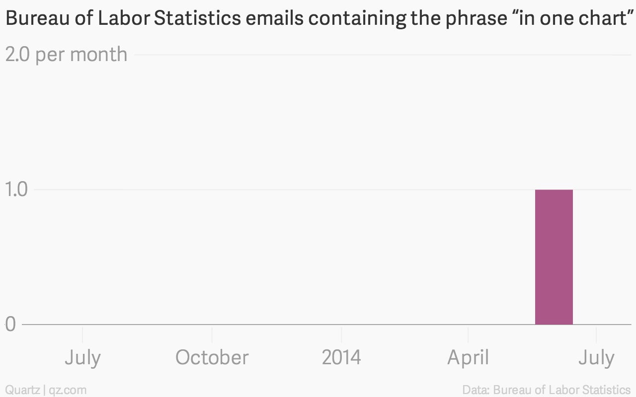
All of the Bureau of Labor Statistics emails containing the phrase “in one chart,” in one chart
The US Bureau of Labor Statistics has lots of data and makes lots of charts, which in turn are used by academics, politicians, corporate consultants, investors, armchair economists and journalists.

The US Bureau of Labor Statistics has lots of data and makes lots of charts, which in turn are used by academics, politicians, corporate consultants, investors, armchair economists and journalists.
In recent years, the latter two groups in particular have developed a convention for sharing small but meaningful insights—not just into BLS data but all sorts of statistics. The trope typically involves a thesis describing the finding followed by “in one chart.”
For instance
- China’s housing headache in one chart
- Why Amazon Is Paying $970 Million for Twitch, in One Chart
- How the Rich Conquered the Economy, in One Chart
- What your favorite drink says about your politics, in one chart
- The utter transformation of US finance, told in one chart
- Popes aren’t getting any younger: Four centuries of papal aging in one chart
and of course
This got us thinking: are there people working at the US government’s compendium of economic statistics who are as obsessed with this meme as we are?
And so Quartz requested copies of emails sent by BLS staff between July 1, 2013 and July 1, 2014 that contained various permutations of the phrase “in one chart” under the US Freedom of Information Act.
This is what we found…in one chart:

During the period we requested there was just one email that contained the phrase. Sent by Christopher Pinheiro at the end of June, the email only used the phrase as part of a url pointing to an article using a chart Vox found on Reddit. Pinheiro is a Boston-based economist for the BLS, according to his LinkedIn profile.

Here’s a link to the story he referenced.
Will the US government’s economists eventually jump onto the “in one chart” bandwagon? Tune in next year….