Apple’s watch likely won’t launch for several months, but today the company laid out design guidelines for software developers looking to start building Apple Watch apps.
Apple $AAPL’s watch likely won’t launch for several months, but today the company laid out design guidelines for software developers looking to start building Apple Watch apps.
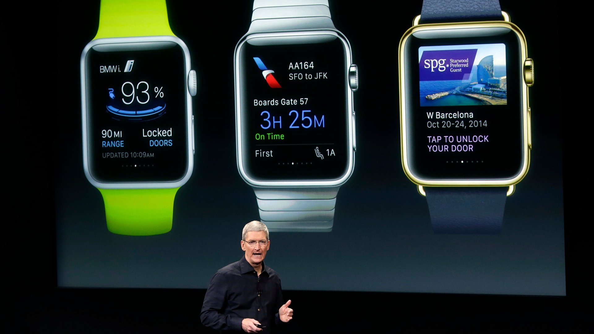
In guideline documents released today, Apple says its watches are designed to “blur the boundaries between physical object and software.” But it looks like Apple also wants to blur any differences between Apple apps and third-party apps, encouraging simplicity and consistency.
Join 500,000+ readers who start their day with Quartz.
By subscribing, you agree to our Terms of Service and Privacy Policy.
A few key points:
It’ll be interesting to see how quickly these recommendations are ignored—and whether Apple blocks early apps that don’t follow along. The restrictive design recommendations seem to be in contrast to iOS devices, where developers are freer to design apps how they please, as long as their apps have “aesthetic integrity.” The iOS App Store has matured to include a wide range of design, ranging from those that mimic Apple’s own apps to those that are entirely custom—or even look more like Android apps.