The US Olympics 2024 bid logo looks like the Chase Bank emblem
On Jan. 8, the US Olympic Committee announced that Boston will be the official city to represent the US bid for the 2024 Olympics and Paralympic Games, edging out Washington, San Francisco, and Los Angeles. Boston’s logo—a glowing blue octagon paired with nondescript sans serif typography—was designed by the marketing agency Hill Holliday. Meant to depict a futuristic laurel wreath, the emblem has been met with critical jabs and mixed reviews. Commentators have likened it to a frisbee, “Autobots fighting with the Decepticons,” and the Identity Disc from Tron.


On Jan. 8, the US Olympic Committee announced that Boston will be the official city to represent the US bid for the 2024 Olympics and Paralympic Games, edging out Washington, San Francisco, and Los Angeles. Boston’s logo—a glowing blue octagon paired with nondescript sans serif typography—was designed by the marketing agency Hill Holliday. Meant to depict a futuristic laurel wreath, the emblem has been met with critical jabs and mixed reviews. Commentators have likened it to a frisbee, “Autobots fighting with the Decepticons,” and the Identity Disc from Tron.
And many have pointed out the close resemblance to the JPMorgan Chase Bank emblem, designed by Chermayeff & Geismar & Haviv in 1961.

But in terms of color, typography choice, and application, the Boston 2024 branding also seems to liberally borrow from the Obama campaign brand book.
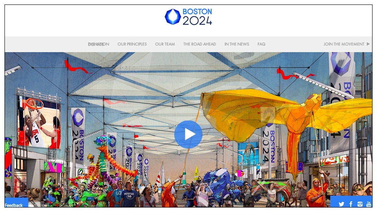
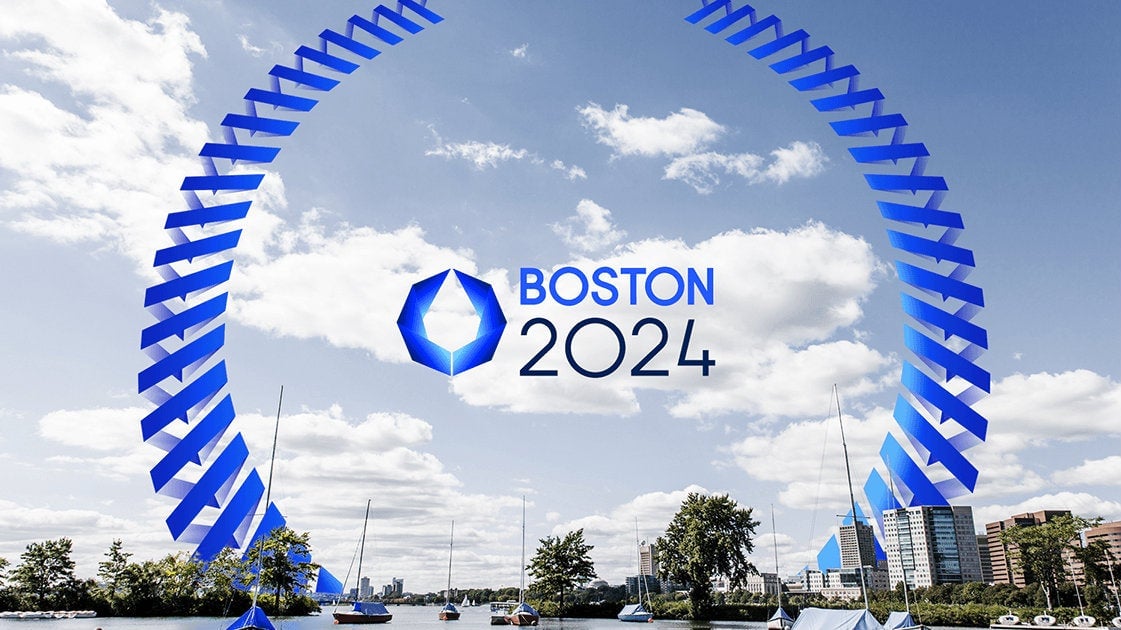
Now, branding campaigns ought not be judged by the logo alone. Check out how it’s used in context via the campaign’s website and social media.


Consider the logo in action in this video:
The International Olympic Committee (IOC) launched the bidding process for the 2024 summer games on Jan 15. Rome was first to announce its candidacy, followed by Boston. The IOC will reveal its decision in 2017, and will have the final say on the design of the official logo and branding.
But even if Boston secures the Olympics for the US, it’s unlikely that this counterproposal by graphic designer Todd Radom will make the cut.