This post was originally published on Jan. 28, 2015, for Bloomberg.com’s fifth design. We have updated it with the latest iteration and figures.
This post was originally published on Jan. 28, 2015, for Bloomberg.com’s fifth design. We have updated it with the latest iteration and figures.
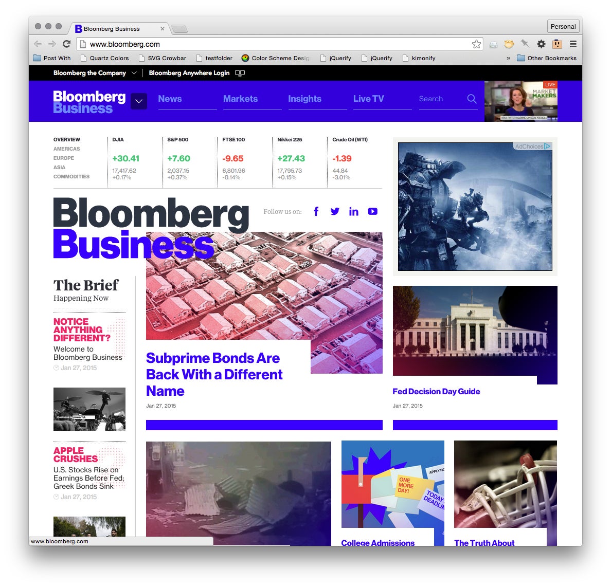
Bloomberg LP’s sprawling media empire has a new public face on the internet. The relaunch of bloomberg.com establishes a metered paywall for access to both its articles and TV stream.
Join 500,000+ readers who start their day with Quartz.
By subscribing, you agree to our Terms of Service and Privacy Policy.
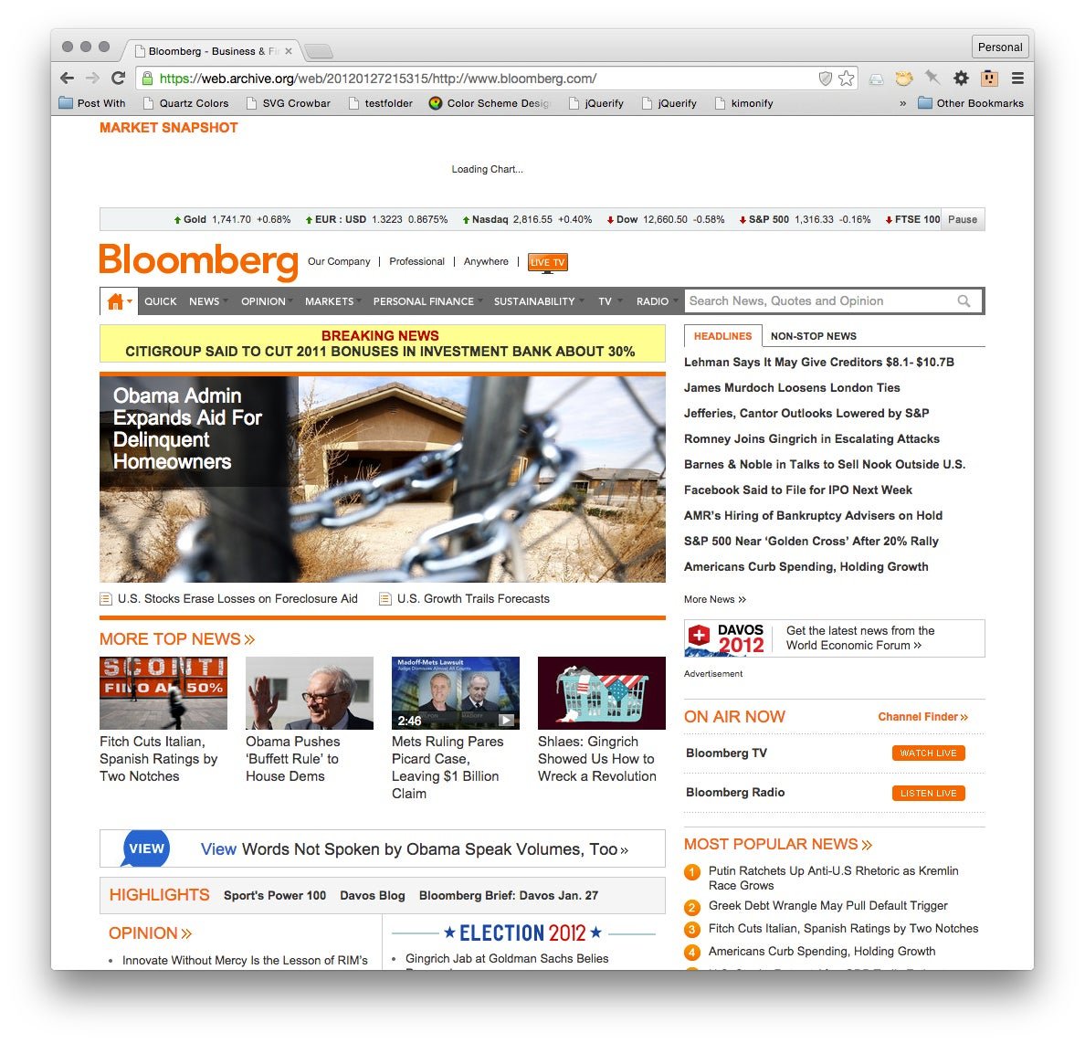
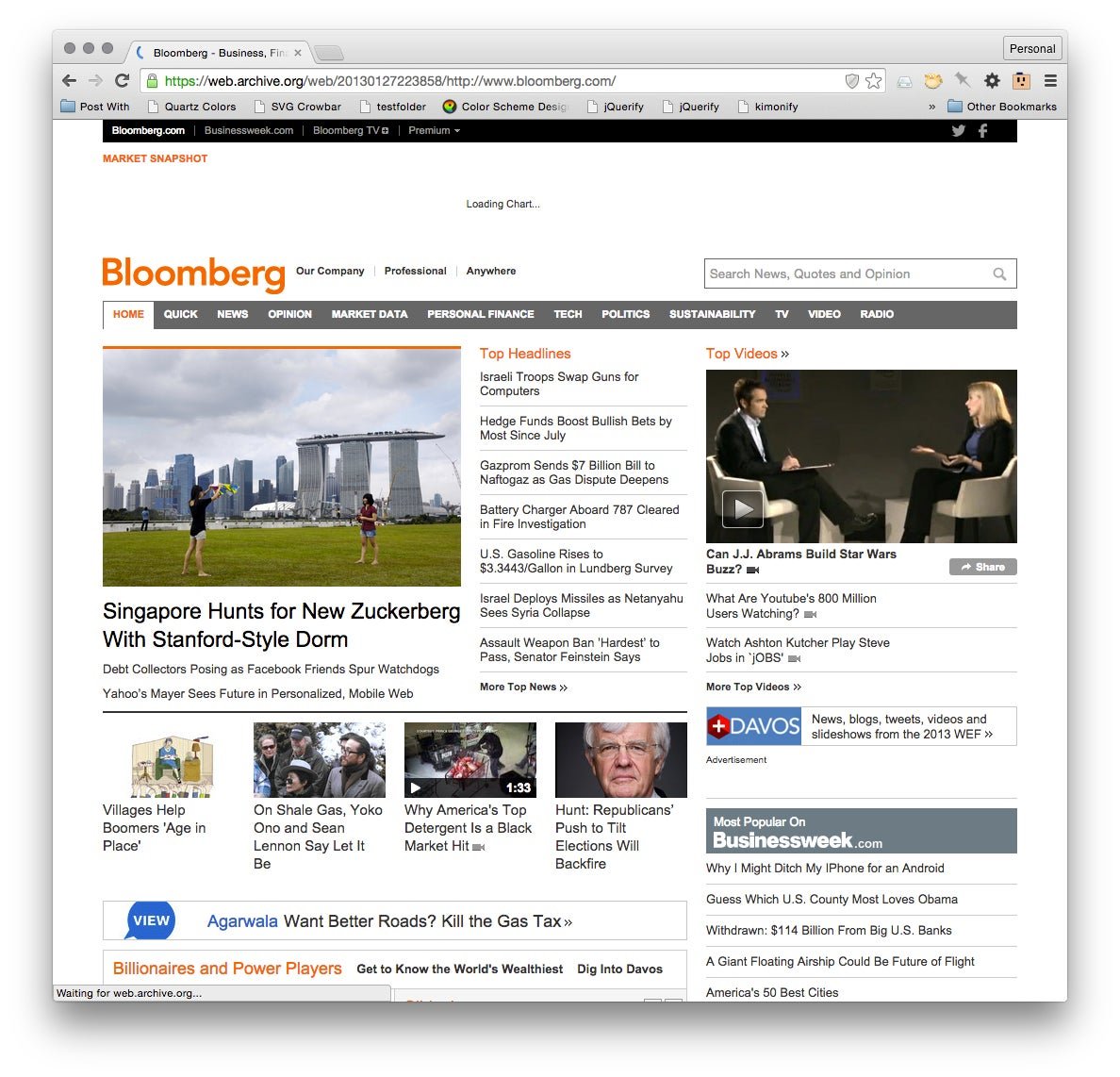
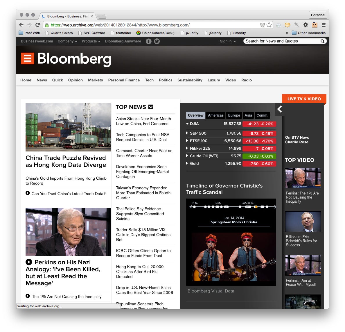
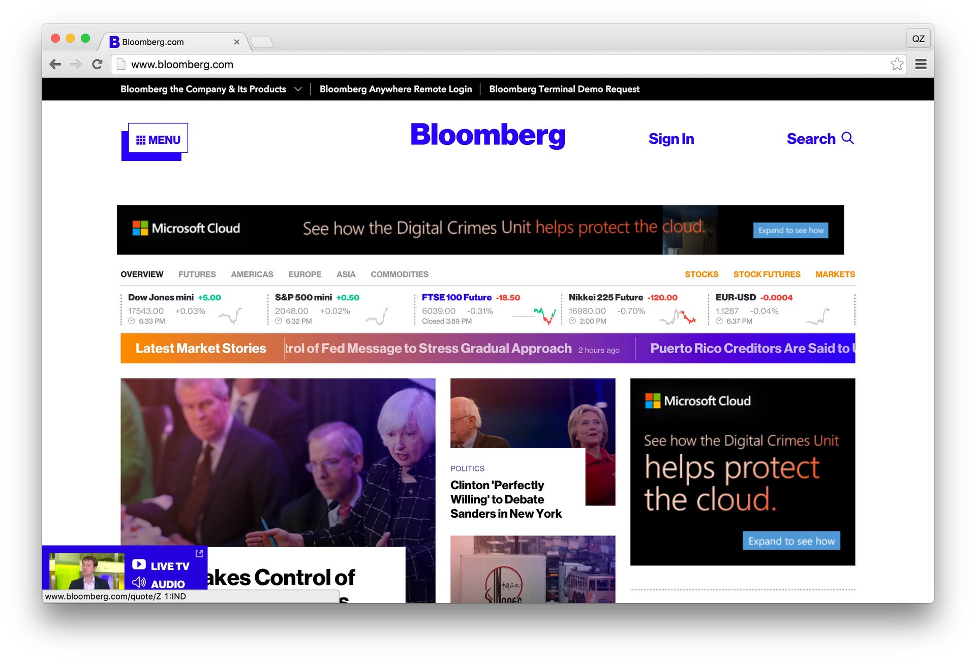
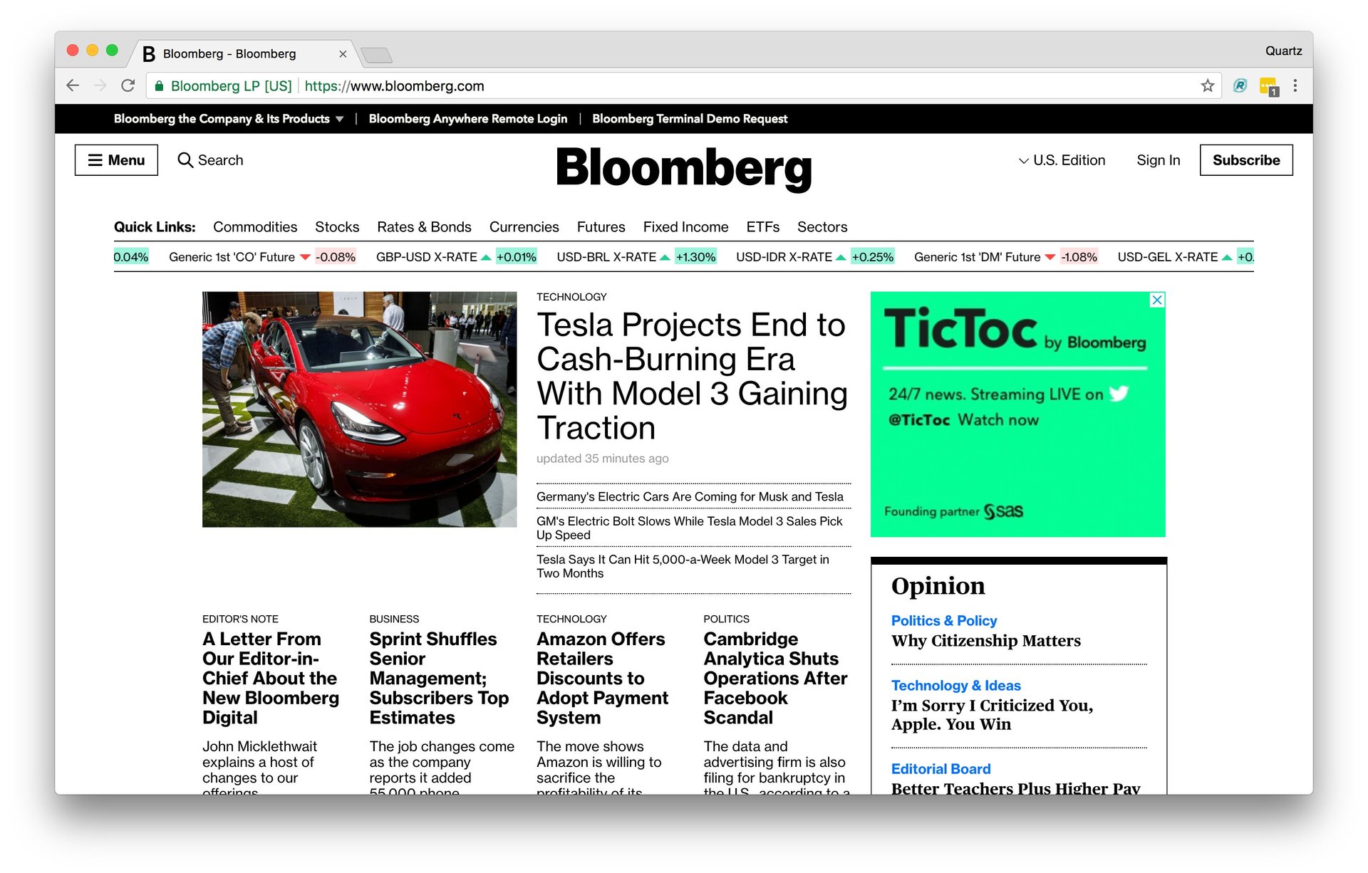
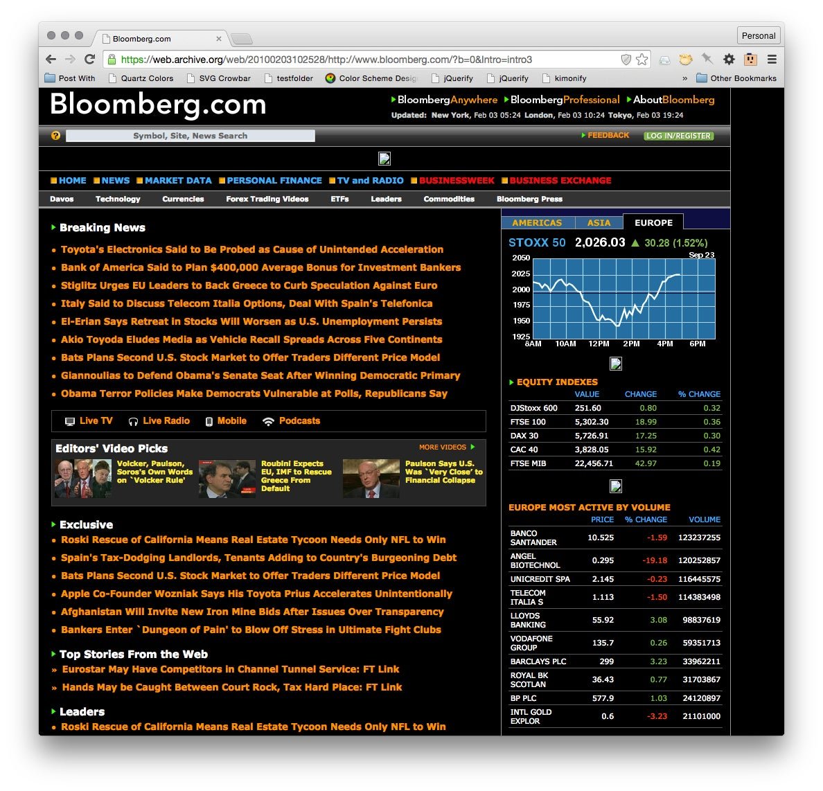
This is actually the seventh design of Bloomberg’s homepage in the last eight years. Looking back on the designs since 2010—using the Internet Archive’s Wayback Machine as well as our own screenshots—provides a visual history of the company’s changing ambitions, from a financial data terminal with a website to a full-fledged consumer media brand supported by subscriptions:

The Wayback machine did not capture the chart that ran across the top in the 2012 and 2013 iteration of the site. Which must be noted here, because I designed it, and contributed to other aspects of this design.