A good business knows how to trick its customers the right way
I was in Golden Gate Park the other weekend when I overheard a debate between a dad and his young son, Caleb. The gist was whether Caleb should clean his room later that afternoon. After some back and forth where it was clear neither side was convincing the other, Dad changed the subject.


Part I
I was in Golden Gate Park the other weekend when I overheard a debate between a dad and his young son, Caleb. The gist was whether Caleb should clean his room later that afternoon. After some back and forth where it was clear neither side was convincing the other, Dad changed the subject.
Dad: Omar’s coming over tomorrow, right?
Caleb: Yup!
Dad: What do you guys want to do?
Caleb: Play in my room.
Dad: Wouldn’t it be nice if your room was clean when he came over?
Caleb: (pause) We can play outside. With the copter.
Dad: Where is the helicopter, by the way? I haven’t seen it in a while.
Caleb: (longer pause)
Dad: I bet you’ll find it pretty quick if you clean your room.
Caleb: (pause, then sigh) Okay. Can you help me?
Part II
As part of a redesign of their shipping centers, FedEx hired a consulting firm to understand how customers ship packages. The research led them to develop four personas based on how prepared people were when they arrived at the center, and much help they wanted from FedEx employees. The most interesting customers were the “Confirmers.”
I am a classic Confirmer—generally well-prepared but nevertheless anxious about all the things that could go wrong. I’m the person standing next to you in line thinking, “Do I have the appropriate size box? Did I pick the right shipping speed? Did I fill out everything on the label correctly? Did I put the label in the right place? Should I get insurance? What about delivery confirmation?”
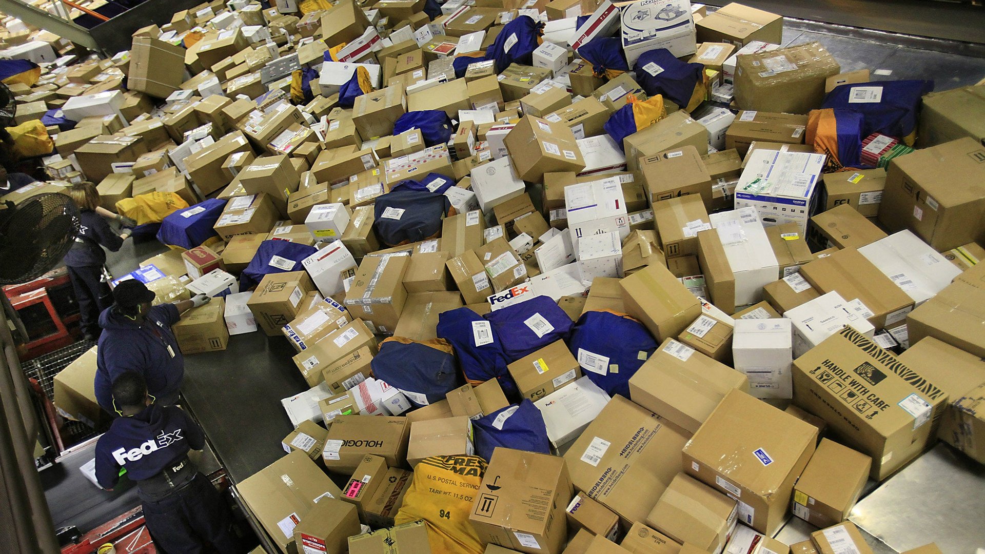
Confirmers, in case you couldn’t guess, like to be reassured. And there was one aspect of the FedEx experience that made Confirmers particularly nervous: After they handed their package over to an employee, the agent would turn around and place it in a gigantic pile of other boxes (“the leaning tower of packages”).
Even though the leaning tower had no impact on whether packages made it safely to their intended destination or not, the mere sight of it gave Confirmers the impression that the whole process wasn’t very reliable.
To put Confirmers at ease, FedEx placed a divider with five presort windows behind the service counter. Agents were instructed to take a package from a customer and slide it through one of the windows, signaling that it was safely on its way.
Of course, behind the dividing wall was the same leaning tower of packages.
Part III
The illusion of choice is just as applicable to designing software as it is to parenting or comforting nervous FedEx customers. Product teams tend to think in terms of actions or features they want users to try. But people don’t wake up in the morning with an urge to “Add a file to Dropbox” or “Install the Pocket browser extension.” They’re trying to solve a problem—share a video with grandparents or save an article to read later.
Your goal is to draw a clear path from that problem to your solution, integrating the product actions you need people to take along the way. The better you are at crafting this story, the more successful you’ll be in motivating someone to act. The optimization challenge is to deliver the right message, at the right time and place, to the right person.
The good news, as demonstrated by Caleb and the FedEx wall, is that there are often multiple ways to nudge someone towards the same outcome, whether it’s a clean room or peace of mind. The key is to bring people along willingly and to make them feel like joint problem solvers instead of helpless order takers.
From a product design perspective, this means that the words you use and the reasons you give are just as important as picking the right next action. For example, let’s say the first thing you want all new users to do is to install your desktop app. You should still frame it in a way that resonates with their particular use case:
- Back up photos on your computer faster [by installing Dropbox]
- Share files straight from your desktop [by installing Dropbox]
- Access your stuff even when you’re offline [by installing Dropbox]
Another implication of the “Focus on the journey, not the destination” approach, is that you should look for multiple places in your product where you can encourage the same action through a different value prop. Even if people don’t bite the first time, you’ll eventually find a message that resonates (or just wear them down, depending on your POV). So if you’re trying to get users to auth their email provider:
- At signup: Create an account in one click —> connect Gmail
- When sharing: Make it easier to share with your contacts —> connect Gmail
- When editing your profile: Have a consistent profile photo —> connect Gmail
Sometimes, the illusion of choice is all that matters.
This post originally appeared at Quibb.