A stunning Instagram gallery that shows the world is still in love with lettering
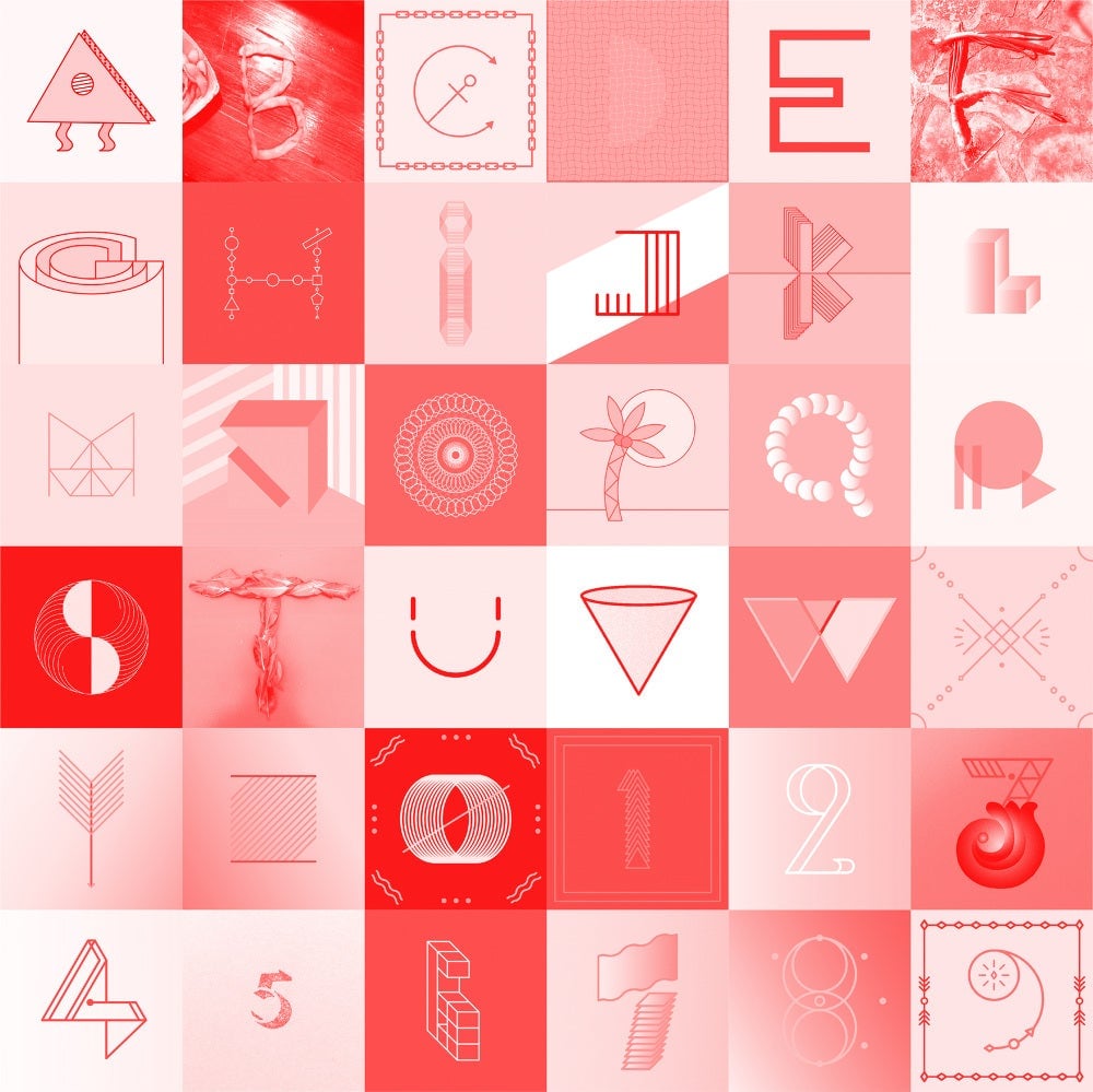
For 36 days, Barcelona-based designers Nina Sans and Rafa Goicoechea are challenging the readers of their website to a most delightful daily exercise regimen. They invite graphic designers, typographers, calligraphers, artists and dabblers from anywhere world to draw the ten numerals and 26 letters from the Latin alphabet.
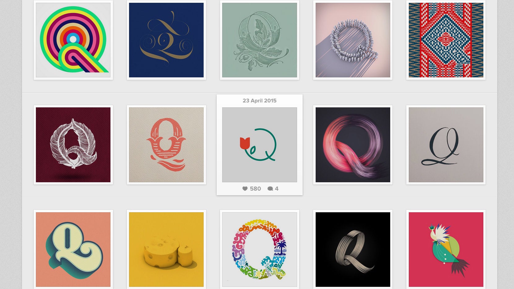

For 36 days, Barcelona-based designers Nina Sans and Rafa Goicoechea are challenging the readers of their website to a most delightful daily exercise regimen. They invite graphic designers, typographers, calligraphers, artists and dabblers from anywhere world to draw the ten numerals and 26 letters from the Latin alphabet.
Today is brought to you by the letter Q (a letter close to our heart).
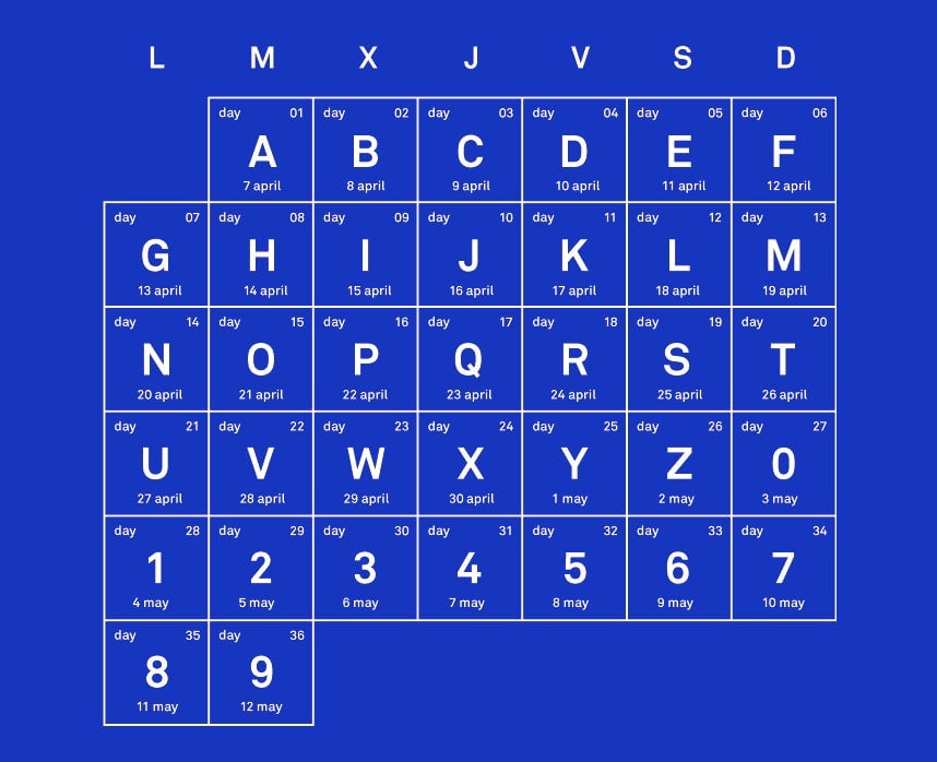
“The goal is to show the vast number of graphic possibilities that exist around typography,” they explained. At the beginning of the season, they publish a calendar, inviting submissions for each day.
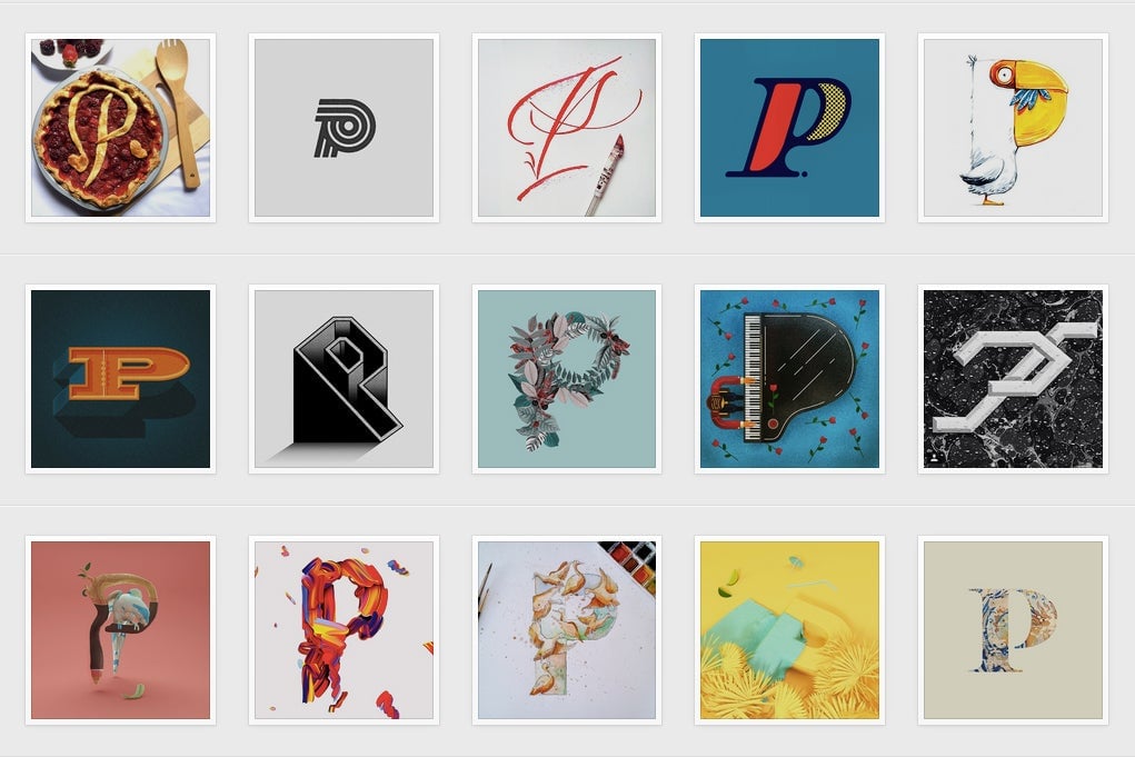
Sans and Goicoechea then sift through hundreds and hundreds of entries to find the best examples aggregated under the #36daysoftype tag on Instagram. “We receive about 1,000 to 1,500 entries every day,” Goicoechea tells Quartz, a graphic and type designer whose favorite letter is R.
Since they started the project last year, they’ve amassed over 28,000 followers on Instagram. Their project, which runs until May 12th this year, testifies to how much the world is still very much in love with typologies, lettering and letterforms.
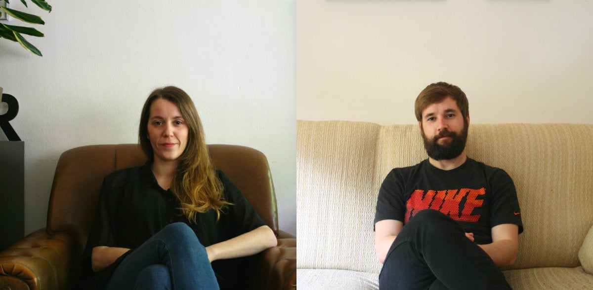
The project started with Sans (who has a preference for the letter X and the numeral 3) with the Daily Triangle project, a creative exercise that plays with the triangle shape using illustration, calligraphy, cropping, and photography. This inspired Goicoechea, her partner, to embark on Typodays, a log of daily experiments with letter forms.
For now, the project of these full-time graphic designers remains on the web. “If we had all the help in the world, we would love to do a website, an exhibition and a book showcasing all these letters, maybe not just the ones we’ve published,” says Goicoechea. They chose to limit the scope to the Latin (also known as Roman) alphabet— even forgoing the ñ in their native Spanish—with the hope of appealing to the widest set of participants.
“There is so much talent around and social media allows a platform for us to see that. It’s giving democracy to design,” reflects Goicoechea. “Sometimes young designers are doing much better work than the supposedly big designers.”