Canada’s new national map shows more Arctic ice—but not because there is more
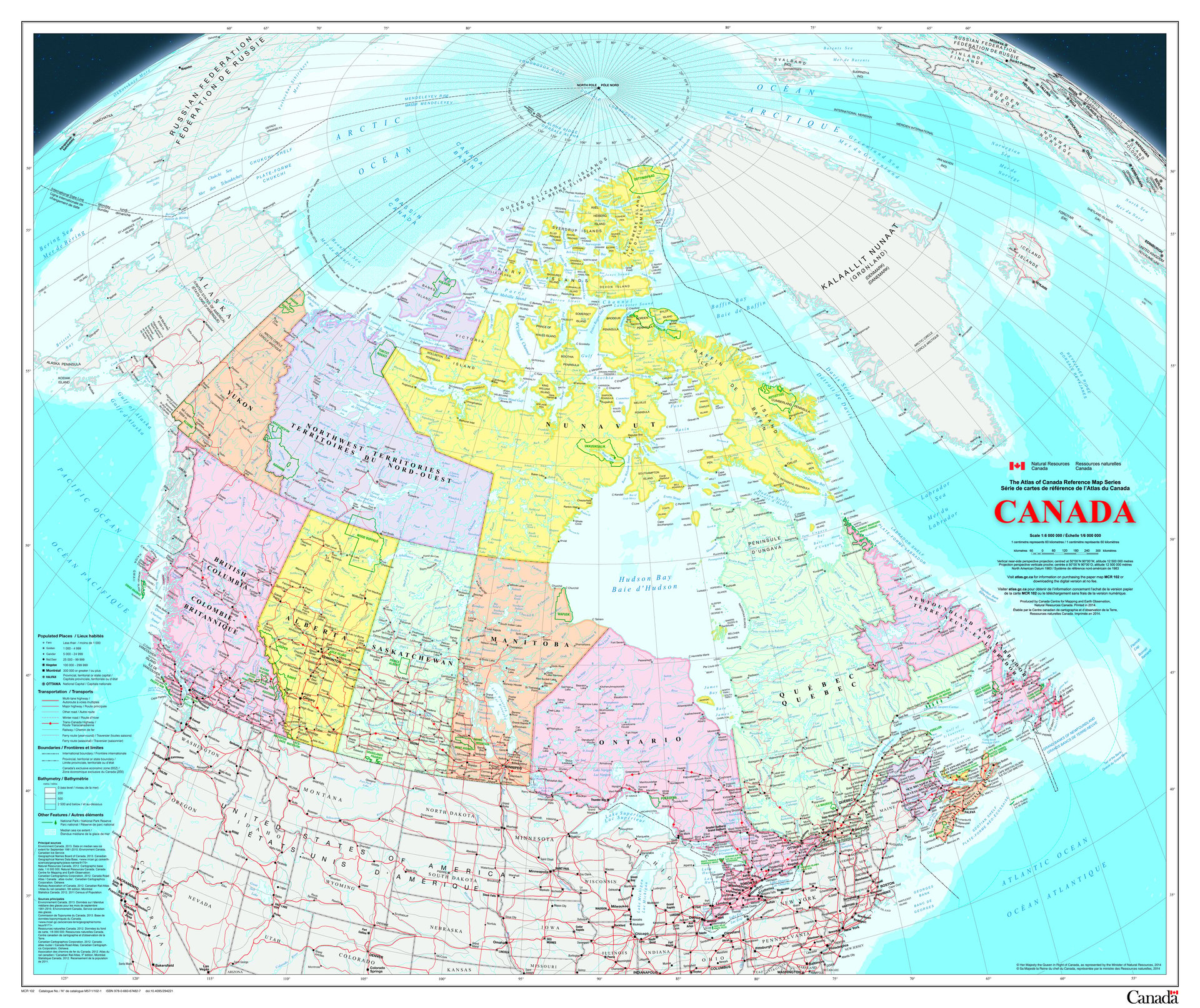
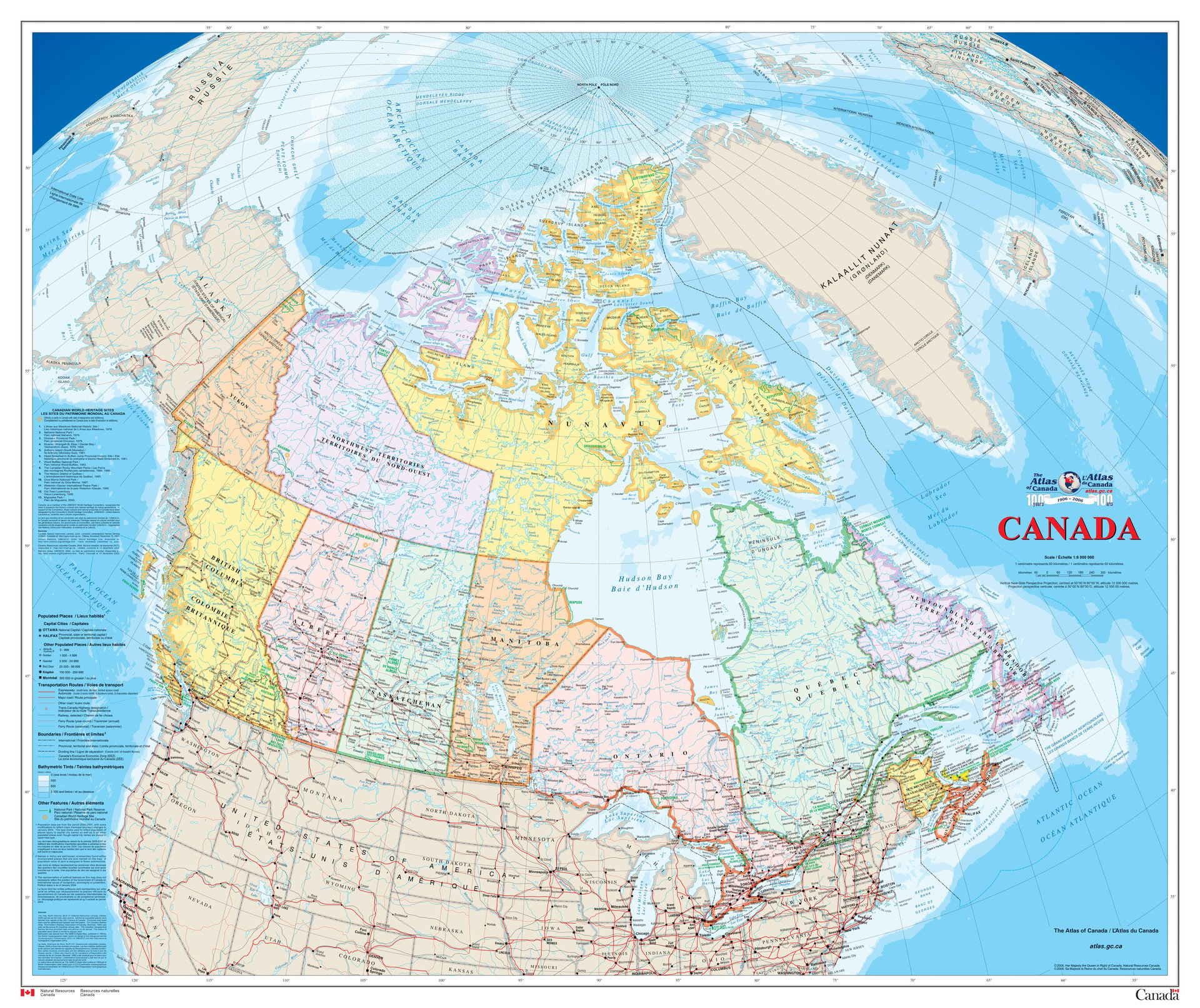
There is a new national map of Canada from Natural Resource Canada, as has been widely reported by the Canadian Broadcasting Corporation (CBC), the Globe & Mail, and others, and it shows a surprising increase in sea ice over the previous version, which was published in 2006.


There is a new national map of Canada from Natural Resource Canada, as has been widely reported by the Canadian Broadcasting Corporation (CBC), the Globe & Mail, and others, and it shows a surprising increase in sea ice over the previous version, which was published in 2006.
The reason for this apparent bit of global cooling is that the two maps calculate the “extent” of sea ice in different ways. While the 2006 map depicts permanently frozen ocean, the 2015 map depicts the extent of ice cover over a 30-year average. In the CBC story, geographer Robert McLeman calls the new map a bit of “fakery,” and I assume that, if asked to elaborate, he would suggest that the Arctic was made to look more “frozen” so as to avoid giving another piece of climate-change evidence to those who would challenge the Harper government’s close alliance with the hydrocarbon industry.
Actually, I think the decision to adjust the representation of the ice edge may have been a bit more complicated.

As I’ve detailed in Contesting the Arctic, the government of Canada has a varied set of priorities when it comes to acknowledging the presence of ice in northern waters. On the one hand, shipping interests (and Transport Canada) seek to emphasize the space’s liquidity so as to promote emergent commercial transportation opportunities.
On the other hand, several other interests seek to highlight the region’s frozen character: not just climate-change-denying southern industrialists, but also foreign affairs officials who use the solidity of ice to suggest that the waters of the Canadian archipelago and even the Arctic Ocean up to the North Pole constitute a kind of Canadian quasi-territory.
As I discuss in Contesting the Arctic, amidst these competing pressures, the very definition of what ice is—and what it means for a body of water to be called “ice covered”—is debated pixel by pixel. From my perspective (which, I confess, is informed much more by northern issues than by the environmental politics of southern Canada), the change in maps may not simply be indicative of climate change denial and support for the hydrocarbon industry. It also signifies the latest skirmish over the role of solidity in the meaning of ice…and the role of ice in the meaning of Canada.

Boundary lines
Let’s take a further look at the 2015 map. As on the 2006 map (and on maps prior to that), the 2015 map depicts sectoral lines marked “international boundary,” which run from the northwestern and northeastern corners of Canadian territory to the North Pole.
These lines defy basic principles of international law (as well as official Canadian declarations of its territorial extent), and, as I note in Contesting the Arctic, the decision to include them only for Canada’s borders but not for those between its circumpolar neighbors is particularly cheeky. The impression is that Arctic ocean-space near Canada is special (ie. it’s “ours” to use or lose) but Arctic ocean-space elsewhere is just regular ocean (ie. it’s high seas).
The map also continues the 2006 map’s practice of depicting Canada’s Exclusive Economic Zone. This is unusual on national maps, except for those of Pacific Ocean archipelagic nations. In this respect, the map reminds me of the thesis—promoted by Phillip Vannini in an Island Studies Journal article in which I also made a small contribution—that it may be fruitful to reconsider Canada as an archipelago. Combined with the maritime “international boundary” lines, the presence of EEZ lines, which do not grant sovereignty but simply sovereign rights to resources, suggests to the average viewer that “Canadian territory” contains a whole lot of ocean as well as land.
And the changing depiction of sea ice is matched by other innovations on the 2015 map that further construct Canada as a nation of land, liquid water, and ice, and that it’s not simply a “territory” in the conventional, “grounded“ sense.
Ice roads
As the news release accompanying the map notes, this is the first national map of Canada to depict ice roads. The inclusion of ice roads complements the shift to depicting average sea-ice extent: Both flatten out temporal variability, or, alternately, both depictions acknowledge that just because something’s not there all the time doesn’t mean that it shouldn’t be mapped.
The depiction of ice roads also further supports the notion that in the North, as nowhere else, the complex intersections that occur as one crosses a shifting landscape of land, water, and ice mean that the diversity of elements serves to unite a space rather than to divide it. This is a message that aligns well with Inuit calls for self-determination, but it also aligns well with the Canadian government’s muscular approach to defining the North—in all its surfaces—as a space of security, resources, citizenship, and development potential.
Inuit place names
And this takes me to the other innovation highlighted in the news release: the inclusion of Inuit place names.
While certainly an important gesture in reaffirming Inuit rights (and in reversing a history of dispossession), the inclusion of Inuit names also, when paired with the depiction of ice roads, communicates the existence of a North that is peopled, controlled, and accessible.
In short, the North is just different enough to offer unique onshore and offshore investment opportunities but just normal (i.e. ‘Western’) enough to offer security for those investments. It seems to me that this was a key message of the recently completed Canadian chairmanship of the Arctic Council (and, most explicitly the Arctic Economic Council that was established under Canada’s sponsorship).
So far as I can tell, there was no explicit linking between the April 15 release of the map and the April 24-25 meeting in Iqaluit at which the chairmanship of the Arctic Council rotated to the United States. However, the map was a fitting way for Canada to make its mark during its last weeks as a leader on the Arctic stage.
Thanks to Claudio Aporta for first alerting me to the 2015 Arctic map and its representation of sea ice extent.