Why corporate annual reports are a designer’s dream project
Corporate graphic design is enjoying a moment in the spotlight. Publishers like Unit Editions and their wildly popular Manuals 1 and Manuals 2, as well as the hugely successful re-issue of the 1970 New York City Transit Authority manuals are clear signs that the wider design community is embracing what some might consider rather staid territory.
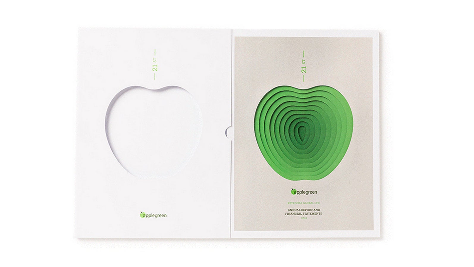

Corporate graphic design is enjoying a moment in the spotlight. Publishers like Unit Editions and their wildly popular Manuals 1 and Manuals 2, as well as the hugely successful re-issue of the 1970 New York City Transit Authority manuals are clear signs that the wider design community is embracing what some might consider rather staid territory.
But while many are finding beauty in the logoforms and motifs of years gone by, there remains an undeniable tension between the idea of the corporate and the creative. Consider Studio Dumbar’s recent identity work for Visser & Smith Marine Contracting, which paired a reasonably unexciting business proposition with a bold, beautiful mark that Creative Review waxed lyrical over, and rightly so. But why is it such a surprise when corporate design yields such impressive results?
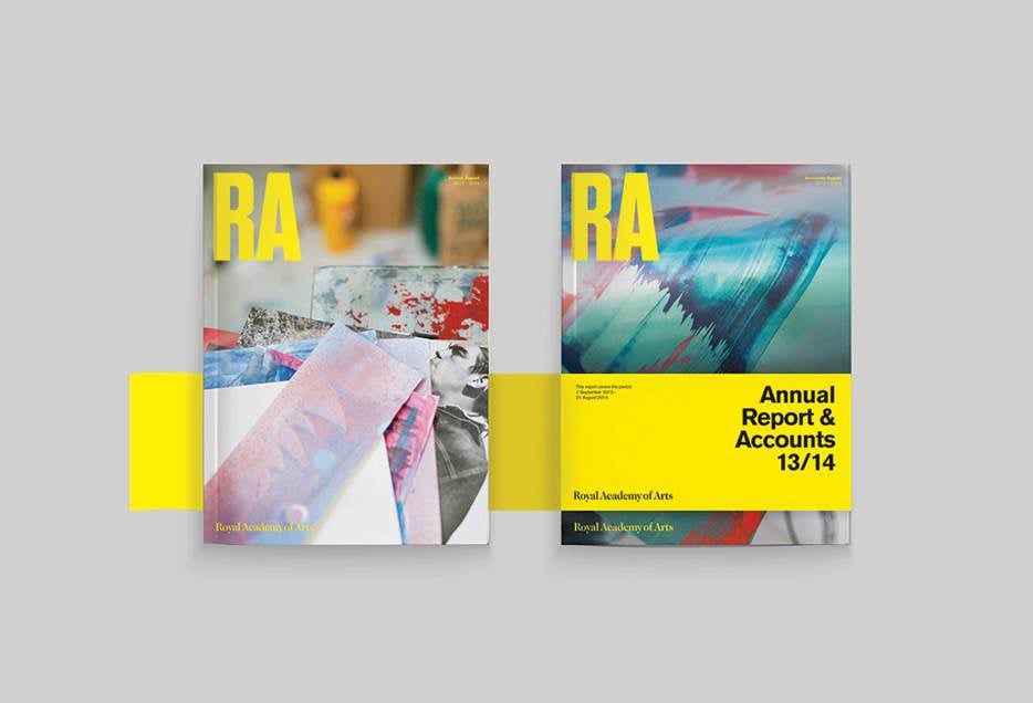
Perhaps one of the most unexpected places to find highly creative design is the realm of annual reports, which boasts some beautiful examples, if you care to look for it. Take Gaggero Works’ partnership with the Royal Academy; the punchy type and striking yellow belly band turn the report into a publication that’s visually closer to an art magazine than a bunch of financial figures. And it’s not the only example of design studios turning the inherent restrictions and challenges of annual reports to their advantage.
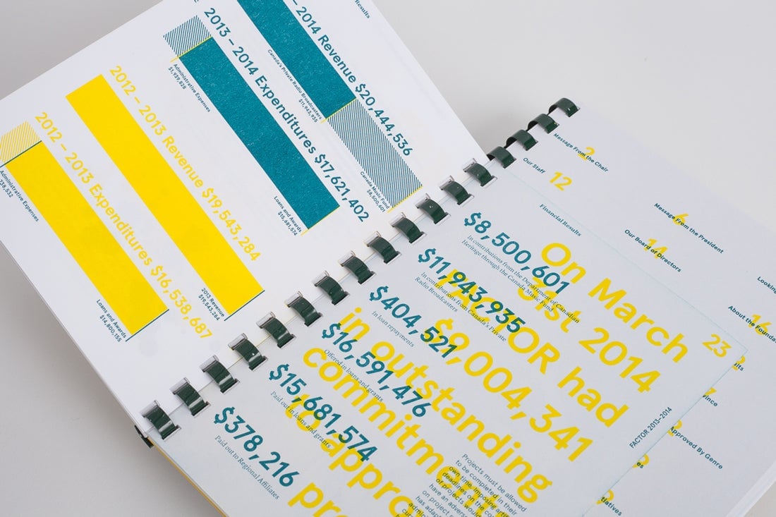
Also Collective’s work for FACTOR’s 2013-14 report makes deft use of diagrams and overprinting to inject some much needed personality into sets of stats, while Albert Ibanyez’s colorful approach to Can Xalant’s annual was praised in the creative press for its use of gradients to signify different languages.
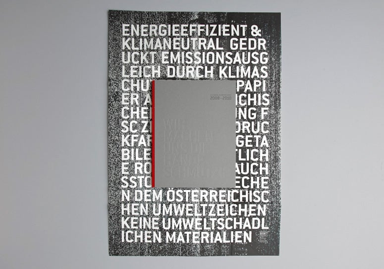
Other designers see the annual report as an opportunity to explore the story of the company itself. MOOI Design recently took Gutenberg-Werbering’s business speciality—printing—and showcased it within the report itself; each copy is unique and hand-finished by the employees themselves. And the annual for Italian paper manufacturer Fedrigoni features a series of portraits and stories of the staff in a 200-page 125th anniversary edition of the report, created to resemble a “block of precious metal” cut from the company’s own stock.
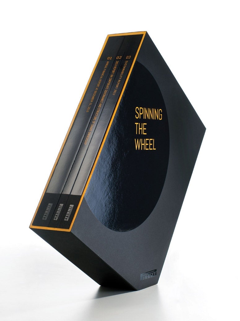
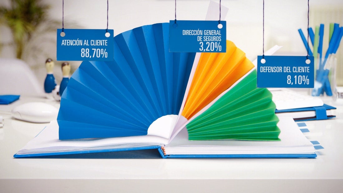
For some, the format has been a source of experimentation. Take the skewed corners of the purposefully precarious report for Pirelli tires, or Amnesty International Hong Kong’s 2013 report designed as a postcard series that could be read and then shared as a way to spread human rights messages. Some have even abandoned the tried-and-tested print format altogether, with Biografica spending the last four years creating animated reports for insurance company client Seguros Pelayo, experimenting with 3D, stop-motion, claymation, and live action.
So with such encouraging signs of subversive creativity at work, is the annual report really such a tedious format?
“No matter the content or context, it’s a communication challenge,” says Constanza Gaggero of Gaggero Studio. “The best designs are the ones that solve everyday problems like these. Converting dull and complex information into something visually legible, engaging, and inspiring.”
ALSO Collective’s Symon Oliver agrees. “For us annual reports can be one of the most exciting opportunities. The thought of taking a spreadsheet of values, doing math, and translating values graphically is a very compelling challenge. The process is sometimes grueling, but it’s worth the effort when you can see raw data transformed into shapes that tell a story.”
In fact, it seems that much of the challenge around crafting engaging and design-led annual reports lies not in the difficulties of the project itself, but more with the clients’ willingness to try something new. Gaggero comments on how many brands see annual reports as “insignificant,” which makes them reluctant to allocate a meaningful budget for design. It’s the clients that are prepared to embrace the importance of creativity and give designers full agency that are seeing some of the most striking results.

“More and more companies and institutions are beginning to change their perception, and they see the opportunity an annual report presents to communicate their values and achievements,” says Biografica’s Pablo Galán Coppel. It’s this readiness to embrace the possibilities that has resulted in Biografica’s ongoing partnership with Pelayo. “Pelayo gave us free reign to show that annual reports can be expressed in a different way. That gave us the opportunity to show a success story to other clients and prove that a different approach can be taken to show a company’s results.”
Studio Gaggero’s striking report for RA is also the result of a close understanding between client and designer. “RA understood the relevance of using the report as a wider communication tool” says Gaggero. “They were open to hear and take on suggestions, not only from the design point of view but also editorially.” It’s something Also Collective comments on as well, attributing their bright and bold work for FACTOR to a good client relationship. “Part of why the report was successful and visually interesting was because the client trusted us and gave us full creative control,” they say.
After speaking with several studios, it’s clear that while the outside world might perceive the annual report as just another piece of dry corporate communication, it’s actually a welcome challenge and an opportunity to inject some creativity into a area in desperate need of it. As a project, it’s also a return to the absolute fundamentals of graphic design—creating the perfect environment for communication and problem solving. “An annual report is the best example of good design!” enthuses Also Collective’s Symon Oliver. “They have the tendency to be a very formal and official document. It’s a classic ‘in the box’ kind of project. But that’s where the opportunity lies—to take raw materials and transform them into a story.”
This post originally appeared at AIGA Eye on Design.