The best infographics of 2015, and why we can’t stop looking at them
You’re not alone. We’re obsessed too. Over the last few years, a steady stream of illustrated charts, diagrams, maps, and process drawings have fed and fostered a raging appetite for infographics. Gareth Cook, a Pulitzer Prize-winning writer and a former editor at The Boston Globe, has been sifting through the deluge to compile a kind of yearbook for the burgeoning field of information design.

You’re not alone. We’re obsessed too. Over the last few years, a steady stream of illustrated charts, diagrams, maps, and process drawings have fed and fostered a raging appetite for infographics. Gareth Cook, a Pulitzer Prize-winning writer and a former editor at The Boston Globe, has been sifting through the deluge to compile a kind of yearbook for the burgeoning field of information design.
While working as a science journalist, Cook realized the efficacy of a well-conceived graphic. “I would be working on these stories about difficult topics like nanotechnology or stem sells and I would struggle to explain them in words,” Cook tells Quartz. “But I would work with the graphics department and they would come up with something that so succinctly and clearly [captures the concept] in a way that words couldn’t. It really drove home how powerful a image could be when writing is not enough.”
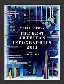
As in its two previous editions, The Best American Infographics 2015 showcases some of the powers of these images. The 159-page volume (which is part of the the “Best American” series) is packed with full-page illustrations, annotations from designers and several wonderful fold-outs, but it is not meant to be a design book, Cook underscores to Quartz. “I want this book for the general public and anyone who’s interested in this mode of storytelling,” he explains.
Cook hopes that the compendium will also help inspire a higher level of literacy and connoisseurship for infographics. Indeed, with the diversity of approaches and formats, it’s easy to get lost with the abstract logic of some graphics, even for the most visually-savvy among us. ”Some are fast reads, but some of them require a lot of work from the reader to pore through the image,” says Cook.
Or course, infographics can also be used to distort data. For example, designers can play with proportions and exaggerate the significance of a small data set, or they can highlight specific events on a chart and demote other critical details to paint a skewed picture. ”Part of why I’m doing this is to help get people used to reading infographics,” says Cook. “but I also want them to start looking at them critically.”
Here are some examples of works featured in the book, and why we can’t stop looking at them:
Infographics distill enormous troves of data
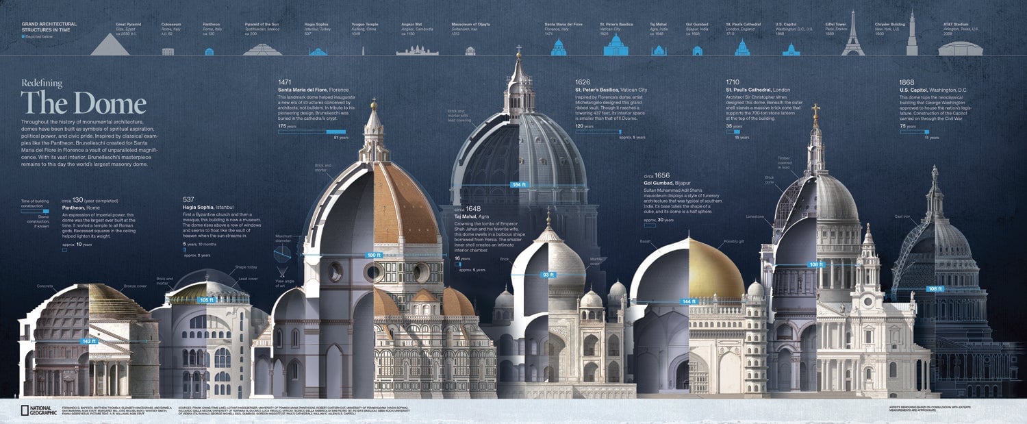
Published in National Geographic, a team of designers, artists and researchers collaborated to produce a series of impressive visualizations to illustrate a story about Brunelleschi’s architectural engineering marvel in Florence, Italy.
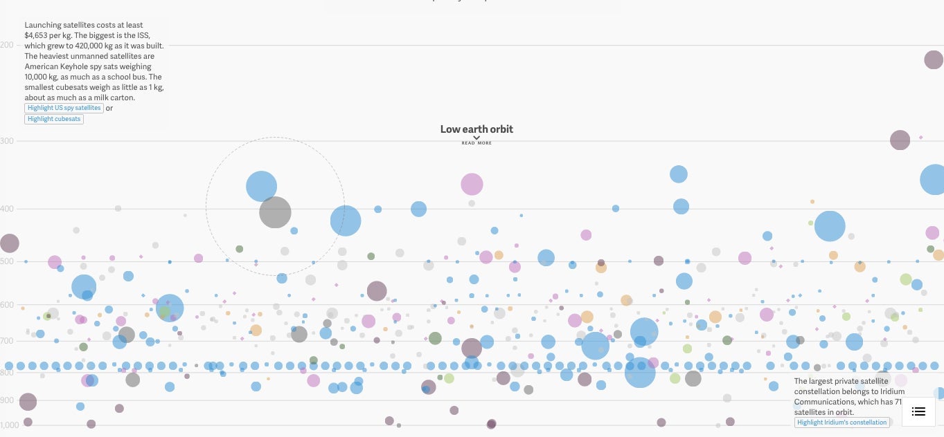
This interactive graphic by Quartz that made it into Cook’s compendium shows every active satellite orbiting the earth.
They make the passing of time beautiful
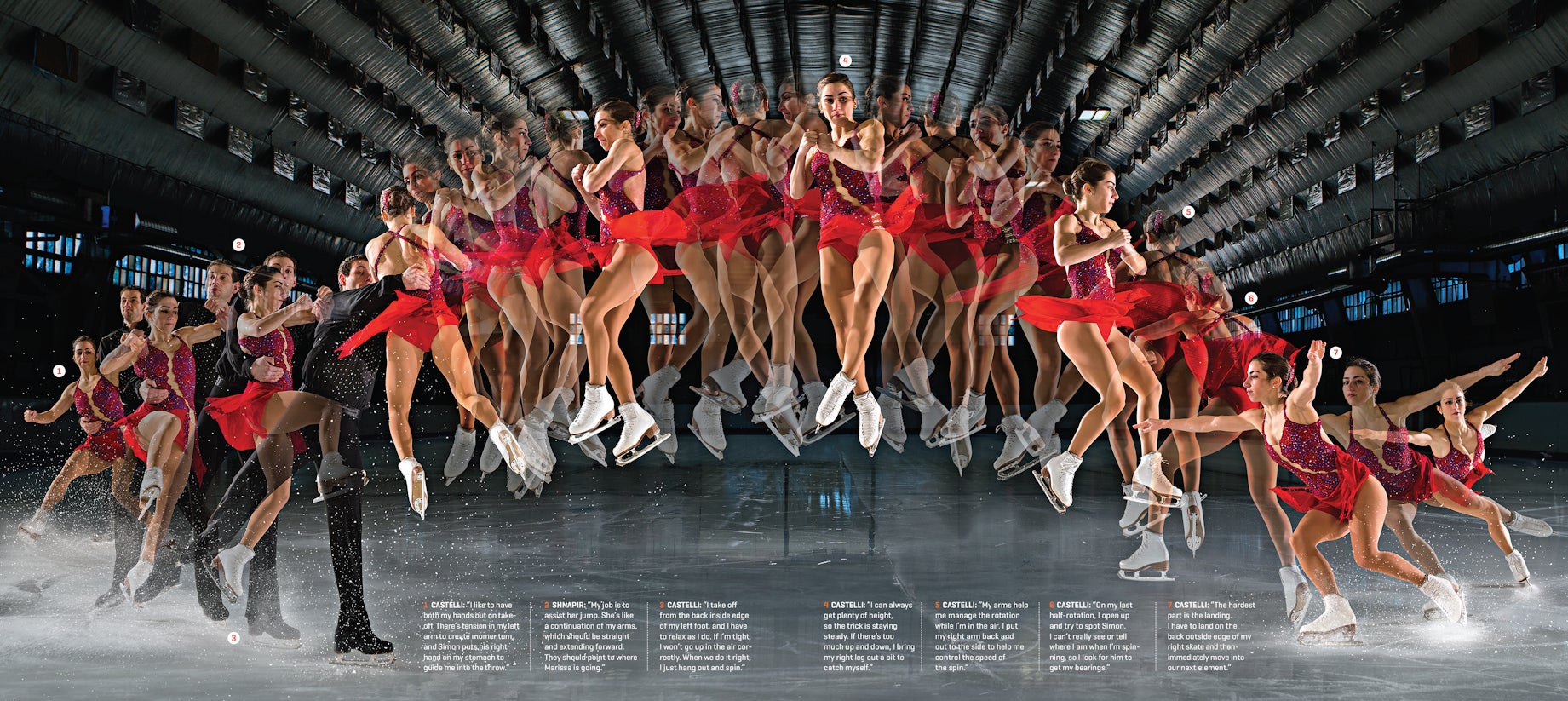
Using a series of 22 photographs, John Huet captured a figure skater’s flight, usually too fast for the naked eye to capture.
They turn process into story
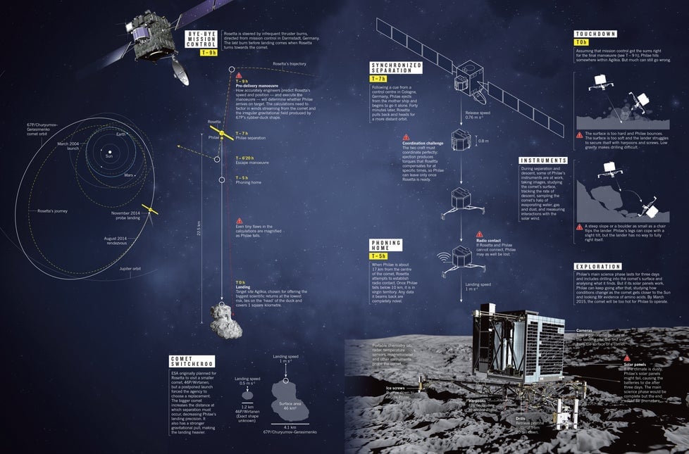
This image show the step-by-step process on the exact science of landing a probe on a rotating comet.
They put a changing world on display
This interactive map, also by Quartz, shows the evolution of “bro” terminology across the US. The map translates the research of a forensic linguist who worked with a data set comprised of several billion tweets into an engaging and concise image.
They make an abstract concept concrete
Each photo in this series published in the New York Times shows what our recommended daily calorie intake looks like in one visual gulp.

They offer a whole new way of seeing things
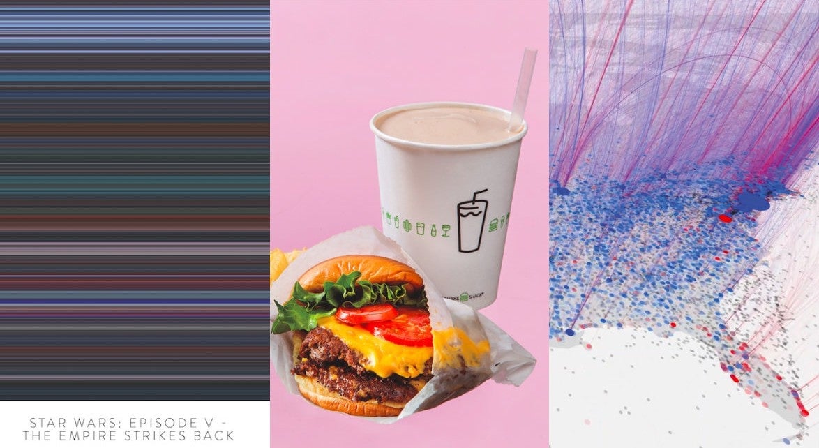
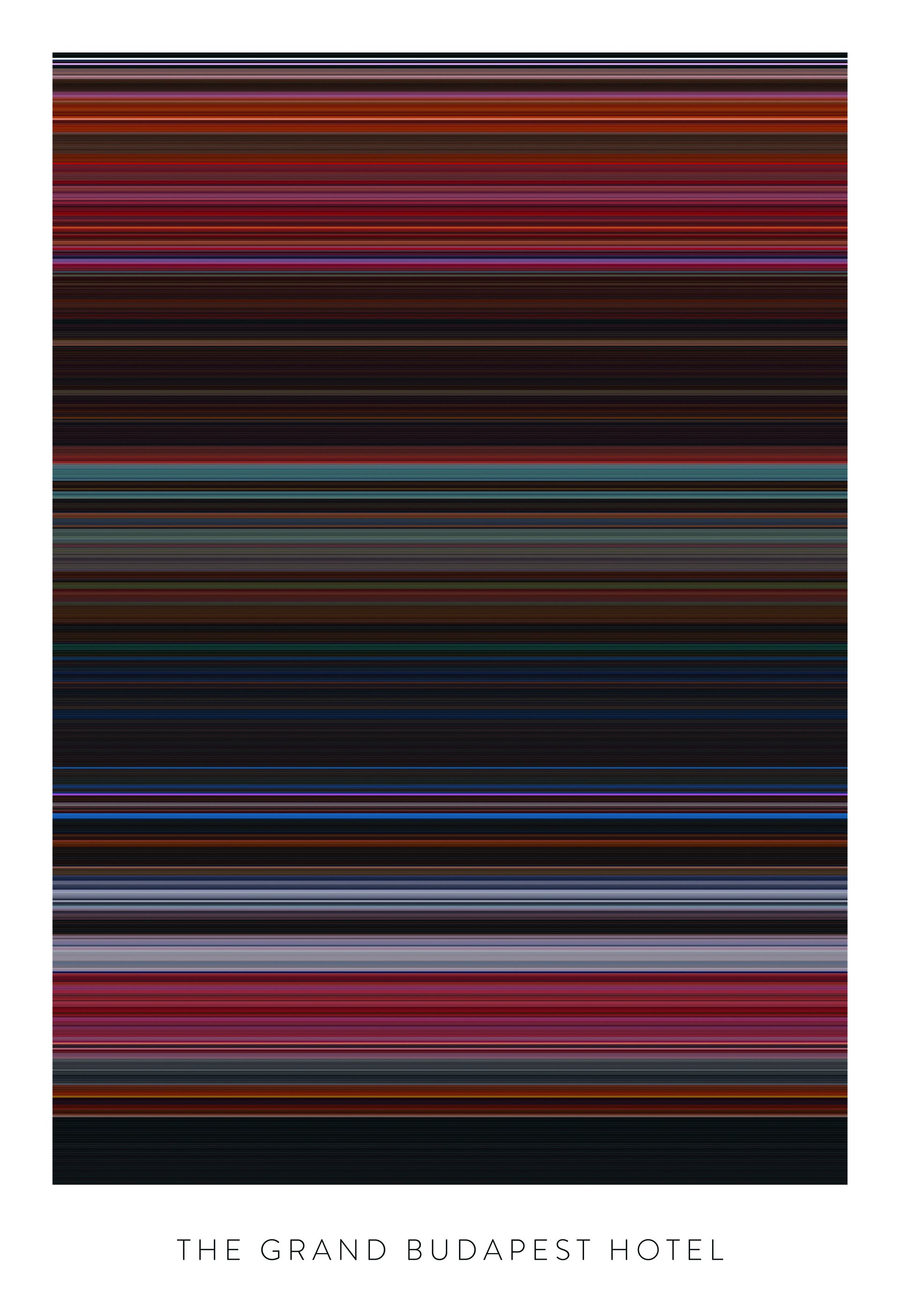
Colors of Motion, a series of visualizations by designer Charlie Clarke, explores the use of color in popular movies. Clarke uses a programming script to extract color data and calculate the average color in a movie frame. Clicking on each band of color reveals the corresponding scene from the movie.
The Best American Infographics 2015, published by Houghton Mifflin Harcourt, will be released on Oct. 6.