The London transit authority’s rarely-publicized, geographically-correct map (pdf) of the London Underground subway system is making the rounds, and it’s been a little unsettling.

The London transit authority’s rarely-publicized, geographically-correct map (pdf) of the London Underground subway system is making the rounds, and it’s been a little unsettling.
On this map, disclosed by Transport for London in response to a Freedom of Information Act request, all of the Tube’s noodle-like contours are laid bare. It’s accurate, yes—at last, the Northern Line is revealed for the twisted mess it is! But it’s also disorienting, as the clean, bold lines of the iconic Tube map melt away.
Join 500,000+ readers who start their day with Quartz.
By subscribing, you agree to our Terms of Service and Privacy Policy.
When it comes to its transit map, London decided long ago that it was willing to forego accuracy for simplicity and design.
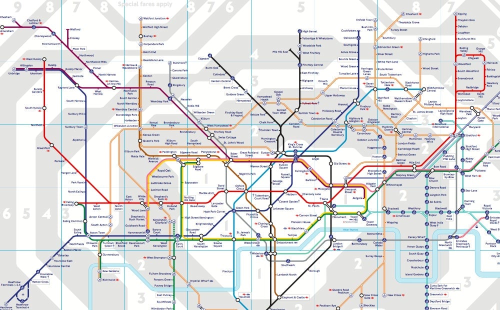
But for the first few decades of its existence, the city’s (much smaller) underground system was mapped out geographically.
A draftsman named Harry Beck came up with the prototype of the current design in 1931. It was all straight lines, with 45- and 90-degree angles only, a modernist masterpiece divorced from the chaotic reality of the streets above. Transit planners initially rejected the map, saying its failure to allow Londoners to gauge real-life distances between stations would be too confusing for riders. A trial run proved them wrong.
Beck’s design principles went on to inform many of the world’s other transit systems. Paris’s current map resembles one Beck designed for fun in the 1940s. Washington DC’s Metro sports decidedly Beckian angles. And the upcoming 24-hour Night Tube in London will have a map that follows on from the daytime version:
But the design-first approach doesn’t work everywhere. In 1976, New York’s Metropolitan Transportation Authority commissioned designer Massimo Vignelli to revamp the subway map. His colorful end result shrank Central Park and distorted Manhattan’s geography in exchange for clean lines and angles like London’s—and New Yorkers hated it.
Why mess with a city whose easily navigable grid system—above 14th Street, anyway—already made perfect sense? Vignelli’s contribution was yanked in 1979, replaced with a version of the messy but geographically-accurate version in use today.
