Summer is often a time for drinking with your friends. I lack friends, so I found another way to participate in this summer ritual: over the summer and fall of 2014, I collected more than two million tweets mentioning alcohol. Using the tweets, which had location tags, I mapped out people’s preferences. In the map below, red areas show where people tweet more about #wine; blue areas show where they tweet more about #beer; yellow areas are balanced. (I focused on tweets containing hashtags because I found these often more reliably came from people who were actually drinking.)
Summer is often a time for drinking with your friends. I lack friends, so I found another way to participate in this summer ritual: over the summer and fall of 2014, I collected more than two million tweets mentioning alcohol. Using the tweets, which had location tags, I mapped out people’s preferences. In the map below, red areas show where people tweet more about #wine; blue areas show where they tweet more about #beer; yellow areas are balanced. (I focused on tweets containing hashtags because I found these often more reliably came from people who were actually drinking.)
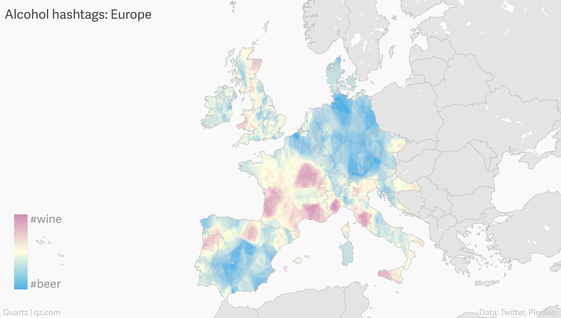
Europe shows even more geographic schisms; it’s a wonder that the Germans and the French get along at all.
Join 500,000+ readers who start their day with Quartz.
By subscribing, you agree to our Terms of Service and Privacy Policy.
Some important caveats about these maps: first, in areas with very few tweeters, patterns are less reliable, which is why some countries in Europe are filtered out. Second, since I searched for tweets only using English words for alcohol, tweeters discussing #vino or #cerveza will be ignored. Third, people tweeting about alcohol are an unusual population.
We can break down these maps by gender, revealing further patterns.
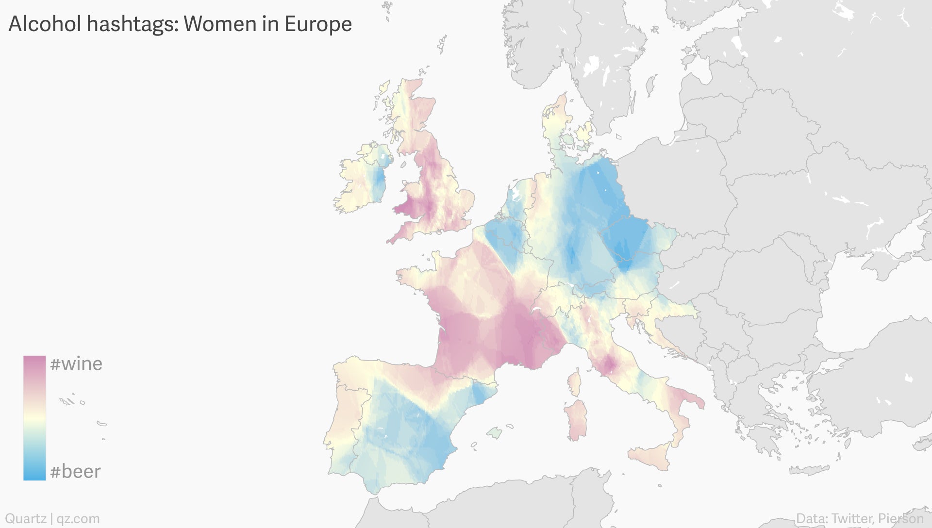
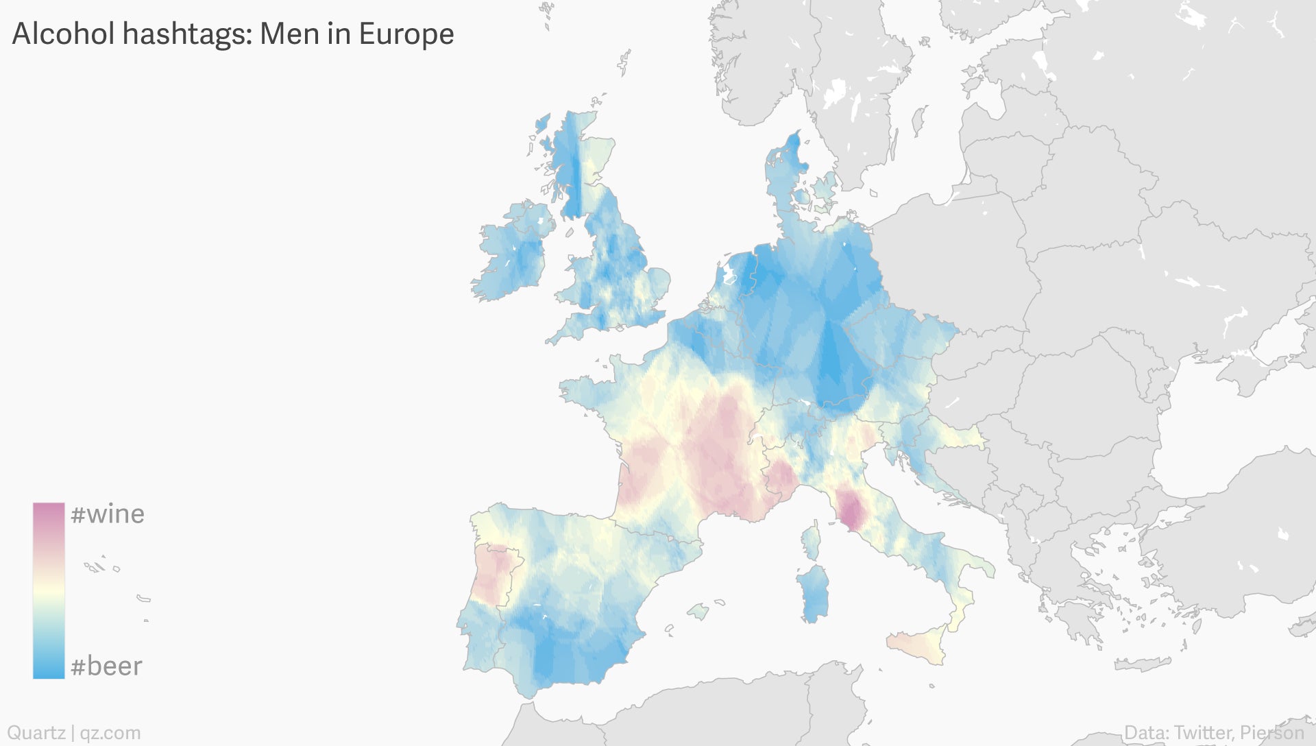
Men are more boring than women, although we didn’t need data science to tell us that: they overwhelmingly factor beer. British women contrast strongly with British men.
Data visualization by Nikhil Sonnad.