The design anatomy of a perfectly crafted store
When it comes to the design of retail interiors, Aesop’s reputation is fabled. As a new feature on their website called Taxonomy of Design explains, the Australian luxury skin care brand’s retail design is unusual—and perhaps worth imitating.
When it comes to the design of retail interiors, Aesop’s reputation is fabled. As a new feature on their website called Taxonomy of Design explains, the Australian luxury skin care brand’s retail design is unusual—and perhaps worth imitating.
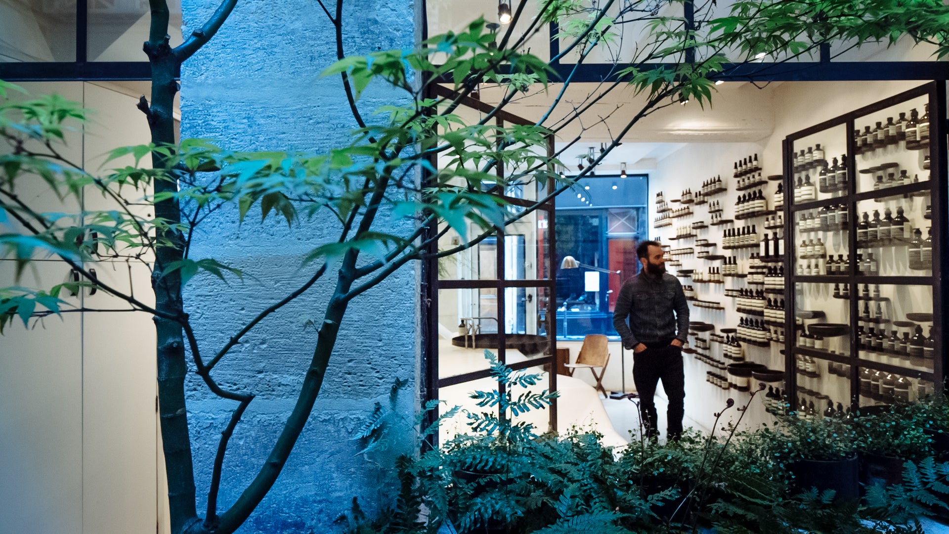
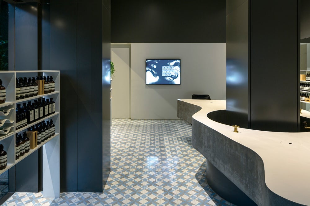
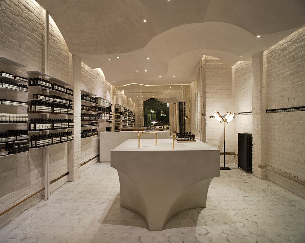
Most retail stores replicate the same layout and interior design template for every outlet. Each of Aesop’s stores, on the other hand, is custom-designed according to the character or history of each location.
From a serene space with curvy cement counters in São Paulo, Brazil, to a canopy ceiling of Paris Review issues in Chelsea, New York, these stores fit into local neighborhoods so well that they’re sometimes hard to spot. Instead of lighted signage and blaring posters, Aesop’s design philosophy promises: ”It is our sincere intention to weave ourselves into the fabric of the street and add something of merit rather than impose a discordant presence.”

Restraint and reuse
Like the brand’s first narrow retail space in a parking lot in Melbourne, most Aesop stores are tiny. There’s usually only room for shelves and a sink where customers try out hand soaps.
In one Boston location, architect and MIT professor William O’Brien Jr. used decorative moulding to create an ingenious system of shelves and drawers.

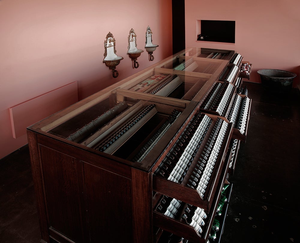
An old archive drawer salvaged from a junk shop was repurposed as the product display shelf and sales counter for a shop in North Melbourne.
And in a São Paulo outpost, Pritzker Prize-winning architect Paulo Mendes da Rocha used pastel-colored handmade tiles to draw the eye.
Good bones
Aesop, which was sold to the Brazilian cosmetics brand Natura Cosméticos three years ago, is big on adaptive reuse. They seek out non-traditional places to reinvent; a store in Milan was once a beloved neighborhood deli, or salumeria. In Oslo, Norway, design team Snøhetta (aka the creators of the world’s coolest banknotes) created a cathedral-like environment inspired by the surfaces from the 1800s, which they discovered during renovation.
The moral to Aesop’s story: Like Muji and the Apple Store, a carefully-considered retail environment can communicate the brand’s message more indelibly than any barrage of heavy-handed branding or towers of products. And far from losing recognition by adapting to local places and materials, global brands can withstand design variations and site-specific interpretations. In fact, such variation may even help grow a loyal local following.