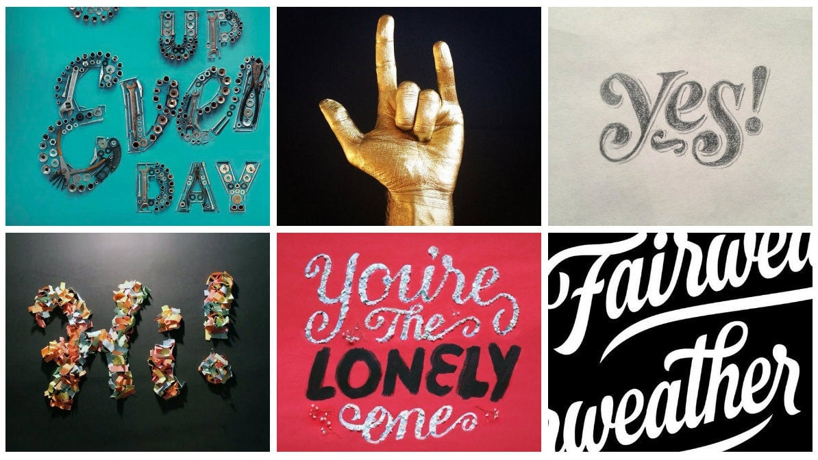
When presidential candidates brag about their Snapchat accounts, it’s a sure sign that video sells. And while short animations have been popular online since the days of Under Construction, Peanut Butter Jelly Time, and other early GIFs, we’re pleased to see how much those snippets have grown up. Today, lively and elegant typography and design can be found in GIF animations and other short clips as more companies up their social game. And when they get there, many call on Joseph Alessio, one designer who’s really excelling in this format.
Why did you start making typographic animations—was it for yourself, for clients?
In Windows XP awhile back, there was a frame-by-frame GIF maker that I’d use to experiment with drawings I’d made in MS Paint as a kid. Later I moved on to Macromedia Flash. The recent spread of GIFs resurrected my own curiosity sometime last year and, while my tools are a little more advanced now, I’m still exploring. It’s been fascinating to see short-form motion expand as a medium, specifically online, and since I’ve begun creating these animations for myself, I’ve had some great client interest as well.
How do you account for the surge in interest in super-short-form video? Do our shrinking attention spans play a part there?
I think the allure of short-form motion, for clients as well as myself, is that it adds a new dimension that is sorely missed online. A book is designed to be read over time; it’s linear, tactile. A poster is hung on a wall and looked at for months, perhaps years. By contrast, image-making for the digital space is incredibly ephemeral. People flip through their Instagram and an amazing piece of still art barely attracts a glance. Sometimes they’ll give a “like,” but often that’s almost a reflex. Adding time, though, brings a fun impact—even if it’s just five or six seconds, you’re providing someone with a new micro-experience.
Your most recent animation is a promotional for the Circles Conference, using their tagline “Inspire, Create, Repeat.” How did you decide on the colors and materials you used?
When I asked Circles’ founder Ismael Burciaga if there were any parameters, he said to just make something cool. I couldn’t ask for a better brief! The leaves and pastels are both a corollary to the tagline and my propensity for found materials. Nature is among the first things that come to mind when I think of inspiration. I wanted to use art supplies for “Create” and I had a few boxes of old pastels that provided a colorful counterpoint to the leaves.
And lastly, I wanted to evoke stencil type, an area of interest for me and the subject of my talk at TypeCon 2015. I sketched out the sans skeleton on a separate sheet beforehand to get the letterspacing right, pored over the pieces of pastels to find the right shapes and sizes for the forms, and cut the leaves to create the fragmented, natural shapes I was looking for. Then I recreated and photographed the frames on a clean sheet—carefully, so as not to leave pastel smudges. This animation is just over 100 frames, not including the conference logo at the end.
Let’s talk about timing. Is six seconds the sweet spot?
I don’t know how much research is behind Vine’s six-second format, but it’s a great length for the medium. Social is a fast-paced, visually saturated environment and once you get above 10 seconds it feels lengthy. You’re still designing for just a snapshot, but it’s a five-eight second snapshot rather than a fly-by glance in someone’s Instagram feed. You want to avoid gratuitous secondary and tertiary motion that feels like filler. So when designing for the social space, five-eight seconds allows plenty of time for motion to develop, but is short enough to loop well and not so long that it dissipates the impact.
Leaves also appear in your animated photographic composition promoting Mathew Carter’s typeface Carter Sans, which features another common motif in your work, a musical instrument. Did you propose this combo “dance” to Monotype?
I was delighted for a chance to use Carter Sans—a beautiful glyphic face by an enduring type designer. It was midsummer and the type felt classical. The animated component wasn’t in the original brief, but I pitched it as a corollary. Stringed instruments recur quite a bit in my work—I play violin and viola—so I used my viola as the centerpiece and built the leaf pattern around it with motion in mind but with a composition that would also work well as an image. The entire piece was about eight feet wide. I actually gathered the leaves from a vine that was growing up the exterior of my building.
Quite a few type-anims (if I can coin the term) on your site and Instagram feed appear to be personal projects and, judging from the captions, were created spontaneously, though painstakingly. Beyond their purely promotional value, is making these this just good, plain fun?
I love creating and this is a medium that I enjoy. I feel like there’s much to be explored here. Experimenting, making words meaningful and beautiful—there’s a joy in it. Everything I make should mean something to me or make me proud.
Take the Emmys project. I don’t watch much TV and don’t keep up with the awards ceremonies, but the trophy presented a spark of inspiration—it was begging to be recreated in a different form. So I excitedly sketched out my idea, although creating it was an arduous process, to say nothing of the paint I was scrubbing off my hands for the next four days! But when I pieced it together and finished animating it, I couldn’t stop smiling about the same project I’d been swearing at a couple of hours earlier.
You’re a letterer and in the intro to your Skillshare course, you mention that typographic illustrations are “read” as communication and “felt” as illustration. With animation, you can control how the text is revealed, which can affect how the words are read. Does this allow you to create more impact compared to straightforward typography and images that use set type?
Absolutely—when illustrating words, you’re fusing written communication with visual, so it already speaks on multiple levels. When you add motion to the mix, there’s yet another dimension. Just as the style of lettering should express the meaning of the words, the animation should as well: choppy, flowing, interacting with other elements—everything can carry meaning, taking an already impactful form of communication to a new level. There’s so much opportunity for both nuance and wow factor.
What’s your background? Some of your embellished letterings are so intricate. Did you train as a calligrapher? In type design?
I’ve been fascinated with letterforms—whether calligraphy, lettering, or type—since before I knew illustration was a real career. I neglected calligraphy early in my teens, drawing out my uncials and blackletter instead of writing them with the proper tools. Since then I’ve studied lettering and type design pretty extensively on my own.
The love of letters survived a video-related internship, resurfaced during my stint as a web designer, and I eventually built it into a freelance practice. I’m primarily self-taught, but I’ve had the help of a lot of lovely people who’ve answered questions and imparted knowledge. There’s something about combining the inherent beauty of language with an illustrative sensibility that endlessly intrigues me—investing words with visual impact, taking written language to multiple dimensions, and communicating in fresh and unexpected ways.
This post originally appeared at AIGA Eye on Design.