With a new “autobiographical” typeface, design legend Tobias Frere-Jones is back in business
On Dec. 1, in New York City, Mallory was born.


On Dec. 1, in New York City, Mallory was born.
The new sans serif typeface is the first commercial release for much-hyped type designer Tobias Frere-Jones, who had been on hiatus after the acrimonious breakup of his partnership with Jonathan Hoefler early last year.
This time, he’s keeping things in the family: Frere-Jones, who hails from creative aristocracy—his brother Sasha is a prominent music critic, while his great-grandfather Edgar Wallace wrote the screenplay for King Kong—opened his new type foundry with his wife Christine Bateup, a lawyer who will handle the business and licensing for the company.
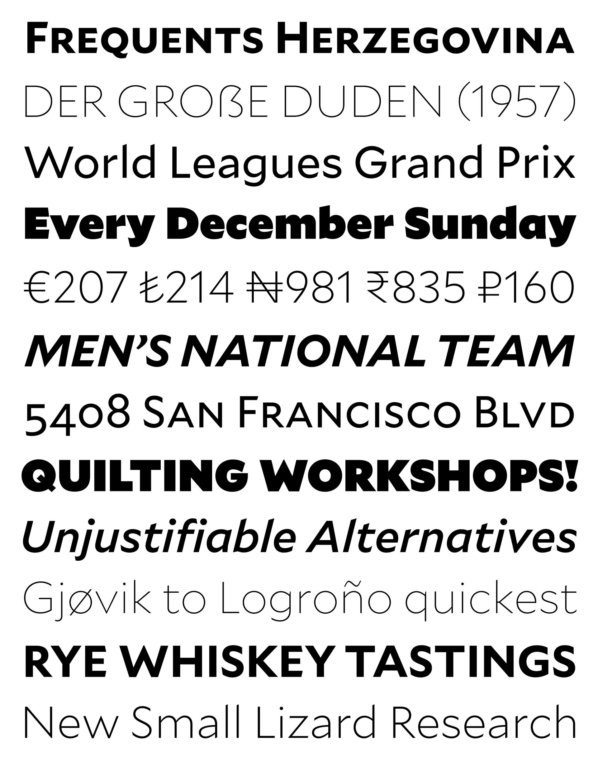
Frere-Jones is widely regarded as the genius behind popular fonts like Interstate, Whitney and Gotham but Mallory is his most autobiographical design project to date—so personal that he gave it his own name (full name: Tobias Edgar Mallory). He jokes that he even endowed the Mallory font with his own UK-US ”dual citizenship,” designed with the austerity of British tradition and the “affable, energetic jokey attitude that runs through American design,” as he puts it.
This is what it looks like:

In his new studio, called Frere-Jones Type, the prolific 45-year old designer found room to experiment with new techniques and dive into his legendary collection of rare type specimen books. “What if I tried to go off a brief based on my own personal history? Would this be a viable recipe for font-making?” explains Frere-Jones to Quartz, describing the process as “abstract and emotional.”
But Frere-Jones is also quick to point out that the fun personal experimentation also included a lot of care for the technical aspects of designing the typeface to make it practical for users. Mallory has 26 font styles each with over 1,200 glyphs to support 72 languages (from Acehnese to Zulu). It includes a new MicroPlus version specifically customized (“spacing of every letter and number to the dot of the i”) so letterforms are legible and comfortable to read, even when displayed on small screens like an Apple Watch or in tiny printed font like the stock market page of a newspaper.
And with his new practice, Frere-Jones is also looking to tackle new commissions that he hasn’t worked on before. “The type that’s shown on those LED screens inside subway trains [in New York City], that type can be so much better and it actually wouldn’t be that hard,” says Frere-Jones. “I do have this fantasy that I’ll redesign those type, space it correctly so it can be read from more than 10 feet away.”