Uber just unveiled its new “less fussy” logo
Uber has a whole new look, CEO Travis Kalanick announced today.


Uber has a whole new look, CEO Travis Kalanick announced today.
The ride hailing service’s new logo is “less fussy” and easier to recognize from afar, said Kalanick (who personally helped design it) in a Feb. 2 blog post. ”We cut the curls, our 1990s hairstyle,” he explained, referring to the slight serifs in the old version.
Curls or no, the new logo still looks a lot like the old one. It will appear on cars and Uber’s corporate communication materials.
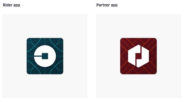
What’s more radical are Uber’s two new app badges: Riders who update their app will now see a notched white circle on a patterned dark blue background, while drivers will see a hexagon on a dark red background.

The two new symbols are meant to evoke the company’s current branding metaphor “atoms and bits,” which unifies its growing menu of services across 400 cities.
Uber’s design team has also assigned colors to each country where the company operates. This expands Uber’s black and white color palette to 65 country-specific color combinations, plus five other global color combinations, Wired reported.
According to Kalanick, the color combinations are based on local architecture, textile, scenery, art and fashion to create “authentic identities” for each country.
Apparently eschewing brand consistency and simplicity, Uber won’t be stopping there: “This is just the start,” Kalanick wrote. “Every city has its own character and our long term goal is to have unique designs for cities as well as countries. This will mean adding hundreds more color palettes and patterns overtime.”