Finally, marijuana packaging that doesn’t look like it was designed by a stoned teenager
A chocolate wrapper is an instrument of seduction. Be it beautiful papers for artisanal chocolates or the familiar graphics of favorite drugstore candy, the package’s job is to tempt and trigger an impulse buy.


A chocolate wrapper is an instrument of seduction. Be it beautiful papers for artisanal chocolates or the familiar graphics of favorite drugstore candy, the package’s job is to tempt and trigger an impulse buy.
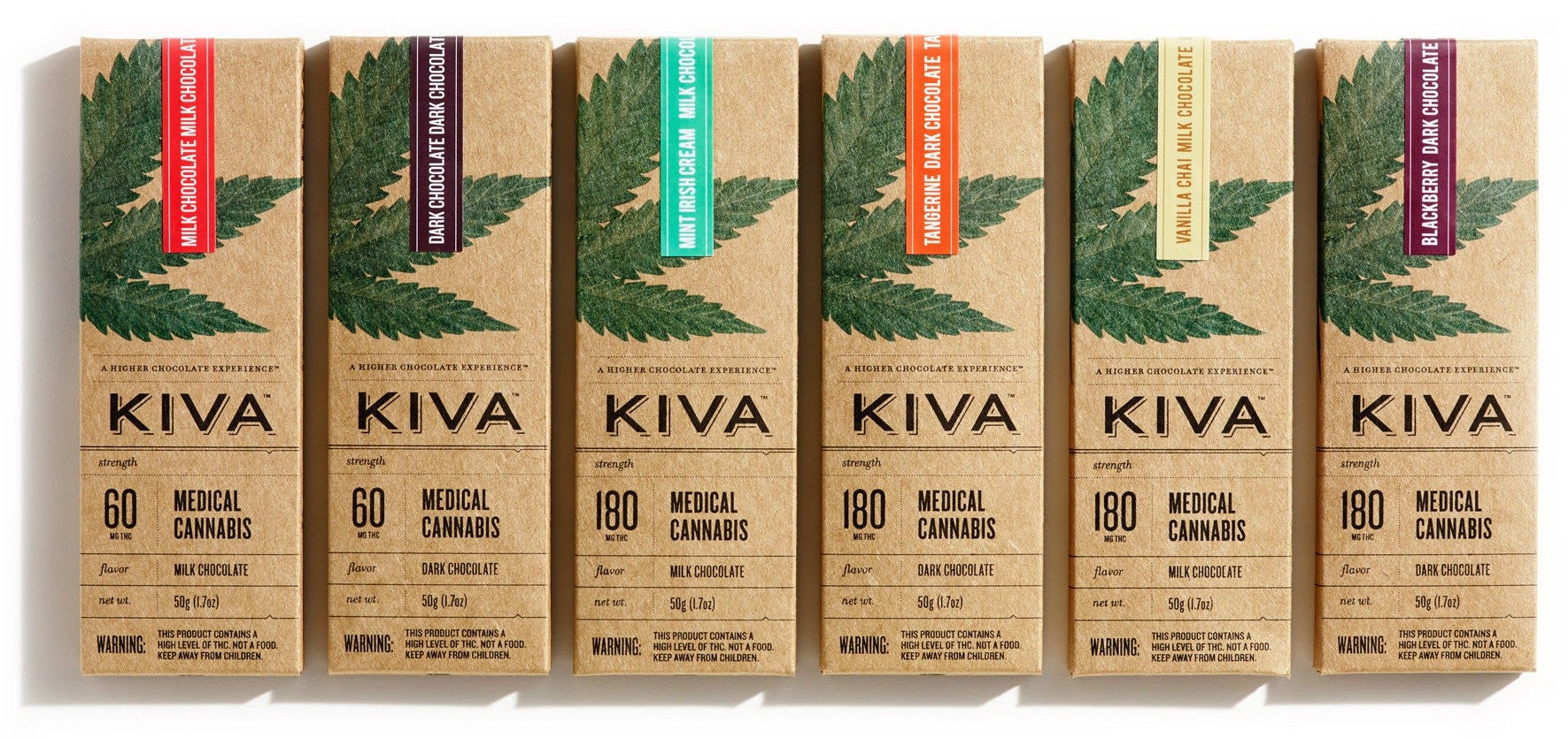
But for graphic designer Nathan Sharp, the assignment went beyond picking good paper, ribbons, and fonts. Tasked with designing the packaging for Kiva Confections, a line of cannabis-infused gourmet chocolates, the Texas-bred designer had to find a tasteful solution for displaying product information and medicinal warnings on the front of the candy bar.

Tasteful warning labels
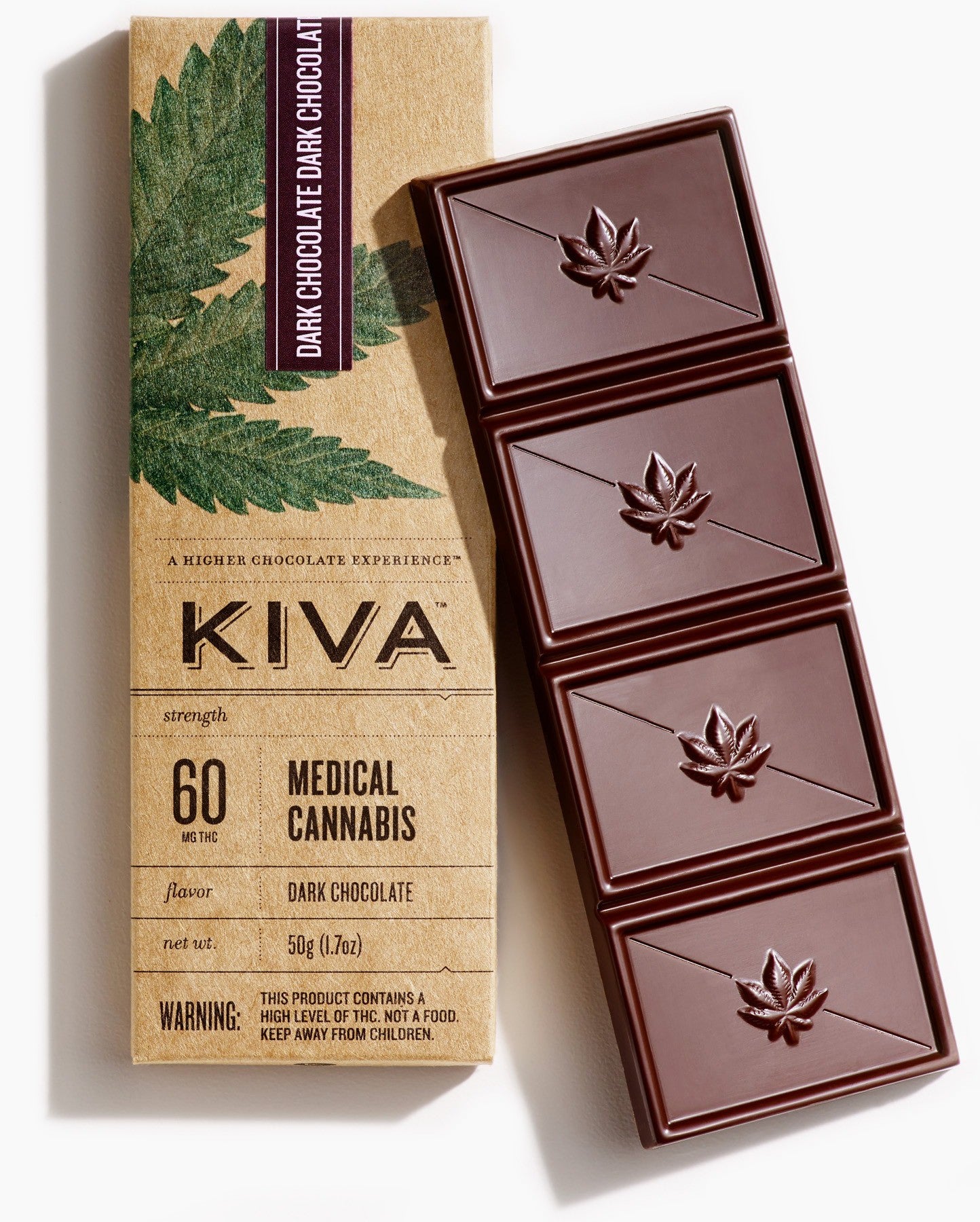
Speaking at Design Observer’s Taste symposium in Los Angeles, California earlier this month, Sharp explained how important it was to make the bar’s medicinal content as clear as possible. With the bluntness of a drug label, delivered with the finesse of a graphic designer’s trained eye, Sharp (who collaborated with designer Jaime Lee) created a package to help guide Kiva’s customers who may be new to cannabis edibles. He made sure that the potency of the candy bar’s tetrahydrocannabinol (THC) content was clearly marked in front of the box.
Chocolate bars are also divided into chunks according to dose. The inner packaging for Kiva’s Mint Irish Cream milk chocolate bar, for example, prescribes bites in 45 mg increments between each “hit.”
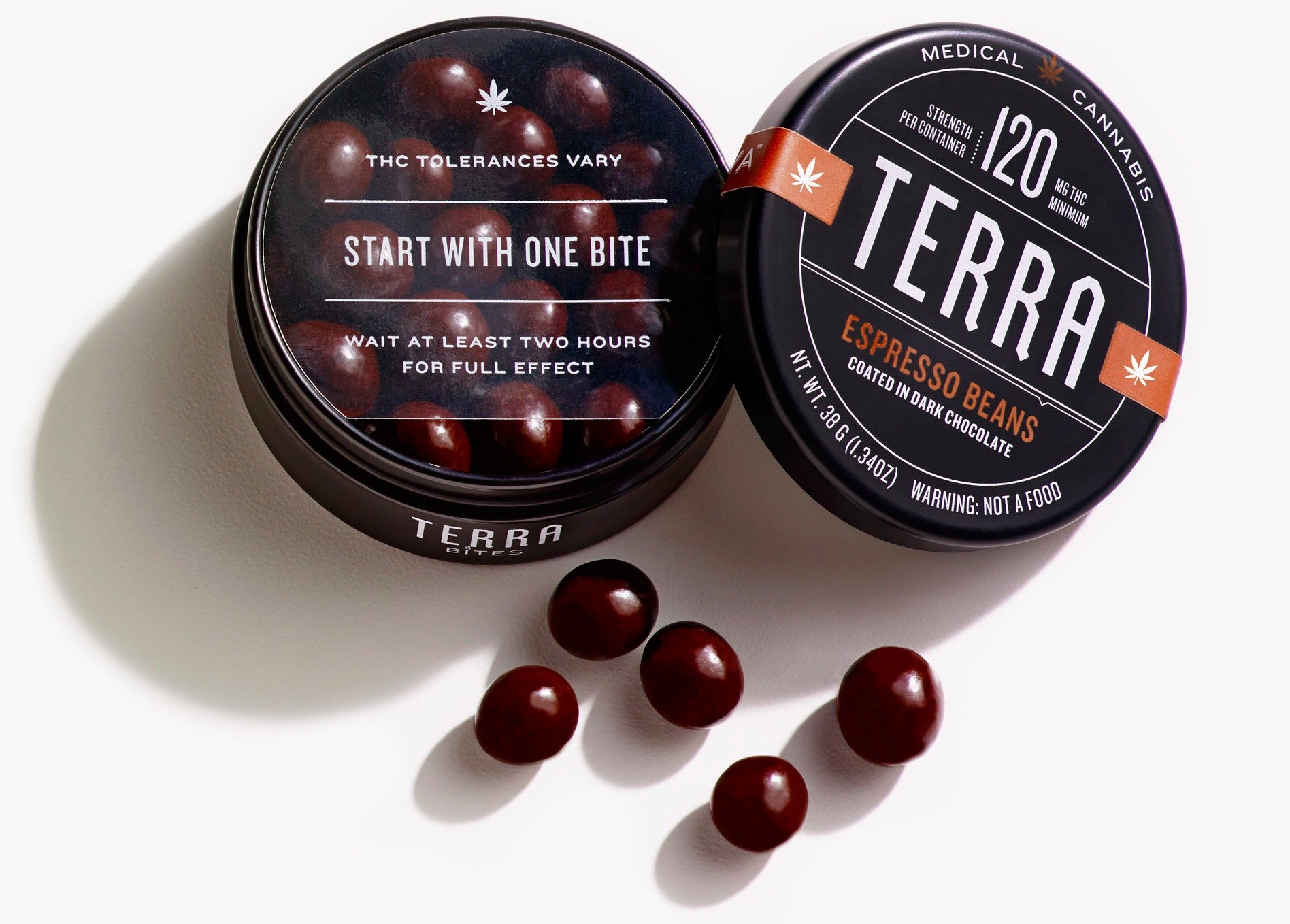
For Kiva’s chocolate-coated infused espresso beans, Sharp inserted a clear sheet that cautions customers to take in the cannabis-infused morsels sparingly.

New normal
Sharp explains that he deliberately avoided the familiar motifs of weed world: trippy psychedelic swirls, Rastafarian colors, and grungy typography. “We didn’t even go there,” he tells Quartz. Sharp’s anti-tie-dye creative direction is a strategic move to fortify Kiva’s quest to normalize cannabis edibles in every day life. “We wanted people to feel safe having them in their home environment,” explains Scott Palmer, Kiva’s co-founder, who presented with Sharp at the conference.
Indeed Kiva’s bars are discreet. With the marijuana leaf artfully cropped, Kiva’s bars easily blend in with other energy bars and artisanal chocolates. Its promotional material too showcases natural ingredients, like advertising for a high-end health product.
Its gift set even looks like a box of tea.
“We wanted [customers, or ‘patients’ as Kiva calls them] not to feel that having the edibles around means they necessarily participate in weed culture,” Palmer says. “We really believe that marijuana is a normal thing—and should be a normal thing—and we wanted the packaging design to respond to that.”
For Sharp, the assignment was an opportunity to forge a new design direction in the billion-dollar cannabis industry. Since marijuana is still considered largely illegal in many US states, regulations governing cannabis packaging and labeling are just being defined. Until the last few years, marijuana was mostly packaged in hastily-marked plastic bags and vials. ”The field is wide open and perhaps we can set a standard,” he says. “Maybe grandiosely, we’re thinking if we can move the brand of cannabis itself.”