The data visualization tweet that made my head explode, and the women who put it back together
The data-visualization community lives on the web and I am a card-carrying member. We are a small and rapidly growing group of people who are passionate about hard facts. We’re big into show-and-tell since people consume our work by seeing it. And many of us work in code which, if you have been following the technology industry, means there is a strong chance our ranks are skewed toward dudes.


The data-visualization community lives on the web and I am a card-carrying member. We are a small and rapidly growing group of people who are passionate about hard facts. We’re big into show-and-tell since people consume our work by seeing it. And many of us work in code which, if you have been following the technology industry, means there is a strong chance our ranks are skewed toward dudes.
We also use social media to keep up with our peers and share our work. All well and good. Except yesterday (May 19.)
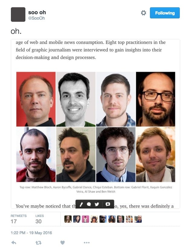
At 1:22pm, Soo Oh, a news application developer at Vox, posted a tweet pointing to this tableau of the “top practitioners in the field of graphic journalism” interviewed for a Medium post.

So. Many. Men.
Some of whom are my good friends. All of whom, I have no reason to disrespect. But the optics kill me. Really?
What makes me angry is not the intent of the author, Tim Wallace, a graphics editor at the New York Times. His post about mapping (since deleted) is/was smart and amusing. He leads us through a little history of cartography with a promise to return later with further posts and includes other agreeable white guys you wouldn’t mind having coffee with, like Walter Cronkite and Fred Armisen.
My problem is the deeply ingrained cultural gender bias that his panel reflects.
Wallace didn’t respond to Quartz’s requests for comment. To his credit, he did address the shortcoming in the text of his original post:
You’ve maybe noticed that these are all fellas. So, yes, there was definitely a gender bias in this study. Despite efforts to create a well-rounded sample of professionals in the field of journalistic cartography, no women were included. This is a shortcoming I willingly concede in hopes that future studies are able to reduce (*gasp* remove?!) this bias.
But conceding there is a shortcoming is frankly not enough. If you know there is an imbalance, you acknowledge there is an imbalance but you don’t bother to find one single woman who can rebalance the imbalance, you have not, as they say “manned up.”
To be sure, including a woman’s point of view as you stroll through the history of cartography will not change that history. It will change now, however, our future history.
I’m also puzzled that this particular post appeared at a sensitive moment for his employer, the New York Times, which is currently under fire for alleged gender bias. It’s painful because the NYT has a special place in my heart. I worked there for 15 years including on the graphics desk where Wallace now works.
Lucky for me I was handed a book that stuck with me, The Girls in the Balcony. It’s the story of a discrimination suit filed in the 1974 by a group of underpaid and underemployed female reporters. Some of those women were my mentors. They were and are my role models.
Had some of the effort put into interviewing eight men been redirected toward finding one woman Wallace might have avoided being at the center of the tornado that is collective force of women in data viz. I hope he republishes his work once he’s “swept all the corners,” a phrase one of his current bosses likes to use.
Meanwhile, there is a twitter list I have of women in dataviz I will be updating that makes me happy. Did you know Kat Downs runs the Washington Post graphics desk? And Jessica Yu runs visuals at the Wall Street Journal. Sarah Squire runs Data, Graphics, and Visuals for Dow Jones. Laura Kurgan runs the Spatial Information Design Lab at Columbia. Kim Rees is a founder of Periscopic. And then there are the optics on this, ProPublica’s Data institute class of 2016 assembled by Sisi Wei and Lena Groeger.

I could go on. But, in this case, I’m at peace with the visuals.