London wants to make its iconic subway font “quirky” again
For the 100th anniversary of the London Underground’s iconic typeface, government agency Transport for London (TfL) will introduce a re-designed tribute font that is as global and quirky as the 1916 original.


For the 100th anniversary of the London Underground’s iconic typeface, government agency Transport for London (TfL) will introduce a re-designed tribute font that is as global and quirky as the 1916 original.

The original font, called Johnston, has come to symbolize the city’s particular sensibility and visual language. But through its various uses and adaptation to digital technology over the years—signage, maps, websites, advertisements and brochures—the lettering evolved to become too “mechanical and too uniform” says Nadine Chahine of Monotype, the Massachusetts-based type foundry commissioned for the special project.
“Our brief to Monotype was to go back to the original principles of Johnston, to reflect on the way the font is now, and see what we might have lost in its 100-year journey,” said TfL design head Jon Hunter in a June 14 press statement.
Named for its creator, Uruguayan-British calligrapher Edward Johnston, the font was startlingly modern when it was introduced in 1916, said Chahine. “It was very new, very innovative. By now we take it for granted and understand that this is a great typeface, but it was an even greater typeface when it was designed—because nobody had done this kind of design before,” she explained. In contrast, many Paris metro stations at the time displayed a sinuous art nouveau typeface, while the New York City subway system had a hodgepodge of serif lettering on mosaic tiles to denote its stations.
Johnston, an influential penmanship master, developed his public typeface over the course of three years based on hand lettering. He even shaped some details based on the marks of a calligraphic quill, like the diamond-shaped dot on the lowercase i and j.
“There were certain idiosyncrasies in the typeface that we thought were a little bit quirky, but they were good. If we can bring them back, then that might bring back some of that original soul,” says Chahine.
Monotype’s new digital-friendly version reproduces some of the irregularities of Johnston’s hand-drawn creation. They tweaked the letter proportions and spacing, and made additional weights, including a fashionable hairline version. They’ve also developed a new # symbol that will be particularly handy with TfL’s new partnership with Twitter to provide commuters with up-to-date service alerts.
Busy riders and tourists may not immediately notice the new font’s details, but the designers say that their careful letterform adjustments are meant to bring back the joy coded in Johnston’s initial version. The new typeface, called Johnston100, will debut in tube maps and posters by next month. It will also be used in the city’s new 60-mile Elizabeth Line, scheduled to open in 2018.

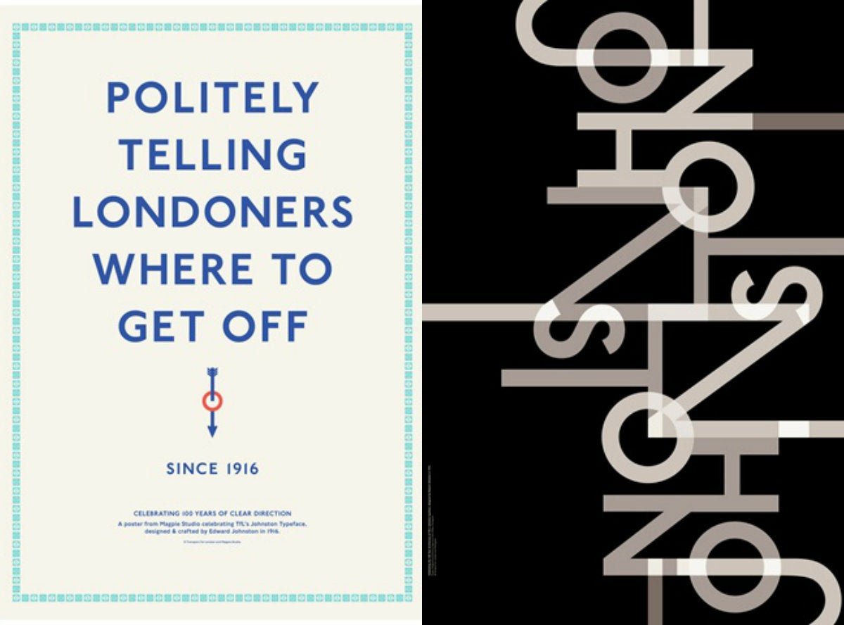
Ten studios, including Monotype, have also created commemorative posters to mark Johnston’s centennial using the updated typeface.