The hardest trick in mobile design: making the product simpler
New York-based startup Foursquare began in 2009 as a mobile application for sharing your location with friends. It still does that, but in order to grow beyond its early users, who are heavily concentrated in the United States and Indonesia, Foursquare has added a slew of new features, fashioning itself as a digital guidebook powered by a trove of real-life data.


New York-based startup Foursquare began in 2009 as a mobile application for sharing your location with friends. It still does that, but in order to grow beyond its early users, who are heavily concentrated in the United States and Indonesia, Foursquare has added a slew of new features, fashioning itself as a digital guidebook powered by a trove of real-life data.
The company’s dilemma, though, is that new features typically add complexity, which is the Achilles’ heel of mobile products. Apps that succeed on phones are often simple in the extreme, hiding their intricacies from the main view. What’s remarkable about Foursquare is that the company has managed to add features and make its product simpler at the same time.
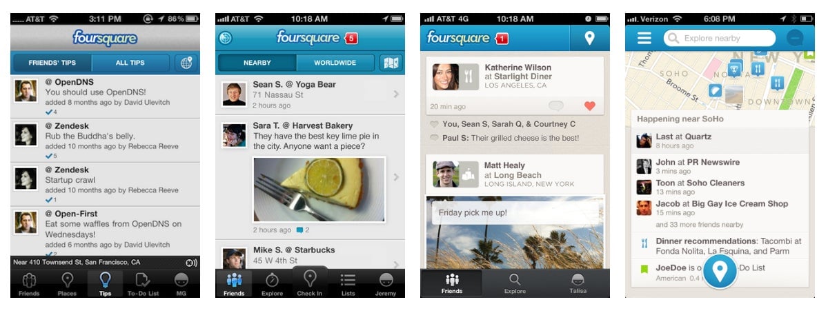
In the image above, look at the row of buttons along the bottom of Foursquare’s iPhone app over time, beginning with September 2010 on the left and ending with the update released by the company this week: from five buttons to three to one. That, despite the addition of several features, most notably “Explore,” which is the guidebook that Foursquare hopes will take it mainstream.
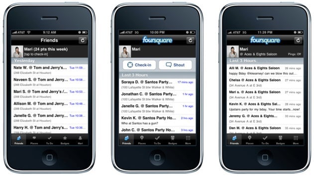
In the newest version, Explore moves to the top of the screen, replacing the company’s logo and creating the impression that there are only two things to do on Foursquare: broadcast your location (the check-in button at the bottom) or find new ones (the search bar on top). Other features have been admirably hidden. The product feels simpler, in fact, than it did back in 2009, when it first launched:

Foursquare just took on $41 million in debt to avoid giving away equity at a reduced valuation, an indication that its investors are nervous about the company’s ability to grow further. (Thirty-three million people have tried the product, but Foursquare won’t disclose how many active users it has.) Who knows if Explore is the right strategy, but from the perspective of mobile design, Foursquare has done an impressive job focusing on it.