A Google Maps redesign aims to offer “fewer distractions”—by highlighting restaurants, bars and shops
For its more than 1 billion users, Google announced a design update to Google Maps yesterday, July 25.


For its more than 1 billion users, Google announced a design update to Google Maps yesterday, July 25.
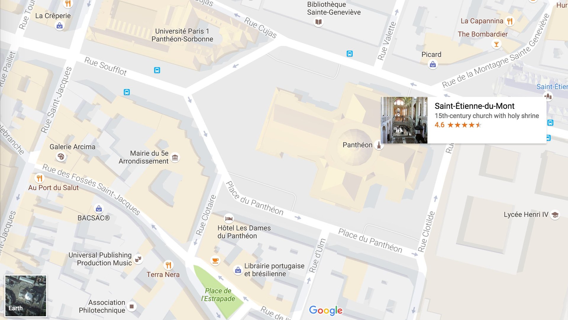
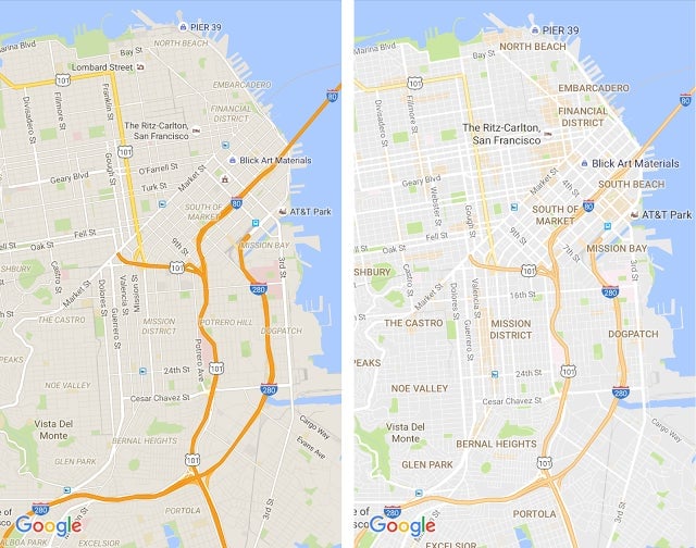
Embracing a “cleaner look,” the new reduced interface for mobile and desktop is focused on discovery and socializing, instead of turn-by-turn directions. Areas of interest like restaurants, bars, and shops are now shaded in a light shade of orange, allowing users to learn about new venues around their destination.
Google determines these areas of interest through an algorithm that scans the earth for areas with high concentration of commercial establishments. For big cities, Google relies on human mappers to pinpoint establishments in these high-traffic areas.

Yet the new Maps design was supposed to help users “navigate the world with fewer distractions,” as Google Maps designer Zhou Bailiang and engineer Mark Li explain in the company blog. The interface updates also include simplified graphics and a more subtle color palette.
Google’s design tweaks comes in the context of its race with Apple for become the “universal map,” as Justin O’Beirne pointed out last month in a detailed analysis comparing the world’s most popular navigation platforms. The two companies have divergent philosophies in dealing with complexity and labeling.
The previous version of Google Maps for instance, prioritized labeling roads while Apple prioritized labeling places, as O’Beirne points out. Improving Google Map’s discovery addresses that gap and brings it somewhat closer to Apple’s thinking.
The difference, as Google spokesperson Elizabeth Davidoff explains to Quartz, is that Google is more interested in highlighting whole areas instead of specific places. “Rather than just highlighting the Westfield Mall in San Francisco as Apple Maps would, in Google Maps you’ll see the entire Union Square area shaded so that you know there are restaurants, bars, shopping and other activities in that vicinity,” says Davidoff. “It’s our goal to make sure our Maps are easy to read for both discovery and navigation.”
While users are still debating which platform is truly superior, Apple and Google are already dictating how most of us navigate the world. A 2015 Nielsen survey of the top 10 most popular smartphone apps pegs the number of Apple Maps users to 46.5 million in the US, placing tenth, behind Google Map’s number 6 ranking.