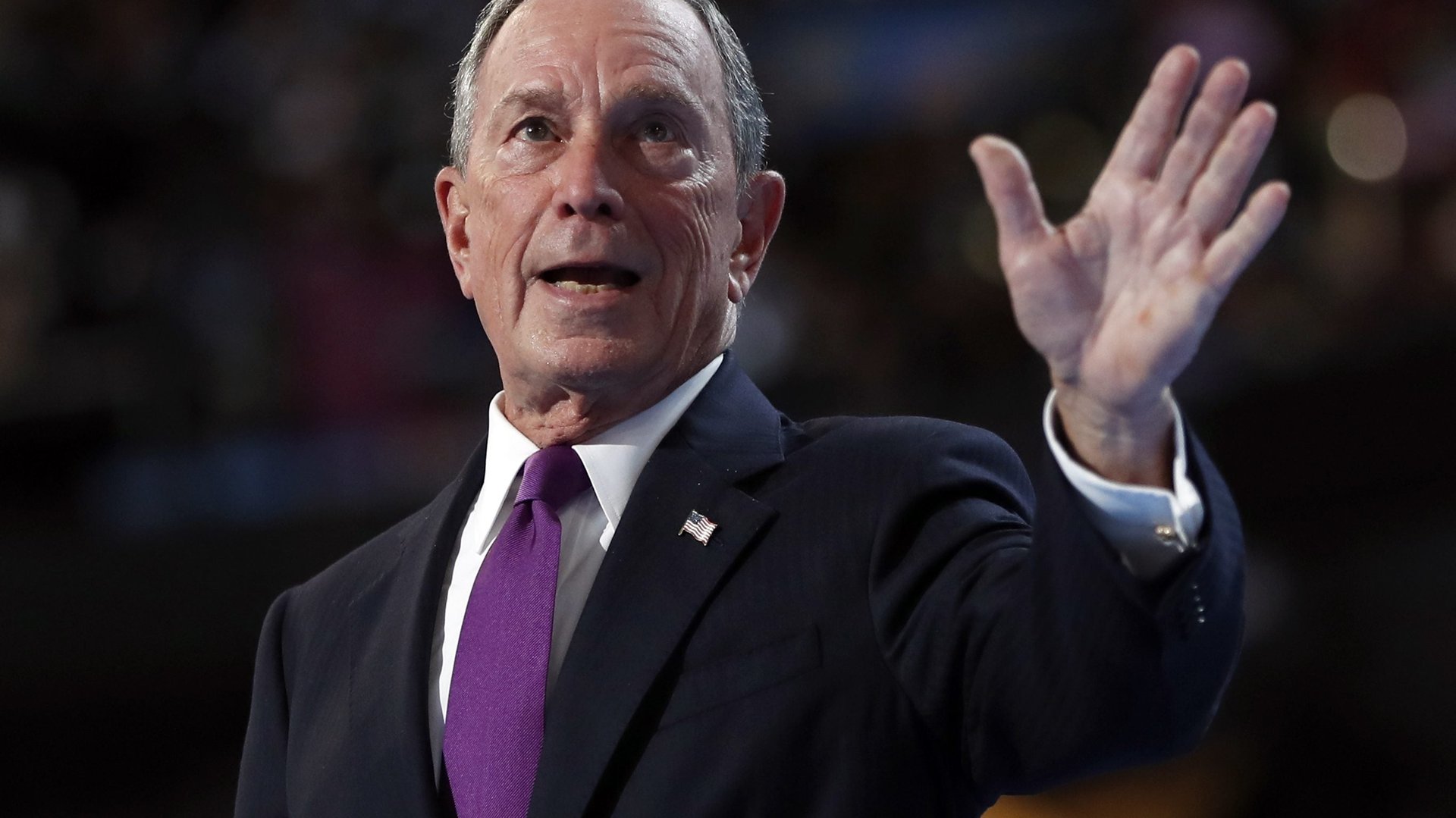
Amid a sea of blue, former New York City mayor Michael Bloomberg raised eyebrows last night, July 28, when he took the stage at the Democratic National Convention wearing a vivid purple tie. Purple, of course, is an intermediate color formed by combining blue and red—the perfect match for his message urging voters to see past party lines.
Amid a sea of blue, former New York City mayor Michael Bloomberg raised eyebrows last night, July 28, when he took the stage at the Democratic National Convention wearing a vivid purple tie. Purple, of course, is an intermediate color formed by combining blue and red—the perfect match for his message urging voters to see past party lines.
“To me, this election is not a choice between a Democrat and a Republican,” said Bloomberg, a longtime Democrat who joined the Republican Party in 2001, then registered as an independent. (Though there are hints that his allegiance still lies with the Democratic party.) “It’s a choice about who is better to lead our country right now, better for our economy, better for our security, better for our freedom, and better for our future.”
Join 500,000+ readers who start their day with Quartz.
By subscribing, you agree to our Terms of Service and Privacy Policy.
Amid the onslaught of Americana-inspired red and blue that saturate the media landscape every US election cycle, Bloomberg’s flash of purple is both politically and visually refreshing.
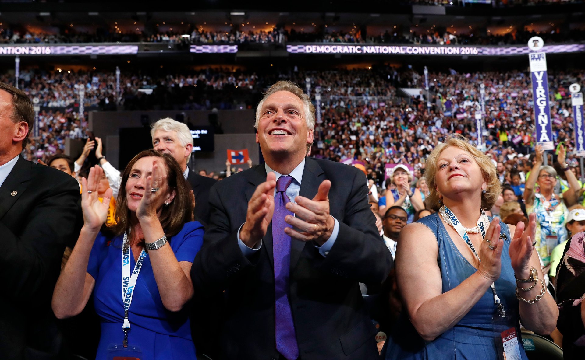
Throughout the bitter presidential race, and especially over the last two weeks, Americans have been extra attentive to the perceived symbolism of color in the US presidential race. Design critics have read deeply into the hue of first lady Michelle Obama’s dress, the ubiquity of red ties in Republican Party debates, and the stage design at last week’s Republican convention in Cleveland, and at this week’s Democratic convention in Philadelphia. But as Smithsonian explained back in 2012, the political meaning of red and blue is a fairly recent phenomenon in the US.
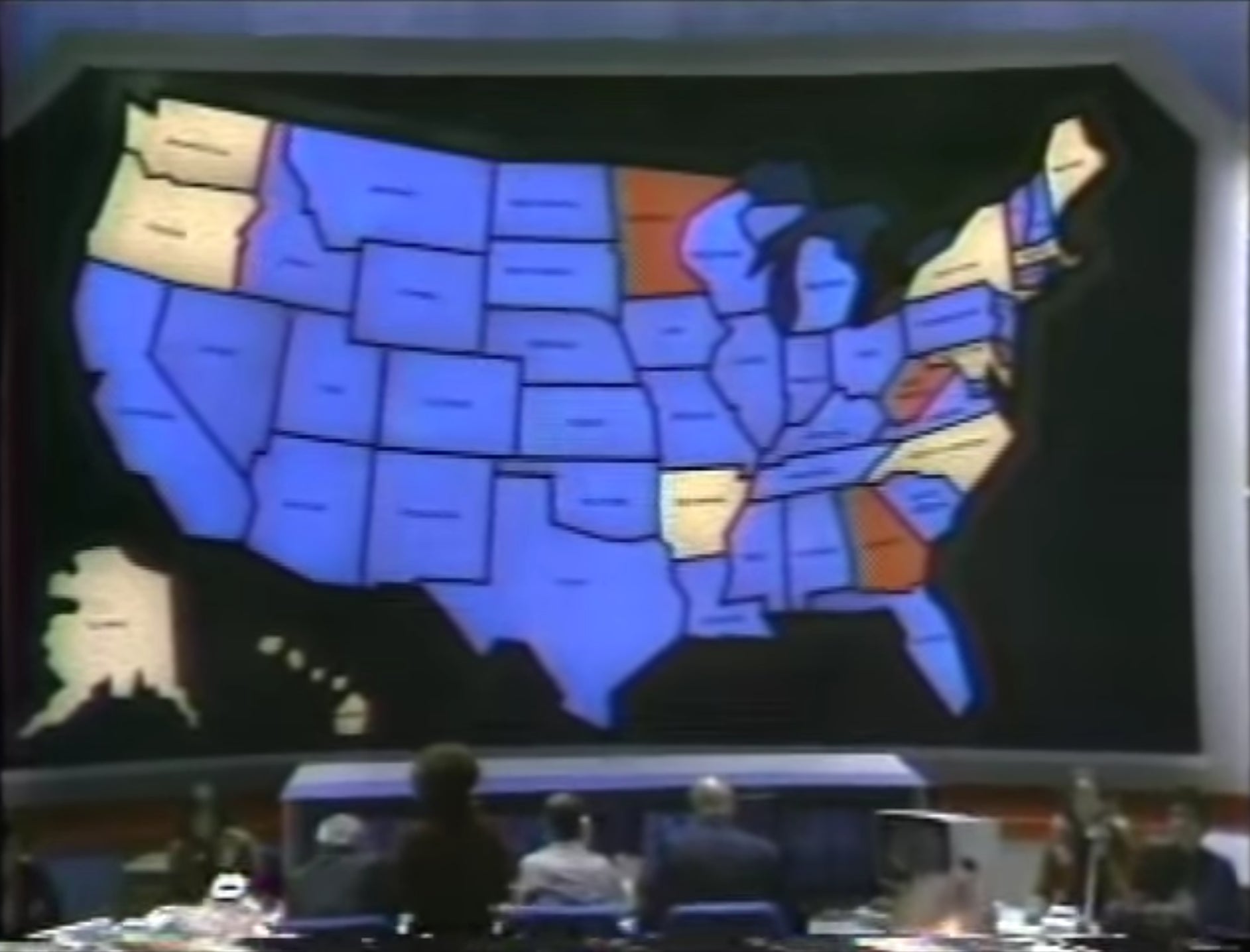
Long before slick computer-generated infographics were available, reports Jodi Enda, news network NBC constructed a giant state-by-state map with thousands of lightbulbs as a set prop for coverage of the 1976 presidential contest between Gerald Ford $F and Jimmy Carter. With colored TVs in most US households, Americans watched states turn from white to blue or red as the votes came in.
This trained Americans on the concept of “red states” and “blue states,” although at the time the colors flip-flopped between the two parties depending on the producer’s whimsy. A Democratic state could be a red state, and vice versa.
“For years, both parties would do red and blue maps, but they always made the other guys red,” explained Chuck Todd, host of NBC News political director to Smithsonian magazine. But that changed during the Cold War, when all shades of red become associated with Communism and slurs like “red” and “pinko” connoted unpatriotic leanings. “During the Cold War, who wanted to be red?” says Todd.
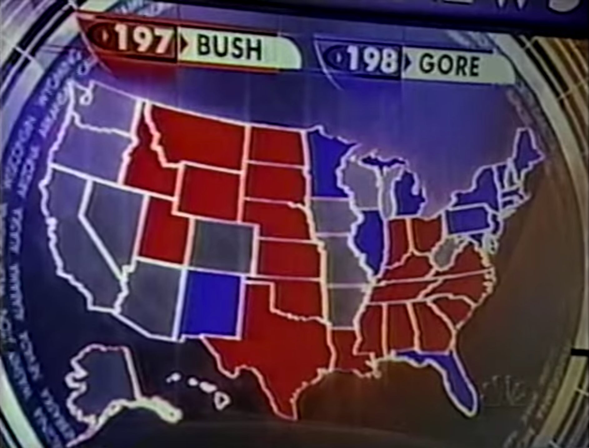
Branding Republicans red and Democrats blue became standardized in the tight race between Al Gore and George W. Bush in the 2000 elections. Because the tallies were so close, networks flashed their color-coded maps so often that it became cemented in viewers’ minds, and echoed in popular news programs.
But while assigning red and blue to political parties might offer some practicalities, the binary colors arbitrarily chosen by a broadcast station’s graphics department is perhaps too limiting. Expanding the color range—beyond the tired and arguably ineffective traditional themes—would allow both designer and voter to make more creative, considered choices.