People are digging through their trash and reusing Target’s well-designed prescription pill bottles
In 2005, Target introduced what has been hailed as “the first significant and useful” redesign of the classic amber-colored prescription pill bottle, as health communications blogger Rick Lesaar puts it.


In 2005, Target introduced what has been hailed as “the first significant and useful” redesign of the classic amber-colored prescription pill bottle, as health communications blogger Rick Lesaar puts it.
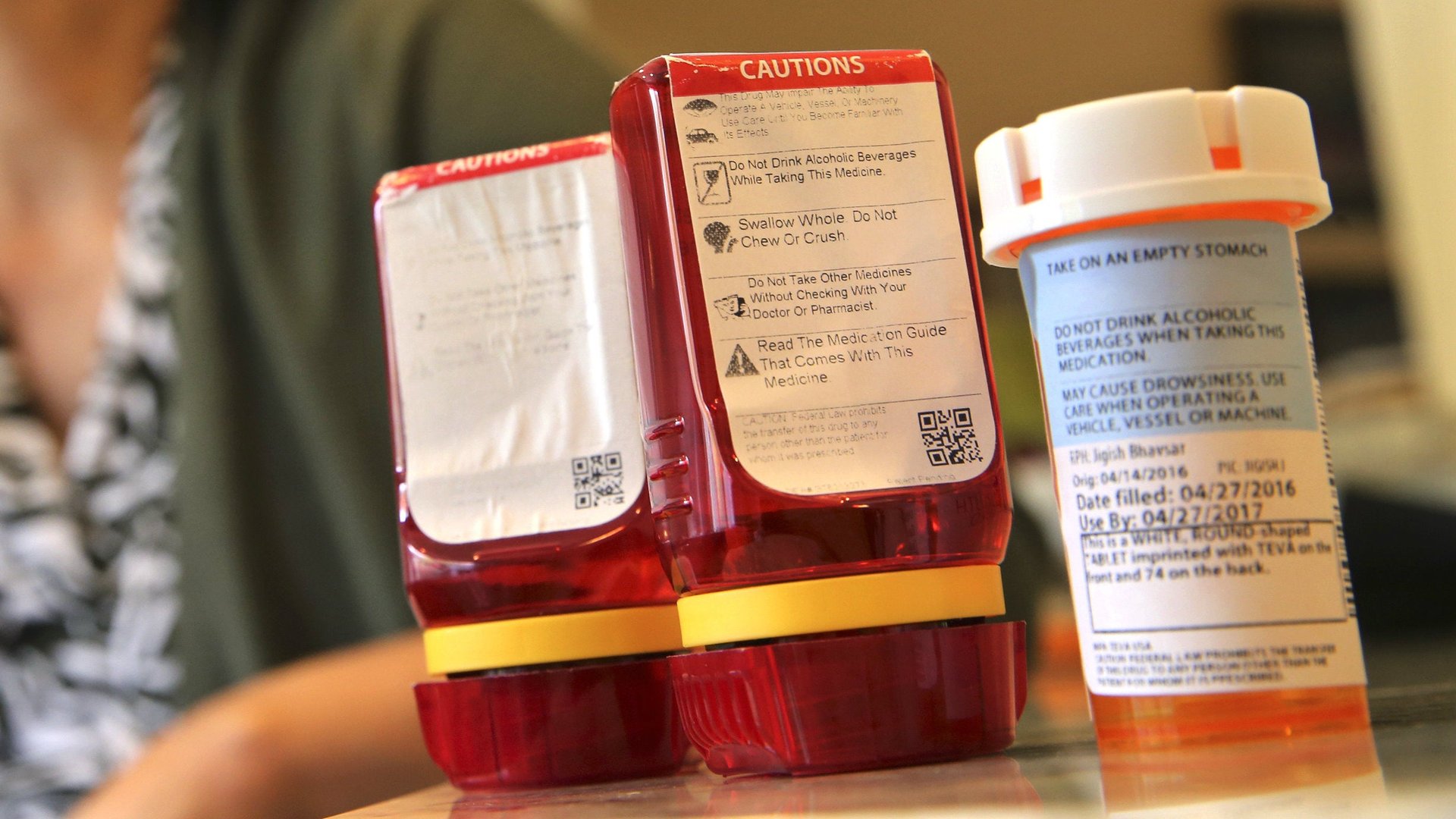
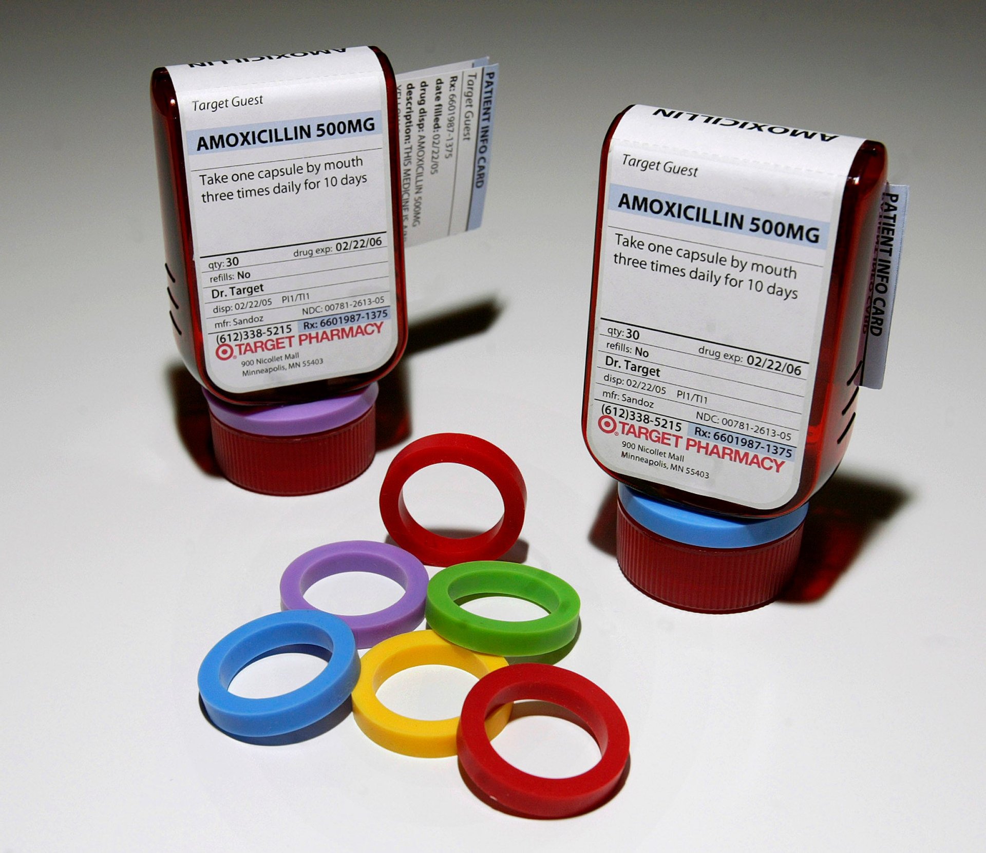
The celebrated red “ClearRx” design solved many common complaints with the standard plastic vials that use the old “Palm N’ Turn” cap. Target’s bottles were easier to open while remaining child-proof; they had a color ring for each member of the family to avoid confusion among medications; and perhaps most importantly, it had a clear, easy-to-read label with the text sized appropriately for aging eyes. Target touted the bottles as an avatar for its design-minded brand ethos and continued to refine its design with enhancements introduced in 2012. The Industrial Design Society of America bestowed ClearRx its “Design of the Decade” award in 2010 and the Museum of Modern Art has included it in its permanent collection.

But when Target sold its in-store pharmacy and clinic operations to CVS Pharmacy for $1.9 billion last December, CVS decided to abandon the much-loved ClearRx system. The drugstore giant decided to revert back to the old, clunky pill bottles because it was simpler to follow the existing prescription-filling procedure implemented at its 9,600 pharmacy outlets across the US, Puerto Rico, and Brazil.
CVS tells Quartz that it’s looking to improve the outdated prescription packaging system. “We are currently exploring options for a next generation prescription labeling and management system that will help patients make clinical gains by making directions easier to understand and improve compliance to their medication therapies,” said a company spokesperson. CVS confirms that it’s hired Deborah Adler, the designer of Target’s ClearRx bottle, for the project, but was mum about the details.
But for many, these solutions could not come fast enough.
Frantic customers are appealing CVS and Target to bring back the red bottle that’s improved their lives significantly. A 553-signature strong petition testifies to the serious implications of what seems like a simple packaging design matter. One commenter suffering from a bone disease wrote:
I have osteoporosis [and it] can feel like I could break a wrist bone trying to open a CVS cap. If I wake at night and have minimal strength, I can’t get the cap off to take my migraine medicine. By the time I’m able to exert enough effort to open the cap, I’m fully awake and can’t get back to sleep. I have a young child and need safety caps. The double pinch ClearRx cap that CVS acquired the right to use are easier to open. CVS can show acquired customers they are valued and maintain customer loyalty by continuing the use of ClearRx bottles. I will continue to recycle my old Target bottles which isn’t the best idea. But I can open the bottle.
Vivian Ruth Sawyer, a Target customer from Louisville, Kentucky dug through her garbage bin to rescue a discarded ClearRx bottle. Sawyer poured refills for her thyroid medicine into the discarded bottles, despite the fact that she would have to keep track of expiration dates, AP reported. It was worth the hassle because the bottles were easier to tell apart in her medicine cabinet, she explained. With the hashtag, #redbottlesrock, many Target customers echoed Sawyer’s sentiment on Twitter:
Quartz also reached out to Adler and Target but did not hear back.