New-look €50 banknotes go into circulation in Europe today (April 4). The European Central Bank (ECB) has been particularly keen to redesign the yellow-orange bill that is its most popular denomination, accounting for nearly half of all banknotes in circulation—and is also among the world’s most counterfeited notes.
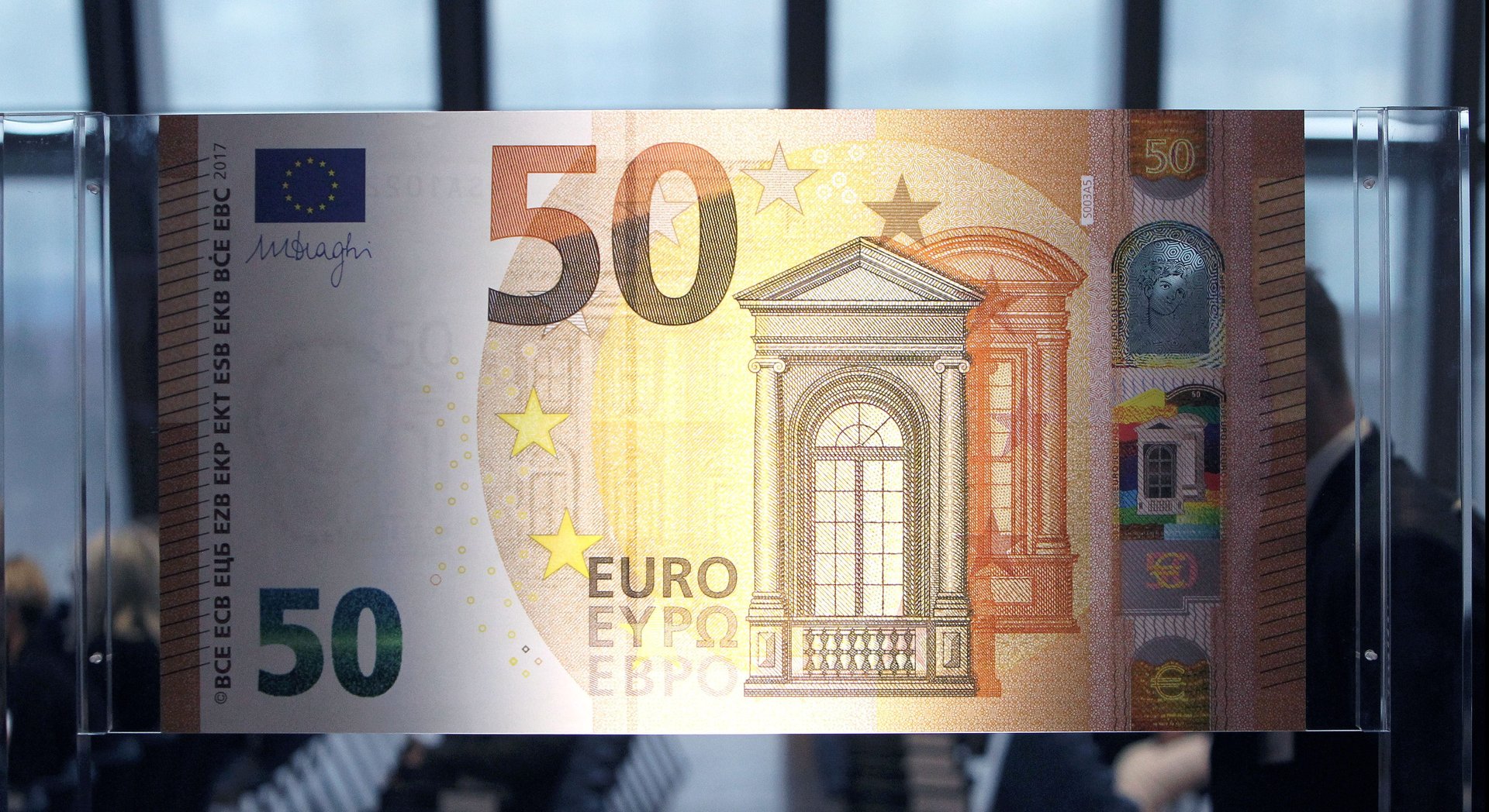
New-look €50 banknotes go into circulation in Europe today (April 4). The European Central Bank (ECB) has been particularly keen to redesign the yellow-orange bill that is its most popular denomination, accounting for nearly half of all banknotes in circulation—and is also among the world’s most counterfeited notes.
Like the €5, €10, and €20 notes in the Europa design series, the surface of the new €50 note features a collage of symbolic architectural motifs drawn by German postage-stamp designer Reinhold Gerstetter. Aside from the usual layers of security features—watermarks, color-changing inks, threads, and microprinting—Gerstetter’s design also features a “portrait window” that frames a hologram of Europa, a Phoenician princess in Greek mythology for whom the continent is named. The princess also appears as a watermark when the banknote is held up to the light.
Join 500,000+ readers who start their day with Quartz.
By subscribing, you agree to our Terms of Service and Privacy Policy.

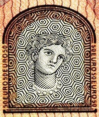
The idea for using a face as an anti-counterfeiting device came from neuroscientists.
The ECB worked with Stanford University neuroscientist David Eagleman to come up with features that will help anyone spot a fake bill. Despite their vigorous “feel-look-tilt” public information campaigns, ECB realized that most people were oblivious to the quality of paper money they exchanged in everyday transactions. ”As banknote-users we are surprisingly unobservant,” writes Eagleman in the Financial Times. “Governments care enormously about the security features; the populace does not…. There was no point spending a massive amount on security features that were noticed only by security experts.” Most fakes, he explained, were only detected by bank personnel who run reams of banknotes through code-reading machines.

Instead of layers of high-tech traps, Eagleman urged the ECB to focus on details that the human eye can spot. After rounds of user testing, Eagleman came up with three design recommendations. The first was to use faces instead of buildings in the banknote watermark. “The human brain is massively specialized for faces, but has little neural real estate devoted to edifices. As forged watermarks are generally hand-drawn, it would be much easier to spot an imperfect face than an imperfect building,” observed Eagleman.
Of course, debates swirled about which person could aptly represent the 19 countries and 338 million citizens of the EU. In the end, ECB turned to mythology and settled on Zeus’s famous lover Europa. ECB debuted this feature in the 2015 redesign of the €20 banknotes.
Eagleman’s other two recommendations were met with less optimism. He suggested that euro notes should be trimmed the same size across all denominations. Eagleman argued that this would cause harried users to take a longer look at the denominations they’re handling, and possibly spot more fakes in the process. The ECB thought this idea was too expensive to implement because all cash vending machines across Europe would have to be retrofitted for the new sizes.

His last suggestion was the boldest. Noting that most users are numbed by the busy swirl of colors, guilloche patterns, typefaces, and illustrations on the surface of the note, Eagleman proposed a design comprised of a blank chit of white paper with a hologram in the middle. “A counterfeiter would not be able to replicate that on a printer, and the man in the street wouldn’t be sidetracked by all the detailing that has nothing to do with the security,” argued Eagleman.
Though intrigued by the idea, the ECB ultimately rejected it, saying that such a stark design would cause confusion and public dissatisfaction.
“There’s too much cultural momentum in the design of banknotes,” Eagleman wrote in the Financial Times, reflecting on his dalliances with bureaucracy. “Currencies are supposed to impress the viewer with the regal power and artistic talents of a ruling body. Apparently, no government wants to appear un-regal and un-artistic when compared to another government.”