Design nerds can’t get enough of these ’70s US government brand manuals
A corporate brand manual is not a fun read. It is a litany of rigid specifications for standardizing the look of print and web-based communication, and is usually filled with extremely boring details about logo sizes, fonts, colors and template layouts. So why are brand manuals suddenly so cool?

A corporate brand manual is not a fun read. It is a litany of rigid specifications for standardizing the look of print and web-based communication, and is usually filled with extremely boring details about logo sizes, fonts, colors and template layouts. So why are brand manuals suddenly so cool?
Over the last three years, technical manuals such as the 1975 NASA style guide manuals have been repackaged as handsome hardcover volumes, destined for display on coffee tables and color-coded bookshelves. They’ve found instant popularity—design sophisticates in the US are happily paying $45–$79 for these publicly-available texts resurrected as lavishly-produced hardcover books.
The success has surprised even Hamish Smyth and Jesse Reed, who founded the publishing imprint Standards Manual in 2014. Simply by republishing old US government documents in the public domain, the New York City-based duo has raised $1.75 million on Kickstarter over the last three years. ”It was something that we thought the design community would want to see. The rest was a surprise,” says Reed of the clamor for their reprinted manuals.
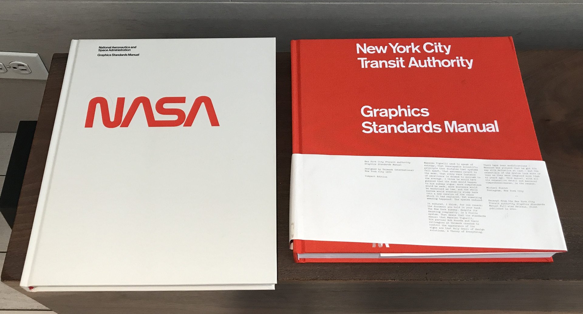
So far, Standards Manual have reprinted three manuals: NASA, the New York Transit Authority and the American and the 1976 American Revolution Bicentennial logo standards. A similar initiative by the French publishing house Empire has a Kickstarter campaign to reprint IBM’s old style guide, designed by Paul Rand in the 1960’s.
Roundabout activism
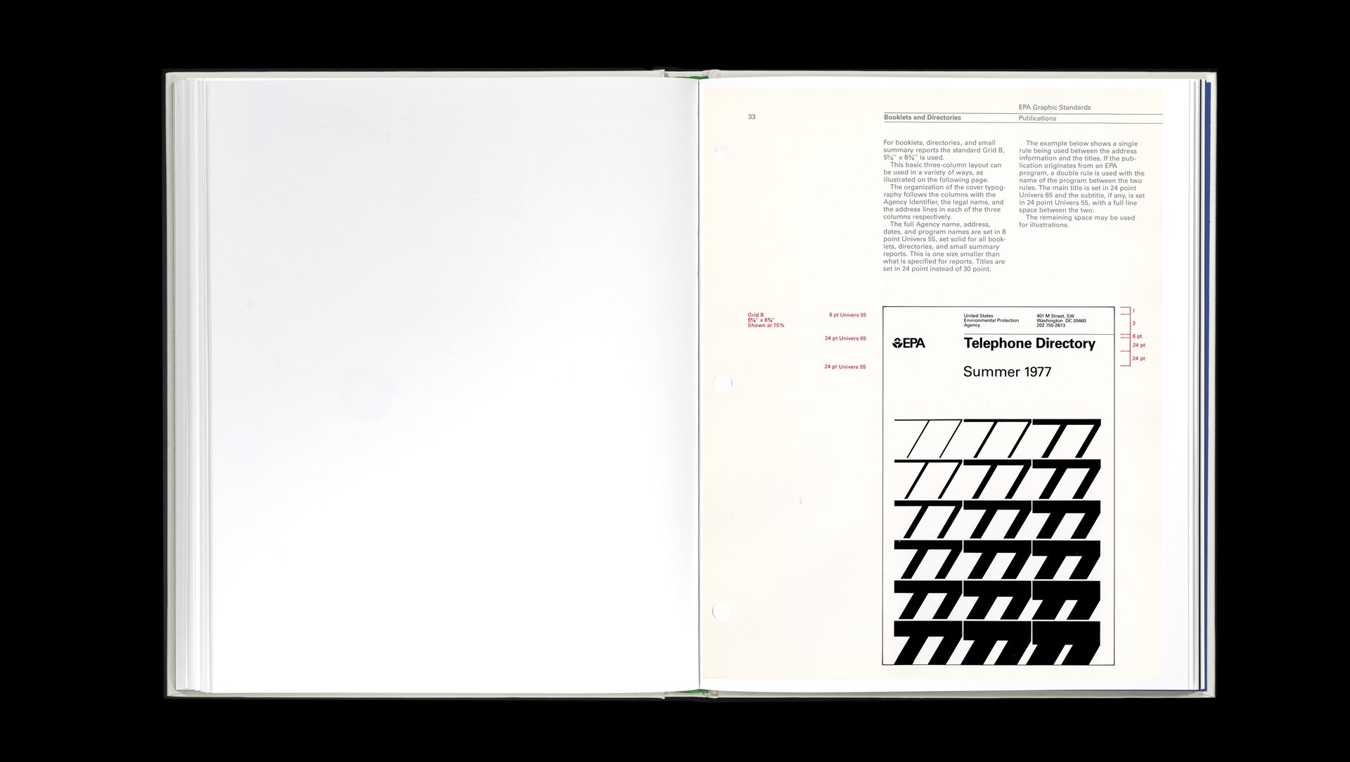
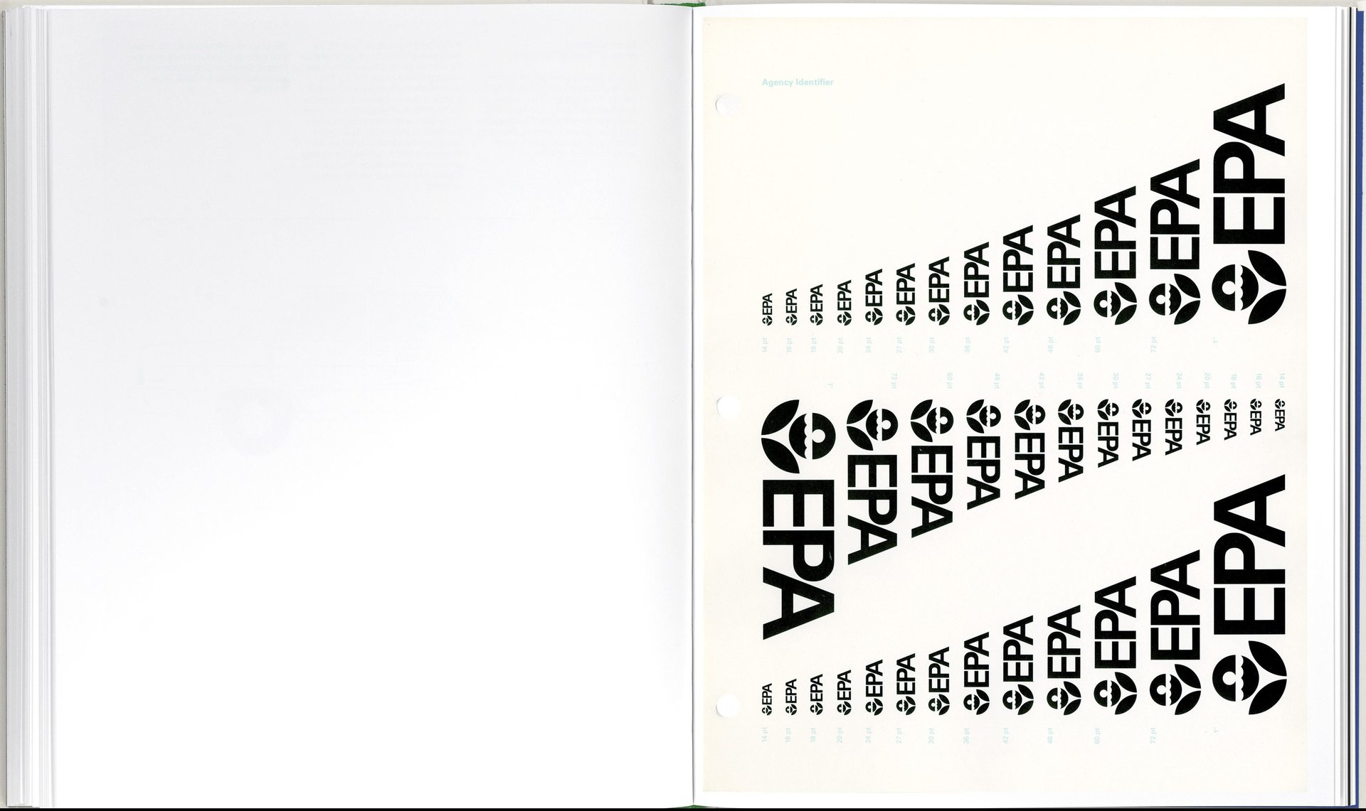
Standards Manual’s new project is a reissue of the US Environmental Protection Agency’s 1977 graphic standards system. At time of writing, the project had already exceeded its Kickstarter funding goal with 1,900 backers pledging $160,000, and it still had three days to go.
This time, US politics may be driving the project’s popularity. Designed in 1977 by Chermayeff & Geismar and designer Steff Geissbuhler, the vintage EPA manual is now being marketed as an (aesthetically pleasing, easy to purchase) symbol of angst about the Trump administration’s plan to cut the environmental agency’s budget by $2.4 billion. Using the voice of Richard Nixon extolling on “the birthright of every American” to clean environment, the book’s promotional video sounds a lot like a campaign for the beleaguered 46-year old agency itself.
There’s undoubtedly some irony in printing a 244-page coffee table book with 14 color inks and 10 gatefolds in the name of the environmental preservation: How many trees had to die to put this freely available online content into book form? What’s the carbon footprint of distributing books printed in Italy? Smyth responds, “We’re concerned about environmental impact, of course, but that’s not the main goal of our book.”
Reed and Smyth, who have previously developed style guides while working at the design agency Pentagram, say that their priority is to bring important historical artifacts back into the circulation. For them, print is the best way to do that. “We’re not making claims that this book is meant to save the world or anything grander than the information inside of it,” Reed tells Quartz. “What it comes down to is that we think these communication tools are important to preserve.”
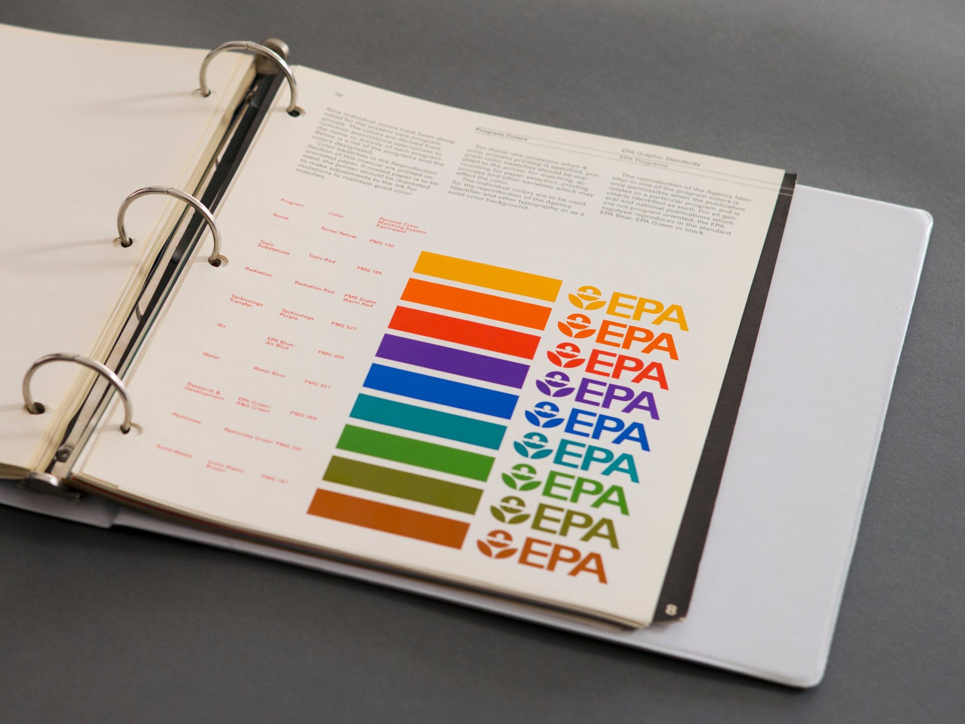
The story of the EPA manual is also a cautionary tale of US government design being dictated by the tastes of bureaucrats: Compared to what the EPA has today, the 1977 visual standards promoted a strict organizing logic. Drawing from their experience in creating brand systems for big corporations such as Chase Bank, NBC, and Mobil Oil, Chermayeff, Geismar and Geissbuhler proposed economical solutions such as rendering the EPA logo in one color and using ready-to-use graphic elements (wavy lines, patterns, vivid colors) to infuse visual interest on the covers of technical reports. They also assigned colors for each of the EPA’s topic areas: Toxic Red, Noise Yellow, Radiation Red, Air Blue.
But two years after the EPA’s standards manual was approved, incoming administrator Anne Gorsuch jettisoned Chermayeff, Geismar and Geissbuhler’s work and reverted back to the old EPA daisy logo. “This is a familiar syndrome. One disaffected executive can deep-six enterprise design,” notes AIGA executive director Julie Anixter in a blog post.
Over the course of Reed and Smyth’s monthlong Kickstarter campaign, a surge of thoughtful articles about the EPA’s design history have emerged. So while the manual’s outdated content may offer more in the way of nostalgia than actual design advice, the imprint’s greatest accomplishments might just be encouraging designers to study history. ”We’re showing federal programs don’t have to be boring and dry,” explains Reed. “At a certain time, there was a lot of focus on quality and care when presenting information.”