From the golden ratio to Fitts's law, these are the hidden rules designers use to make objects, spaces, and screens feel inevitable

Credit: Pilan Filmes / Pexels
Good design doesn't announce itself. It doesn't need to. When a chair feels right to sit in, when a button lands exactly where your thumb expects it, when a room feels calm without you knowing why — design is working. The principles behind those experiences are not mysterious. They were codified, tested, borrowed, and refined over decades, sometimes centuries, by architects, typographers, industrial designers, interface engineers, and psychologists working in fields that only occasionally spoke to each other. What's striking is how often they arrived at the same conclusions.
These principles operate at every scale. Some describe how the human visual system processes shape and contrast. Others explain why people freeze when given too many options, or why the most-used button on a remote control wears out first. A few are rooted in mathematics — ratios and curves that recur in natural structures from nautilus shells to tree branching — and have been used in architecture and painting for so long they feel organic, even when they're deliberate. Others are purely behavioral, derived from watching how people actually move through space or interact with software.
What makes these principles powerful is that they transfer. A principle that helps a graphic designer balance a poster is the same principle an industrial designer uses to proportion a car dashboard. A concept that explains why people trust a familiar typeface also explains why they feel unsettled by fonts they can't categorize. The vocabulary changes from discipline to discipline, but the underlying logic is consistent.
None of these principles are rules to follow without judgment. Context determines whether any given principle applies — and understanding why a principle works is more useful than memorizing when to use it. A designer who understands why visual hierarchy works can apply it to a mobile app, a wayfinding system, a magazine spread, or a garden path. The principle doesn't change; the medium does.
This piece covers 25 of the most durable and widely applied design principles. Some are named after the people who formalized them. Others are nameless concepts so embedded in practice that most designers apply them without thinking. All of them are worth knowing — not because they guarantee good design, but because they explain why so much of what surrounds you was made the way it was.

Credit: Content Pixie / Unsplash
Few mathematical concepts have had as long a run in design as the golden ratio, a proportion of approximately 1:1.618. It appears when a line is divided so that the ratio of the whole to the larger segment equals the ratio of the larger segment to the smaller one. The result is a specific relationship between parts that recurs throughout geometry and is closely related to the Fibonacci sequence, in which each number is the sum of the two before it.
The ratio's presence in natural structures — the arrangement of seeds in a sunflower, the spiral of a nautilus shell, the branching of veins — has made it attractive to designers seeking a rational basis for aesthetic choices. Whether nature uses the golden ratio as a strict mathematical rule or whether human pattern recognition is prone to finding it post hoc remains debated. What is clearer is that the ratio has been deliberately applied in design for centuries.
The Parthenon, though often cited as a golden ratio structure, is a more complicated case than popular accounts suggest: not all of its dimensions precisely match the ratio, and some attributions appear to be retrospective. What's more certain is the Renaissance use of related proportions in painting and architecture. Luca Pacioli's 1509 book on divine proportion, illustrated by Leonardo da Vinci, made the ratio a serious object of mathematical and artistic interest.
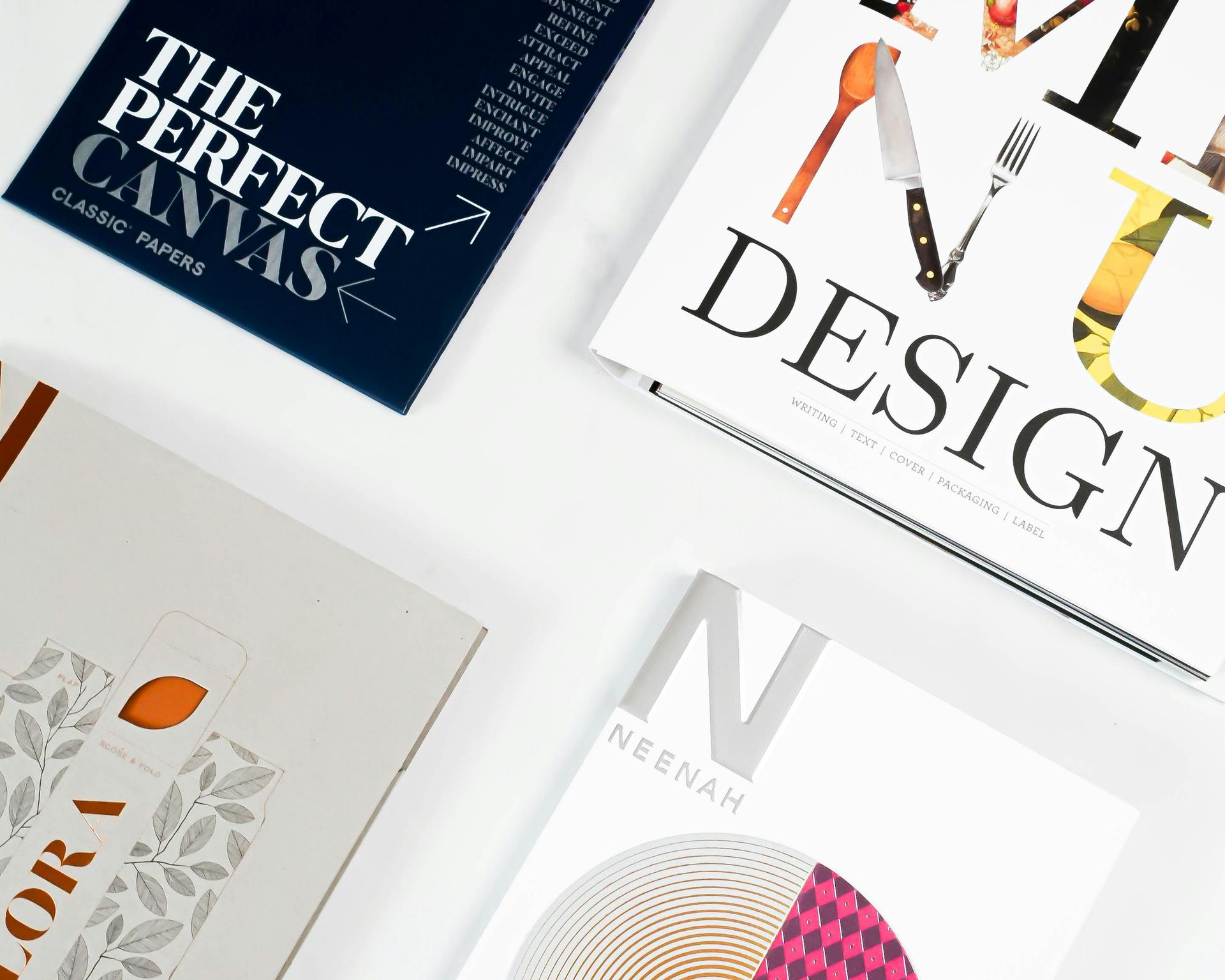
In modern design, the golden ratio is used to set typographic scales, proportion layout grids, and determine the size relationships between interface elements. A text hierarchy in which headings, subheadings, and body copy relate to each other by the ratio produces a measurable sense of visual order. The same logic applies to spacing — if a margin is set and subsequent spacing follows the golden ratio, the result often feels coherent without the viewer being able to say exactly why.
The ratio also informs logo design and product form. The Apple $AAPL logo, the Twitter $TWTR bird, and the layout of the Pepsi circle have all been analyzed through golden ratio grids, with varying degrees of rigor behind the claim. What the ratio reliably provides is a principled starting point — a ratio with mathematical legitimacy that design practice has validated over time. Whether it's the only proportion that works, or simply a well-tested one, depends on the eye doing the judging.
Credit: 2H Media / Unsplash
Visual hierarchy is the principle that design elements should be organized to communicate their relative importance. It answers the question of where the eye goes first, second, and third — and why. Without hierarchy, every element competes for equal attention, and the result is visual noise with no clear entry point.
The tools for creating hierarchy are straightforward: size, weight, color, contrast, position, and spacing. A headline larger than surrounding text draws the eye before the body copy does. A bold element against a light background stands out from regular-weight text. A saturated accent color on a neutral background pulls attention before a softer tone does. Position matters too — elements at the top of a composition or at the center of a visual field tend to be read first in cultures that process information left to right and top to bottom.
Contrast is the engine of hierarchy. When two elements have the same size, weight, color, and position, the eye has no basis for prioritizing one over the other. Hierarchy requires difference, and effective hierarchy requires that the degree of difference matches the degree of importance. A subheading that's only slightly larger than body text creates an ambiguous hierarchy. A subheading that's meaningfully larger creates a clear one.
Proximity reinforces hierarchy through grouping. Elements that are close together are read as related. A caption placed directly under an image is understood to describe that image. A block of white space separating two sections signals a break in content. The spacing between elements communicates structure even when there is no explicit rule or divider marking the difference.
Hierarchy applies to every medium where multiple elements compete for attention. In a printed poster, it determines the reading sequence. In a website layout, it guides a user toward the primary action — a purchase button, a signup form, a navigation link. In an architectural space, it distinguishes load-bearing structural elements from decorative ones, or an entrance from a service door. The principle doesn't change; the elements being ranked do.
One of the more useful tests for visual hierarchy is squinting at a composition until detail blurs. What's left — the shapes and tonal masses — shows the hierarchy as the viewer's visual system actually processes it. If the most important element isn't the most visually prominent one at that level of abstraction, the hierarchy needs adjustment.

Credit: indra projects / Pexels
Fitts's law, formalized by psychologist Paul Fitts in 1954, describes the relationship between target size, target distance, and the time it takes to reach a target with a pointing device. The law holds that larger targets and closer targets are faster to acquire. This seems intuitive, but the specific, predictive nature of Fitts's formulation is what makes it useful.
In the original research, Fitts was studying human motor performance — how quickly people could tap between targets using a stylus. The finding was that the time to reach a target increases with distance and decreases with target size, in a logarithmic relationship. This gave designers a mathematical model for predicting interaction speed from physical or screen layout decisions.
The implications for interface design are direct. A navigation button that appears frequently should be large enough to tap quickly. A destructive action — delete, cancel, log out — should be either smaller or further from the primary action to reduce accidental triggering. The corners and edges of a screen are, from a Fitts's law perspective, unusually valuable real estate because a cursor running to the edge of a screen doesn't overshoot: the screen boundary acts as an infinite target.
This is one reason why the menu bars on older desktop operating systems were anchored to the top edge of the screen rather than floating within a window. A menu at the screen's top edge can be reached by moving the mouse upward and releasing without needing to stop at a precise pixel. The same logic doesn't apply to touch interfaces in quite the same way, but the principle — that larger targets and shorter distances reduce interaction time — still holds.
Fitts's law is a reminder that physical form and cognitive load are linked. A checkout button placed far from the product thumbnail, or a confirmation control designed to be small for aesthetic reasons, creates friction not just in the emotional sense but in the measurable, milliseconds-per-interaction sense. Good interface design often means trading some visual minimalism for functional efficiency — and Fitts's law provides the framework for deciding when that tradeoff is worth making.

Credit: Canva Images
Hick's law describes the relationship between the number of choices available and the time it takes to make a decision. More options mean longer decision times, in a logarithmic relationship. The law is named after British psychologist William Edmund Hick, who demonstrated the principle in experiments conducted in the early 1950s alongside Ray Hyman.
The practical implication is one that designers across disciplines have internalized even when they haven't named it: reducing options is often a service to the user. A menu with 30 items takes longer to process than a menu with eight. A product page listing 15 variants creates more cognitive friction than one presenting three. This isn't because users are incapable of handling complexity; it's because decision-making has a real cognitive cost, and that cost scales with the number of choices.
The psychology behind this extends beyond the time it takes to scan options. When too many choices are available, people can experience decision paralysis — a condition in which the presence of more alternatives makes any single selection harder to commit to. The prospect of regretting an unchosen option increases with the size of the option set. A shopper choosing between two jams makes a faster, more satisfied selection than one choosing between 24, even though the larger selection theoretically offers more opportunity to find the optimal fit.
In interface design, Hick's law argues for progressive disclosure: showing only the most relevant options upfront and offering additional depth behind a secondary action or expanded menu. It argues against sprawling navigation systems in which all possible destinations are visible at once. In product design, it argues for coherent product lines rather than near-identical variations that force customers to distinguish between marginal differences.
The law has limits. When users already know what they're looking for — as in an experienced user scanning a familiar menu — the cost of additional options is lower because recognition rather than evaluation is doing the work. The law applies most forcefully in situations where users are unfamiliar with the option set and must read and evaluate each item before deciding. Context determines how much Hick's law should constrain a given design.

Credit: Mikhail Nilov / Pexels
The Gestalt principles are a group of perceptual laws describing how the human visual system groups individual elements into unified wholes. Developed by German psychologists — primarily Max Wertheimer, Wolfgang Köhler, and Kurt Koffka — in the early 20th century, they formalized the observation that perception is not merely the sum of individual sensory inputs. The mind actively organizes visual information into patterns, and the Gestalt principles describe the rules it uses.
The principle of proximity holds that elements placed close together are perceived as a group. Dots arranged in a tight cluster read as a single shape rather than separate points. In layout design, this means spacing communicates structure: items belonging to the same category should be visually closer to each other than to items from other categories.
Similarity groups elements that share visual properties — color, shape, size, or texture — regardless of their physical proximity. A grid of blue circles and red squares will be parsed as two separate groups based on color and shape, not as a single undifferentiated grid.
The principle of continuity holds that the eye prefers to follow smooth, continuous paths. When two lines cross, the eye tends to perceive two continuous lines passing through each other rather than four short line segments meeting at a point. This is why overlapping curves feel like a weave rather than a pile of disconnected arcs.
Closure describes the tendency to perceive complete shapes even when parts are missing. A circle with a small gap is perceived as a circle. A triangle defined by three dots at its corners, with no connecting lines, is perceived as a triangle. Design frequently exploits this by using implied shapes — elements that suggest a boundary without drawing it.
The figure-ground relationship, which Gestalt psychology formalized, describes how the visual field is parsed into objects (figures) and background. The same element can read as figure or ground depending on context, as in M.C. Escher's illustrations or the classic vase-faces illusion. In layout design, managing which elements read as figure — as the content requiring attention — and which read as ground is one of the foundational tasks of visual organization.

Credit: Zac Taheriyan / Unsplash
The rule of thirds is a compositional guideline in which the frame is divided into nine equal rectangles by two horizontal and two vertical lines. The four points where these lines intersect are called power points or crash points, and placing key elements at or near these intersections is said to produce more dynamic and visually satisfying compositions than placing them at the center of the frame.
The principle predates photography. It appears in 18th-century writing on painting and landscape design, and was described explicitly by the English painter John Thomas Smith in 1797. It has since become one of the most widely taught compositional rules in photography, cinematography, and graphic design — partly because of its effectiveness and partly because the grid overlay is easy to visualize and apply.
The logic behind the rule is that centered compositions, though sometimes appropriate, can produce a static quality. A horizon line that bisects a photograph exactly in half tends to read as divided rather than unified. A horizon placed at the upper or lower third gives more weight to either the sky or the foreground, creating a clearer sense of what the image is about. A subject placed at an intersection point, rather than the center, leaves room for the eye to move through the frame rather than arriving at the center and stopping.
The rule is a guideline, not a law. Centered symmetry is a deliberate, effective choice in many contexts — particularly in formal portraiture, product photography, and graphic compositions where stillness is a virtue. The rule's value is in providing a principled alternative to defaulting to the center out of habit.
In UI design, the rule of thirds influences how content is positioned within hero images, how a homepage is proportioned, and where a call-to-action lands within a visual field. A full-screen background image with text overlaid in the upper-left third of the frame positions the type at a compositional sweet spot rather than centered awkwardly over the image.

Credit: Paula Schmidt / Pexels
Negative space — also called white space, though it need not be white — is the empty or unoccupied area in a composition. It is not the absence of design. It is a design element with its own function, and managing it is one of the things that most distinguishes considered design from cluttered or amateur work.
Negative space performs several roles simultaneously. It reduces visual noise, giving the eye a place to rest between elements. It creates contrast that makes positive elements — the shapes, text, or objects the design is about — stand out more clearly. It signals hierarchy and grouping: more space around an element implies more importance. And at sufficient scale, negative space itself can carry meaning, as when the space between and around letterforms implies a shape.
Some of the most recognized logos in design use negative space as a primary element. The FedEx $FDX logo contains an arrow formed by the gap between the E and the x. The NBC peacock uses color fields arranged so the negative space between them reads as feathers. These examples have become so widely cited that they risk feeling like clever tricks rather than serious design principles — but they demonstrate something fundamental: the eye reads both what's there and what's left out.
In architecture and spatial design, negative space is called void. The courtyards of traditional Islamic and Mediterranean architecture are formally designed voids — empty at their center, shaped by the surrounding structure. A well-proportioned courtyard creates a sense of calm and orientation that the building's mass alone cannot provide. Modern open-plan office design uses the same principle, though often less skillfully, in trying to create breathing room between workstations and clusters.
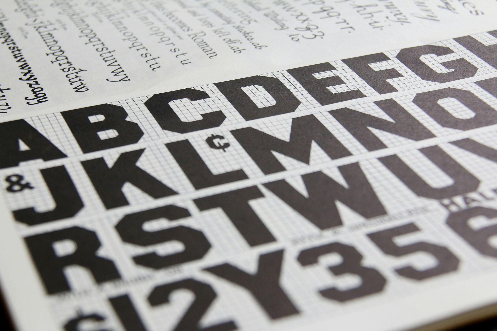
In typographic design, the negative space within and around letterforms — called counters when it's the space inside a letter like o or p — affects legibility, character, and visual rhythm. Two typefaces set at the same size can feel completely different in terms of density based on the amount of counter space designed into them. Spacing between letters (tracking), between words, and between lines (leading) are all forms of negative space that designers control explicitly.

Credit: Helena Lopes / Pexels
Color theory is the body of knowledge describing how colors are perceived, how they interact, and how they carry meaning. Its formal study in the West dates to Johann Wolfgang von Goethe's 1810 Theory of Colors, though practical color knowledge long predates systematic theory. The field encompasses physical optics, perceptual psychology, and cultural semiotics — the same color can carry different information depending on which of these lenses applies.
The color wheel, in its modern form, organizes hues into a circular spectrum and identifies relationships between them. Complementary colors sit opposite each other on the wheel — red and green, blue and orange, yellow and purple. Placed adjacent to each other, complementary colors create maximum contrast and visual vibration. Analogous colors sit near each other on the wheel and create harmony without tension. Triadic schemes use three colors equally spaced around the wheel, producing vibrant but balanced combinations.
Saturation and value (brightness) are as important as hue in most design work. A palette of muted, desaturated tones produces a different emotional register than the same hue range at full saturation, even if the colors are nominally "the same." Value contrast — the difference between light and dark — drives legibility. Black text on a white background has maximum value contrast. Gray text on a light gray background has low value contrast and is correspondingly harder to read.
Color also carries cultural associations that are neither universal nor fixed. White carries associations with purity and mourning in different cultures. Red signals danger, passion, luck, and prohibition depending on context. These associations are neither neutral nor reliable across audiences, which is why designers working across cultures need to test their choices rather than assuming a single global color vocabulary.
In digital design, the difference between additive color (light, used for screens) and subtractive color (pigment, used for print) affects how the same palette looks in different media. A blue chosen on a screen may print significantly darker or differently saturated than it appeared in design software. Color management — the process of maintaining consistency across output devices — is a practical discipline with real consequences for how finished work looks.

Credit: helloimnik / Unsplash
Typography hierarchy is the system by which type at different sizes, weights, and styles signals information structure to the reader. It is distinct from visual hierarchy in general — it applies specifically to the arrangement of text, where the choice of typeface, weight, size, style, and spacing communicates what is a heading, what is a subhead, what is body copy, and what is a label or caption.
A well-constructed typographic hierarchy has at least three levels. The display or headline level is the largest and most visually prominent, meant to attract initial attention. The body level is optimized for sustained reading — set at a size and weight that allows the eye to move quickly across lines without fatigue. A tertiary level, used for captions, labels, metadata, or footnotes, is smaller and lighter, designed to be available without competing for attention.
The key to an effective hierarchy is differentiation: each level must be visually distinct enough from the others that there is no ambiguity about the level a given piece of text occupies. If a subheading is only slightly larger than body text, the hierarchy is unclear and the reader's eye doesn't know where to land. Contrast between levels — in size, weight, or style — creates the visual steps that guide reading sequence.
Typeface selection within a hierarchy matters beyond the individual level. A serif at the headline with a sans-serif at the body produces a clear contrast of personality; a sans-serif at both levels requires more differentiation through weight and size. Pairing two completely different display faces without a connecting logic creates visual competition rather than hierarchy.
Line length — the number of characters per line — interacts with typographic hierarchy in readability. Long lines of body text are harder to track because the eye must find the start of the next line across a longer horizontal return. Classic editorial design sets body copy at 45 to 75 characters per line. Shorter lines can feel choppy. Headings, set larger with fewer words, often work at longer line lengths or even full-bleed widths where body copy wouldn't.

Credit: cottonbro studio / Pexels
Affordance, as the term is used in design, describes the range of actions that an object makes possible for a user. A chair affords sitting. A button affords pressing. A handle affords pulling. The concept was introduced by perceptual psychologist James J. Gibson in 1977 and later adapted for design by cognitive scientist Donald Norman in his 1988 book The Design of Everyday Things.
Norman's refinement is particularly useful for design practice. He distinguished between the actual affordances of an object and what he called "perceived affordances" — the actions the user believes are possible based on the object's appearance. When a door has a flat metal plate on it, users read this as a signal to push, because a plate affords pushing. When it has a vertical bar, they read it as a signal to pull. When the visual signal and the actual function don't match — when a door that should be pushed has a bar that implies pulling — the result is a "Norman door," a design failure so common it became a named category.
Signifiers are the perceptual cues that communicate affordances. They are what users actually perceive and act on. The difference matters because affordances exist whether or not a signifier is present, but users can only act on affordances they perceive. A touchscreen surface technically affords swiping, but without a signifier — a visible scroll indicator, a partially visible element extending off the edge — users have no way of knowing that swiping is possible.
In physical product design, affordances are often built into form. A recessed area on a lid signals where to press. A textured surface suggests a grip. The curvature of a handle indicates orientation. Good affordance design uses material, shape, and placement to communicate function before the user reads a label or manual.
In digital interface design, affordances are largely visual and must be constructed through convention — buttons that look like buttons, links that look like links, draggable elements that look draggable. As interfaces become flatter and more minimal, the signifiers that communicate affordances become more subtle, and the risk of users not knowing what to do with an element increases.

Credit: Canva Images
The principle of least astonishment holds that systems — whether software interfaces, physical devices, or built environments — should behave in ways that match user expectations rather than surprise them. When a user takes an action and the system does something unexpected, cognitive load increases sharply. The user must now update their mental model of the system and decide what to do next, rather than continuing their primary task.
The principle originates in software engineering but applies across design domains. A light switch that controls the fixture directly above it astonishes no one. A light switch that controls a fixture in another room violates the principle because the physical relationship between cause and effect doesn't match the user's spatial model. The result isn't just inconvenience; it erodes trust in the system.
Mental models are the internal representations users build of how systems work. When a system's behavior matches a user's mental model, the system feels intuitive. When it doesn't, it feels broken or arbitrary, even if it is working exactly as designed. Designing to meet existing mental models — or deliberately reshaping them when a new approach is genuinely superior — is one of the core tasks in experience design.
The principle interacts strongly with convention. Conventions persist in design not because they are the optimal solution but because they are familiar, and familiarity creates an expectation. The arrangement of the QWERTY keyboard is not optimized for typing speed; it persists because deviation from it would astonish users who have built years of muscle memory around the existing layout. The scrollbar on the right side of a window, the close button in the corner, the back button at the upper left of a browser — all of these are conventions that the principle of least astonishment argues for preserving, absent a compelling reason to change.
Violating the principle is sometimes justified. New paradigms sometimes require training users out of an old expectation in favor of a better one. But the cost of doing so should be estimated clearly: how much astonishment, for how long, in exchange for what benefit?

Credit: David Underland / Pexels
The principle of proximity is one of the Gestalt principles, but it merits a separate examination for how broadly it applies beyond simple visual perception. Proximity creates meaning. Elements placed near each other are understood as related, regardless of whether there is an explicit visual connector between them — no line, bracket, or border is required.
In graphic design, proximity is used to build information architecture without decoration. A caption placed tightly beneath a photograph is understood to describe that photograph; the same caption placed two inches away is understood as a separate text element. A phone number listed directly below a business name is read as contact information for that business. White space — the negative space between groups — signals separation as clearly as a ruled line does.
In product design, proximity determines the layout of controls. A button positioned near the function it controls creates a spatial logic that users internalize quickly. A volume knob on an amplifier is almost always positioned near the speaker output connections, because these are functionally related. Remote controls group playback controls together, navigation controls together, and input-select controls separately, because the groupings reflect distinct task categories.
In wayfinding and environmental design, proximity organizes signage. Information about a destination should appear close to the decision point — the intersection or branching corridor where a choice needs to be made. Information too early arrives before it's needed; information too late arrives after the decision opportunity has passed.
The principle extends into interaction design for digital systems. Form fields grouped by topic — personal information, payment details, delivery preferences — reduce the cognitive work of completing a long form by breaking it into meaningful chunks. A user who sees a form organized by proximity understands the structure at a glance rather than having to read every label to find where to enter a specific piece of information.
Proximity also creates hierarchy when combined with size differences. A group of closely spaced, small elements near a large, isolated element creates a clear figure-ground distinction: the large element reads as dominant, the small cluster as subordinate detail.
Credit: Glen Carrie / Unsplash
Contrast is the degree of difference between adjacent elements — whether in value (light versus dark), hue, size, shape, or texture. It is a prerequisite for readability in any medium, and its absence is one of the most reliable causes of design that fails people with reduced visual acuity.
The Web Content Accessibility Guidelines (WCAG) specify minimum contrast ratios for text against its background: at least 4.5:1 for normal text and 3:1 for large text. These ratios are calculated using the relative luminance of the foreground and background colors. White text on a black background has a contrast ratio of 21:1, the maximum possible. Light gray text on a white background might have a ratio of 1.5:1, which is inadequate for readability under standard conditions and far worse for people with low vision.
Value contrast — the light-dark dimension — is the primary driver of legibility for printed and screen-based text. Hue contrast, the difference in color, contributes less to legibility than most people expect, because the eye's ability to detect hue differences degrades under many real-world reading conditions: in bright sunlight, at small sizes, at a distance, or for users with color vision deficiencies. About 8% of men of Northern European descent have some form of color vision deficiency. Red-green combinations, extremely common in design, are precisely the combination that this group is most likely to misread.
Contrast also operates at the compositional level. A design in which all elements have similar visual weight creates a flat, undifferentiated field. A design with strong contrast — a large element against a small one, a saturated element against a neutral field — has visual energy and clear hierarchy. Contrast is what makes a poster readable at a distance, what makes a call-to-action visible among other page elements, and what makes a brand's logo stand out from the products around it on a shelf.
Managing contrast is partly technical and partly perceptual. Contrast ratios can be calculated; their effect on actual readability under real conditions requires looking at the work as a user would see it, not just as a numerical output.

Credit: tabitha turner / Unsplash
Progressive $PGR disclosure is the practice of presenting only the information, controls, or content that is immediately relevant to the user's current task, and revealing additional complexity only when the user seeks it. The principle addresses a fundamental tension in design: comprehensive systems are necessarily complex, but complexity creates barriers to entry and increases the chance of error.
The concept applies directly to software interfaces but has analogs in many other design fields. A recipe in a cookbook that leads with ingredients and essential steps, then offers variations and substitutions in a sidebar, is using progressive disclosure. The main content serves the primary task — making the dish — and the secondary content serves the user who wants to adapt or understand the recipe more deeply.
In interface design, progressive disclosure takes several forms. An "advanced" section in a settings panel reveals detailed controls that most users will never need, so that the default view remains usable. Tooltips that appear on hover explain a control's function without labeling every element in the interface at all times. A multi-step form reveals subsequent steps only after the previous step is complete, so the user is never confronted with the full scope of the task upfront.
The design challenge is determining the correct threshold between primary and secondary content — what should be immediately visible, and what should be one step removed. This threshold varies with the user population: expert users often want more information and control visible by default, while novice users may be overwhelmed by the same amount of information.
Progressive disclosure also has a temporal dimension. Many digital products introduce features gradually, as users' experience with the product grows — a practice sometimes called progressive onboarding. Rather than requiring new users to learn all features at once, the product introduces complexity in proportion to the user's demonstrated engagement with earlier, simpler features. The principle in both cases is the same: match the amount of information presented to the amount the user can productively use at that moment.

Credit: Stephen Kim / Pexels
Repetition is the recurrence of a visual element — a color, shape, texture, line weight, typeface, or spatial interval — across a composition or across a system. Consistency is what repetition creates at the level of a system over time. Both are foundational to how design communicates identity and builds user understanding.
In visual design, repetition creates unity. When the same shade of blue appears in a logo, a headline, and a call-to-action button, these elements read as connected — part of the same system rather than separate objects competing for attention. When the same eight-pixel grid governs the spacing between every element in a layout, the layout feels orderly without the structure being visible. Repetition is the mechanism by which a design system becomes recognizable as a system.
Consistency operates at the level of behavior as well as appearance. When a button in one part of a digital product behaves differently from a button that looks identical in another part — when clicking one button triggers an immediate action and clicking another opens a confirmation dialog — users must hold two separate rules for the same visual pattern. Inconsistency of this kind erodes trust and requires users to stay alert rather than acting on learned behavior.
In wayfinding and signage systems, repetition ensures that users encountering information at one point in a journey can recognize and trust information presented at subsequent points. The same typeface, the same color system, the same icon vocabulary, applied consistently, builds a reading fluency with the system over time. When a waypoint sign changes font between floors of a building, users notice that something is different without necessarily being able to say what — and the uncertainty this creates is a form of friction.
The tension in using repetition is knowing when to break it. Repetition without variation becomes monotony. A purely consistent typographic system without any contrast or exception offers no emphasis anywhere. The most effective uses of repetition establish a clear baseline so that deliberate variation from that baseline reads as meaningful rather than accidental.

Credit: Max Vakhtbovych / Pexels
The 60-30-10 rule is a color proportion guideline used primarily in interior design and graphic design. It holds that a color scheme tends to feel balanced when the dominant color occupies roughly 60% of a space, a secondary color occupies 30%, and an accent color occupies the remaining 10%. The numbers are not strict mathematical requirements but rather a framework for preventing any single color from overwhelming a composition.
The rule reflects something real about how color balance works: when three colors are used in roughly equal proportion, the result often feels restless or undecided. When one color is clearly dominant, one is secondary, and one is used sparingly for emphasis, the composition has a clear logic. The accent color — at 10% — is present enough to register but not so present that it loses its function as a point of emphasis.
In interior design, the dominant 60% is typically the wall color, floors, and large furniture — the elements that provide the room's overall tonal register. The secondary 30% covers upholstery, bedding, curtains, and secondary furniture — elements that are substantial but subordinate. The accent 10% is reserved for cushions, vases, small decorative objects, light fixtures, and other elements that carry the room's point of energy.
In graphic and brand design, the rule translates roughly to background and field colors, main content and large interface elements, and interactive or alert elements respectively. A digital product in which 60% of the interface is a neutral gray or off-white, 30% is a medium-tone brand color, and 10% is a saturated accent tends to feel coherent without being visually exhausting.
The rule has practical limits. Some brand palettes are deliberately high in saturation throughout — this is common in consumer goods aimed at children or in retail categories where shelf standout is the primary visual goal. And the rule says nothing about hue selection, only proportion. Two complementary colors at 60/30 can produce high tension regardless of their proportional relationship.

Credit: Cristian Castillo / Unsplash
Symmetry and balance are related but distinct properties in visual composition. Symmetry describes a formal, mathematical relationship in which one part of a composition mirrors another along an axis. Balance describes a more perceptual property — the sense that a composition feels stable and weighted correctly, regardless of whether it is formally symmetrical.
Perfect bilateral symmetry — in which the left side of a composition is a mirror of the right — is the most common type. It produces an immediate sense of formality, stability, and authority. Court buildings, religious architecture, formal portrait photography, and institutional logos frequently use bilateral symmetry because the visual language of mirroring carries associations with permanence and gravity.
Asymmetric balance achieves visual equilibrium without mirroring. A large, light element on one side of a composition can be balanced by a small, dark element on the other, because visual weight is a function of both size and contrast. A photograph of a single object centered on a white field is symmetrical; a photograph in which the object is offset with open space on one side can be balanced if the open space itself has visual weight through tone or texture.
Radial symmetry, in which elements are arranged around a central point, appears in mandalas, rose windows, compass roses, and many decorative patterns. It creates a strong focal pull toward the center and a sense of contained energy rather than the static quality of bilateral symmetry.
The tension between symmetry and dynamism is one of the fundamental decisions in composition. Symmetry tends toward stillness; asymmetry tends toward movement. Architecture that is perfectly symmetrical from the outside may be asymmetrical in plan to accommodate program — the interior spaces arranged to serve function rather than reflect the exterior's formal language. Resolving this tension is a recurring challenge in design at every scale.

Credit: Tom Fisk / Pexels
Flow in visual design refers to the directed movement of the eye through a composition. The eye is not passive; it moves constantly, and design can either control that movement or leave it to chance. When flow is designed deliberately, it guides the viewer through content in an order that matches the designer's communicative intention.
The eye is drawn to contrast, to faces and eyes, to large elements before small ones, to color before neutral tones, and to motion before stillness. These are not design conventions but perceptual defaults — tendencies that persist across cultures and that designers can use or counteract. A composition's entry point — the first place the eye lands — is often not chosen consciously by the viewer but is instead determined by the element with the highest local contrast or the largest visual weight.
Lines and edges direct the eye along their length. A diagonal line, or a series of elements arranged diagonally, creates a visual vector — the eye follows the implied direction. Curves carry a sense of movement that straight lines don't. In photography, the principle of leading lines refers to physical lines in an image — a road, a shoreline, a railing — that guide the viewer's eye toward the image's subject.
Typography has inherent flow because written language is read in a specific direction. In left-to-right reading cultures, the top-left corner of a page is the conventional entry point for text. Design that places key information at this entry point works with the viewer's existing reading behavior. Design that places key information at the bottom-right must work harder to direct the eye there.
In multi-page and multi-screen design, flow operates across the whole sequence, not just within a single frame. The eye's journey through a publication, a website, or an exhibition space is as much a design problem as the layout of any single page. Transitions between sections, the pacing of information density, and the rhythm of visual rest points and focal moments all contribute to the experiential flow of the whole.

Credit: Francesco Ungaro / Pexels
Grid systems are frameworks of horizontal and vertical lines that divide a composition into columns, rows, and gutter spaces. They are invisible in the finished design but govern the placement of every element within it. Their purpose is to create structural coherence, simplify layout decisions, and enable the visual consistency that makes a publication or interface feel like a unified system rather than a collection of individual pages.
The grid as a design tool was formalized in 20th-century Swiss typography, particularly in the work of Josef Müller-Brockmann, whose 1961 book on grid systems in graphic design became a foundational text for modernist layout practice. The core argument was that the grid is not a constraint but a tool for freedom: once the structural framework is established, the designer can make expressive choices within it without losing overall coherence.
In digital design, grids are most commonly 12-column systems, because 12 is divisible by one, two, three, four, and six — making it flexible for different layout configurations. A three-column layout divides the grid into groups of four columns; a two-column layout uses six columns per side. The flexibility of 12-column grids has made them the dominant system in web layout frameworks.
Modularity extends the grid concept beyond two-dimensional layout. In product design, modular systems use standardized components that can be combined, replaced, or reconfigured. A modular shelving system that accepts components of consistent depth and height allows users to build configurations the original designer did not anticipate, because all parts conform to the same underlying system. The same principle governs component libraries in software development, where standardized UI elements can be combined into interfaces without each combination requiring custom design work.
The relationship between grid and modularity is not merely formal. Both encode a philosophy: that coherence at the system level enables freedom at the component level, and that constraints applied consistently produce more flexible outcomes than improvisation applied case by case.

Credit: Michael D Beck / Pexels
Scale hierarchy refers to the deliberate use of size differences to communicate relative importance, emphasis, or distance. When elements in a composition differ significantly in size, the larger elements read as dominant and the smaller elements read as subordinate. This is one of the simplest and most reliable tools for creating visual order.
Scale contrast works in all directions. A very large element with much smaller supporting elements creates emphasis through dominance. A small element isolated in a large field is emphasized through contrast with the surrounding space. Scale can also imply distance, because objects appear smaller when they are farther away — a principle that artists and designers exploit in perspective systems to create the illusion of depth in two-dimensional work.
In typography, scale hierarchy is so fundamental that it is built into every word-processing application in the form of heading levels. An H1 heading is larger than an H2, which is larger than an H3, and so on — a machine-readable encoding of the visual principle that size signals structural importance. When this hierarchy is applied consistently, a reader can skim a document and understand its structure without reading all the content.
In architectural design, scale operates at the level of individual rooms as well as at the scale of the whole building. A cathedral uses dramatic scale variation — a high nave, narrow side aisles, intimate chapels — to produce varied spatial experiences within a single structure. The transition from a compressed, low space to an expansive, high one is a deliberate manipulation of scale that produces an emotional effect. Shopping centers and theme parks use the same tool, though toward different ends.
Scale also communicates brand confidence. Large-format logos, signage, and product photography suggest authority. Timid, undersized type on a label or sign reads as uncertain. The deliberate oversizing of certain elements — a single word printed large, a single image taking the full screen — can signal intention and restraint simultaneously, because it requires the confidence to leave the rest of the space unoccupied.

Credit: Canva Images
Brand and design consistency across touchpoints refers to the coherent application of a visual and experiential identity across every medium, channel, and context in which an organization, product, or service appears. A touchpoint is any point of contact between a user or customer and the entity in question: a website, a product package, a retail space, a piece of printed material, a customer service interaction.
Consistency creates recognition. When the same visual language — color, typeface, spacing, imagery style, tone of voice — appears across all touchpoints, users accumulate a reliable mental model of what the entity is and what to expect from it. This recognition is both functional and associative: it tells users they are in the right place and it activates whatever prior associations they have with the brand.
Inconsistency, conversely, creates cognitive friction. A company whose website uses a different color palette from its printed materials, whose customer service communications use a different typeface from its packaging, and whose mobile app uses different UI conventions from its desktop site is asking users to re-orient themselves at every point of contact. The effort required is small in any individual instance, but accumulated across all touchpoints over time, it contributes to a sense of the brand as fragmented or unreliable.
The practical mechanism for achieving consistency is a design system or brand identity guidelines document — a set of specifications covering all visual elements, their acceptable variations, and the rules governing their application across different media. Large organizations apply these with substantial rigor; a logo can have approved color variations for print, screen, and dark backgrounds, specified minimum sizes, and a list of unapproved applications. Smaller operations often work from simpler style guides.
Consistency has limits as a value. A brand identity that was appropriate for one era, product category, or customer base may be entirely wrong for a new context. The history of brand management is full of cases in which consistency was maintained past the point of relevance, or in which inconsistency was the correct creative choice for a specific campaign or market.

Credit: El Jundi / Pexels
The Doherty threshold, introduced by IBM $IBM researchers Walter Doherty and Ahrvind Thadani in a 1982 paper, identifies 400 milliseconds as the upper bound for system response time before users' productivity and engagement begin to drop measurably. Below 400 milliseconds, users experience the system as responding in real time to their actions. Above that threshold, the delay is perceptible and begins to interrupt the user's cognitive flow.
The threshold emerged from studies of how response time affected the productivity of typists interacting with computer systems. The finding was that users who received feedback within 400 milliseconds maintained engagement and throughput; users who waited longer showed measurably worse performance and higher rates of error. The number is not a cliff — performance doesn't suddenly collapse at 401 milliseconds — but it marks a zone beyond which the penalty for delay compounds quickly.
The design implication is that perceived responsiveness is a functional quality, not merely an aesthetic preference. A website that loads in two seconds feels different from one that loads in 0.3 seconds; but the difference is not only experiential. The slower site sees higher bounce rates, lower conversion rates, and lower engagement because the delay breaks the user's attention before they have reached the content.
Modern web performance measurement frameworks track metrics like First Contentful Paint (the time until the first visual element appears), Time to Interactive (the time until the page responds to user input), and Largest Contentful Paint (the time until the main content is visible). These are attempts to operationalize the Doherty threshold principle across the complex, asynchronous reality of modern web pages, where different elements load at different times.
The threshold also applies to interactive software beyond the web. Animation that takes longer than 400 milliseconds to complete feels slow; animation under 100 milliseconds feels nearly instantaneous. Interface transitions, loading states, and feedback animations are all calibrated, consciously or not, against the user's perception of system responsiveness, and the Doherty threshold is the benchmark against which that perception is measured.

Credit: Olga Kovalski / Pexels
In design, similarity groups elements together while differentiation sets them apart. These are not merely aesthetic choices but perceptual tools that carry information: when elements look alike, the viewer infers they serve similar functions or belong to the same category. When an element looks different from its neighbors, the viewer infers a difference in function, importance, or type.
This principle is the basis of the visual encoding used in data visualization. A chart that uses the same color for data points in the same category, and a different color for data points in a different category, is using similarity and differentiation to make categorical information visible without labeling every point. A map that uses a consistent icon vocabulary — with each icon type visually distinct from others — communicates the difference between a restaurant, a hotel, and a transit stop through appearance rather than label reading.
In interface design, buttons that look like buttons, links that look like links, and disabled controls that look clearly disabled — these are applications of similarity and differentiation. When all clickable elements share a visual vocabulary (consistent color, shape, and weight), users can quickly identify where action is possible. When interactive and non-interactive elements look similar, or when elements that perform different actions look identical, users make errors.
The tension is in managing differentiation without fragmentation. A design in which every element looks unique has no groupings and no visual logic. A design in which every element looks the same has groupings but no hierarchy. Effective design establishes a small vocabulary of visually distinct types — primary action, secondary action, informational text, label, status indicator — and applies them consistently so that differentiation carries predictable meaning.
This also operates at the brand identity level. Brand differentiation is the practice of making a company's visual identity distinct from competitors', so that consumers can identify the brand quickly in a competitive context. Differentiation here is not about internal hierarchy but about external recognition — the goal is to be clearly unlike the brands around you in a way that reflects your actual market position.

Credit: Canva Images
Feedback in design is the mechanism by which a system communicates to the user that an action has been received and what the result of that action was. Without feedback, users cannot know whether their interaction produced an effect, and they tend to repeat the action — sometimes multiple times — assuming it didn't register.
The feedback principle is so fundamental that its absence is immediately noticed as a failure. A light switch that doesn't cause any visible change, a button that doesn't register a click state, a form submission that doesn't confirm receipt — all of these create uncertainty that forces the user to reconsider their action and decide what to do next. The cognitive overhead of uncertain feedback is disproportionate to the complexity of the solution: a visible click state, a loading indicator, a confirmation message.
Feedback operates at multiple timescales. Immediate feedback — within the 400-millisecond range — confirms that an input was received. Progress feedback — a loading bar, a percentage complete indicator — addresses tasks that take longer than immediate responses can cover. Outcome feedback — a success message, an error explanation, a confirmation email — addresses the result of a task that may have taken considerable time.
Error feedback is particularly important because errors represent moments when the user's mental model diverged from the system's actual behavior. A good error message does three things: it tells the user what went wrong, explains why (in non-technical terms), and indicates what to do next. Error messages that say only "Error" or "Invalid input" without specifying what was invalid or how to correct it force the user to guess — a significant failure of feedback design.
The visibility of system status is one of Jakob Nielsen's ten usability heuristics, first published in 1994, precisely because its absence is one of the most consistently reported sources of user frustration. Users who cannot tell what state a system is in — is it loading? did my input register? is the file saving? — are operating without the information they need to make decisions about what to do next.

Credit: ClickerHappy / Pexels
Wayfinding is the set of strategies people use to navigate unfamiliar environments, and wayfinding design is the practice of making environments easier to navigate through deliberate spatial and informational cues. The term was introduced by urban designer Kevin Lynch in his 1960 book The Image of the City, which studied how people develop cognitive maps of cities.
Lynch identified five elements that people use to orient themselves in urban environments: paths (routes of travel), edges (boundaries between different zones), districts (areas with a recognizable character), nodes (intersections or concentrations of activity), and landmarks (distinctive objects used as reference points). Effective wayfinding design makes each of these elements legible — easy to perceive, identify, and use in navigation decisions.
Signage is only one component of wayfinding. Environmental cues — the visible change in floor material that signals a transition between sections of a hospital, the ceiling height that increases as you approach a central atrium, the change in lighting color that distinguishes a retail area from a service corridor — do as much wayfinding work as explicit signs. Environments that depend entirely on signage for navigation typically have underlying spatial layouts that are confusing, and signs placed over a confusing layout rarely fully compensate.
Digital wayfinding translates these principles to navigating information architecture. Breadcrumb navigation, persistent menus, progress indicators in multi-step processes, and "you are here" indicators in site maps all serve the same function as landmarks and signage in physical space: they tell the user where they are, where they've been, and how to get where they're going.
The distinction between navigation that provides orientation and navigation that merely provides access is important. A website menu that lists every possible destination provides access but not orientation — the user who doesn't already know where they're going gets no help from a comprehensive list. Wayfinding design at its best teaches the structure of a space while facilitating movement through it, so that repeated use builds a cognitive map rather than dependence on explicit guidance.
