
20 Excel and spreadsheet skills that will save you hours every week
From pivot tables to keyboard shortcuts, these Excel skills cut down repetitive work and help you get more done in less time
-1400x933.png)
Credit: Canva Images
Most people who use Excel every day are using less than a quarter of what it can do. They retype data that Flash Fill could clean in seconds. They scroll through thousands of rows looking for a single value that a lookup formula could find instantly. They rebuild the same summary table every week instead of setting up a pivot table once and refreshing it with a click. None of this is a failure of effort. Excel's interface buries its most useful features behind menus, and most people learn the program through trial and error rather than through any kind of formal instruction.
The skills on this list are not exotic. They are the small, repeatable moves that separate someone who fights their spreadsheet from someone who commands it. A handful of keyboard shortcuts, a set of functions that replace slow manual counting, and a few formatting tricks turn a wall of numbers into something readable at a glance. Some of these features have existed for decades and never made it into anyone's training. Others, like XLOOKUP, are newer additions that quietly replaced older, clunkier methods most people still default to out of habit.
None of these require a coding background or help from an IT department. Most take less than five minutes to learn, and once learned, save that much time or more every single day. A marketer building a monthly report, a small-business owner tracking inventory, a student organizing research data, and a manager reviewing a budget will all find something useful here.
The list moves from broadly useful to more specialized. Shortcuts and formatting tricks that apply to almost any spreadsheet come first, followed by functions and tools suited to larger or messier data sets. Most of what follows works close to the same way in Google $GOOGL Sheets, with only minor differences in menu names or syntax. The underlying logic carries over even for readers who rarely open Excel itself.
There is no need to learn all 20 skills at once. Picking two or three and using them consistently for a week is enough to change how a spreadsheet gets built and how long it takes to build one.
1. Master the keyboard shortcuts that eliminate scrolling
Credit: Canva Images
Scrolling through a spreadsheet with a mouse is one of the slowest ways to move around in Excel, and it's also one of the most common. A handful of keyboard shortcuts eliminate almost all of it.
Ctrl plus an arrow key jumps to the edge of a block of data in that direction. It skips past empty cells and stops at the last filled cell before a gap. This is the fastest way to get from the top of a column to the bottom of thousands of rows without a single scroll. Ctrl+Home jumps to cell A1 no matter where the cursor currently sits. Ctrl+End jumps to the last cell that contains data or formatting, which is useful for confirming exactly how large a sheet actually is.
Switching between sheet tabs is faster with Ctrl+Page Up and Ctrl+Page Down than clicking each tab individually, especially in workbooks with a dozen or more sheets. For jumping straight to a specific cell, F5 or Ctrl+G opens the Go To box, where typing a cell reference like Z500 moves the cursor there immediately, no scrolling required.
Selecting entire rows or columns is quicker with Shift+Space, which selects the row, and Ctrl+Space, which selects the column, than dragging across a header. Combine either one with Ctrl+Shift+Arrow to extend a selection from the current cell to the edge of a data block in one motion. This is useful before copying, deleting, or formatting a large range.
None of these shortcuts require memorizing a manual. They map onto logic Windows uses elsewhere, which is part of why they stick once learned. A person who uses even three or four of them consistently will notice within a week that navigating a large workbook takes a fraction of the time it used to.
These shortcuts also carry over almost exactly into Google $GOOGL Sheets. Both programs share keyboard conventions inherited from decades of spreadsheet software design. Anyone who splits their work between the two platforms does not need to learn a second set of habits.
2. Use Flash Fill to clean up data without writing a formula

Credit: Canva Images
Flash Fill, introduced in Excel 2013, watches what a person types into a column and tries to detect a pattern based on the data already sitting next to it. Once it recognizes that pattern, it offers to fill in the rest of the column automatically, no formula required.
The classic example is splitting a full name into first and last names. Typing "John" into the first row of a column next to one that reads "John Smith" prompts a suggestion. Once a second entry confirms the pattern, Excel fills in the rest of the first names, correctly split from the last names. The same tool can extract a domain from an email address, reformat phone numbers into a consistent style, or combine a first and last name into one field. It can also convert a messy date format into a standard one.
Flash Fill can be triggered by typing the pattern manually until Excel grays in a suggestion, then pressing Enter to accept it. It can also be triggered directly through Ctrl+E once at least one example row is filled in, or through the Flash Fill button on the Data tab.
The tool works by matching patterns in visible data, not by applying a fixed rule. That makes it best suited to clean, consistent source data and one-time cleanup jobs, rather than anything that needs to keep working automatically as new rows get added. If the source data changes, Flash Fill does not update on its own the way a formula would. For a dataset that only needs to be cleaned once, that is rarely a problem.
It is worth checking the results carefully before accepting them, especially with larger datasets. Flash Fill can occasionally misread a pattern if the source data has inconsistent formatting partway through. Scanning down the filled column for entries that look out of place takes a few seconds and prevents a small error from slipping into a finished report.
3. Build a pivot table instead of a manual summary

Credit: Lukas Blazek / Pexels
A pivot table takes a long list of raw data and turns it into a summary without requiring a single formula. Instead of manually adding up sales by region or counting orders by month, a pivot table does the aggregation by dragging field names into different boxes.
To build one, select any cell inside a data range, then go to the Insert tab and choose PivotTable. Excel opens a new sheet with a field list on the side. Dragging a field into the Rows box breaks the summary out by that category. Dragging a field into the Values box calculates a total for it, sum by default, though this can be changed to average, count, or several other options. Dragging a field into the Filters box lets a report be narrowed down to one region, one product line, or one time period without touching the underlying data.
Dates dropped into a pivot table can be grouped automatically into months, quarters, or years. This turns a column of individual transaction dates into a clean monthly trend without writing a single date function. Changing the summary from a total to an average, or from a count to a percentage of the grand total, takes a couple of clicks rather than a rebuilt formula.
The biggest advantage over a manual summary is what happens when the source data changes. A manually built summary needs to be rebuilt, or have its formulas checked, every time new rows are added. A pivot table just needs a refresh, done through the Data tab or by right-clicking anywhere inside the table, and it recalculates against the current data automatically.
Pivot tables have a reputation for being complicated, but the actual mechanics are closer to sorting a set of labeled boxes than programming. Anyone comfortable dragging and dropping can build a working one on the first attempt. The skill transfers directly to Google $GOOGL Sheets, which has its own version of the same tool under the same name.
4. Switch from VLOOKUP to XLOOKUP
-1920x1280.jpg)
Credit: RDNE Stock project / Pexels
VLOOKUP has been part of Excel since the software's earliest versions, and remains one of its most widely used functions. It also comes with limitations that catch out even experienced users. It only searches in the leftmost column of a selected range and returns a value from a column to the right, counted by position rather than by name. Insert a new column into that range, and the count shifts, breaking the formula without any warning.
XLOOKUP, introduced by Microsoft $MSFT in 2019 and rolled out more broadly to Microsoft 365 subscribers in 2020, fixes most of these problems. It can search in any direction, left or right, so the lookup column no longer needs to sit to the left of the result column. It references the result column directly rather than counting its position, so inserting or deleting columns elsewhere in the sheet does not break the formula. It also defaults to an exact match, where VLOOKUP defaults to an approximate one — a difference that has caused more spreadsheet errors than almost any other setting in Excel.
XLOOKUP also has a built-in way to handle a value that is not found. Instead of returning the #N/A error VLOOKUP produces, XLOOKUP can be told to return a specific message, a zero, or a blank cell instead. This stops that error from cascading into other formulas that depend on the result.
A typical use case is looking up a product's price from a separate list using its product code. Another is pulling an employee's department from an ID number stored in a different sheet. Where VLOOKUP requires counting exactly how many columns to the right the answer sits, XLOOKUP just points to the column itself.
XLOOKUP requires Microsoft 365 or Excel 2021 or later. It is not available in Excel 2019, 2016, or any earlier standalone version. Anyone on an older license will need to stick with VLOOKUP or INDEX and MATCH until they upgrade. Google $GOOGL Sheets has since added its own version of the function as well.
5. Use conditional formatting to spot outliers without scanning

Credit: Canva Images
Reading through a column of numbers looking for anything unusual is slow and easy to get wrong, especially past a few dozen rows. Conditional formatting does that scanning automatically by applying formatting, like a fill color or an icon, to cells that meet a rule set in advance.
The feature sits on the Home tab under Conditional Formatting. A few built-in rules cover most common needs. These include highlighting duplicate values in a list, highlighting cells that fall above or below the average, or highlighting the top or bottom set of values by rank. Custom rules can go further, using a formula to define exactly which cells should be flagged, such as marking any expense that exceeds a specific budget line.
Color scales apply a gradient across a range, shading the highest values one color and the lowest another. This turns a table of numbers into something closer to a heat map that can be read at a glance. Data bars fill each cell with a small horizontal bar sized to its value, useful for comparing magnitudes down a column without a separate chart. Icon sets add small symbols, like arrows or traffic-light colors, next to each value based on which range it falls into.
A manager reviewing a monthly budget can set up conditional formatting once so that any line item running over target turns red automatically. That beats checking each row by eye every time the sheet updates. A recruiter scanning a spreadsheet of candidates can highlight anyone missing a required field without searching manually.
Rules can be edited or removed through Conditional Formatting's Manage Rules option, which lists every rule currently applied to a sheet in one place. This becomes useful once a sheet has accumulated several rules, since it is otherwise easy to forget which one is doing what. Conditional formatting rules travel with the cells they are applied to, so copying a formatted range into a new sheet brings the formatting along automatically.
6. Add drop-down lists with data validation
Credit: Birgit Müller (WMDE) / Wikimedia Commons (CC BY-SA 4.0)
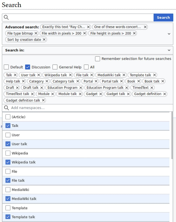
A cell that accepts any typed entry is a cell that will eventually contain a typo, an inconsistent abbreviation, or a value that does not belong. Data validation prevents this by restricting what can be entered into a cell, most commonly through a drop-down list.
Setting one up starts on the Data tab, under Data Validation. Choosing "List" as the validation type allows a short set of values typed directly into the settings box, separated by commas. It also accepts a reference to a range of cells elsewhere in the workbook that contains the approved options. Once applied, the cell shows a small arrow that opens the list of choices. Typing anything outside that list triggers a warning or blocks the entry outright, depending on how strict the rule is set.
This is especially useful on any sheet that more than one person fills in, such as a shared expense tracker or a project status log. Without validation, one person might type "In Progress," another "in progress," and a third "WIP," which makes the column useless for filtering or summarizing later with a formula like COUNTIF. A drop-down list forces everyone into the same set of options from the start.
Data validation is not limited to lists. The same menu allows a cell to accept only whole numbers within a range, only dates within a certain window, or only text under a certain length. It can also require a value that passes a custom formula, such as an entry in one cell before another cell can be filled in. An input message can also be added, so that clicking the cell shows a small tooltip explaining what belongs there. This is useful on a template that other people will fill in without guidance.
Because the source list for a drop-down can point to a separate range, updating the approved values in one place updates every drop-down built from it. There is no need to edit each cell's settings individually.
7. Name your ranges instead of memorizing cell addresses

Credit: Canva Images
A formula like =B2*$C$1 works perfectly well, but it tells a reader nothing about what B2 or C1 actually represent without opening the sheet to check. A named range solves this by attaching a plain-language label to a cell or range, so the same formula can instead read =Revenue*TaxRate.
Creating one takes a few seconds. Select the cell or range, click into the Name Box just to the left of the formula bar, type a name with no spaces, and press Enter. For more control, the Formulas tab includes a Define Name option with a longer description field. It also offers a choice between two scopes: the workbook level, where the name works on any sheet, or the worksheet level, where it only applies to that one tab.
Once a range has a name, that name can be typed directly into any formula instead of the cell reference, and Excel treats it exactly the same way. This matters most in workbooks with many formulas referencing the same few constants, like a tax rate, an exchange rate, or a commission percentage. Naming that one cell means every formula referencing it reads clearly, and updating the rate in one place updates every formula that depends on it.
Named ranges also make formulas easier to audit. A formula built entirely from cell references requires clicking through the sheet to confirm what each one points to. A formula built from named ranges mostly explains itself.
One caution is worth keeping in mind. Excel generally updates a named range automatically when rows are inserted within it, but a range defined in an unusual way can sometimes stay fixed instead of expanding. Checking that a named range still covers the right cells after a major edit takes a moment and avoids a formula quietly working from an incomplete set of data.
8. Freeze panes so headers never scroll out of view

Credit: Wolf Art / Pexels
Scrolling down a long spreadsheet eventually pushes the header row off the top of the screen, leaving a wall of numbers with no labels attached to them. Freeze Panes solves this by locking specific rows or columns in place so they stay visible no matter how far the rest of the sheet scrolls.
The simplest version lives on the View tab. Freeze Top Row keeps the very first row of the sheet pinned in place while everything below it scrolls freely underneath. Freeze First Column does the same thing for the leftmost column, which is useful on a sheet where row labels sit in column A rather than at the top. Both options apply with a single click and require no setup.
For more control, selecting a specific cell before opening Freeze Panes locks everything above and to the left of that cell. Everything below and to the right stays free to scroll. This is the option to use when a sheet needs both a frozen header row and a frozen label column at the same time. A large data table often needs this, with row labels down the left side and column headers across the top.
A frozen pane shows up as a thin gray line running across or down the sheet, marking the boundary between the locked and scrollable sections. It can be removed at any time through the same View tab menu, now showing Unfreeze Panes instead.
This feature matters most on data sets too large to fit on one screen, which describes most working spreadsheets outside of quick calculations. Without it, checking which column corresponds to a number 300 rows down means scrolling back to the top, reading the header, then scrolling back down again. With it, the header is always right there. Google $GOOGL Sheets includes the identical feature under View, then Freeze.
9. Convert a data range into an official table

Credit: Canva Images
Selecting a block of data and pressing Ctrl+T converts it into what Excel calls a table, a structured object that behaves differently from a plain range in several useful ways.
The most immediate benefit is automatic formula fill-down. Adding a formula to one cell in a table column applies it to every row in that column automatically, including new rows added later at the bottom. A plain range requires manually copying the formula down every time a new row appears. That step is easy to forget, and it is a common source of reports that quietly stop updating correctly partway through.
Tables also introduce structured references, a way of writing formulas using column names instead of cell addresses. A formula written as =SUM(Table1[Sales]) refers to the entire Sales column of a table named Table1. It keeps totaling the correct range as rows are added or removed, without ever needing to be rewritten. This reads more clearly than a formula like =SUM(B2:B847), and it never needs updating as the table grows.
Every table comes with filter buttons built into its header row by default, so sorting and filtering are available immediately without applying AutoFilter separately. Tables also apply banded row shading automatically, alternating a light background color row by row. This makes it easier to track a row across a wide sheet without a ruler or a squint.
Naming a table something more specific than the Excel default, done through the Table Design tab, makes it easier to reference later on. Formulas, pivot tables, and charts can all point to a named table and update automatically as the table grows or shrinks. A chart built from a table range extends itself to include new data points added at the bottom. There is no need to edit the chart's source range by hand.
10. Calculate conditional totals with SUMIFS and COUNTIFS

Credit: Marina Agrelo / Pexels
Adding up a column of numbers is simple with SUM. Adding up only the numbers that meet a specific condition, like every sale made in a certain region during a certain month, requires a different tool: SUMIFS.
The function takes a sum range, followed by pairs of criteria: a range to check and a condition that range needs to meet. A formula like =SUMIFS(SalesAmount, Region, "West", Month, "June") adds up every value in the SalesAmount column where the row has "West" in Region and "June" in Month. It does this in one step, with no manual filtering required first. Additional criteria pairs can be added to narrow the condition further, and there is no fixed limit on how many can be combined in a single formula.
COUNTIFS works the same way but counts matching rows instead of summing a value. That makes it useful for answering a question like how many orders a specific customer placed within a certain date range. AVERAGEIFS applies the identical logic to calculate a conditional average, such as the average order value for a specific product category during a specific quarter.
Before these functions existed in their current form, the workaround was to filter the data to matching rows, then apply a plain SUM or COUNT to what was left. The filter then had to be removed and the process repeated for the next condition. That approach is slow, easy to get wrong, and leaves no record of what was actually calculated once the filter is removed.
SUMIFS, COUNTIFS, and AVERAGEIFS solve the same problem as a formula that lives permanently in a cell. It recalculates automatically whenever the underlying data changes, with no need to ever reapply a filter. This makes them well suited to any report that gets rebuilt regularly with new data, such as a weekly sales summary or a monthly expense breakdown by department.
11. Use Paste Special to skip rebuilding a sheet by hand

Credit: Canva Images
The standard Ctrl+V paste copies everything about a cell — its formula, its formatting, and its value all at once. Paste Special, opened with Ctrl+Alt+V, breaks that single action into several more specific ones, each solving a different problem.
Pasting values only takes the result of a formula and drops it into the new location as a plain number, with no formula attached. This matters most when a report full of formulas needs to be sent outside the workbook it was built in. Formulas that reference other sheets or workbooks can break, or return errors, once removed from their original context. Converting a finished report to values before sending it removes that risk entirely.
Pasting formats only copies the visual styling of a cell, such as its color, borders, and number format, without touching whatever value or formula already sits in the destination cell. This is a faster way to apply consistent formatting across a sheet than rebuilding it manually in each new location.
Transpose flips the orientation of copied data, turning a row into a column or a column into a row. This solves a common layout problem: data entered running down a column that actually needs to run across a row to match the rest of a report, or the reverse. Rebuilding that layout by retyping every value takes far longer than copying the range, opening Paste Special, and checking the Transpose box.
Paste Special also supports pasting with a mathematical operation: adding, subtracting, multiplying, or dividing the copied value into whatever is already in the destination cell. This suits a task like applying a single percentage increase across an entire column of prices at once. Copy the percentage, select the price column, and choose multiply, rather than writing and dragging down a separate formula for every row.
12. Learn custom number formats instead of retyping labels

Credit: Avinash Kumar / Unsplash
Typing "$1,200.00" directly into a cell looks correct on screen, but it turns what should be a number into text. That breaks any formula that tries to add, average, or otherwise calculate on it. Custom number formats solve this by changing how a value displays without changing the value itself.
The setting lives under Format Cells, opened with Ctrl+1, on the Number tab. Selecting Custom opens a field where a format code controls exactly how the number appears. A code like $#,##0.00 displays a plain number as currency, with a thousands separator and two decimal places. The cell still holds the original number underneath, available for any formula to use directly.
Custom formats can add a unit after a number without changing what is stored, showing "1,200 units" while the cell still contains the number 1200 for calculation purposes. A percentage format multiplies the display by 100 and adds a percent sign, while the underlying value stays as a decimal. That keeps it compatible with other formulas that expect a raw percentage rather than a whole number.
Negative numbers can be set to display in red, in parentheses, or with a minus sign, depending on which convention a report needs to follow. All of this works through the same format code, without any conditional formatting rule required. Dates can display in dozens of different orders and styles, from a full written date to a short numeric one. None of this changes the actual date value stored in the cell.
The distinction between formatting and typing matters most in any sheet that will later be summed, averaged, or referenced by another formula. A column of numbers typed as text with a currency symbol attached will not add up correctly with SUM. The same column using a custom number format will, since the underlying values remain genuine numbers throughout.
13. Lock cell references with dollar signs before copying formulas

Credit: Canva Images
Copying a formula down a column or across a row is one of the most common actions in Excel. It is also where a specific kind of error shows up most often. By default, Excel treats every cell reference in a formula as relative, meaning it shifts to match the new position every time the formula is copied elsewhere.
That shifting behavior is usually exactly what is wanted. A formula that multiplies each row's quantity by its own price should shift as it is copied down a column, so each row calculates against its own values. The trouble starts when a formula needs to reference one fixed cell, like a single tax rate or exchange rate, no matter where the formula gets copied to.
A dollar sign locks a reference so it stops shifting. Writing $C$1 instead of C1 locks both the column and the row, so copying that formula anywhere in the sheet always points back to the exact same cell. A single dollar sign before just the column letter, like $C1, locks only the column while letting the row shift. A dollar sign before just the row number, like C$1, does the reverse.
Pressing F4 while a cell reference is selected inside a formula cycles through these four options in order, without needing to type the dollar signs manually. This is faster than editing the reference by hand, especially in a formula with several references that each need a different combination of locking.
A common use case is a spreadsheet calculating commission across dozens of sales rows. Every row's commission depends on its own sales figure but the same commission rate stored in one cell. Locking that one rate cell with dollar signs before copying the formula down ensures every row references the correct rate. Without it, the reference can shift to an empty cell a few rows down and return an error or a zero.
14. Let AutoFill handle the typing on repetitive sequences

Credit: Maria Stewart / Unsplash
The small square at the bottom-right corner of a selected cell, known as the fill handle, extends far beyond copying a single value down a column. Dragging it recognizes and continues a range of common patterns automatically.
Typing a date into a cell and dragging the fill handle down continues the sequence by day, with no formula needed. Typing a weekday name does the same for days of the week, cycling back to Monday after Sunday. A month name continues through the calendar year the same way. Typing two numbers in adjacent cells, like 10 and 20, then selecting both before dragging, tells Excel to continue the pattern at that same interval. It fills in 30, 40, 50, and onward.
Double-clicking the fill handle instead of dragging it fills a formula or pattern down automatically, matching the length of an adjacent column. This is faster than dragging by hand on a sheet with hundreds of rows, since Excel detects where the adjacent data ends and stops there.
Beyond the built-in patterns, a custom list can be created for any sequence specific to one workplace or dataset. Department names, store locations, and product categories that do not follow an alphabetical or numerical order are common examples. This is set up through File, then Options, then Advanced, then Edit Custom Lists, where a sequence can be typed in once and saved. After that, typing the first item in the sequence and dragging the fill handle continues the list in the correct order every time. This works the same way Excel already handles days of the week.
This turns a repetitive typing task, entering the same fixed sequence of labels across dozens of rows, into a single drag. It is a small feature, but on a sheet rebuilt weekly with the same recurring categories, it adds up to real time saved over a year of use.
15. Clean and reshape data with Text to Columns and Power Query

Credit: cottonbro studio / Pexels
Data rarely arrives in the shape a spreadsheet actually needs it in. A column might contain a full address that needs splitting into street, city, and postal code. A report exported from another system might combine several fields into one that needs separating before any formula can use it properly.
Text to Columns, found on the Data tab, handles the simpler version of this problem. Selecting a column and choosing Text to Columns opens a wizard that splits its contents into multiple columns based on a delimiter. That delimiter might be a comma, a space, or a specific character the data uses to separate fields. This works well as a one-time fix: run it once, and the column is split immediately. The split does not repeat automatically if new data is pasted into the same column later.
Power Query, accessed through the Data tab's Get and Transform section, solves a wider range of problems and remembers how it did it. Instead of applying a one-off action, Power Query records each cleaning step — splitting columns, removing blank rows, merging tables from different sources, renaming headers — as a saved sequence. That sequence can be rerun with one click whenever the source data updates. This suits a report that gets rebuilt regularly with fresh data from the same source far better than a one-time split.
Power Query can also combine data from multiple sheets, workbooks, or even external files into a single clean table, something Text to Columns has no ability to do at all. A monthly reporting process that pulls data from several regional spreadsheets and needs it combined into one consistent table is a natural fit for Power Query. The combination steps only need to be built once, then simply refreshed each month.
The two tools solve different scales of the same problem. Text to Columns handles a quick, one-time split, while Power Query handles anything that needs to happen the same way again and again.
16. Collapse detail with Group and Outline

Credit: Richard Heinen / Unsplash
A report with monthly detail across 12 columns is useful for someone checking a specific month, but overwhelming for someone who only wants to see the yearly total. Group and Outline solves this by collapsing detail rows or columns down to a summary level, without deleting any of the underlying data.
Selecting a set of rows or columns and choosing Group, found on the Data tab, adds a small bracket in the margin. A minus sign in that bracket collapses the selected range down to a single line when clicked, and a plus sign expands it back out. Multiple levels of grouping can be nested. A sheet organized by year, quarter, and month can collapse down to yearly totals with one click, then expand one level at a time as needed.
This differs from simply hiding rows or columns, which leaves no visible indication that anything is hidden and can confuse anyone else opening the sheet later. A grouped and collapsed section shows a clear outline bar with a plus sign, signaling that more detail exists and can be expanded on demand.
The keyboard shortcut Shift+Alt+Right Arrow groups a selected range without opening the Data tab at all, and Shift+Alt+Left Arrow ungroups it. Excel can also apply grouping automatically through the Auto Outline option. It detects existing subtotal rows in a sheet and groups the detail beneath each one. This is useful on a report that already has subtotals built in but has never been collapsed for easier viewing.
A monthly financial report is a common use case: 12 months of detail across the columns, collapsing down to a single quarterly or annual column for a summary view. The full monthly detail stays available underneath for anyone who needs to check a specific period. Nobody has to choose between a detailed sheet and a clean one, since Group and Outline lets the same sheet serve as both.
17. Search and replace with wildcards

Credit: Ron Lach / Pexels
Find and Replace, opened with Ctrl+H, handles a straightforward search for one exact piece of text. Wildcards extend it to match patterns instead of exact text, which solves a wider range of cleanup tasks in a single pass.
An asterisk stands in for any number of characters, including none at all. Searching for "Invoice*" finds every cell that starts with the word Invoice, regardless of what follows it, whether that is a number, a date, or nothing else. This is useful for finding and updating every entry that follows a naming pattern without needing to know each individual value in advance.
A question mark stands in for exactly one character, which is more precise than an asterisk when the length of the pattern matters. Searching for "200?" finds four-character entries starting with 200, such as 2001 through 2009, without also matching a longer number like 20015 the way an asterisk would.
Both wildcards work inside the Find and Replace search box by default, with no special setting needed first. This differs from using wildcards inside a formula, such as inside a COUNTIF or SUMIF condition, where they also work but only within functions specifically designed to accept them.
A common use case is cleaning up inconsistent labeling across a large sheet, such as replacing every entry that starts with "Dept-" with a different prefix. Another is finding every cell that contains a specific word somewhere in the middle of a longer string that varies row to row. Combining wildcards with Replace All applies the fix across an entire sheet or workbook in one action, rather than editing each matching cell individually.
It is worth running a search first, without replacing anything, to review how many cells match the pattern before committing to a bulk replace. This takes a few seconds and prevents an overly broad wildcard pattern from changing cells that were never meant to be included.
18. Add sparklines for trends that fit inside one cell

Credit: Canva Images
A full chart takes up real space on a sheet, which becomes a problem on a report with dozens of rows, each one needing its own trend shown alongside it. Sparklines solve this by compressing a chart down to fit inside a single cell.
Found on the Insert tab, sparklines come in three types. A line sparkline plots a simple trend across a row of data, useful for showing 12 months of sales for a single product without a separate chart for each one. A column sparkline shows the same data as a small set of vertical bars instead of a connected line. This is useful when the individual values matter more than the overall shape of the trend. A win-loss sparkline reduces the data down further, showing only whether each period was positive or negative. This suits something like a monthly profit and loss check across many product lines at once.
Setting one up means selecting the cell where the sparkline should appear, choosing the sparkline type from the Insert tab, then selecting the range of data it should summarize. The sparkline then sits inside that single cell, small enough to fit next to a row of other data in a table. It resizes automatically if the row height or column width changes later.
The main advantage over a full chart is density. A summary table with 50 rows, each showing a product's monthly sales trend as a sparkline in the final column, fits entirely on one screen. Building 50 separate full-sized charts to show the same information would be impractical and would take up far more space than the underlying data itself.
Sparklines are not meant to replace a full chart when precise values matter, since they carry no axis labels or gridlines by default. They are built for a different purpose: showing the shape of a trend at a glance, across many rows at once, without demanding much attention from the reader.
19. Remove duplicate entries in one click

Credit: Tanja Tepavac / Unsplash
A list built up over months, or pulled together from multiple sources, often ends up with the same entry recorded more than once. That might be a repeated customer record, a duplicate order number, or the same email address entered twice under slightly different names. Finding these by scrolling through the list manually is slow and unreliable past a few dozen rows.
Excel's Remove Duplicates tool, found on the Data tab, handles this in a single pass. Selecting the data range and choosing Remove Duplicates opens a dialog listing every column in the selection. Checkboxes control which ones get checked when deciding whether two rows count as duplicates. Checking only the email address column, for instance, treats two rows as duplicates if they share an email address, even if the name attached to each one is spelled differently.
Once confirmed, Excel removes every duplicate row it finds based on the selected columns and reports back exactly how many were removed and how many unique values remain. This report is worth reading before moving on. An unexpectedly high number of duplicates removed can signal a deeper problem with how the data was collected, rather than a simple one-off entry error.
Remove Duplicates is a destructive action: the removed rows are deleted from the sheet, not just hidden. There is no built-in way to review which specific rows were removed after the fact. Working on a copy of the data is worth the extra few seconds it takes. The same goes for making sure Ctrl+Z is available to undo the action if the result looks wrong.
Sometimes a duplicate removal needs to be more selective, such as keeping the most recent of several duplicate entries rather than an arbitrary one. Sorting the data by date before running Remove Duplicates ensures the row that survives is the intended one. Excel keeps the first occurrence it encounters and removes the ones that follow.
20. Run backward what-if scenarios with Goal Seek

Credit: Kindel Media / Pexels
Most spreadsheet formulas work in one direction: plug in the inputs, and the formula calculates a result. Goal Seek works in the opposite direction, starting from a desired result and calculating which input would produce it.
Found under the Data tab inside What-If Analysis, Goal Seek asks for three pieces of information. Those are which cell contains the formula to solve, what value that formula should equal, and which single input cell should change to reach it. Excel then tests different values in that input cell, adjusting automatically until the formula's result matches the target as closely as possible, and reports the input value it landed on.
A common use case is figuring out how many units need to be sold to break even. The old way is to guess a sales figure, plug it into a profit formula, and adjust by hand if the result is off. Goal Seek skips that guesswork. Given the fixed costs and price per unit built into the sheet, it takes a target profit of zero and calculates the exact unit count needed to reach it.
Another common use is working backward from a loan payment. Given a loan amount and a term, Goal Seek can calculate the interest rate that would produce a specific monthly payment. That beats manually testing different rates one at a time inside a payment formula until the numbers line up.
Goal Seek only adjusts one input cell at a time, which suits a straightforward single-variable question but not a scenario where several inputs might need to change together. For that kind of multi-variable problem, Excel's Solver add-in offers more flexibility. Unlike Goal Seek, which is available by default in every standard installation, Solver requires being enabled first through the Add-ins menu.
Goal Seek works by testing values until it converges on an answer, rather than solving the formula algebraically. Because of that, it occasionally needs a moment on a very large or complex sheet. For most single-formula questions, the result appears almost immediately.