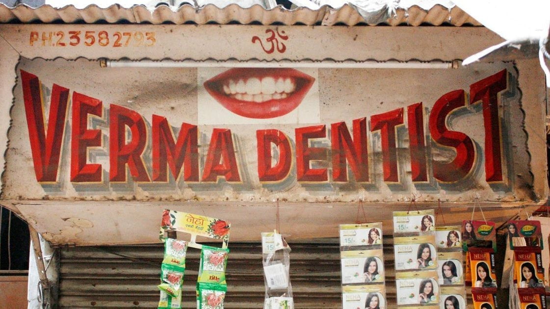
A designer is documenting the unique typefaces found only on India’s streets
As she was walking down a street in Panjim in 2017, a shop sign caught the eye of Pooja Saxena, a typeface and graphic designer. The wooden sign, written in cursive Sans Serif font, was advertising Bentex watches and straps. It was the elaborately designed “B” with its multiple curves and an eye in the middle that intrigued her. It was the perfect addition to her online project, titled India Street Lettering, where she documents street lettering and signage from across India.


As she was walking down a street in Panjim in 2017, a shop sign caught the eye of Pooja Saxena, a typeface and graphic designer. The wooden sign, written in cursive Sans Serif font, was advertising Bentex watches and straps. It was the elaborately designed “B” with its multiple curves and an eye in the middle that intrigued her. It was the perfect addition to her online project, titled India Street Lettering, where she documents street lettering and signage from across India.
Saxena shared a photograph of the Bentex sign as part of a recent social media challenge. The letter “B,” which she described as flamboyant, was her second entry for the online challenge titled #36DaysOfType, celebrating typography and lettering.
Five years ago, Barcelona-based graphic designers Nina Sans and Rafa Goicoechea got the ball rolling on a project they titled 36 Days of Type, with 26 days assigned to each letter of the Latin alphabet, and the rest to 10 numerals. Now in its fifth edition, artists and designers all over the world have been posting their takes on the letters since April 03, experimenting with material, colours, calligraphy, and graphics.
Saxena’s entries for the challenge bring into focus the shop signs, building names, and billboards she has spotted on the streets of India, with an emphasis on a certain letter either because of an eye-catching curve or a detail reminiscent of a design movement. “India is rich not only in the sheer number of languages and scripts used, but also in the variety of styles and materials in which public lettering exists, and it plays a huge role in how we experience our cities and neighbourhoods,” said the 30-year-old.
Saxena is part of an emerging community of typographers who are devoting their time to adapting regional scripts for the digital age. In the last few years, with the emergence of type design studios, such as India Type Foundry and Mota Italic, and designers such as Saxena, Shiva Nallaperumal, and Satya Rajpurohit, the interest in typography has grown. These typographers are creating aesthetically pleasing font families, keeping in mind the vast amount of letters included in the scripts that exist in the country.
Saxena, who has a little over 1,000 followers on Instagram, has so far showcased shop signs from Delhi, Panjim, Chennai, Mumbai and Bengaluru on her page. “There is diversity in styles and materials. Some signs are hand-painted, others are neon, and then there are signs fashioned out of wood, metal, tiles, or even carved in stone,” said the Delhi-based designer.
For #36DaysOfType, Saxena is showcasing a few of her favourite examples of local type she has documented over the years around Indian cities, or “in the wild” as she likes to say.
“A”
“My family and friends—especially my brother Prateek—know that the greatest gifts to me usually involve type,” said Saxena. “Prateek is great at spotting signs in Goa, where he lives, and makes lists of places he thinks I should visit. Mapusa Market was one of them. What really attracted me to this sign were the colours. Blue and beige is not a combination you often see on hand-painted signs. Its slight italic angle, relaxed serif letters, and tight spacing made me a fan.”
“D”
The neon sign on MG Road was spotted by the typographer on a trip Bengaluru years ago. “Hand-painted signs are easy to see as handmade, but so many people don’t realise that neon signs are handmade too. A person heats and bends a glass tube into the shape of the letter.” For Saxena, the neon signs are a combination of history, chemistry, pop culture, and design. “Neon was discovered in 1904 and the chemistry behind these signs makes me wonder how one gets all these colours and also makes me think of the film Blade Runner,” she said. “All this makes neon signs just so exciting and attractive.”
“E”
The “E” that Saxena spotted for the 36 Days series is one she found on a building called Oval View and she chose it for its Art Deco aesthetic, an architectural style that is prominently seen in some areas of Mumbai. “A couple of years ago, I planned a trip to Mumbai [and spent] an afternoon near Oval Maidan, documenting all the Art Deco signs in the neighbourhood,” she said. “If you start from the intersection of Madame Cama Road and Maharishi Karve Road and walk up to Eros Cinema, there are so many gems to see. This particular ‘E’ was tall and with two bars in the middle, instead of one. It is hard to miss.”
“H”
“I found this ‘H’ as part of my research for a lettering walk in Kashmere Gate in Delhi,” said Saxena, who conducts lettering walks in the Paharaganj area. “I had visited the cemeteries in this area years ago as a college student, and remembered that there was some beautiful tombstones. This letter is from a tombstone that would have been erected around 1823 – it is one of the oldest I have found in the cemetery.”
“I”
While in Bengaluru, finding it difficult to explain to cab drivers where exactly she wanted to go, Saxena would end up exploring places on foot quite a bit. The Prince Boutique sign, with its stylish “I,” was spotted by her on one such walk. “I chanced upon a quiet road nearby with a row of wonderful hand-painted signs for everything—mosques, boutiques, vegetable and fruit sellers to an auto parts shop,” she said. “Of the lot, the vivid colours and stylish letters of Prince are my favourite. I think they really seem to fit what the shop sells.” She believes that shop signs are meant to not only attract customers, but are also a way for locals to engage with their vernacular and design heritage.
“The signs need to be attractive and memorable and need to be in language and aesthetic style that the customer has come to expect and will be drawn to,” she said. “I love signs which use interesting style of letters, colour, and layout, or use expressive lettering to incorporate illustrations into the letters. Also, how a sign maker tackles the complexity of Indian scripts can be inspiring.”
This piece was first published on Scroll.in. We welcome your comments at [email protected].