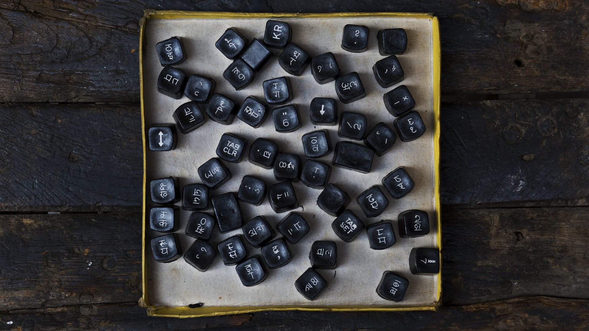
How the world of fonts is making room for Indian languages
Peter Bilak likes to think of fonts as the voice of the text. They convey emotions and tone, just like voices—and just like voices, there are some fonts that are inherently better at communicating a message.


Peter Bilak likes to think of fonts as the voice of the text. They convey emotions and tone, just like voices—and just like voices, there are some fonts that are inherently better at communicating a message.
Bilak knows this universe of fonts, with their adjunct emotions, intimately. In 2009, the Slovakian typeface designer had co-founded Indian Type Foundry, the first company in the country dedicated to designing and distributing fonts.
A decade on, the Ahmedabad-based company has many distinctions to its name: it developed the first-of-its-kind modern Devanagari font (Fedra Hindi) and spearheaded efforts to create a humanist typeface that supports all Indian languages (Kohinoor) as well as a sans serif font covering 12 Indian languages (Akhand).
Its rise did not happen in a vacuum, though.
Over the last decade or so, dozens of type designers and collectives have been concertedly addressing a deep disparity—the dearth of fonts for Indian languages. To them, it’s important that in a nation as varied as India, there should be fonts to reflect the linguistic diversity.
“We don’t realise (this) but (on everything from) bank forms to film titles, only English was being used because of the lack of suitable fonts in Indic languages,” said Shiva Nallaperumal, a partner at November, a Mumbai-based graphic design studio.
Deep complexities
The origin of type design in Indic languages goes back to the history of print in India. Girish Dalvi, co-founder of Ek Type Collective and professor of design at the Indian Institute of Technology (IIT), Bombay, says the earliest type foundry was Nirnay Sagar Press. Established in Bombay in the year 1834, the publisher of Sanskrit texts produced “hand lettering in Gujarati and Devanagari.”
Innovations like those continued for a century and a half, but the production of modern Indic fonts began in earnest only after the proliferation of computers—and, more specifically, the internet.
A turning point came with the introduction of Unicode.
A computing industry standard, Unicode attaches a unique number to every written character—no matter what language or platform—making it possible for the first time to create a font in an Indian language that could be used and seen across platforms. Of course, fonts could be, and were, developed before, but they were system-specific: if you sent a text in an earlier Indic font, the receiver could see it only if the receiving system supported that type.
Those pre-Unicode fonts are today called Legacy Fonts. “They were very basic and not conducive to design intervention,” said Nallaperumal. “The maatras were a bit off and you had to create 1,000 versions to make Devanagari work. Most software was created with Latin type design in mind and could not support complex Indian languages.”
The complexity of writing systems in India still poses a challenge for designers. Every major language has its own structure and aesthetic that rarely translates into another language—a sharp contrast from the Latin script. “The structure of the Latin script is pretty straightforward and linear for the most part, where one letter follows the other, with an occasional diacritical accent mark thrown in,” explained Kalapi Gajjar-Bordawekar, type designer and co-founder of the studio Universal Thirst. “But in the case of most Indic scripts, letter shapes transform based on context.”
One instance of this is when a maatra is applied to a consonant or when two consonants conjugate to form a compound unit. Such transformations, says Gajjar-Bordawekar, aren’t enabled on systems by default and “explicit instructions have to be included in the font files by programming all possible combinations, which is followed by a series of systematic tests on multiple computing environments and platforms to ensure that they function as intended. This process is time-consuming and requires specialised knowledge.”
The first known modern Indian fonts that supported two scripts—Mangal for Hindi and Latha for Tamil—were designed by RK Joshi, who was an academic type designer, calligrapher and professor of type design at IIT-Bombay. They were released in 2001 by Microsoft to support the Windows 2000 operating system, and were followed by custom fonts developed by the UK-based Tiro Typeworks for Vodafone Hindi.
Around the time Indian Type Foundry released the Devanagari font Fedra Hindi in 2009, Ek Type launched the first open source font family that supported Devanagari, Gujarati, Gurmukhi, Bengali, Tamil, and Latin. It was called Mukta. “(It) being open-source ensured everyone could use it free, including students, which made it one of the most popular in the country,” said Dalvi. Several independent Indian designers and studios were being commissioned around this time to create open source fonts to populate the Google Fonts library, an initiative that fed back into the trend by creating a resource of base fonts. The result: the development of more popular Indic type families.
Lack of information
Dalvi, who has a PhD in typography from IIT-Bombay, has written extensively about “the decolonisation of (the) script,” and believes that the graphic design industry is burdened with a cultural hegemony in which even a popular script like Devanagari is marginalised.
It is something, he says, that is easy to see in Indic language text with scattered English words. “The English word always stands out and is larger than the Indic language text with its two-storied system.”
This was something that Satya Rajpurohit, the other co-founder of Indian Type Foundry, took note of when he designed Fedra Hindi to match the existing Latin Fedra. Ever since, his font families include a Latin variant of their own.
Independent Mumbai-based designer Aarya Purohit, who collaborated with Nallaperumal to create the Indic font family Oli, said, “Even in Indic fonts that are not developed in conjunction with existing Latin ones, the Latin metric weighs down on them considerably.” In other words, there are several possible problems, such as a reduction in size of the Indic letters to fit the height of the single tier.
“While there are many books, online or offline, about Latin scripts, or even marginal scripts, such as Armenian or Hebrew, there is very little information about the shaping of Indic fonts,” said Bilak. For Devanagari, the primary reference book—Typography of Devanagari by BS Naik—was published in 1971 and is barely relevant for the digital age. On other languages and scripts, such as Odia or Telugu, says Bilak, there is even less information.
“Young designers find the lack of information discouraging, and there are not many places where one can learn how to design functional Indic fonts,” Bilak said. “There is also a lack of digital tools made for designing Devanagari (or other Indic) fonts.” He is hoping to develop open source tools that will make the process easier.
Gradual improvement
Despite the hindrances and prejudices, there is a consensus that in the last decade, there has been a great improvement in quality Indic fonts emerging from the country. To describe it as a boom would be ambitious, but it is undeniable that the pool has widened.
“It was Fedra Hindi that opened up the market in 2009,” said Nallaperumal. “Suddenly every font was looking better.”
Hitesh Malviya, a Baroda-based independent type designer, who has created fonts such as Kihim (inspired by Nasreen Mohamedi’s art), says the technological advancement in design during this period also played a role. More than a decade ago, Indic fonts were primarily being designed by software developers who sold them as supporting products.
“The platform they used could not support more than 300 characters and they had to fit all conjuncts within the glyph set. That was one reason we didn’t have good quality Indic fonts since all major Indic scripts were not supported in the Unicode system,” Malviya said.
As more designers waded into typography and more fonts appeared, design trends began getting reflected in them. The shift from generic fonts to design heavy, experimental ones was clear. Meanwhile, Rajpurohit’s Indian Type Foundry, which has an illustrious list of clients, including Apple and Star Plus, created the first font marketplace in the country, fontstore.com.
The Indic type industry in India is still largely dependent on custom design projects, in which brand identity is created using multilingual font systems. “The majority of work comes in the form of custom commissions from technology and media companies looking to expand their presence globally,” said Gajjar-Bordawekar. “These custom projects are usually large in scale with long development periods. They include multiple scripts in multiple weights and styles, often with challenging technological requirements due to continuous technological innovation.”
All languages aren’t made equal and there is greater demand for Devanagari, followed by widely-spoken ones like Bengali and Tamil. “Nearly 50% of my business in Indic fonts comes from Devanagari,” said Rajpurohit. “For every 10 Devanagari licences we sell, we sell two Bangla and one Kannada.”
While designers credit freely available open source fonts for collaborative possibilities, they are still cautious. “From (an) economic point of view, designers refrain from entering the open type system,” said Purohit. “The availability of free fonts keeps designers from being able to demand a fair price, something that isn’t good for the industry.”
Nevertheless, it is a good time for typography in Indian languages: the possibilities are endless and the Latin type market faces saturation. “There are at least four different cuts of Helvetica (the Latin font),” said Purohit. “In the Indic industry, there is still a lot of room for interpretation and conceptual originality.”
Others agree that the globalised economy is driving large players to execute niche campaigns, all of which require well-designed Indic fonts. “The only way is up,” said Gajjar-Bordawekar. “With continuous advancements in web-technologies and large software companies investing in emerging markets, the need to deliver a great experience to non-English speaking users will create a greater demand for high-quality, multi-script typefaces.”
This piece was first published on Scroll.in. We welcome your comments at [email protected].