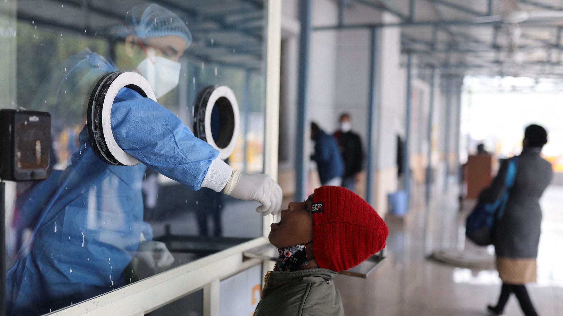
Into the third year of the pandemic and with a third wave raging through the country, India’s data quality still has miles to go.
Epidemiologists and disease modellers agree that disaggregated and transparent data can go a long way in not only better managing the surge in infections but also informing future policy decisions.
Dismal data collection and presentation hindered India’s efforts to tackle and fully understand the impact of the brutal second wave in April 2021. “It’s a complete massacre of data,” Bhramar Mukherjee, an epidemiologist at the University of Michigan, had told The New York Times last April.
Now’s the chance to rectify mistakes, especially with a variant that’s yet to overwhelm hospitals.
A data wishlist for the government, for starters, would include a single home for all its covid-19 data.
India’s ministry of health publishes daily covid-19 death data, besides the change in the number of active cases, on its website. Separately, it gives out the number of daily infections through press releases. These data are not downloadable.
India’s 28 states and eight union territories publish their own mortality and infection numbers individually, but with little uniformity in presentation.
“First there needs to be a national dashboard of daily and cumulative recorded cases, hospitalisations, and fatalities, down to district level,” said Murad Banaji, a mathematician at Middlesex University, London. “It is absurd that almost two years into the pandemic we rely on volunteer efforts to collate this basic data.”
Volunteer data collectives have been essential to the understanding of the pandemic in India. Covid-19 India was one such dashboard. It parsed data from various states and provided an overview of the country. After 16 months, with the work of 300-plus volunteers, and 4.4 billion site visits till October 2021, that collective stopped updating its dashboard.
“With our work and personal lives limping back to normalcy, we believe it’s time for us to look ahead and focus on them,” the volunteers wrote in a blog post. Comments as recent as Jan. 15 on the post have been requesting the website to resume its updates.
Besides, a consolidated data platform also needs to have more granular data.
With a variant like omicron, which is believed to cause less severe disease than the delta variant, it is crucial to understand how this wave is affecting older people, those with comorbidities, or the unvaccinated.
Countries like the UK put out high-quality data that have been instructive to other countries in deciding their own policies for omicron, according to Gautam Menon, professor at the departments of physics and biology, Ashoka University.
“South Africa also set a very good example in terms of transparency and data availability,” Menon said. Several Scandinavian countries offer granular data, “but this is also because their populations are much, much smaller than ours and they have universal healthcare, so they can track their populations well,” he said.
In India, cities like Delhi and Mumbai, besides states like Kerala, have broken down covid-19 bulletins based on hospitalisations. Yet, the age, gender, and disease profiles of those needing oxygen or ventilator support are missing. “It would be most useful currently to understand the profile of cases and their severity, as a function of age, vaccination, and prior infection status,” said Menon.
Access to vaccination and infection data will also be key to assessing vaccine efficacy in the real world, and against different variants.
Though the omicron variant escapes the immunity conferred by vaccines and past infection, data from other countries have shown that inoculation can still greatly curb the severity of disease and the possibility of death. Infections, thus, need to be seen in the context of vaccinations in India.
While Iqbal Singh Chahal, head of Mumbai’s civic body, has said that, as of Jan. 13, up to 96% of the patients needing oxygen were unvaccinated, this update is not periodically reflected in the city’s daily bulletin. The southern state of Tamil Nadu, meanwhile, offers the disease profile of those who died of covid-19 but not their vaccination status.
“What is missing is the ability to correlate vaccination status to the outcome of a later infection,” Menon said. “Only then can we tell whether our vaccines continue to protect three or six or 12 months down the line and how good they are at preventing severe cases of covid-19.”
This is not particularly difficult for the government, given that labs conducting RT-PCR tests for covid-19 are mandated (pdf) to also collect vaccination data. In an ideal situation, they would seed the dashboard for the analyses of breakthrough infections. In fact, this information was to be linked to India’s vaccination portal Cowin.
The government has now created a website for this information. But data journalism platform IndiaSpend found only a bunch of graphs, minus the underlying data, on the new site. Thus, there is no clear picture of the number of covid-19 deaths among the unvaccinated.
However, even beyond vaccinations, covid-19 mortality data is an area of grave concern in India.
India has been undercounting covid-19 deaths, in some states by a factor of 10. The country likely had over 2 million unreported deaths during the pandemic, some six to seven times higher than the official count, according to a study published on Jan. 6 in the Science magazine.
Such underreporting was evident during India’s second wave of covid-19, where mass funerals stood in stark contrast to the official figures reported.
Experts like Banaji say that having real-time all-cause mortality data is key to understanding the pandemic. “Where death registration is high and systems are online, this is simply a question of transparency—making anonymised data publicly accessible, or producing weekly reports at the district level,” he said. In areas with poor death registration, periodic surveys can fill in the gaps. “The centre should provide resources to state governments to carry out such surveying,” Banaji said.
Some states like Andhra Pradesh do a fair job of providing all-cause mortality data, offering real-time death registration data via a publicly accessible portal, according to Banaji. “For this reason, we have a much clearer idea of the mortality impact of the pandemic in Andhra Pradesh than in most other parts of the country,” he said.