Great photography isn't mostly about gear — it's about how you see, how you wait, and how you make a hundred small decisions before you press the shutter
KOBU Agency / Unsplash
Most people who pick up a camera for the first time make the same assumption: that better photos come from better equipment. A newer body, a faster lens, a more sophisticated autofocus system — if the results are disappointing, the camera must be at fault. This assumption is understandable and largely wrong. Professional photographers produce extraordinary images on phones. Photographers with expensive cameras produce disappointing ones. The equipment matters at the margins. What separates consistently great photos from consistently mediocre ones is almost entirely about the decisions made by the person behind the camera.
Those decisions fall into a few broad categories. Some are technical — understanding how aperture, shutter speed, and ISO interact, how light behaves at different times of day and in different conditions, how to expose correctly when the scene is not cooperating. Some are compositional — how to organize the elements of a frame to direct attention, create depth, and produce images that hold the eye. Some are about timing — the patience to wait for the decisive moment, the alertness to recognize it, the reflexes to capture it. And some are harder to categorize — the ability to develop a distinct point of view, to see the ordinary world as a source of compelling images, to edit ruthlessly from the hundreds of frames taken to find the few that work.
None of these are innate gifts reserved for people who were born with an eye for photography. They are skills, developed through practice, study, and the specific discipline of looking carefully at photographs — both one's own and those of photographers one admires — and understanding why some work and some do not. The photographers who take consistently great images are not luckier than those who take consistently mediocre ones. They have thought harder about the decisions this list covers, and they make those decisions more deliberately and more accurately.
This list covers 20 specific skills that make the largest difference in photographic quality. Each slide explains what the skill is, why it matters, and how to develop it — because naming a skill without explaining how to build it is useful only to those who have already mastered it. The goal is to give photographers at every level a specific, actionable understanding of what great photography requires, so that the next time they pick up a camera, the decisions they make are more deliberate and the results are better.
Lobiya / Pexels
Light is the raw material of photography — the word itself derives from the Greek phos, meaning light — and the ability to read, understand, and work with light is the foundation of every other photographic skill. A photograph is not an image of a subject. It is an image of light reflecting off a subject, and the quality of that light — its direction, its color temperature, its hardness or softness, its contrast — determines the character of the image more than any other single variable.
The most important distinction is between hard light and soft light. Hard light comes from a small, concentrated source relative to the subject — direct midday sun, an undiffused flash, a bare bulb — and produces sharp shadows, high contrast, and pronounced texture. Soft light comes from a large source relative to the subject — an overcast sky, light bounced off a large reflector, a window with a translucent curtain — and produces gradual shadow transitions, lower contrast, and a flattering, dimensional quality. Neither is universally better, but understanding which quality of light suits your subject is the first step toward using light deliberately rather than accepting whatever happens to be present.
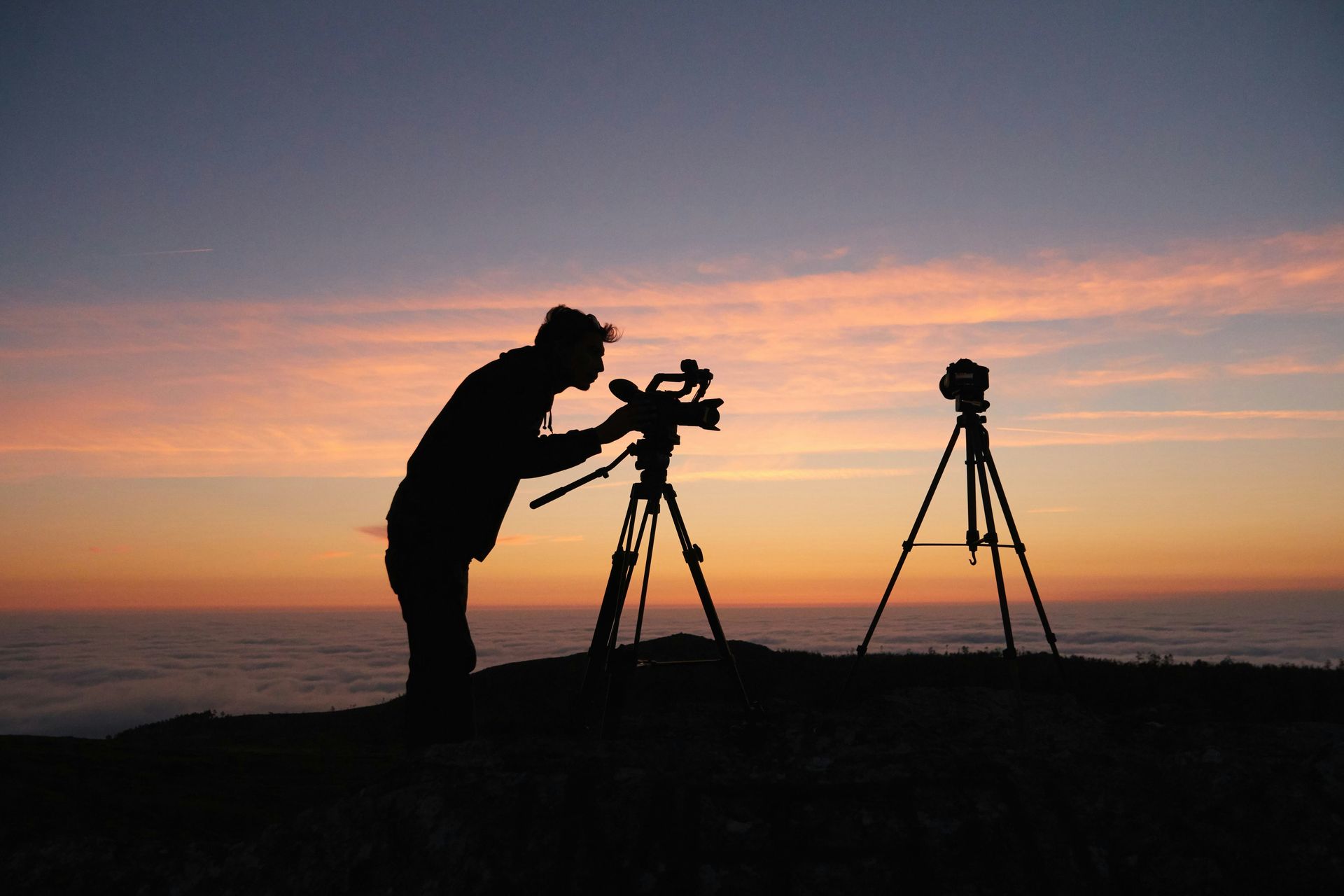
Direction matters as much as quality. Front lighting — with the light source behind the photographer and falling directly on the subject — produces even, flat illumination with minimal shadow. Side lighting reveals texture and three-dimensionality. Back lighting — with the light source behind the subject — produces silhouettes or rim lighting effects that can be extraordinary or simply underexposed, depending on how the exposure is managed.
The golden hours — the hour after sunrise and before sunset — produce light that is warm in color, low in angle, and soft in quality, which is why landscape and portrait photographers so consistently work at those times. But great photographers work in all light conditions, including the flat midday light that most beginners avoid, by understanding what that light can and cannot do and choosing subjects and compositions accordingly.
Developing the skill of reading light requires looking consciously at the light in every environment you enter — not at the subjects or the potential compositions, but at the light itself. Where is it coming from? What quality does it have? What does it do to the shadows? What color is it? This habit of looking, practiced consistently, produces a sensitivity to light that eventually becomes automatic.
zs Lin / Pexels
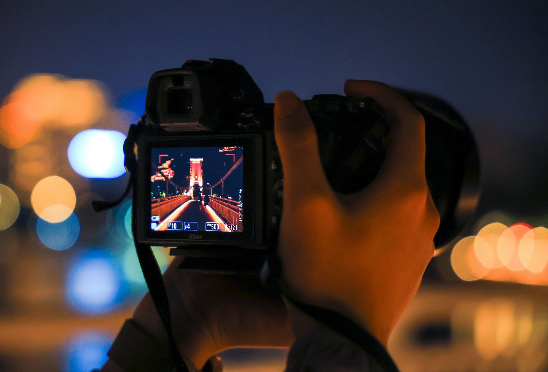
Exposure — the amount of light that reaches the camera sensor — is controlled by three variables: aperture, shutter speed, and ISO. Understanding how these three variables interact and what each one does independently to the image is the foundational technical skill of photography, and mastering their relationships is what separates photographers who consistently get technically correct exposures from those who rely on automatic modes and hope for the best.
Aperture is the size of the opening in the lens through which light passes, measured in f-stops. A wide aperture (low f-number, such as f/1.8) admits more light and produces a shallow depth of field — a narrow band of sharp focus with the foreground and background blurred. A narrow aperture (high f-number, such as f/16) admits less light and produces a deep depth of field with everything sharp. Aperture is therefore both an exposure control and a creative control — the choice of aperture determines how much of the image is in focus, which is a fundamental compositional decision.
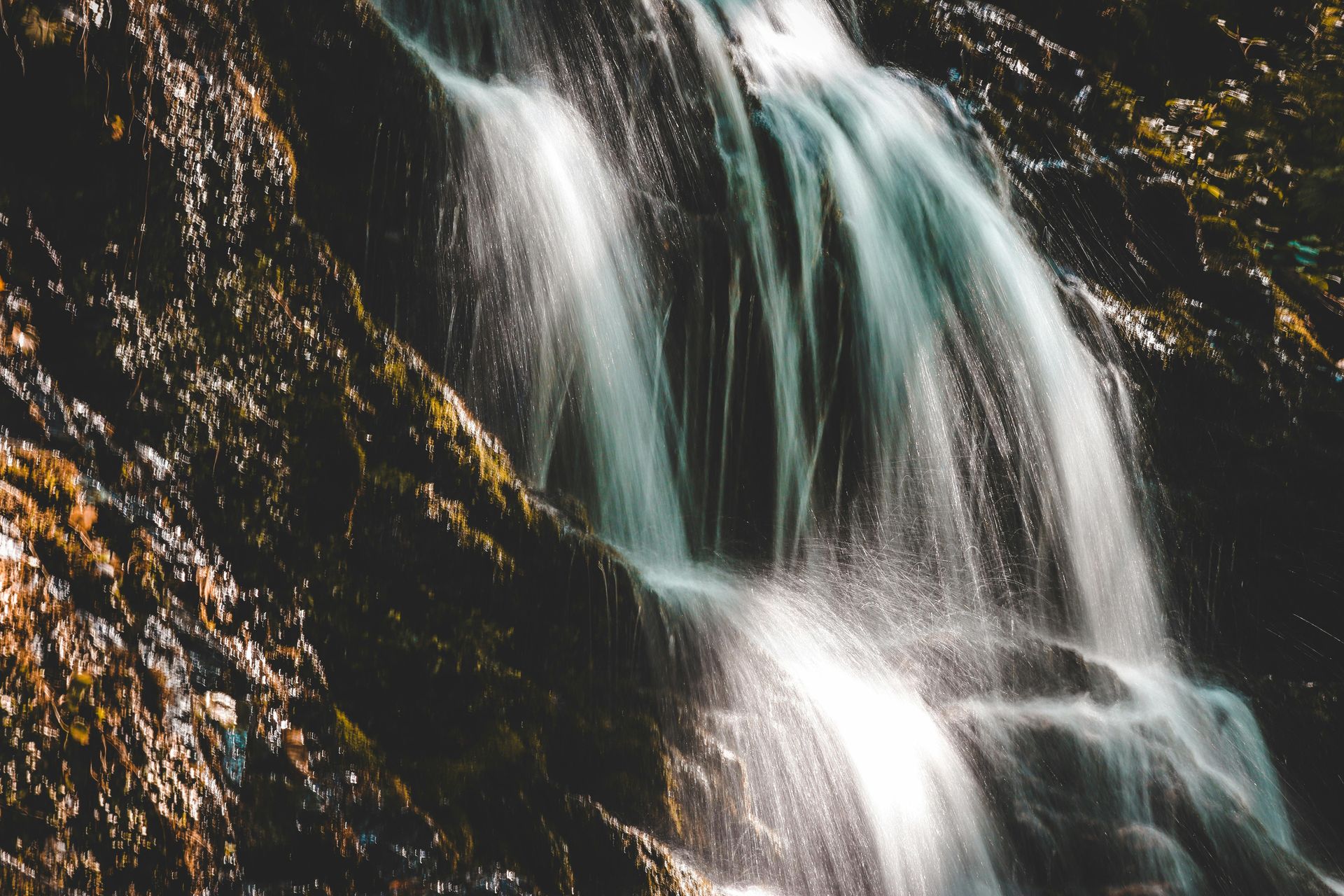
Shutter speed is the duration of the exposure, measured in fractions of a second or seconds. A fast shutter speed (1/1000 second) freezes motion. A slow shutter speed (1/30 second) renders motion as blur. As with aperture, shutter speed is both an exposure control and a creative one — a waterfall photographed at 1/2000 second looks like a frozen curtain of water; the same waterfall at one second looks like flowing silk.
ISO is the sensor's sensitivity to light. Higher ISO allows shooting in low light but introduces digital noise — the grain-like texture that degrades image quality. The relationship between the three variables follows the exposure triangle: any increase in light from one variable must be compensated by a decrease from another to maintain the same exposure.
Developing exposure mastery requires shooting in manual mode — not because manual is always superior to automatic modes, but because shooting in manual forces a conscious understanding of the trade-offs that automatic modes make invisibly. Once those trade-offs are understood, aperture-priority and shutter-priority modes can be used knowledgeably rather than reflexively.

Marina Leonova / Pexels
Composition is the arrangement of visual elements within the frame — the decisions about what to include, what to exclude, where to place the subject, how to handle the foreground and background, and how to direct the viewer's eye through the image. It is the skill that most directly determines whether an image has visual coherence and impact, and it is the skill whose development most directly separates photographers who make images from those who merely take them.
The rule of thirds — dividing the frame into a 3x3 grid and placing key elements at the intersections — is the most frequently cited compositional guideline in photography, and it is a useful starting point precisely because it discourages the beginner's default of placing the subject in the center of the frame. But it is a rule that, once understood, should be broken deliberately rather than followed automatically. Central compositions can be powerful when they convey symmetry or confrontation. Off-center compositions can feel arbitrary if there is no visual tension to justify the placement.
Leading lines — roads, fences, rivers, pathways — that draw the eye into the frame and toward the subject create depth and movement. Framing the subject with elements in the foreground — doorways, branches, arches — adds layers to the image and focuses attention. Negative space — empty areas of the frame that give the subject room to breathe — can be as compositionally active as the subject itself.
The most productive compositional habit is also the simplest: moving. Most beginner photographers stand in one place, point the camera, and press the shutter. Moving a meter to the left, crouching down, climbing slightly higher — these adjustments completely change the relationship between foreground and background, between subject and context. The camera position that produces the best composition is rarely the first one you stand in.

David Dibert / Pexels
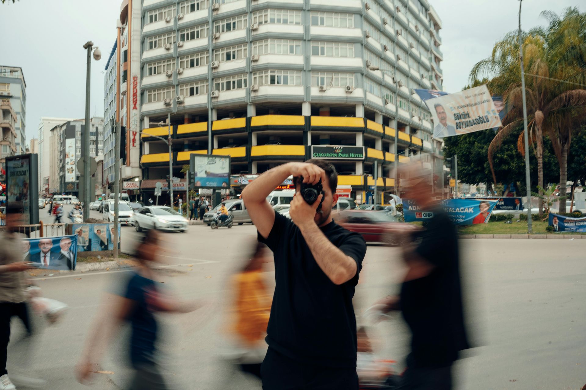
The decisive moment — Henri Cartier-Bresson's concept of the instant at which the spatial and temporal elements of a scene align into their most expressive configuration — is the organizing principle of a large portion of the world's greatest photography. It is also the skill most dependent not on technical knowledge but on temperament: the willingness to wait, the alertness to recognize the moment when it arrives, and the reflexes to capture it.
Patience in photography operates on several timescales. On the scale of seconds and minutes, it means waiting at a chosen position for the elements of the scene to align — for the person to walk into the frame at the right position, for the light to break through the clouds, for the street corner to produce the combination of figures and shadows that the image requires. On the scale of hours, it means returning to a location at the right time of day for the light. On the scale of days and weeks, it means monitoring weather forecasts for the conditions a specific landscape requires, or waiting for a specific moment in a longer event or story.
The technical expression of timing is burst mode — the camera's ability to shoot multiple frames per second — but burst mode is a tool for capturing a moment, not for recognizing it. The recognition requires prior observation of the scene: understanding where the light falls, where people tend to walk, what expressions or gestures are characteristic of the subject, and therefore what configuration will produce the image the photographer is working toward.
Street photographers who produce consistently strong work describe the habit of working a scene — staying in a chosen spot for long enough to understand its rhythms, to see what happens and anticipate what might happen, rather than moving continuously in search of new subjects. The best image from a scene is often not the first one available but the one that becomes available once the photographer has been patient enough.

Kawê Rodrigues / Pexels
Editing — the selection of the images from a shoot that are worth keeping, processing, and showing — is the skill that photographers most consistently underinvest in, and the one whose development most immediately improves the perceived quality of their work. A photographer who takes 200 frames and presents 30 will always seem worse than a photographer who takes 200 frames and presents three. The images you show define your photography in the viewer's mind, and every weak image in a set diminishes the strong ones around it.
The difficulty of ruthless editing is psychological rather than technical. Every image a photographer takes has some attachment — the memory of the moment, the effort involved, the small thing about it that almost works. Editing requires the ability to see images as a viewer rather than as the photographer who took them: to ask not "does this remind me of the moment?" but "is this image compelling to someone with no connection to it?"
The standard for keeping an image should be high. Technical failures — camera shake, missed focus, significant exposure error — are generally reasons to discard. But technically adequate images that are compositionally weak, that fail to capture a decisive moment, or that cover the same ground as a stronger image from the same shoot should also be discarded. The question is not "is this photo good?" but "does this photo add something that the others don't?"
One practical approach is to edit in two passes. The first pass eliminates clear failures — unsharp, badly exposed, or redundant frames. The second pass, done after an interval, applies a more stringent standard to what remains. Images that seemed strong immediately after the shoot often look weaker after a day of distance. Distance and detachment are editing's most useful conditions.
Laurentiu Robu / Pexels
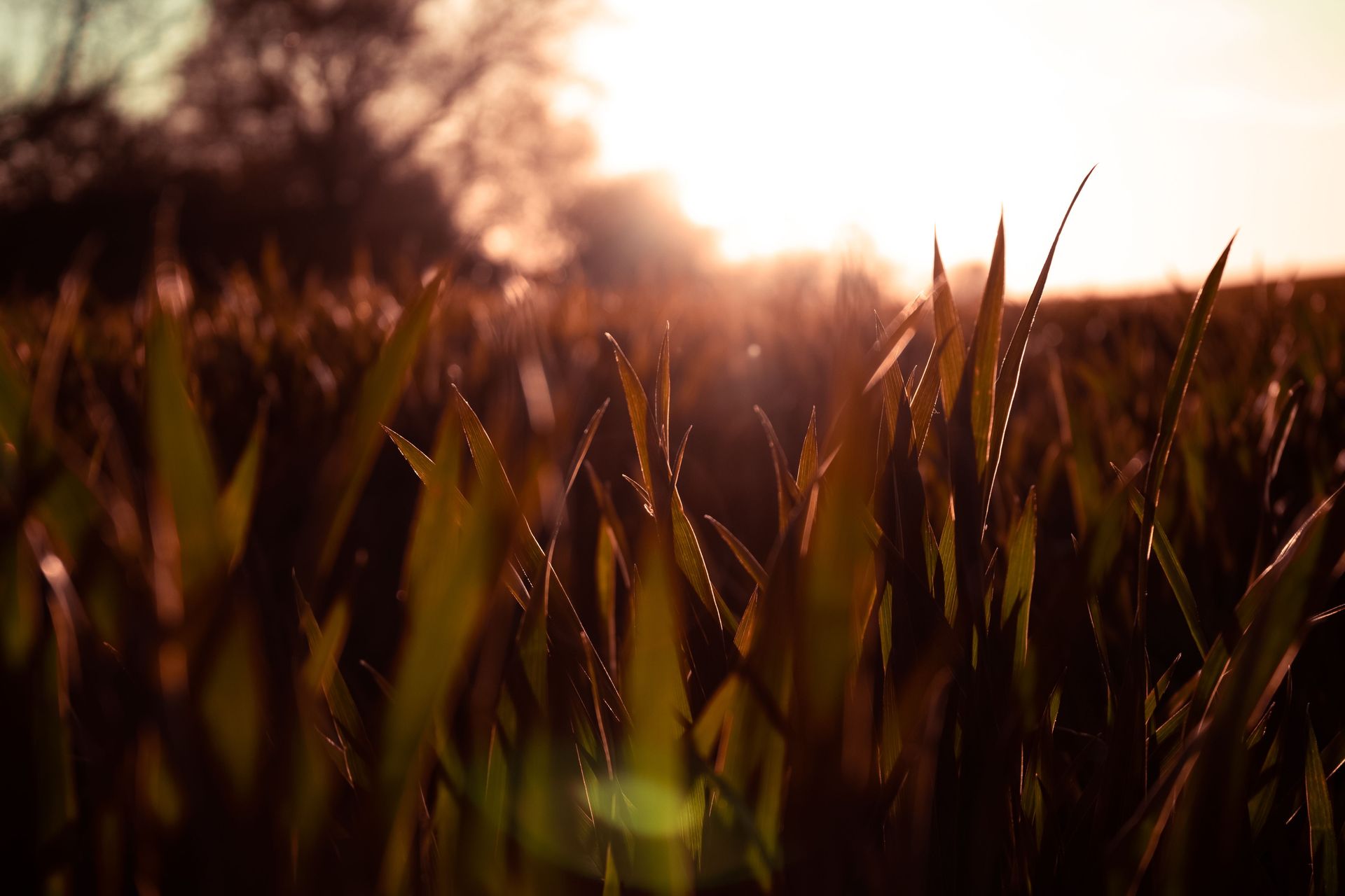
Depth of field — the range of distances from the camera that appears acceptably sharp in an image — is one of the most powerful creative controls available to a photographer, and its deliberate use is one of the clearest indicators of intentional, skilled photography. An image where everything is equally sharp communicates a different relationship to the subject than one where a single plane of sharp focus isolates the subject against a soft background. Understanding what depth of field does and how to control it is fundamental to making images that look the way you intend.
Depth of field is controlled primarily by aperture — wider apertures produce shallower depth of field, narrower apertures produce deeper depth of field — but it is also affected by the focal length of the lens (longer lenses produce shallower depth of field at the same aperture) and by the distance from the camera to the subject (closer subjects produce shallower depth of field than distant ones at the same aperture).
The shallow depth of field produced by a wide aperture — the creamy background blur that photographers call bokeh, from the Japanese word for blur — has become so widely used in portrait photography that it has become a visual cliché. The background blur is pleasing and technically skillful, but it is not always the right choice. Images that use deep depth of field to embed the subject in a rich, fully sharp environment — a face in a crowd, a person in a landscape, a detail within a larger context — can be more compositionally complex and more informative about the subject's world than images that isolate the subject against an out-of-focus background.
The skill is not mastering one approach to depth of field but understanding what each approach communicates and making the choice deliberately. Before pressing the shutter, a conscious question: does this image benefit from shallow depth of field, or would deep depth of field serve the composition better?
Xue Guangjian / Pexels
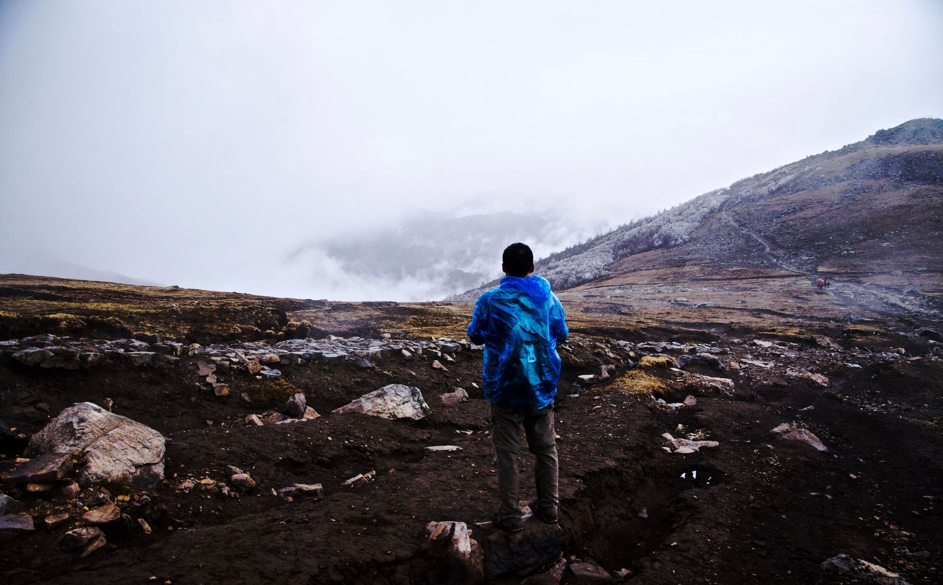
Backgrounds are the element most consistently overlooked by photographers whose results disappoint them. A strong subject with a distracting background produces a weak image. A modest subject against a clean, complementary background produces a strong one. The background is not a neutral container for the subject — it is an active compositional element whose relationship to the subject determines much of the image's visual clarity and impact.
The most common background problem is clutter — visual complexity that competes with the subject for the viewer's attention. Trees that appear to grow from people's heads, lamp posts that bisect figures, busy patterns that create visual noise behind a quiet subject — these are problems that could be solved by moving the camera position or the subject, or by changing the aperture to blur the background. The failure to notice them before pressing the shutter is a failure of attention to the complete frame rather than just the subject.
The practical habit that addresses background problems is simple: before pressing the shutter, look deliberately at the four edges of the frame and at the background. Are there elements that should not be there? Is the background tone complementary or competing with the subject? Does the background provide context that helps the image, or does it simply add noise?
Skilled photographers actively seek out clean, interesting, or contextually meaningful backgrounds before positioning their subjects relative to them. A portrait placed against a wall of the right color or texture, a street scene composed so that a particularly evocative background is framed behind the central figure, a landscape composition that uses the sky as a clean negative space — these are background decisions made before the subject is considered, and they are the decisions that distinguish photographs that are compositionally deliberate from those that are not.

Sebastian Feistl / Pexels
Raw format — the unprocessed data captured directly from the camera sensor, as opposed to the JPEG format in which the camera processes and compresses the image — is the foundation of any serious post-processing workflow, and the difference between shooting raw and shooting JPEG is the difference between having full creative control over the final image and accepting the camera's automated decisions.
A JPEG is a finished image produced by the camera according to preset parameters: sharpening, color rendering, noise reduction, and most importantly, a tone curve that maps the sensor's dynamic range into a compressed output range that fits on screen or in print. The camera's JPEG processing discards data — particularly in the highlights and shadows — that cannot be recovered in post-processing. What the camera gives you is what you have.
A raw file retains all the data captured by the sensor. The white balance, the exposure, the tone curve, and the color rendering are all fully adjustable in post-processing without any quality loss, because these decisions have not been baked into the file. An image that is slightly underexposed in raw format can often be corrected to an excellent exposure in post. An overexposed highlight that is completely blown in JPEG may retain detail in raw that can be recovered with a highlight adjustment.
Raw files require a processing step — software such as Adobe $ADBE Lightroom, Capture One, or the open-source Darktable — that JPEGs do not. This is a genuine workflow cost. For photographers who are not interested in post-processing, well-configured JPEG settings can produce excellent results. But for anyone who wants full creative control over color, tone, and the rendering of difficult lighting situations, raw format is not optional.
Alexander Dummer / Pexels
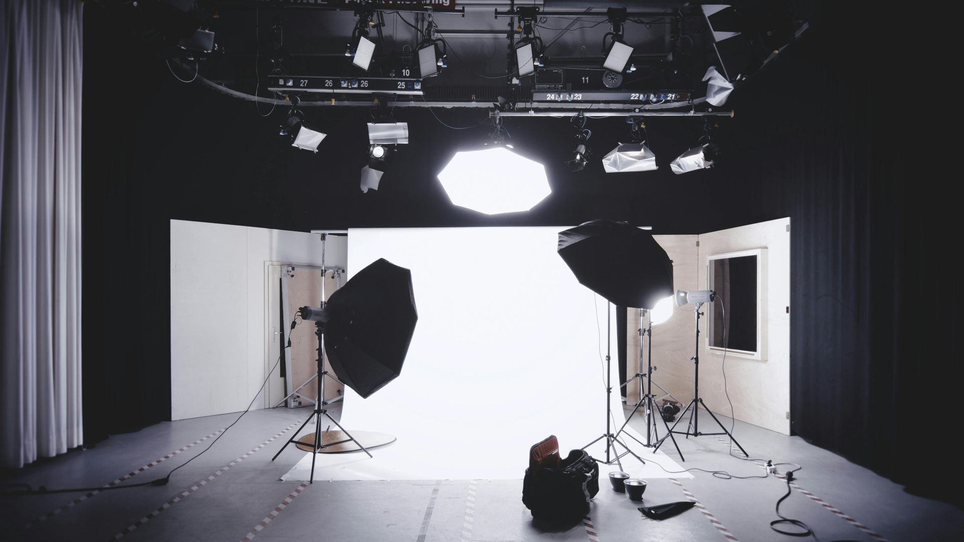
Natural light is variable, unpredictable, and sometimes extraordinary. Artificial light — flash, studio strobes, LED panels, practical lights — is controllable in ways that natural light is not, and the ability to shape artificial light is what allows photographers to work independently of the weather, the time of day, and the quality of available light. It is also the skill with the steepest learning curve in photography, because artificial light introduces variables — color balance, power ratios, light modifier effects — that natural light photography does not require.
The most accessible entry point to artificial light is a single off-camera flash. Moving the flash off the camera axis — connecting it by a sync cable, a radio trigger, or using the optical slave function of a secondary flash — immediately improves the quality of flash photography by removing the flat, frontal illumination of on-camera flash and allowing light to come from a more directional position. Bouncing an on-camera flash off a ceiling or a nearby wall is a simpler version of the same principle.
Light modifiers — umbrellas, softboxes, beauty dishes, reflectors — change the apparent size of the light source relative to the subject, which changes the quality from hard to soft. A bare flash head produces hard light; the same flash head fitted with a large softbox produces soft light whose quality approximates an overcast sky or a large window. The modifier does not add more light — it spreads and softens the light that is already there.
Understanding the inverse square law — the principle that light intensity falls off with the square of the distance, meaning that doubling the distance between light source and subject reduces the light intensity to one quarter — is the most important technical concept for anyone working with artificial light. It explains why moving a light source slightly closer produces a dramatic increase in its softness and why backgrounds fall off quickly when the light source is close to the subject.
Tahir Osman / Pexels
Technical mastery — understanding light, exposure, composition, and the other skills on this list — is necessary but not sufficient for great photography. The photographers whose work is most immediately recognizable, most compelling over time, and most worth studying have something beyond technical competence: a personal vision, a specific way of seeing the world that gives their images a coherent character across subjects and contexts.
Personal vision is not a style, though it often manifests as one. Style is the surface — a preference for high contrast, a consistent use of a particular color palette, a characteristic focal length. Vision is the underlying orientation to the world that produces the style: what the photographer finds interesting, what they notice that others walk past, what questions their images are implicitly asking, what emotional relationship they have with their subjects.
Personal vision develops through two processes simultaneously. The first is looking — studying the work of photographers whose images produce strong responses, trying to understand not just what makes a specific image work but what the photographer is interested in across their body of work, what they see consistently that others do not. This kind of study is most productive when it extends beyond technically admirable images to images that have something to say.
The second process is shooting — a lot, in the same contexts and with the same concerns, over time, which allows patterns to emerge in what one finds compelling. Most photographers who develop a strong personal vision do so by working repeatedly on a specific subject or in a specific place, developing a depth of familiarity that transforms their images from observations into interpretations. Breadth of subject spreads attention too thin for the kind of sustained looking that vision requires. Narrowing the focus deepens it.
Annie Spratt / Unsplash
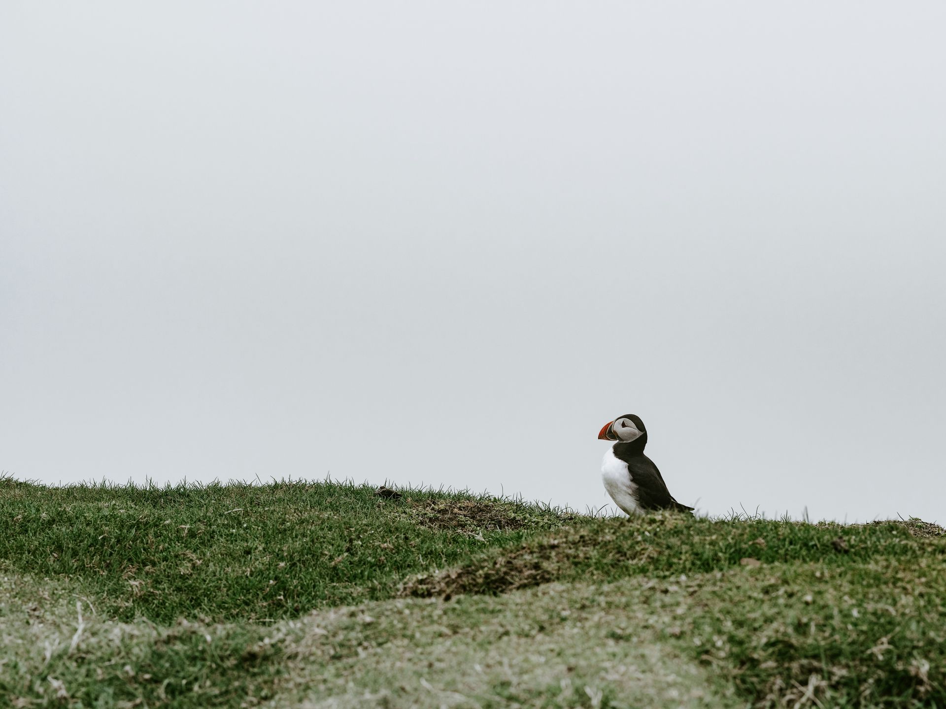
Negative space — the empty or unoccupied areas of a frame, as distinct from the subject — is one of the most powerful and most underused compositional tools in photography. In a culture of visual busyness, where more information and more elements are generally assumed to mean more interest, the deliberate use of empty space to isolate a subject, create tension, or produce an emotional quality of stillness is a skill that immediately distinguishes considered composition from instinctive snapping.
Negative space works by giving the subject room — visually and sometimes metaphorically. A figure small in the frame against a vast sky or a still ocean communicates isolation, scale, or insignificance in a way that a tightly cropped portrait cannot. A single object placed against a clean background commands attention precisely because there is nothing competing for it. The negative space does not merely frame the subject — it comments on it.
The difficulty of using negative space deliberately is that it requires resisting the compositional instinct to fill the frame, to include more context, to close the distance between camera and subject. That instinct is often misidentified as thoroughness. It is more often anxiety — the fear that the subject alone is not enough, that the image needs more. Developing comfort with emptiness in the frame is a compositional maturity that most photographers reach only after they have produced enough cluttered images to understand what they were trying to avoid.
Practical exercises for developing sensitivity to negative space include photographing on plain, uncluttered backgrounds — a clear sky, a still body of water, a plain painted wall — and experimenting with how much of the frame the subject can relinquish while retaining visual coherence. The minimum subject area required to hold a composition is almost always smaller than beginning photographers assume.

Darlene Alderson / Pexels
Post-processing — the editing of images in software after they have been captured — is not a substitute for getting things right in camera, but it is an integral part of the photographic process for most serious photographers and a skill whose development significantly improves the final quality of images. The photographers who produce the most consistently polished work are not those who process the least — they are those who process with the most intention, making adjustments that serve the image rather than applying arbitrary stylistic filters.
The foundational post-processing skills — exposure adjustment, white balance correction, highlight recovery, shadow lifting, and basic color correction — are learnable in an afternoon and produce immediate, measurable improvements in image quality. Getting the exposure right in processing is not the same as getting it right in camera — a raw file processed well is better than a JPEG processed from an identically exposed capture — but it is vastly better than leaving an underexposed raw file unprocessed because "I wanted to get it right in camera."
Beyond correction, processing includes creative decisions: the conversion to black and white, which removes color as a compositional element and forces the eye to read the image purely through tone and contrast; the selective adjustment of local areas — dodging and burning — that guides the viewer's eye through the image; the choice of color treatment that gives a body of work visual consistency. These decisions are as creative as the decisions made at the moment of capture, and they are no less legitimate as expressions of the photographer's vision.
The most common post-processing error is over-processing — the application of adjustments that call attention to themselves rather than serving the image. Excessive clarity, over-sharpened textures, HDR effects that produce an artificial, surreal quality, and skin smoothing that removes all evidence of human texture are all symptoms of processing that is trying too hard. The test is whether the processing is visible to a viewer who is not looking for it.
Jakub Zerdzicki / Pexels
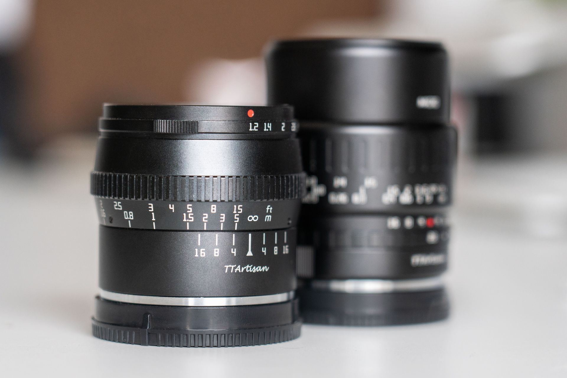
Focal length — the characteristic of a lens that determines its angle of view and its compression of distance — is one of the most significant creative variables in photography and one whose effects on image character are not intuitive from a technical description. Different focal lengths do not simply produce images of different magnification. They change the spatial relationship between the subject and its environment in ways that fundamentally alter what the image communicates.
Wide-angle lenses (typically 24mm and below on a full-frame sensor) encompass a large angle of view and exaggerate the apparent distance between near and far elements. They are the lenses of context — they put the subject in its environment, show a large space, and produce images with dynamic foreground-background relationships. Used close to a subject, they produce the perspective distortion that makes noses appear large and faces feel assertive or confrontational.
Standard lenses (35mm to 50mm) approximate the angle of view and perspective of the human eye and produce images that feel natural and unmanipulated — neither compressed nor expanded in their spatial relationships. They are versatile, invisible, and the focal lengths that most photojournalists and street photographers have historically favored precisely because they show the world as it is rather than as a specific lens effect.
Telephoto lenses (85mm and above) compress the apparent distance between near and far elements, bringing the background closer to the subject. They are the lenses of isolation — they separate the subject from its environment through compression and shallow depth of field, and they produce the quality of intimacy in portrait photography that comes from being able to work at a comfortable distance while filling the frame with a face.
Most photographers who develop a strong personal vision work primarily with one or two focal lengths — learning to see in those specific ways rather than switching between perspectives constantly. The constraint of a single focal length forces compositional decisions that a zoom lens makes it easy to avoid.
Quang Nguyen Vinh / Pexels
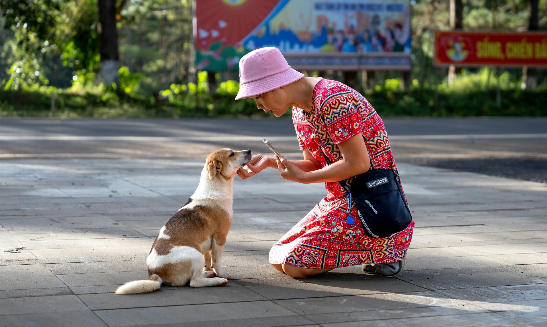
The technical skills of photography are tools. The skill that determines whether those tools are used to their potential is the quality of attention brought to the scene before the camera is raised — the capacity to notice what is worth photographing, to perceive the specific moment when a scene becomes an image, and to maintain the kind of open, non-judgmental awareness that allows unexpected things to enter the frame.
Presence in photography means genuinely being in the environment rather than moving through it with a camera. It means looking at everything — not just the obvious subject but the peripheral details, the background elements, the light, the behavior of people in the space — with the specific alertness of someone who knows that what they are looking for will not announce itself. Street photographers describe the experience as a kind of relaxed hyperawareness: fully in the moment, not anticipating specific images, but prepared to recognize them when they appear.
The most productive habit for developing this quality of attention is leaving the camera at the ready — not in a bag, not capped, not in sleep mode — but in hand, set to the appropriate exposure, so that the time between recognizing an image and capturing it is as short as possible. The opportunity cost of being a second too slow in photography is permanent. The moment is gone, and the preparation that would have captured it is only useful retrospectively.
Observational habits developed outside photography — the practice of looking carefully at the world, noticing light, noticing people, noticing juxtapositions — transfer directly to the quality of photographic seeing. Photographers who read their environments closely, who notice what most people walk past, who are curious about everything in their field of view, consistently produce more interesting images than those who arrive at a scene with a specific image in mind and try to find it.
Pixabay / Pexels
Color is one of the most emotionally powerful elements in photography, and its management — through the choices made at the moment of shooting and in post-processing — is a skill that most photographers develop through intuition and experience rather than through deliberate study of color theory. Bringing some theoretical structure to those intuitions produces more consistent and more deliberate color results.
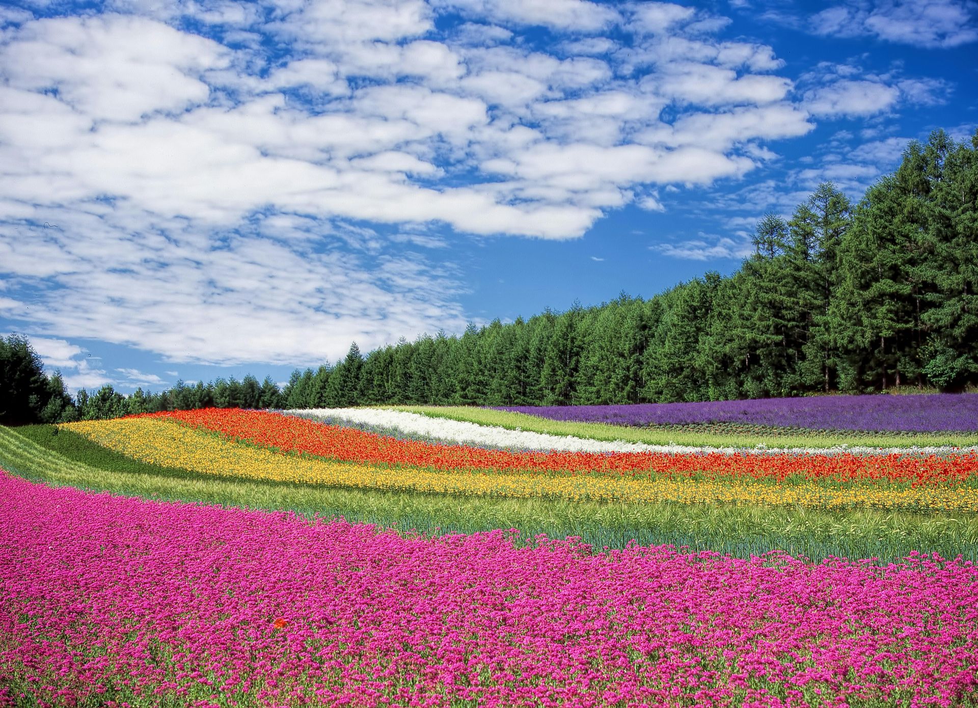
The basic vocabulary of color theory is immediately applicable to photography. Complementary colors — those opposite each other on the color wheel, such as orange and blue, or red and green — create visual tension and mutual intensification when placed together in a frame. Analogous colors — those adjacent on the color wheel, such as yellow, orange, and red — create visual harmony and cohesion. Monochromatic images — those dominated by a single hue in different tones and saturations — have a specific quiet visual quality distinct from either complementary or analogous color schemes.
The orange-and-teal color grading that has become ubiquitous in cinema and photography over the past decade is a complementary color scheme applied to skin tones (pushed orange) against environmental tones (pushed teal). Its visual appeal is real and its overuse has made it a cliché — but understanding why it works, and what it does to the relationship between figures and environments, makes it a conscious choice rather than a default filter.
Color temperature — the warmth or coolness of the light, measured in Kelvin — is a color dimension that photography shares with painting and cinema. Warm light (lower Kelvin values, orange-tinted) is associated with morning, evening, interior environments, and emotional warmth. Cool light (higher Kelvin values, blue-tinted) is associated with overcast days, shade, night environments, and emotional distance. The ability to manage color temperature through white balance settings and post-processing gives photographers a direct tool for the emotional tone of an image.

Pavel Danilyuk / Pexels
The photographs that last — that are reproduced, discussed, and returned to across decades — are almost always images that contain a story. They do not merely document what was in front of the camera. They produce a specific question in the viewer's mind, or establish a tension between elements that invites interpretation, or capture a moment of such compressed human truth that the image feels larger than its subject.
Story in a single photograph does not require narrative in the conventional sense — a beginning, middle, and end. It requires tension — the sense that something is happening, or has just happened, or is about to happen; or that the relationship between two elements in the frame is significant; or that the subject exists in a specific moment of emotional or physical intensity that the image has caught at its peak.
The technical preconditions for a story-containing image are all the other skills on this list — the composition that arranges the elements to create the tension, the light that gives the moment its emotional character, the timing that catches the decisive instant. But the storytelling dimension requires something additional: awareness of what is happening, understanding of its significance, and the ability to recognize when a scene has reached the moment at which its story is most concentrated.
Developing the storytelling skill requires studying images that tell stories — not just admiring them but analyzing them. What creates the tension? What question does the image ask? Where does the eye go first, and what does it discover next? What information is present that is not the central subject? What is absent? The answers to these questions, accumulated across dozens of studied images, form a visual grammar that eventually becomes unconscious and available at the moment of shooting.

Vitaly Gariev / Pexels
The most underused resource available to any photographer is their own archive of images — the accumulation of everything they have shot, including the failures, the near-misses, the almost-good images that reveal exactly where their seeing or their technique is falling short. Most photographers process their images, keep the ones they like, and discard the analysis along with the failures. Photographers who improve most rapidly do something different: they study their failures systematically.
A missed focus problem that recurs across multiple images from a shoot is a technique problem with a specific solution. A composition that almost works but doesn't suggests a specific element that needed to be included or excluded. A sequence of images from a location where the light was not right is information about when and how to return. The archive of failures is a direct map to the skills that need the most development.
Regular review of older work — images taken six months or a year ago — is separately useful. Images that seemed strong at the time of shooting often look different with distance: compositional weaknesses that the emotional memory of the moment obscured become visible. Images dismissed at the time sometimes reveal qualities that were not apparent on first review. The gap between initial assessment and later assessment is itself information about how one's photographic seeing is developing.
The most productive habit is periodic deliberate review: selecting a body of work — a trip, a project, a month's shooting — and studying it as if it were someone else's. What patterns emerge? What kinds of images consistently work? What kinds consistently fall short? The answers reveal both strengths to build on and weaknesses to address, and they make the next body of work more intentional than the previous one.
Connor Scott McManus / Pexels
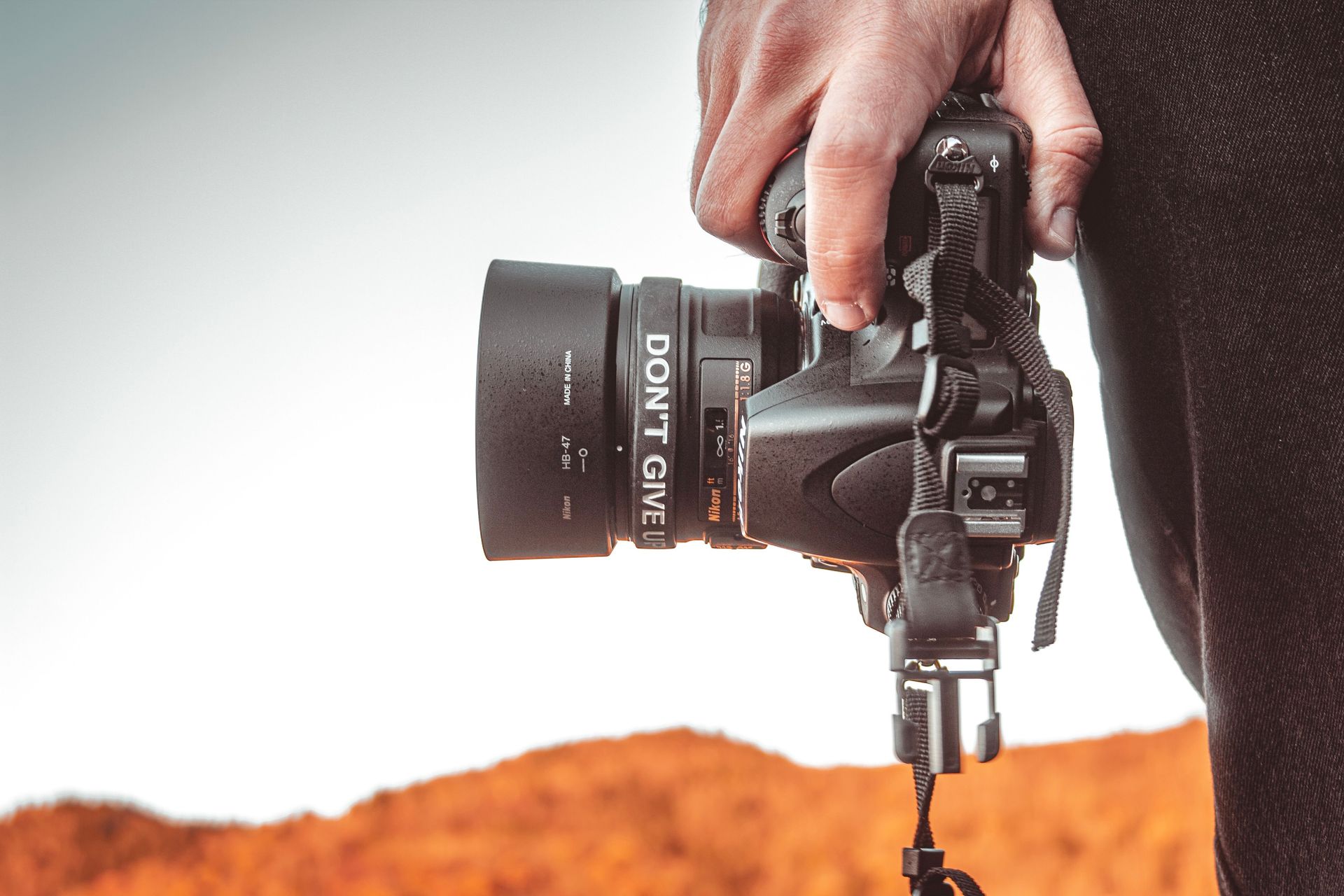
The final skill on this list is the most counterintuitive: the ability to recognize when not to raise the camera. Great photography is partly about the images taken and substantially about the images not taken — the decision to wait rather than settle, to not press the shutter when the image is almost right but not right, to be present in a scene rather than behind a lens when the camera would create a barrier to the experience that makes the scene worth photographing.
The compulsion to photograph everything — enabled and amplified by the zero marginal cost of digital capture — is one of the most significant impediments to photographic growth, because it substitutes quantity for intention. The photographer who captures 500 frames from an afternoon's shoot has not been more attentive than the one who captured 50 — they have been less discriminating, pressing the shutter on images that do not yet meet the standard the editing will eventually enforce.
The discipline of not shooting is most useful in two situations. The first is when the image is not yet ready — when the composition needs adjustment, when the light needs to change, when the decisive moment has not arrived. Waiting costs nothing except patience, and patience is consistently rewarded. The second is when shooting would interfere with being present to an experience that cannot be recovered. Some moments are better lived than photographed, and the photographer who knows the difference between a moment that requires a camera and a moment that does not is the photographer who brings genuine discernment to both decisions.
Corentin Henry / Pexels
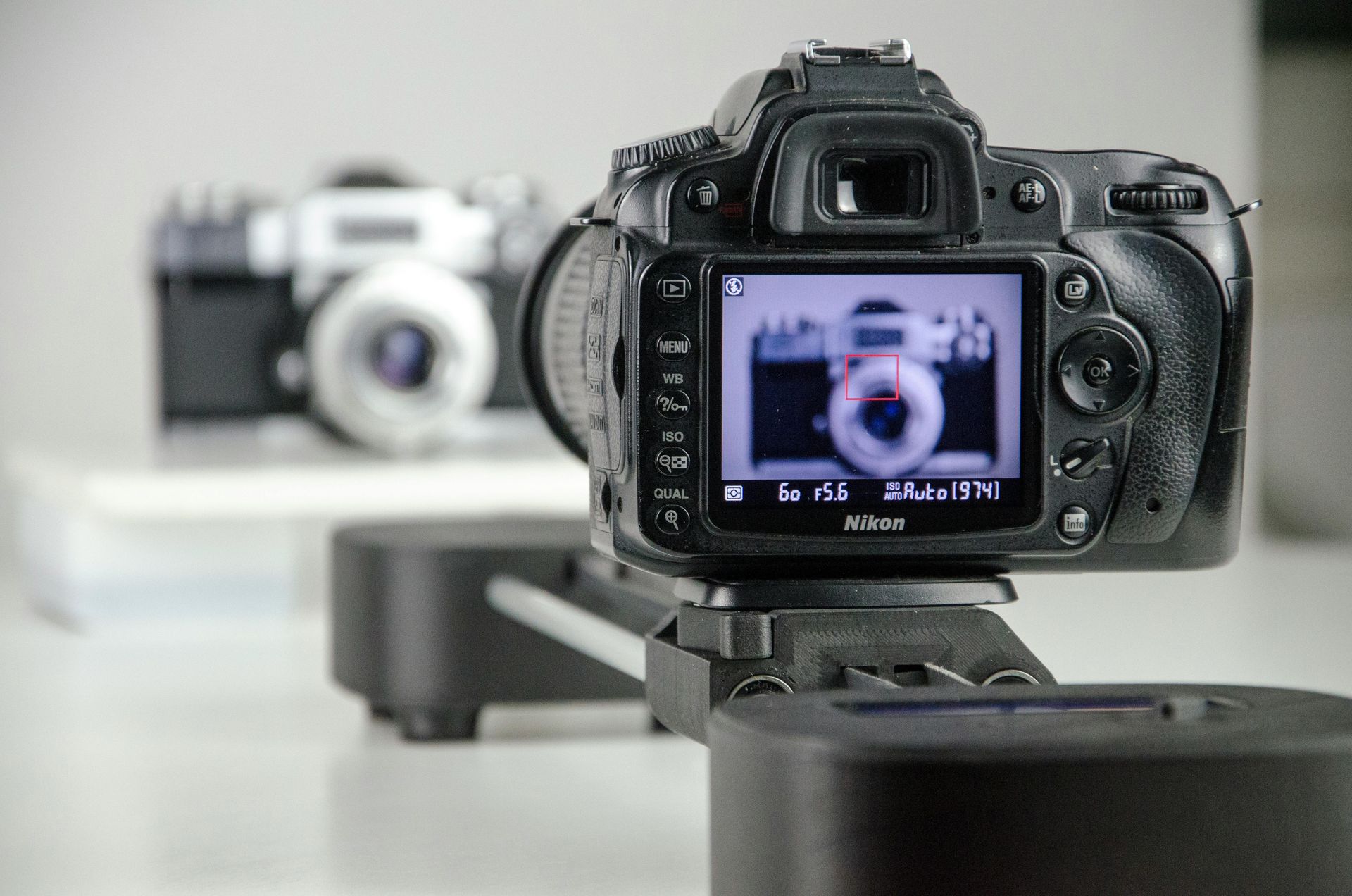
Camera metering — the system by which the camera measures the light in a scene and calculates the exposure required — is one of the most misunderstood aspects of camera operation, and understanding its limitations is what separates photographers who consistently nail exposure from those who consistently wonder why their automatic settings produced the wrong result.
All camera metering systems work on the same principle: they assume that the scene being metered averages out to a middle grey tone, approximately 18% reflectance. This assumption works well for scenes with average tonal distribution — a mix of lights, darks, and mid-tones that genuinely average to middle grey. It fails predictably in scenes that deviate from that average. A snow scene, a white wall, a bright beach — scenes that are predominantly light — will be underexposed by a camera metering to middle grey, because the meter tries to render the bright tones as middle grey by reducing the exposure. A dark scene, a black suit, a night environment — scenes that are predominantly dark — will be overexposed for the same reason.
Modern cameras offer multiple metering modes that address this in different ways. Evaluative or matrix metering analyzes the entire frame and applies pattern recognition algorithms. Spot metering reads the exposure from a small area — typically the center of the frame or the selected autofocus point — allowing the photographer to meter from a specific tone and use exposure compensation to set the final exposure deliberately.
The most useful habit is exposure compensation — the ability to tell the camera to expose more or less than its metering suggests. For a snow scene, adding one to two stops of positive exposure compensation tells the camera to expose brighter than its middle-grey assumption. For a dark scene, negative exposure compensation tells it to expose darker. The histogram — the tonal distribution graph available in most cameras and in all raw processing software — is the most reliable indicator of correct exposure and should be used alongside the metering system rather than trusting the metering alone.
Nairod Reyes / Pexels
The photographers who work most effectively under pressure — in street photography, photojournalism, events, and any situation where the image exists for a fraction of a second — are those who can operate their equipment without looking at it, without hesitation, and without the cognitive interruption of having to think about a technical problem while the image is happening in front of them.
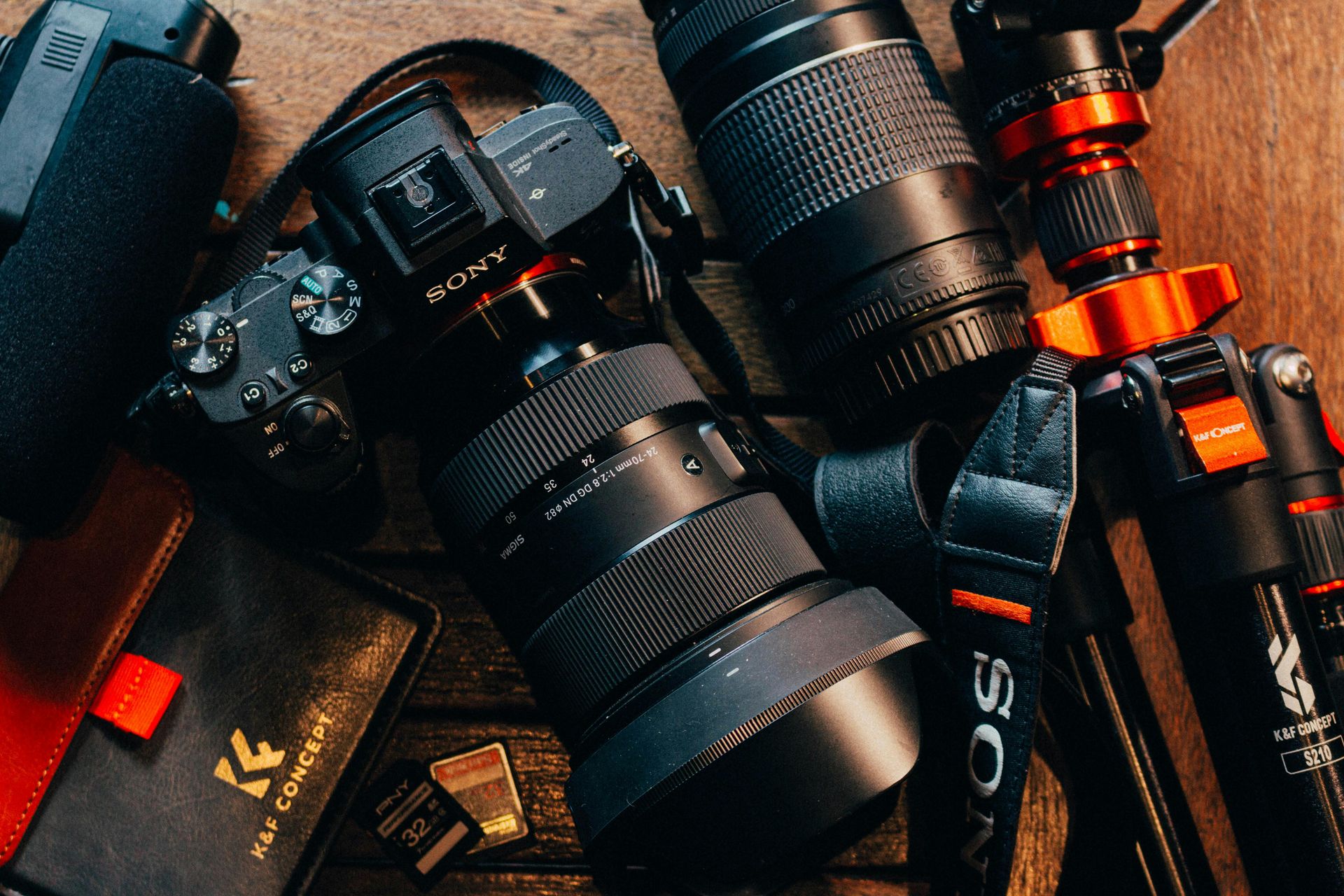
Knowing your equipment means knowing where every control is without looking. It means knowing what your lens's minimum focus distance is, so you never try to focus closer than it allows. It means knowing how your autofocus system behaves in low light, so you can switch to manual focus before the camera starts hunting when the light drops. It means knowing how long your battery lasts under your typical shooting conditions, so you are never caught without power at the critical moment. It means knowing the quirks and limitations of your specific camera — which noise levels are acceptable at which ISO settings, how the metering behaves in backlit situations, how much highlight latitude the sensor has at its base ISO.
This knowledge is not acquired by reading the manual, though the manual is a useful starting point. It is acquired by shooting deliberately — by testing the camera's performance at different ISO settings against a controlled subject, by practicing changing settings in the dark until the muscle memory is reliable, by reviewing images critically against the settings used to understand where the system's limits lie.
The most counterproductive habit in photography is using unfamiliar equipment for important work. A new camera, a rented lens, a borrowed flash — equipment that has not been tested and learned creates cognitive overhead at exactly the moment when full attention should be on the scene. The best camera for any situation is the one you know best, operated at the level of reflex rather than thought.
