The internet sport of finding sexual anatomy in every logo is ruining graphic design
It was only a matter of time before the internet found yet another logo to mock. This week’s victim: the spirited 2018 World Chess Championship emblem by Moscow-based design firm Shuka.
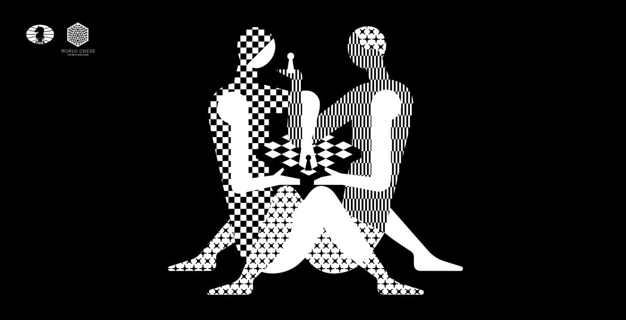

It was only a matter of time before the internet found yet another logo to mock. This week’s victim: the spirited 2018 World Chess Championship emblem by Moscow-based design firm Shuka.
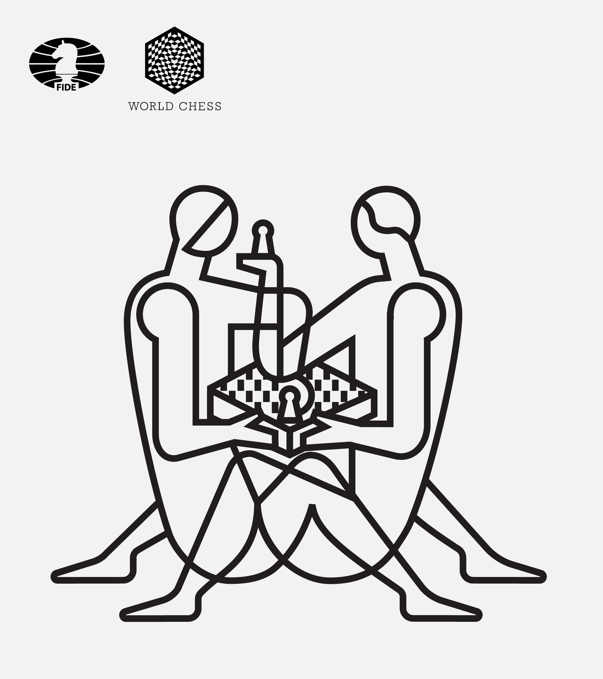
Unveiled on Dec. 17, the key graphic features a pair of stylized human figures locked in duel. Internet critics instantly pounced on the emblem calling out the sexually suggestive pose which reminded many of a tantric pose in the Kama Sutra. It’s been dubbed “#ChessIsSexy,” “Kardashian sexy chess,” or—because Twitter can’t resist a pun—”pawnographic.”
Shuka’s art director and founder Ivan Vasin says he’s pleased that the emblem is helping draw a spotlight to the notoriously nerdy sport. “We are happy that there is the reaction,” Vasin tells Quartz.
He explains that the design is meant to champion humans in a sport that’s increasingly tethered to bots and computers. “We thought, what is the meaning of chess in 2018? Chess is, foremost, the game of human beings,” mused Vasin. “Here we show their relations, their feelings. Here we speak about the human values: humanity, freedom and love. We say that the chess is for people—reachable, more democratic,” he explains.
Vasin adds that their studio is tickled that chess players around the world are suddenly taking note of graphic design. Founders of the leading online gaming site Chess.com even made a video mimicking the pose.
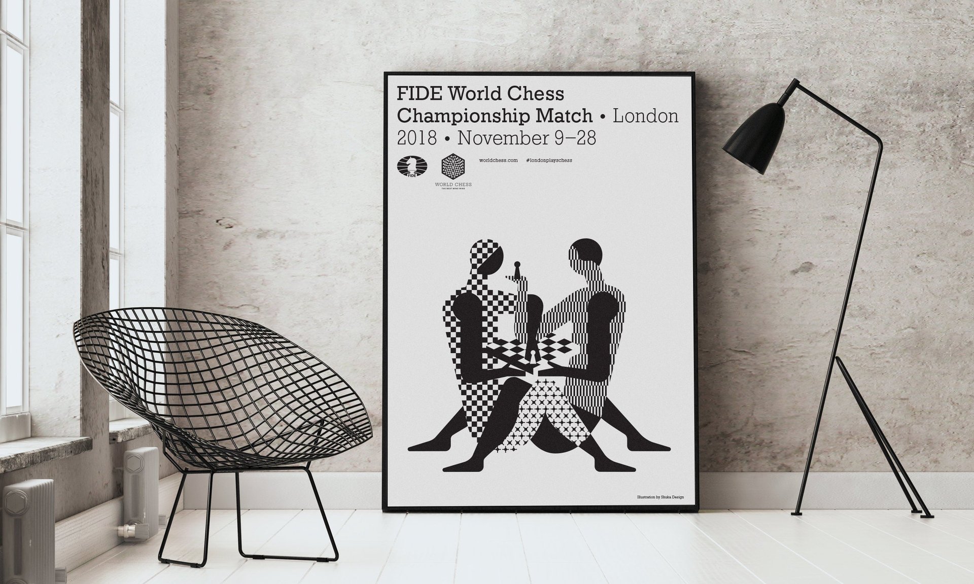
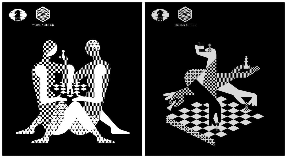
Shuka’s design solution is actually quite genius. In a sea of soulless corporate clip art branding, its World Chess logo is graphically arresting. Playing with a collage of grid patterns of chessboards, the branding instantly reads “chess.” It translates well on collateral materials and posters, and—as the internet reaction proves—highly legible when shared on social media. The single color design can also potentially help organizers save on printing costs. But perhaps Shuka’s best maneuver is creating a fresh mark that’s somehow in line with the branding scheme of the tournament’s previous years. Do you know how agonizing it is for a graphic designer to receive the creative brief: “similar but new”?
Still, the puerile “pawnographic” commentary is not surprising. From the 2014 vagina incident in the AirBnb logo to the perceived phallus in too-many-to-mention examples, people are quick to see sexual anatomy in logos. The graphic design “spectator sport,” as Michael Bierut once wrote on Design Observer, seems harmless fun but it’s actually damaging to the practice of graphic design. Snarky comments make clients nervous and as a result, limits designers to a range of safe options that no one will raise an eyebrow at—or notice.
This is how boring graphic design prospers.
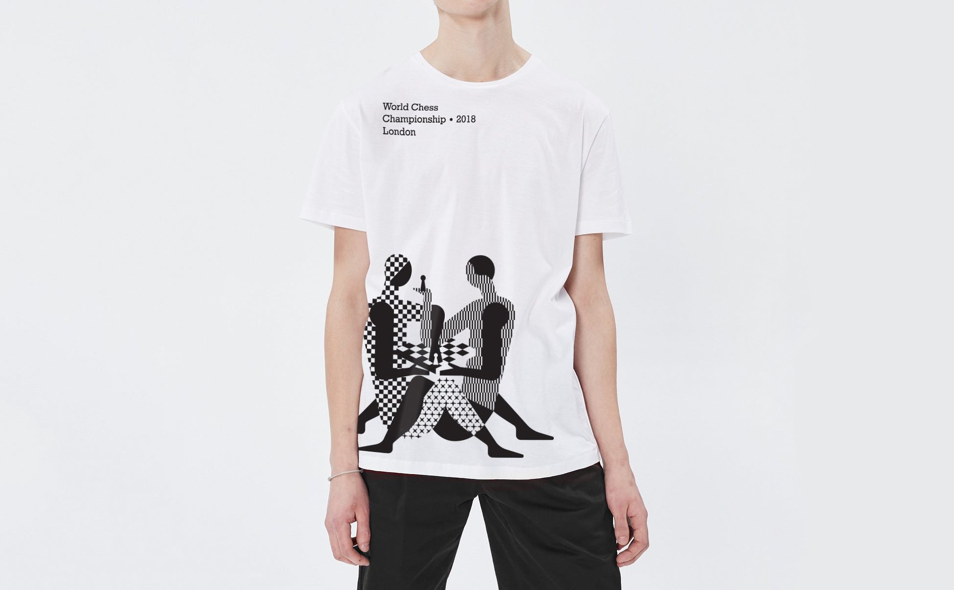
Don’t judge a logo by the Twitter image. Inquire where it’s applied, its context and check what the client was trying to achieve.
The World Chess also deserve some credit for sticking with the branding despite the deluge of criticism. They’re celebrating the spotlight and now selling $45 souvenir posters they’ve dubbed “2018 World Chess Championship ‘Sexy’ Limited Edition Print.”
And you know what, if the 2018 logo does recalls a pose from the ancient book of love, so be it. Chess, afterall, is an intense, intellectual tryst—the sexiest kind there is.