Israeli designers really, really dislike their nation’s 70th independence anniversary logo
For the 70th anniversary of its nation’s independence, Israelis are clamoring for the end of tired, design clichés.


For the 70th anniversary of its nation’s independence, Israelis are clamoring for the end of tired, design clichés.
In April, Israel’s Ministry Culture and Sport is orchestrating an epic 70-hour spectacle with fireworks, parades, folk dancing and a massive 70km. long party—all to fete the country’s birthday. The celebration’s theme underscores Israel’s reputation as an innovation-minded nation. “[Israel is] creative, looks to the future, thinks outside the box, and is a trailblazer in research, medicine and agriculture, thereby providing a vital contribution to all of humanity,” proclaimed culture minister Miri Regev at a Jan. 15 press event. But the branding of the festivities is seeped in old graphic tropes—and the local design community is outraged.
The problem: contrary to the celebration’s innovation-focused theme, the chosen logo is oddly old fashioned, observes designer Oded Ben Yehuda who wrote a scathing review of the emblem in Israeli lifestyle site XNET. Ben Yehuda, who runs a branding studio in Tel Aviv, called the logo a “cliché of creativity” and pointed to several conceptual and stylistic blunders: the anemic and calligraphic font connotes an Ashkenazi (i.e. ‘old fashioned’) aesthetic; the Microsoft Windows 1992-like flying pane graphics is dated; and perhaps most confounding is the corny, oxymoronic Hebrew slogan at the bottom, which translates into “a legacy of innovation.”

“Yes, there is technological innovation in Israel, but there is no ‘legacy of innovation’ in it,” Ben Yehuda argues. With a booming tech start-up sector concentrated in an area dubbed “Silicon Wadi,” Israel has attracted companies like Google, Apple, Facebook, and Microsoft who have established local offices throughout the country. And techies world-wide have dubbed Israel “the Start-Up Nation.” But the logo feels decidedly disconnected from these triumphs—which are relatively recent–Ben Yehuda continues. The logo “certainly does not reflect innovation, nor tradition, and it is 70 light years away from representing Israel 2018,” he says.
In his article, Ben Yehuda also points to the several unanswered questions about the logo’s designer. Last year, Israel’s Sport and Culture Ministry invited the public to submit their ideas for the logo—a common practice for national branding exercises. But oddly, it ended up using a design supplied by the producers of April’s 70 hour-long event. The ministry, which didn’t respond to Quartzy emails, would not elaborate about the selection process, except to say that it had the authority to choose the final design.
“It was difficult to develop too high expectations for the unveiling of the logo, since the Ministry of Culture asked the residents to design a free logo, without offering a worn dime to experienced designers who would work on a quality logo,” writes Yehuda. “Still, there was hope that this farce would end well.”
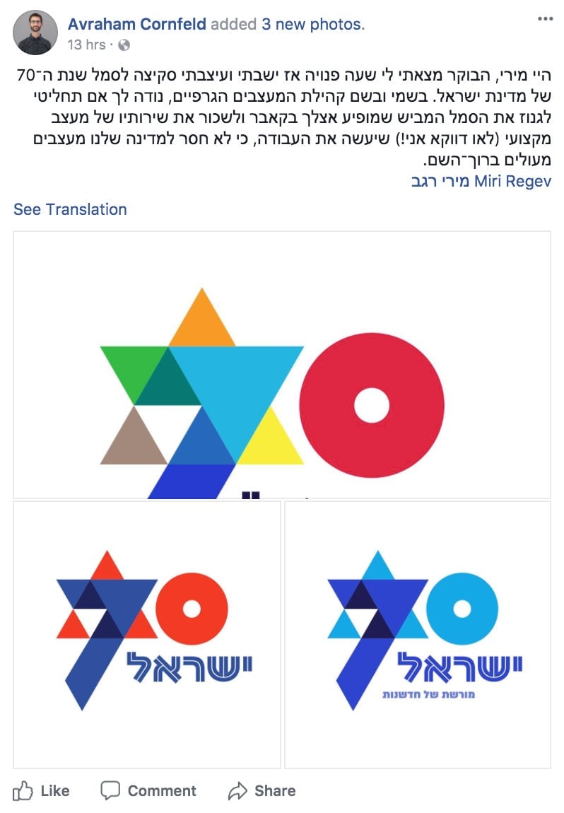
Ben Yehuda’s ardent criticism has inspired designers to mock up alternatives for the emblem. Typographer Avraham Cornfeld came up with a vibrant design and captioned his proposal with an appeal to Regev to hire professional graphic designers to do the work.

Soon, the logo will be displayed on thousands of anniversary posters, billboards and commemorative materials—serving most likely, as a constant visual annoyance to those who’d hoped for better. “People were very angry and emotional about the symbol because it was supposed to reflect not only the state but also express it,” says Yehuda, noting a collective desire to project a modern, progressive identity. “People care very much.”