
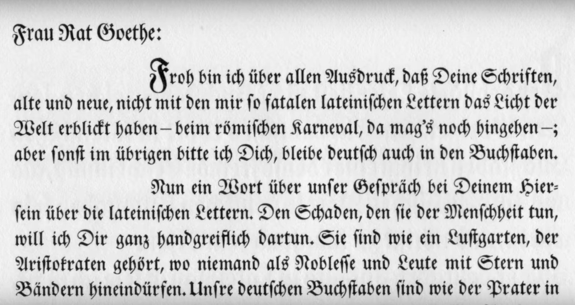
In the early 1800s, a talented German punchcutter by the name of Justus Enrich Walbaum created a typeface that signaled modernity. A departure from the Blackletter fonts that were common in German books at that time, Walbaum designed a “warm and stylish” Roman typeface that would become a favorite of publishers for its readability. Walbaum Antiqua, as it was called, was so superior that Johann Wolfgang von Goethe insisted that his books be printed in this typeface.
Despite its technical excellence, Walbaum has largely been forgotten, eclipsed by similar high-contrast serifs such as Didot and Bodoni, which are still commonly used in books and fashion magazines today. Apart from a few logos and publications, Walbaum isn’t exactly the top-of-mind font for most graphic designers.
“Walbaum has gotten the short shrift,” says Monotype’s Charles Nix, who collaborated with fellow type designers Carl Crossgrove and Juan Villanueva to properly restore the 200-year-old font for 21st-century users.
Walbaum Antiqua’s relative obscurity is also due to the political climate in the 1800s, Nix explains. Unfortunately for Walbaum, French forces, under Napoleon’s command, invaded and occupied Prussia around the time he introduced his French-style letters. Germans dismissed Walbaum Antiqua, which was inspired by the French designer Firmin Didot’s eponymous typeface, as anti-patriotic.
Describing the project as a labor of love, Nix says he, Crossgrove, and Villanueva wanted to “do right” by the German designer, who they greatly admired.
“As type designers and font geeks normally do, we professed our mutual love of Walbaum and how it’s been overlooked,” says Nix, describing his first meeting with Crossgrove in 2015. “We made a pinky pact that we would get to it.”
After over two years of work, the three designers unveiled a remastered version of Walbaum last month—posited to be the most extensive restoration of the under-appreciated serif. Like restoring a painting, remastering a classic typeface requires both detective work and artistry. First, designers scour libraries and archives to collect old samples of the typeface in various sizes and weights. They take high resolution photos and trace letterforms digitally, often smoothing out shapes to eliminate rough details from the ink gain and paper fibers. Sometimes, designers are required to infer an entire alphabet based on a few letters. They prepare the bold, italicized styles, upper and lower case letters, numerals, and punctuation marks, and create character sets for various languages.
Using type specimens from 1803 and 1812, Nix, Crossgrove and Villanueva sought to extrapolate from Walbaum’s original intent, using the mantra, “What would Justus do?”
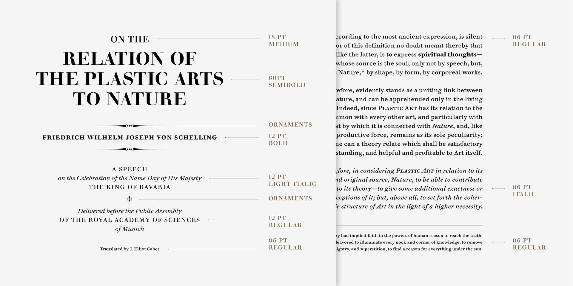
The result: Sixty-nine Walbaum variations optimized for size—from 6pt footnote text to massive marquee lettering—that work well on print and digital displays.

This isn’t the first time someone has attempted to remaster Walbaum for digital applications. In fact, several Walbaum variations were already available. But most of them lack the finesse of the original, explains Crossgrove. “Most of the available digital versions were lacking something—some of them were incomplete or uninspiring,” he says.
The problem is in what’s called “optical sizing.” Before computers allowed us to change a font’s point sizes instantly, type designers had to create variations of the same typeface in different sizes. In this process, they were also able to make important adjustments, such as adding more space between letters in small text, or making the letterform openings a bit larger to increase legibility.
All this was lost when typefaces were digitized in the 1980s and 1990s.

For efficiency’s sake, digital type foundries choose just one size master as a basis for each typeface, then size it up or down, often losing the nuances the designer had originally created. “Users gained the ability to scale a font for any setting, but lost the type maker’s size-specific optimizations,” explains Stephen Coles on Typographica. “This newfound freedom altered the typeface’s intended appearance and, in many cases, its integrity. Fonts made for small text looked clunky and inelegant when enlarged. Fonts made for headlines became anemic and unreadable when reduced for body.”
Nix illustrated the point with an analogy: “Imagine if we all decided that 10-year-old boys would be the optimal human form,” he says. “Rather than having babies, we just shrunk 10-year-old boys to baby size, and enlarge them to the size of a full grown man. That’s kind of what we’re combatting.”
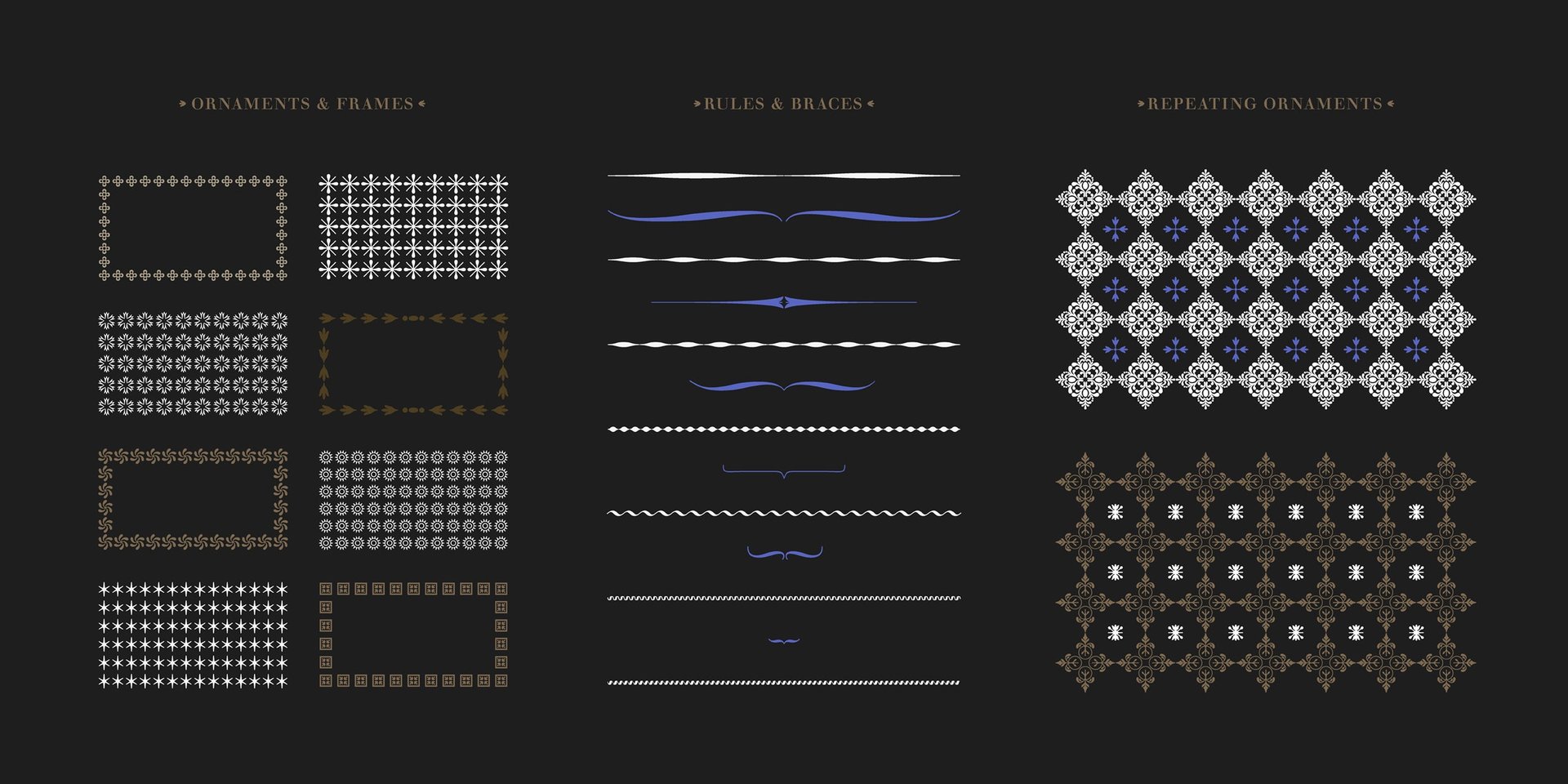
Walbaum originally developed 28 size variations of the serif in the 1800s—including numerals, decorative ornaments to separate blocks of text, and mathematical symbols—but most digital revivals prior to Monotype’s restoration were based on just one master. “This is something endemic when the digital type revival happened,” says Crossgrove, referring to the era in which the works of famous typographers such as John Baskerville, William Caslon, and Claude Garamond were recreated in pixel versions for use on PCs. “It probably has to do with marketing or cost of manufacture…There are a lot forces sweeping aside all the additional rich material that you can have.”
But this one-size-fits-all approach is changing, says Crossgrove. “[Type designers] have been restoring the idea that type can be made for a specific size use…It’s not a new thing to do that but it’s one of the things that was lost in these technological changes.”
And why do type restorations matter for non-font geeks? For those of us who do extended reading on our various screens and media devices (basically, all of us) ease of reading can make a big difference. “The legibility is improved dramatically,” says Nix, referring to the restored Walbaum font. “My experience as a book designer and as a reader, it’s very obvious that the careful attention to the spacing, the shape of the form of those smaller sizes, the adjustment of serif length and overall aesthetic in addition to that—make for a much better reading experience.”