Get ready for the Bauhaus centennial festivities—and it all starts with these fonts
Next year marks the 100th anniversary of the Bauhaus, which many consider the most influential modern design and architecture school ever established. Founded in 1919 in Germany by architect Walter Gropius, Staatliches Bauhaus promoted a philosophy that combined traditional crafts, fine arts, and technology as a method for generating design solutions for the greatest number of people. Though the school closed after 14 years after yielding to Nazi pressure, its egalitarian principles and its famous graduates and teachers have shaped modern cities around the world.
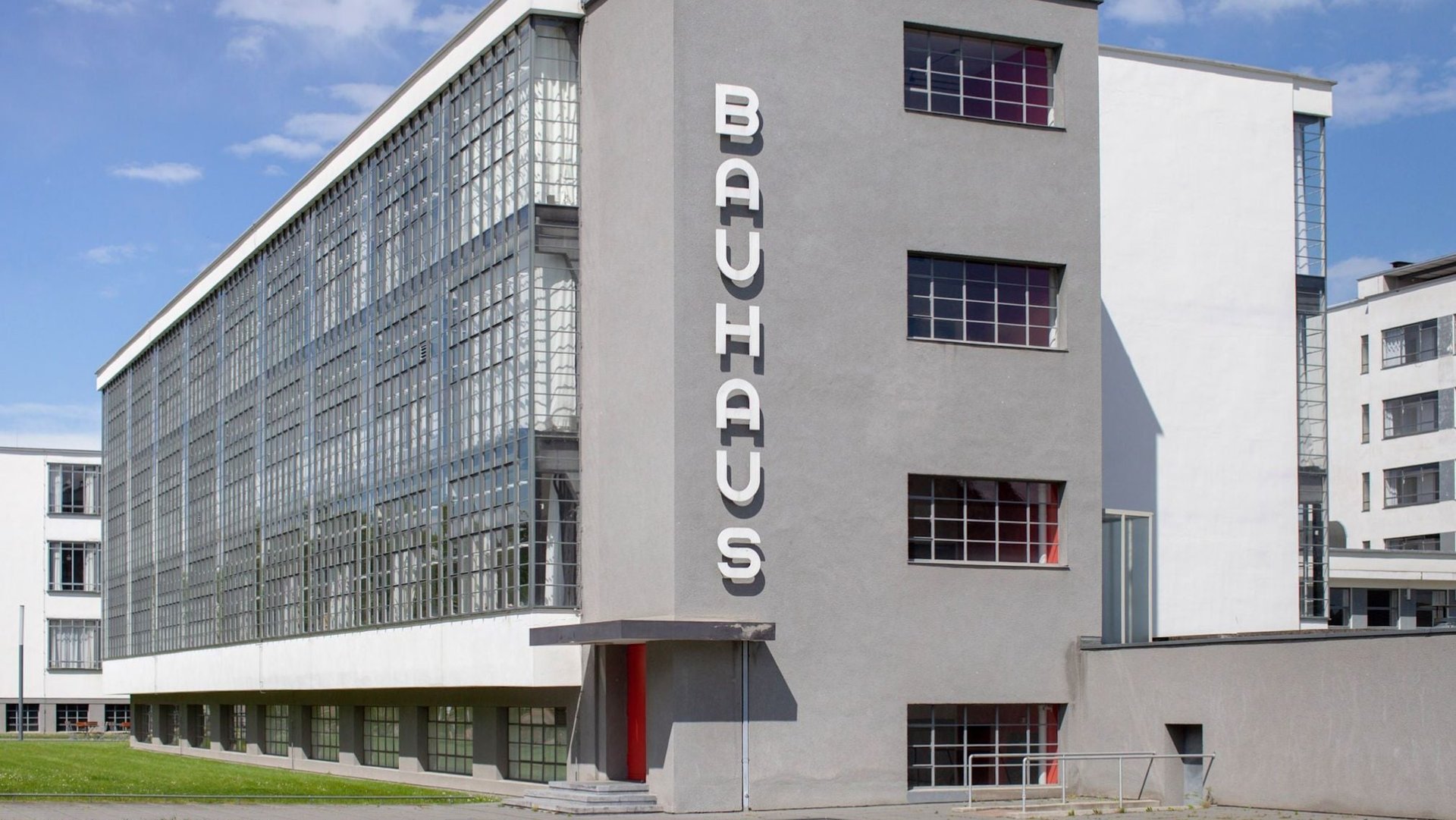

Next year marks the 100th anniversary of the Bauhaus, which many consider the most influential modern design and architecture school ever established. Founded in 1919 in Germany by architect Walter Gropius, Staatliches Bauhaus promoted a philosophy that combined traditional crafts, fine arts, and technology as a method for generating design solutions for the greatest number of people. Though the school closed after 14 years after yielding to Nazi pressure, its egalitarian principles and its famous graduates and teachers have shaped modern cities around the world.
Bauhaus 100-themed activities are already gearing up in Germany, and one exciting initiative called “Adobe Hidden Treasures: Bauhaus Dessau” offers anyone in the world a way to declare their allegiance to the progressive school right from their desktop. Available on Adobe’s font subscription service Typekit are the first two of five new digital typefaces inspired by lettering samples rescued from the archives of the Bauhaus Dessau Foundation.
The typefaces are named after former Bauhaus masters and students: “Joschmi” after the typography instructor Joost Schmidt, “Xanti” for set design teacher Xanti Schawinsky, “Alfarn” for architect Alfred Arndt, “Reross” for type designer Reingold Rossig and “Carl” for painter Carl Marx (not to be confused with the author of the Communist Manifesto, Karl).
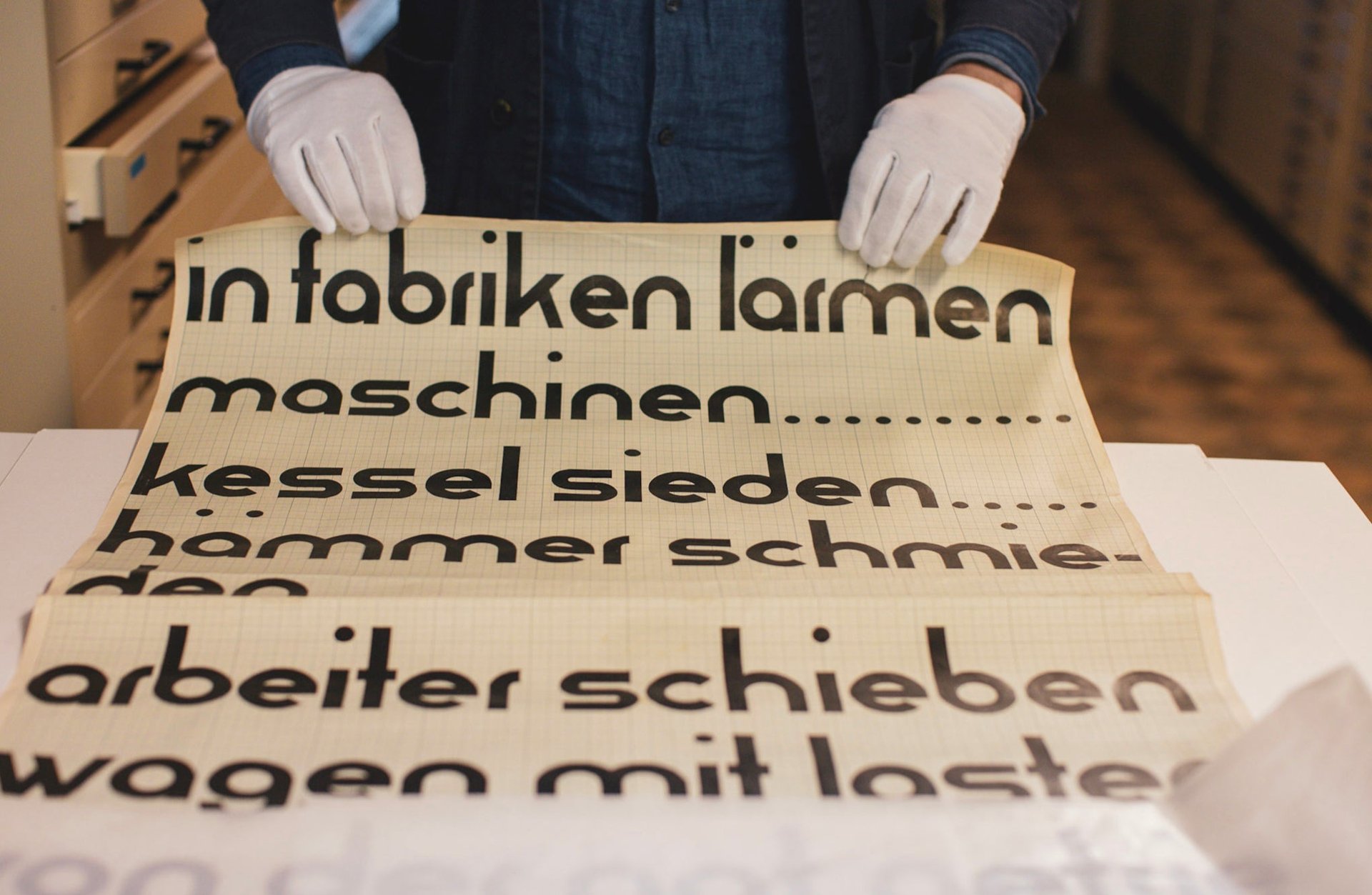
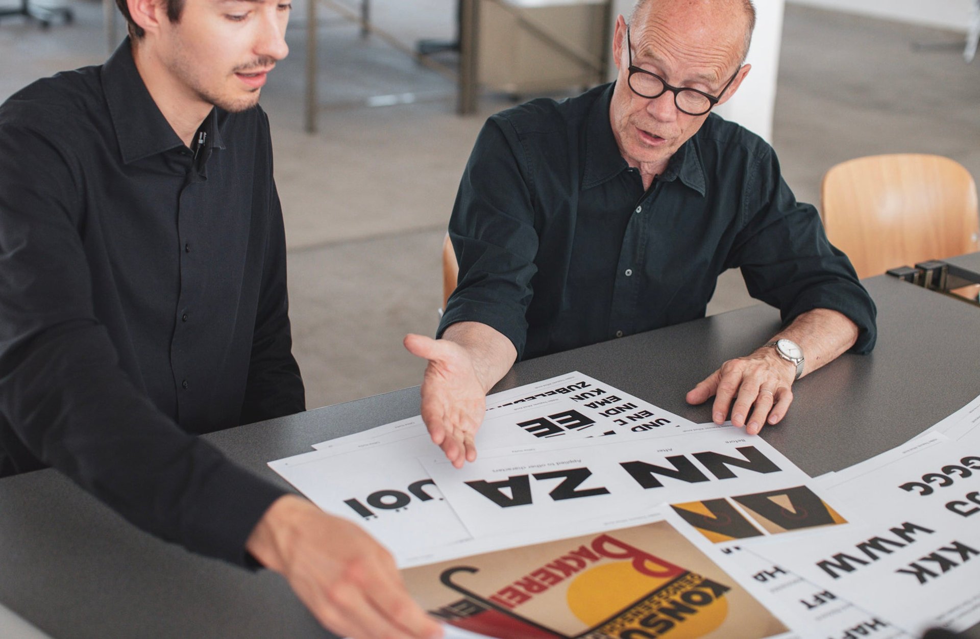
In the spirit of keeping things in the school setting, five young type design students were handpicked from prestigious design universities in the US, UK, Germany, Switzerland and the Netherlands to develop the Bauhaus Dessau fonts. Under the guidance of celebrated German type designer and writer Erik Spiekermann, the designers extrapolated complete alphabets and glyphs from fragments found in the yellowing archival sheets. “The students at the Bauhaus were given exercises to draw letterforms, not to design typefaces,” explains Spiekermann. “The tools did not exist to do so at a school in 1928. So we imagined what the students would have done had they had computers and type design software.”
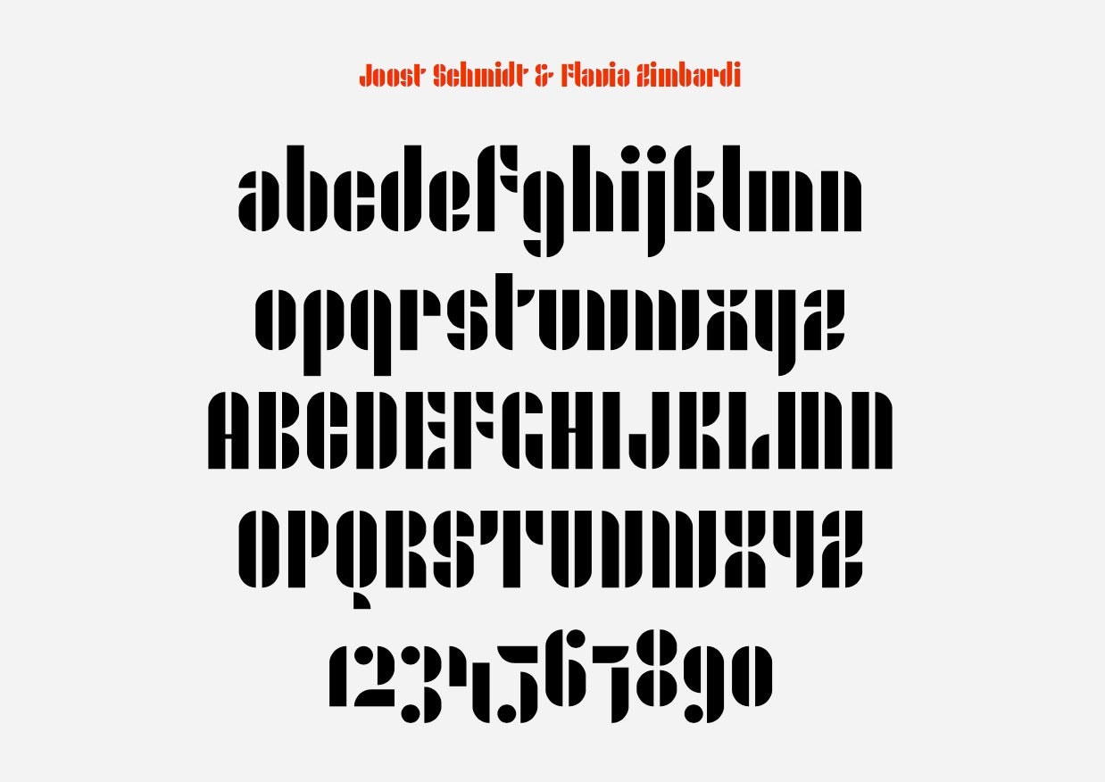
Developing the font families required getting into the mind of the original designer, says Type@Cooper graduate Flavia Zimbardi who developed the stencil-style face, Joschmi. A fan of Schmidt’s work cover designs and posters, she seized the opportunity to develop a typeface in his honor. “Only six lowercase letters were found in the archives which gave me the opportunity to complete a typeface started by one of the most visionary typographers of the early 20th century,” she tells Quartz.
University of Reading graduate Hidetaka Yamasaki started with a rather crude sample drawn by Marx, a painter who cherished being seen as an outsider in the arts scene. “His [Marx’s] sketch conveys a comfortable, warm feeling, and I assume that he made them by trial and error. The letter shapes are a blend of geometry and organic form. The greatest challenge of my project involved carrying over the warm atmosphere of Marx’ handrawn sketch into digital form,” says Yamasaki.
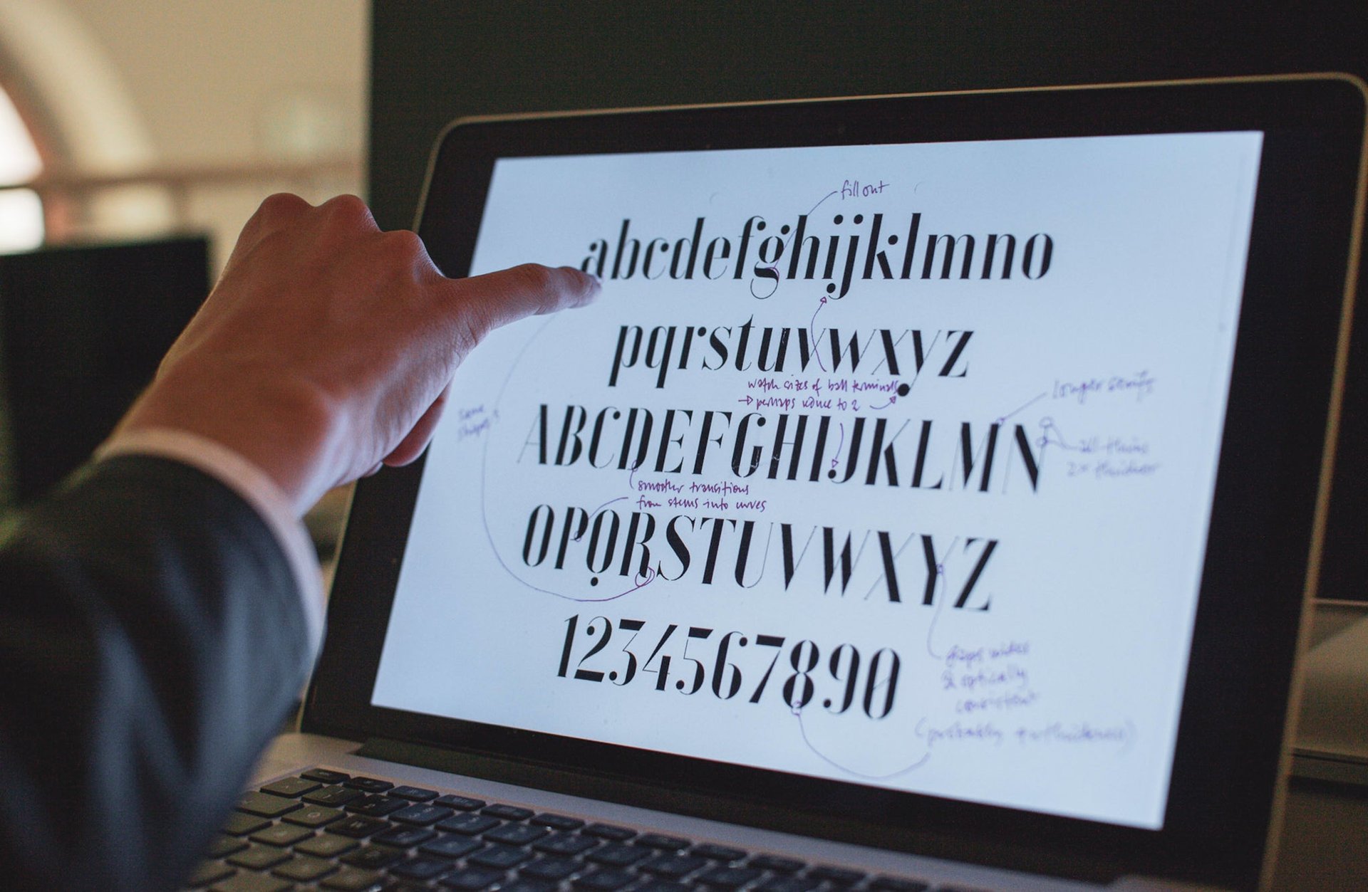
Even with the thousands of commercially-available fonts available, Spiekermann says the Bauhaus Dessau’s fascinating creation story offers an extra layer of pleasure for font nerds. “Typefaces are the visual voice of language. Designers always need more nuances,” he says. “Font design based on a 90-year history is a great story to tell.”