An 18th-century geologist emerges as 2019’s most insightful color guru
In 1774, a 25-year-old geologist published an academic textbook that would become a color bible for today’s designers. In Von den äusserlichen Kennzeichen der Fossilien (Treatise on the External Characters of Fossils), Abraham Gottlob Werner included a comprehensive color index to help scientists classify minerals and fossils.


In 1774, a 25-year-old geologist published an academic textbook that would become a color bible for today’s designers. In Von den äusserlichen Kennzeichen der Fossilien (Treatise on the External Characters of Fossils), Abraham Gottlob Werner included a comprehensive color index to help scientists classify minerals and fossils.

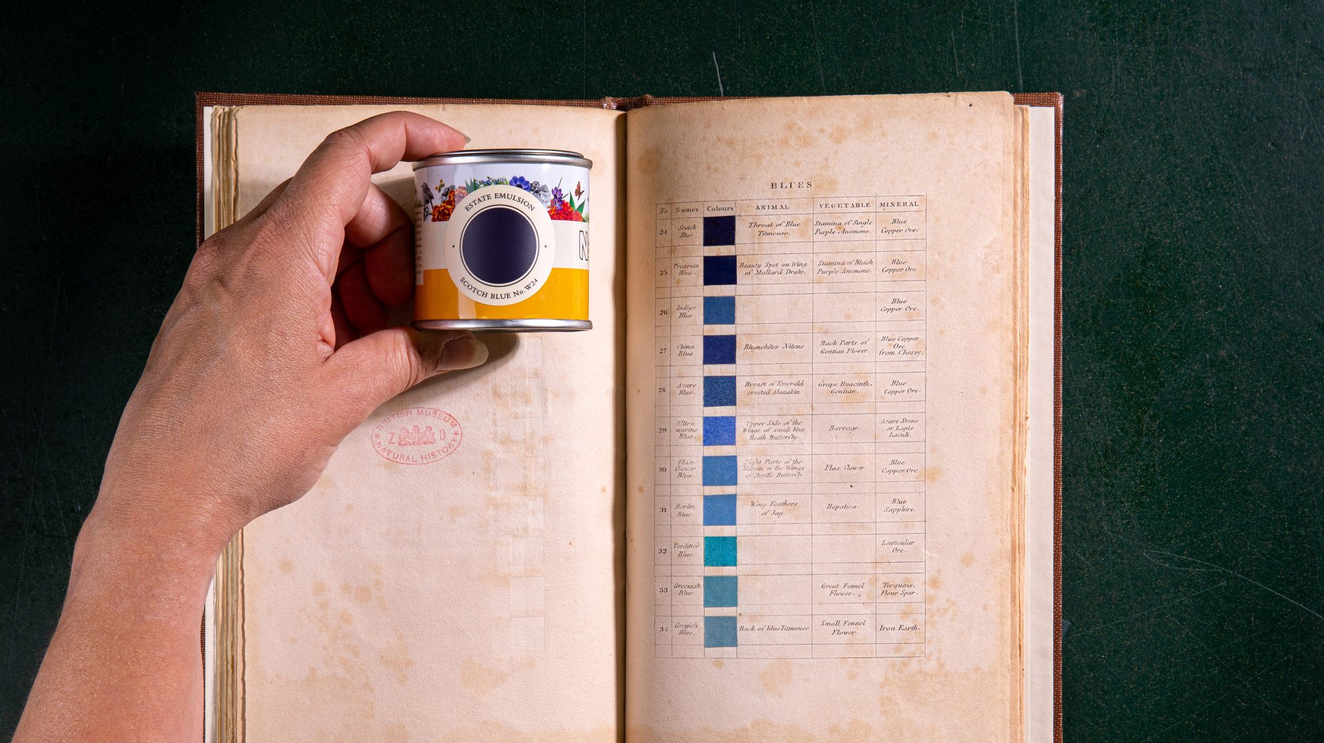
Werner’s chromatic notes intrigued many beyond the mineralogy circles artists including British painter Patrick Smye who charted and illustrated his notations with corresponding tints. First published in 1814, Smye’s book Werner’s Nomenclature of Colours lists names with “as-seen-in” examples found in nature. For instance, the color Snow White can be seen in the “breast of the black headed gull, a snow drop, Carara Marble [sic] and calcareous sinter,” Smye suggests.
Embraced by artists and scientists alike, Werner’s color taxonomy gave people the language to describe a specific color. One famous example: Charles Darwin referred to Werner’s Nomenclature to describe moving cuttlefish as “clouds varying in tint between hyacinth red and chestnut brown.” He called glaciers in South America “beryl blue,” likening it to the hazy blue-green mineral Werner cites.
Now, Werner’s Nomenclature has inspired new paint colors from the British brand Farrow & Ball. The Dorset-based household paint and wallpaper company worked with copies of Werner’s Nomenclature from London’s Museum of Natural History’s to arrive at the 16 newest colors in their lineup.
Farrow & Ball commissioned interior designer Robin Standefer and partner Stephen Alesch to demonstrate how to use the new colors like Broccoli Brown, Dutch Orange, Scotch Blue, or Verdigris Green. The duo, who run the celebrated New York-based studio Roman and Williams, is perhaps most widely known for defining the hipster aesthetic through their work for the Ace Hotel chain.
Consulting Werner’s Nomenclature reminds us to observe phenomena with our own senses as he did, says Standefer. “It was before people thought about naming a color from their imagination. They said ‘Sap Green’ because that’s what they were seeing. There’s a simplicity and almost childlike innocence to that,” she says.
Offering a counterpoint to an over-reliance on branded color standards manuals and pre-packaged color trends, Alesch suggests that observing the natural world can teach us a lot about how colors behave and mutate.”What I love about Werner’s Nomenclature is that you see the human struggle to try to define colors, which is indeed very hard to do,” he says. “Naming the tonalities at twilight is so much more romantic without holding up a Pantone book to the sky.”