In order to predict the future, the ancient Romans would often sacrifice an animal, open up its guts and look closely at its entrails. Since the discovery of an Excel spreadsheet error in Carmen Reinhart and Ken Rogoff’s analysis of debt and growth by University of Massachusetts at Amherst graduate student Thomas Herndon and his professors Michael Ash and Robert Pollin, many economists have taken a cue from the Romans with the Reinhart and Rogoff data to see if there is any hint of an effect of high levels of national debt on economic growth. The two of us gave our first take in analyzing the Reinhart and Rogoff data in our May 29, 2013 column. We wrote that “…we could not find even a shred of evidence in the Reinhart and Rogoff data for a negative effect of government debt on growth.”
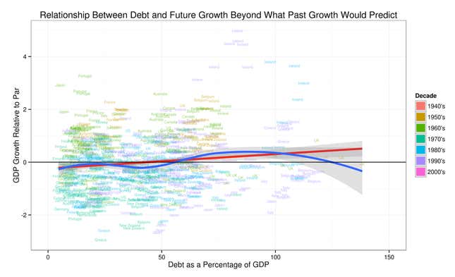
Our further analysis since then (here, and here), and University of Massachusetts at Amherst Professor Arindrajit Dube’s analysis since then and full release of his previous work (here, here, and here) in response to our column have only confirmed that view. (Links to other reactions to our earlier column can be found here.) Indeed, although we have found no shred of evidence for a negative effect of government debt on growth in the Reinhart and Rogoff data, the two of us have found at least a mirage of a positive effect of debt on growth, as shown in the graph above.
The point of the graph at the top is to find out if the ratio of debt has any relationship to GDP growth, after isolating the part of GDP growth that can’t be predicted by past GDP growth alone. Let us give two examples of why it might be important to adjust for past growth rates when looking at the effect of debt on growth. First, if a country is run badly in other ways, is likely to grow slowly whatever its level of debt. In order to see if debt makes things worse, it is crucial to adjust for the fact that it was growing slowly to begin with. Second, if a country is run well, it is likely to grow fast while it is in the “catch-up” phase of copying proven techniques from other countries. Then as it gets closer to the technological frontier, its growth will naturally slow down. If getting richer in this way also tends to lead through typical political dynamics to a larger welfare state with higher levels of debt, one would see high levels of debt during that later mature phase of slower growth. This is not debt causing slow growth, but economic development having two separate effects: the slowdown in growth as a country nears the technological frontier, and the development of a welfare state. Adjusting for past growth helps us adjust for how far along a country is in its growth trajectory.
In the graph, if “GDP Growth Relative to Par” is positive, it means GDP growth is higher in the next 10 years than would be predicted by past GDP growth alone. If “GDP Growth Relative to Par” is negative, it means GDP growth is lower in the next 10 years than would be predicted by past GDP growth. (Here, in accounting for the effect of past GDP growth, we use data on the most recent five past years individually, and the average growth rate over the period from 10 years in the past to five years in the past.) The thick red line shows that, overall, high debt is associated with GDP growth just a little higher than what one would guess from looking at the past record of GDP growth alone. The thick blue curve gives more detail by showing in a flexible way what levels of debt are associated with above par growth and what levels of debt are associated with below par growth. We generated it with standard scatterplot smoothing techniques. The thick blue curve shows that, in particular, GDP growth seems surprisingly high in the range from debt about 60% of GDP to debt about 120% of GDP. Higher and lower debt levels are associated with future growth that is somewhat lower than would be predicted by looking at past growth alone. Interestingly, debt at 90% of GDP, instead of being a cliff beyond which the growth performance looks much worse, looks like the top of a gently rounded hill. If one took the tiny bit of evidence here much, much more seriously than we do, it would suggest that debt below 90% of GDP is just as bad as debt above 90% of GDP, but that neither is very bad.
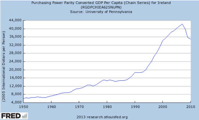
Where does the evidence of above par growth in the range from 60% to 120% of GDP come from? Part of the answer is Ireland. In particular, all but one of the cases when GDP growth was more than 2.5% per year above what would be expected from looking at past growth occurred in a 10-year period after Ireland had a debt to GDP ratio in the range from 60% to 120% of GDP. It is well-known that Ireland has recently gotten into trouble because of its debt, but what does the overall picture of its growth performance over the last few decades look like? Here is a graph of Ireland’s per capita GDP from the Federal Reserve Bank of St. Louis data base:

The consequences of debt have reversed some of Ireland’s previous growth, but it is still a growth success story, despite the high levels of debt it had in the 1980s and ’90s.
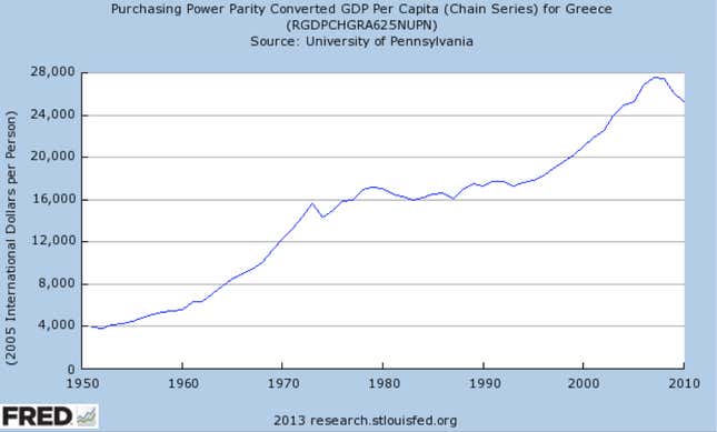
In addition to Ireland, a bit of the evidence for good growth performance following high levels of debt comes from Greece. As the graph below shows, Greece has had more impressive growth in the last two decades than many people realize, despite the hit it has taken recently because of its debt troubles.

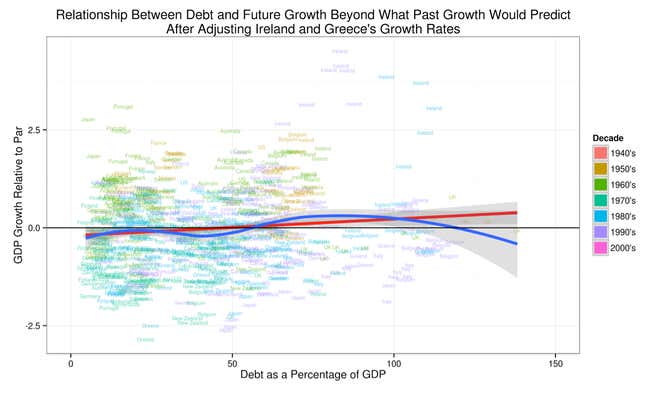
We did a simple exercise to see if the bump up in the thick blue curve in the graph at the top is entirely due to Ireland’s and Greece’s growth that has been reversed recently because of their debt troubles. To be sure that the bad consequences of Ireland’s and Greece’s debt for GDP in the last few years were accounted for when looking at the effect of debt on growth, we pretended that the recent declines in GDP had been spread out as a drag on growth over the period from 1990 to 2007 instead of happening in the last few years. Then we redid our analysis. Making this adjustment to the growth data is a simple, if ad hoc, way of trying to make sure that the consequences of Irish and Greek debt are not missed by the analysis.
Imagining slower growth earlier on to account for Ireland’s and Greece’s recent GDP declines makes the performance of Ireland and Greece in that period from 1990 to 2007 look less stellar. The key effect is on the thick blue curve estimating the effect of debt on growth. Looking closely at the graph below after adjusting Ireland’s and Greece’s growth rates, you can see that the bump up in the thick blue curve in the range where debt is between 60% and 120% of GDP has been cut down to size, but it is still there. So the bump cannot be attributed entirely to Ireland and Greece “stealing growth from the future” with their high levels of debt.

We want to stress that there is no real justification for making the adjustment for Ireland and Greece that we made except as a way of showing that the argument that Ireland and Greece had high growth in the 1990s and early 2000s, but now have had to pay the piper is not enough to turn the story about the effects of debt on growth around.
There are three broader points to make from this discussion of Ireland and Greece.
- We still don’t recommend taking the upward bump in growth predicted by the thick blue curves in the 60% to 120% ranges for debt should not be taken seriously.
- The fact that looking at the experience of two countries in two decades can account for a good share of the bump up in the 60% to 120% ranges illustrates just how little there is to go on from the Reinhart and Rogoff data set. Our scatter plots with the thick blue curves give the impression of more than there really is, because we have dots for growth from 1970 to 1980 and 1971 to 1981 and 1972 to 1982, and so on. And there is no way to escape this kind of issue when the economic forces one is interested have both short-run and long-run effects, and change as slowly over time as levels of national debt do. There are advanced statistical methods for correcting for such issues; the corrections almost always go in the direction of saying that there is less evidence in a set of data than it might seem. Even without being experts ourselves in making those statistical corrections, we feel reasonably confident in saying that the Reinhart and Rogoff data speak very softly about any positive or negative effect of debt on growth at all: barely a whisper.
- Third, the inclusion of Ireland and Greece and the fact that the basic story survives after pretending their GDP declines were a drag on growth earlier contradicts to some extent the claim of economics blogger and blog critic Paul Andrews in his post “None the Wiser After Reinhart, Rogoff, et al.” that Reinhart and Rogoff’s data focus on “20 or so of the most healthy economies the world has ever seen.” After adjusting for the hit their economies have taken recently, the inclusion of Ireland and Greece gives some perspective on the effects of debt on the growth of economies that have subsequently had problems paying for their debt. There could certainly be other economies whose growth is more vulnerable to debt than Ireland and Greece, but to us these seem like exactly the kinds of cases people would have in mind when they argue that one should expect debt to have a negative effect on growth.
Understanding all of this matters because, as Mark Gongloff of Huffington Post writes:
Reinhart and Rogoff’s 2010 paper, “Growth in a Time of Debt,” … has been used to justify austerity programs around the world. In that paper, and in many other papers, op-ed pieces and congressional testimony over the years, Reinhart and Rogoff have warned that high debt slows down growth, making it a huge problem to be dealt with immediately. The human costs of this error have been enormous.
Even though there are many effective ways to stimulate economies without adding much to their national debt, the primary remedies for sluggish economies that are actually on the table politically are those that do increase national debt, so it matters whether people think debt is damning or think debt is just debt. It is painful enough that debt has to be paid back (with some combination of interest and principal), and high levels of debt may help cause debt crises like those we have seen for Ireland and Greece. But the bottom line from our examination of the entrails is that the omens and portents in the Reinhart and Rogoff data do not back up the argument that debt has a negative effect on economic growth.


