Puffin has radically redesigned the covers of classic children’s books using Pantone colors
You’ve seen it in cosmetics, Starbucks coffee cups, and even hospital scrubs, and now Pantone mania has infiltrated the children’s book section.


You’ve seen it in cosmetics, Starbucks coffee cups, and even hospital scrubs, and now Pantone mania has infiltrated the children’s book section.
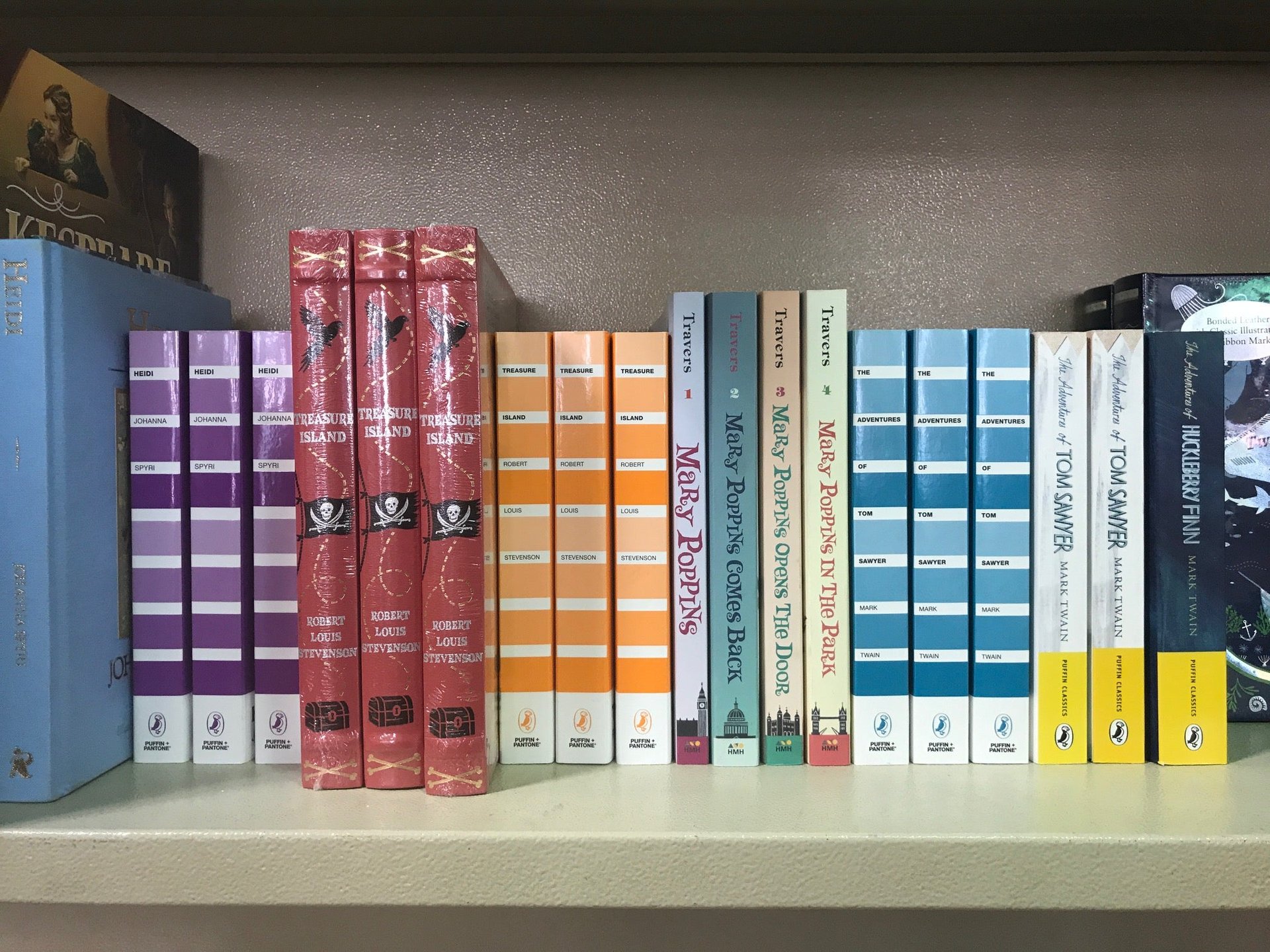
A series of literary classics cloaked in stark, plain covers are designed to look like the color-standard company’s iconic color-specification chips. Published by Puffin Books this month, the set is touted as an alternative to illustrated book covers that young readers have come to expect.
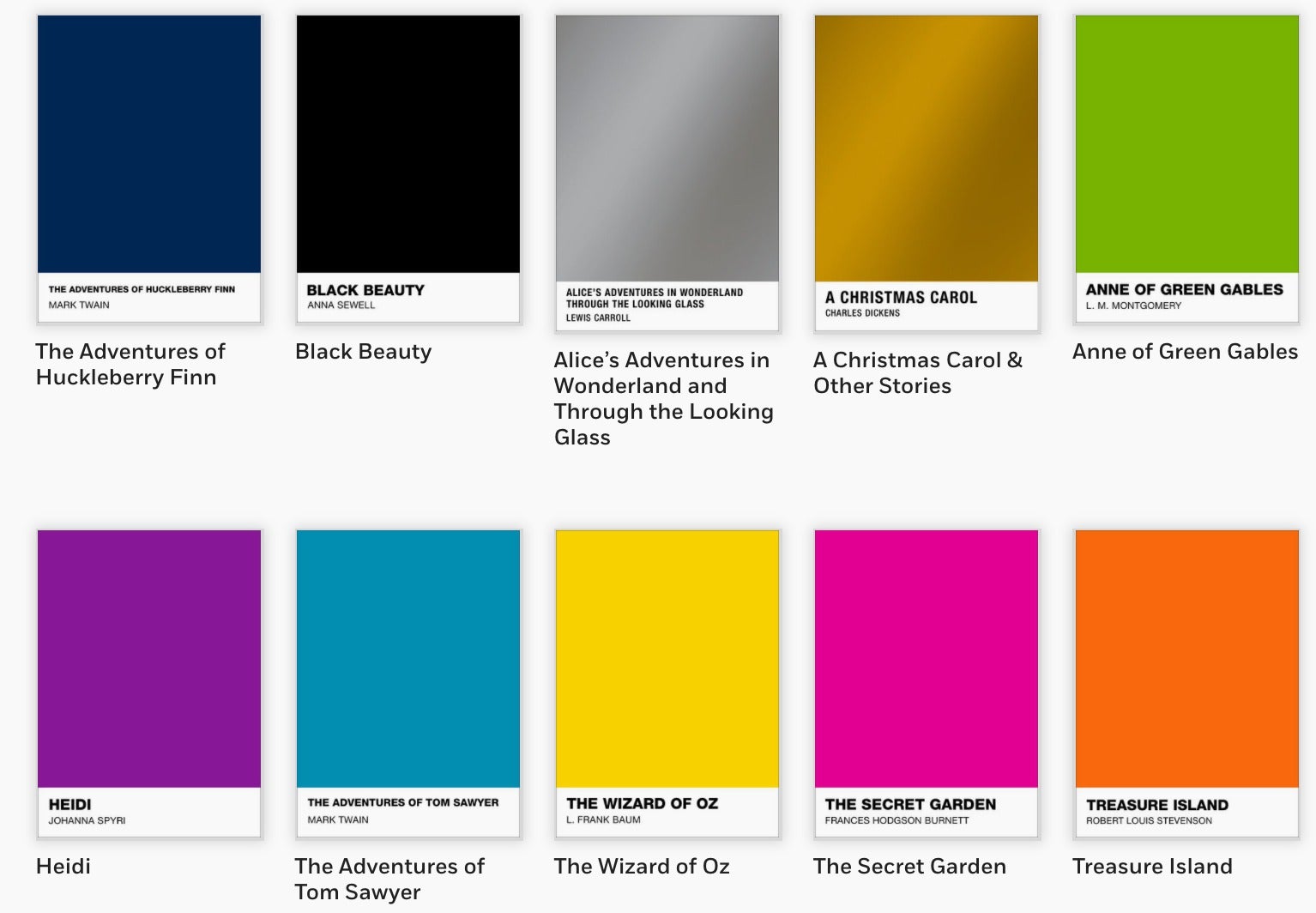
The project is the brainchild of graphic designer Danielle Calotta, who used a process of free association to come up with the color for each title. Some choices were obvious: green for Anne of Green Gables; black for Black Beauty; metallic gold for A Christmas Carol. Others titles were harder, like The Wizard of Oz, which is covered in a sunny yellow hue. “Some people don’t know that her [Dorothy’s] original shoes [in the book] were silver, but a lot of people know her ruby red shoes. Then there’s also Emerald City, but inevitably, we settled with the yellow brick road,” explains Calotta.
The designer says her formulaic approach is just another way to think about book covers, and not meant to entirely replace illustrated versions. “This is a modern twist to children’s classics,” she explains. “I don’t know why they can’t both exist.”
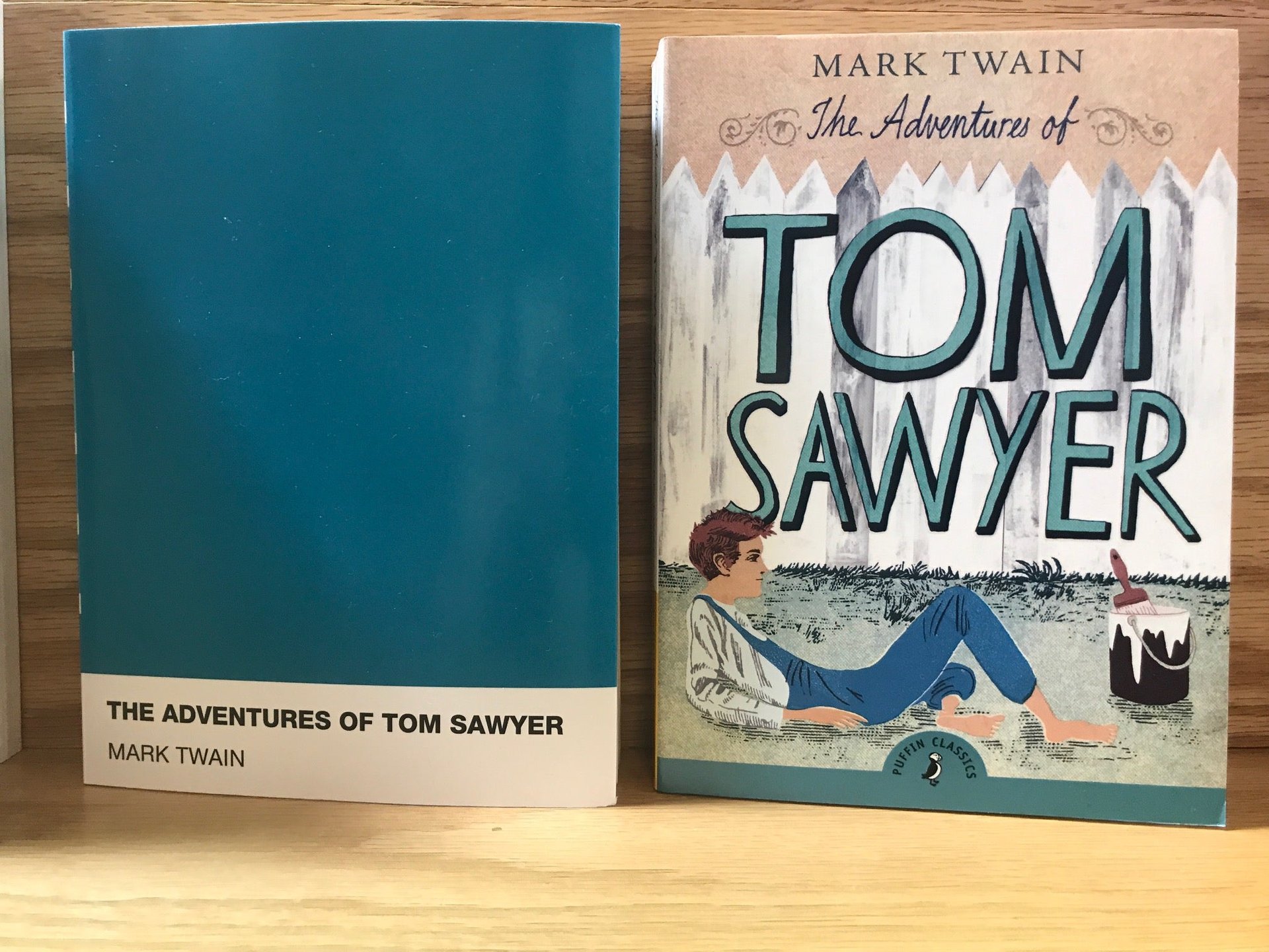
Seeing the two covers side-by-side presents a startling contrast. On one hand, the nostalgic appeal of charming illustrations is unassailable, but the shock of plain covers in a crowded bookshelf draws the eye. “It takes you by surprise,” says book editor Dana Leydig. “With all the books out there, it’s so difficult to make a book that people will look at.”
Reader’s review
But what do Puffin’s target readers think of these minimalist covers? Will it work for middle schoolers who have yet to be exposed to the cult of Pantone?
Nine-year old Izzy, an avid reader who had never heard of Pantone before, thinks that both cover-design options are useful. Comparing two editions of The Wizard of Oz, she says the version she would be more drawn to when browsing at the bookstore “depends on the day I was having. The one that’s more plain looks neat. The other one looks more exciting and kid-friendly. If I wanted to just get into the story, I would go with the plain one.”
Izzy says that using color as book covers is an interesting tactic because it adds a layer of mystery for the reader, who “can think about why the color is good for the story or why it’s not,” and she agrees that it’s a more mature look overall.
But in choosing books, Izzy says, the most important thing to look at is the blurb on the back. “Even if I don’t really like the [front] cover I still look at the back, because you should never really judge a book by the cover,” she says. Izzy is disappointed that the back of the Pantone version says nothing about L. Frank Baum’s masterpiece.
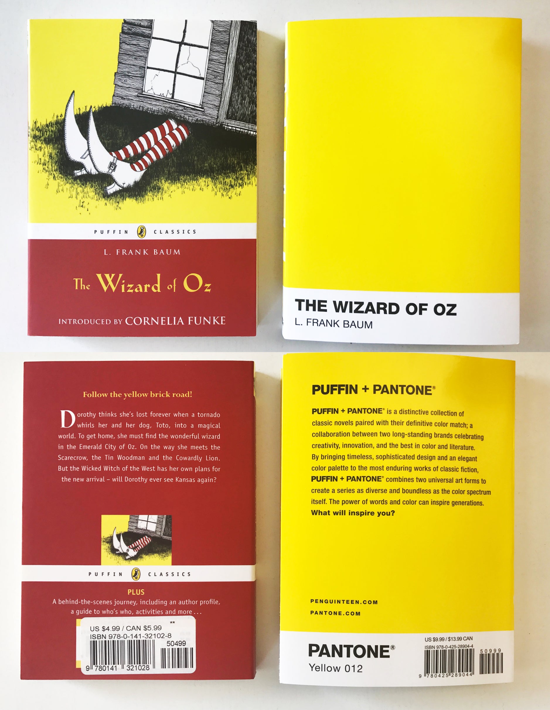
Instead of a useful plot summary, the back cover of the Pantone series features slick marketing drivel about the Puffin-Pantone collaboration. To find the book-jacket blurb, you have to look at the flap on the front cover. The back flap, meanwhile, features a Pantone color strip, an Easter egg of sorts for graphic designers but something likely to go over the heads of young readers.
By surrendering the book’s form to Pantone’s design vernacular, it makes it seem like the books are sponsored or at least subsidized by the New Jersey-based color-standards company. The irony is that the Pantone series, which retails at $9.99, is almost double the $4.99 I paid for the illustrated version.
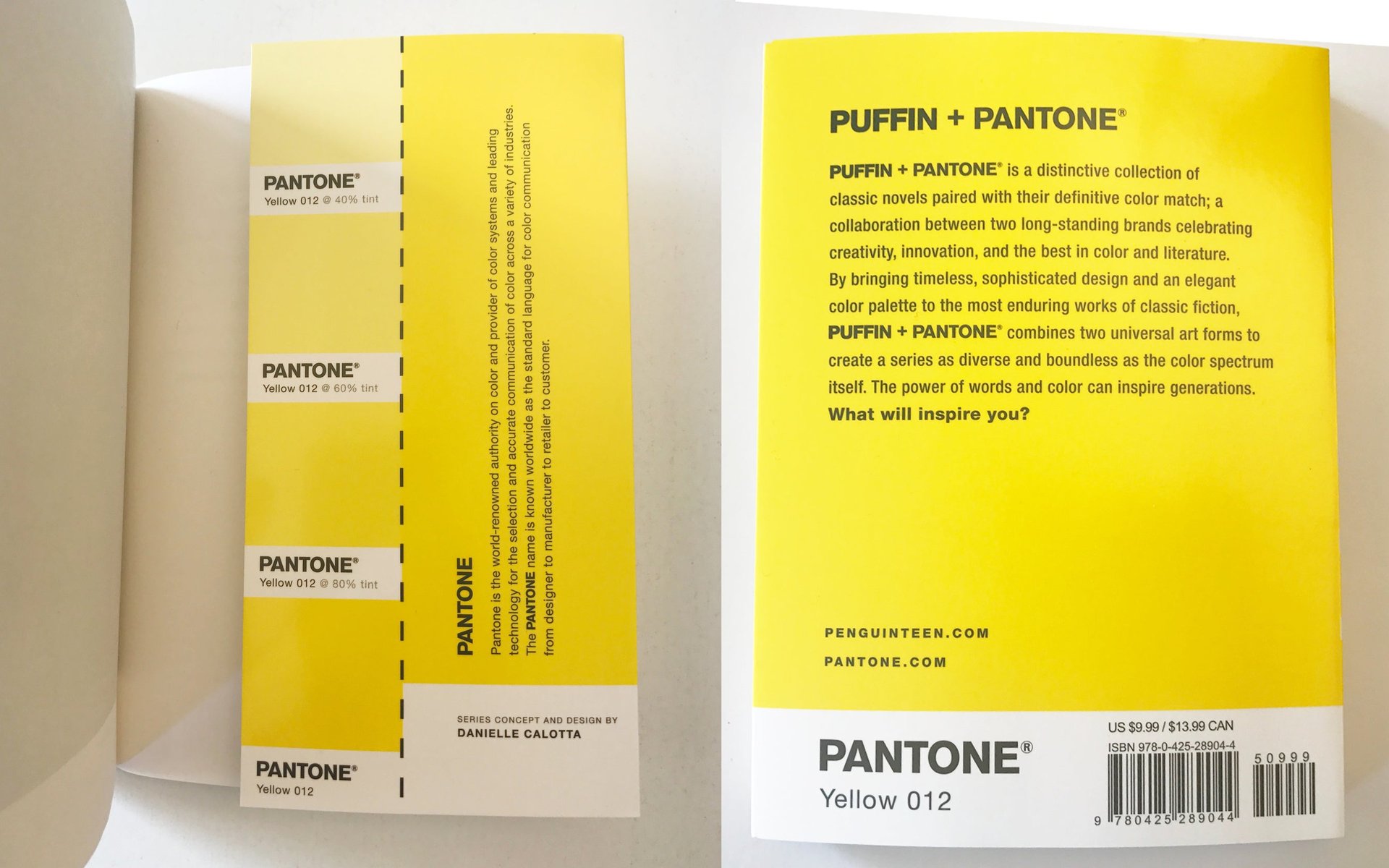
Perhaps the old maxim should be updated, as the astute Izzy suggests: Never judge a book by its front cover, but you can learn a lot from the back.