All hail ggplot2—The code powering all those excellent charts is 10 years old
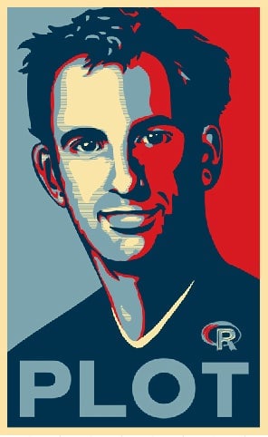
On June 10, 2007, the statistician and developer Hadley Wickham officially released ggplot2, a chart-making system for the statistical programming language R. It would alter the course of his life and the future of data visualization.


On June 10, 2007, the statistician and developer Hadley Wickham officially released ggplot2, a chart-making system for the statistical programming language R. It would alter the course of his life and the future of data visualization.
“When I created it, I was hoping that maybe a thousand people use it,” Wickham told Quartz. “At the time, that seemed like an incredibly large number.”
In just the last five years, ggplot2 has been downloaded well over 10 million times, with more than 400,000 downloads in the month before this article was published. Data scientists at top tech companies, the US government, and journalists at publications like the New York Times all use the program to analyze and present data. Like R, ggplot2 is free and open source.
The success of the visualization program has allowed Wickham, a former professor at Rice University who is originally from New Zealand, to leave academia and pursue his dreams of making R the perfect data-analysis language. He now has four people that work for him full time at the company RStudio on the pursuit. “I truly can’t imagine what my life would be like without the success of ggplot2,” said Wickham.

Wickham’s inspiration for making the program came from the book The Grammar of Graphics, Leland Wilkenson’s “magnum opus” (pdf) on the components of data visualization. The “gg” in ggplot2 stands for “grammar of graphics”.
Wilkenson’s book helped Wickham see the fundamental relationships between different types of charts. “One idea that really stuck with me is that a pie chart is just a bar chart drawn in polar coordinates,” said Wickham. “They look very different, but in terms of the grammar they have a lot of underlying similarities.”
Understanding these foundational similarities allowed Wickham to build the simple ggplot2 code that made creating complex graphics intuitive for millions of people. Wickham believes that the charting programs (or “packages” in R programmer speak) that existed before ggplot2 were less successful, in part, because they were unappealing from a theoretical point of view.
Wickham believes two other factors account for ggplot2’s massive popularity.
First, the R language in general exploded in popularity over the past decade. It is difficult to estimate exactly how many people are using R at any given time. One way to measure the growth of a program’s popularity is to look at the number of questions about the topic on Stack Exchange, the popular programming forum. In January 2011, there were just 251 questions asked about R in the forum. In January 2017, there were nearly 4,000.
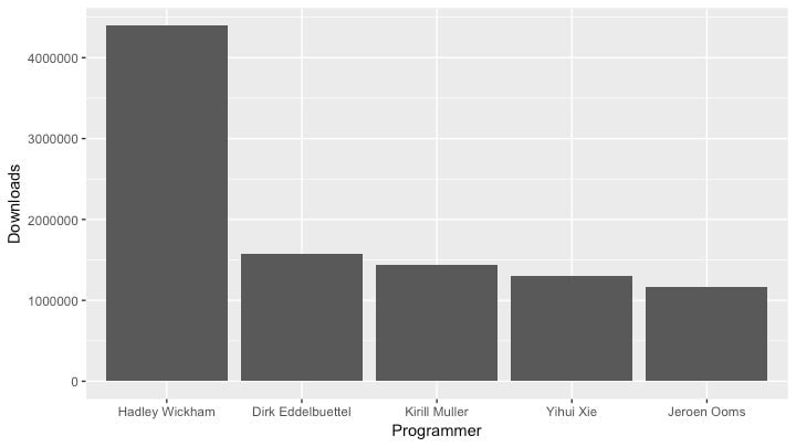
Second, Wickham ascribes ggplot2’s popularity to his effort to make the defaults aesthetically pleasing—at least relative to most programming software. It’s easiest to see this in an example. Let’s say you have a dataset of the R programmers with the most programs downloaded between May 17 and June 15, 2017.
The code to make the following decent looking column chart is relatively straightforward:
ggplot(dataset, aes(x = Programmer, y = Downloads)) + geom_col()

It might not look incredible, but this is very close to usable for a presentation, and certainly good enough for exploring data. Adding bells and whistles to a chart like this is relatively easy once you get the hang of it.
Wickham says that though he is proud that ggplot2 is used in media and by prominent academics, he is most excited when it empowers curious individuals working on quirky projects. “People with a lot of resources probably would have succeeded no matter what,” said Wickham. “I am more motivated by the people who maybe would have struggled more without it.” He particularly loved when one analyst used ggplot2 to look into the factors that lead to success on the reality TV show RuPaul’s Drag Race.
Ten years after ggplot2’s release, Wickham wonders how much longer his program will dominate chart making in R. “It really feels to me now like ggplot2 is ripe for disruption,” said Wickham. “I’m surprised some young gun hasn’t come along, and thought, ‘Wow this is crap,’ and done better. But so far, it hasn’t really happened.”