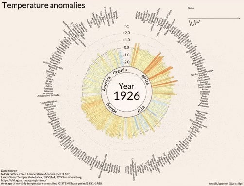
Sometimes you need a pulsing red circle of data to understand how abnormally hot Earth is getting
Earth is constantly breaking heat records. The latest international State of the Climate report noted that 2016 was the hottest year on record, and NASA just announced that July 2017 tied with July 2016 as the hottest July on record. We’ve heard a variation on this theme, well, a few times: 16 of the 17 warmest years on record have all happened since 2001.


Earth is constantly breaking heat records. The latest international State of the Climate report noted that 2016 was the hottest year on record, and NASA just announced that July 2017 tied with July 2016 as the hottest July on record. We’ve heard a variation on this theme, well, a few times: 16 of the 17 warmest years on record have all happened since 2001.
The whole premise of heat records is abnormality. But as the headlines pile up, it can be difficult to keep in perspective how unprecedented the trend really is. Some scientists call this “shifting baseline syndrome“—when we become numb to the severity of the situation simply because we start to forget where the baseline was before.
That’s where visuals come in.
Antti Lipponen, a climate researcher at the Finnish Meteorological Institute, put together a striking graphic using 1900-2016 global surface temperature data pulled from NASA’s Goddard Institute for Space Studies’ Surface Temperature Analysis (GISTEMP).
Watch to the end as the bars—they represent the severity of abnormally high temperatures in different countries—begin to radiate outward in more places in the 1990s. By 2016, they form a sort of pulsing red circle.
July 2017, which brought uncharacteristic wildfires to Europe, looks like this in Lipponen’s graphic representation:
Globally, it tied July 2016 as the hottest in recorded history, but Lipponen points out that in some regions, it exceeded July 2016’s heat: