Charts are cool. But they are not always necessary, or even helpful. I am here to make a case for the humble, effective table.
Charts are cool. But they are not always necessary, or even helpful. I am here to make a case for the humble, effective table.
While the use of tables to display data in rows and columns goes back, at least, to the 2nd century, the chart is a relatively new innovation. Bar, line, and pie charts, the workhorses of data visualization, were all invented by Scottish political economist William Playfair at the turn of the 18th century. Playfair thought his charts were a particularly excellent way to show changes of magnitude over time. For example, in one of the earliest known charts, Playfair brilliantly used a line chart to show the evolution of England’s balance of trade.
Join 500,000+ readers who start their day with Quartz.
By subscribing, you agree to our Terms of Service and Privacy Policy.
The goal of putting data into charts, with few exceptions, should be to help people quickly understand numerical patterns and relationships. Charts are often incredibly effective at doing this. The chart below, which shows the stock market capitalization of Tesla $TSLA and Nissan over time, is an example of a visual that allows the reader to rapidly comprehend a large amount of information.
Unfortunately, today, the use of the chart is out of control. Too often, data analysts, businesspeople, and journalists use charts when a table would be better. In many cases, charts actually make the data more challenging to process and understand.
Below is an example of a bar chart from a report to investors published by one of the largest companies in the world.
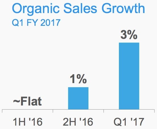
Below, here is the same information in table form.
The table is better. It takes up less space. The chart’s bars, which do essentially no work because we can easily comprehend the relationship between 0, 1, and 3, only move the data label further away from the time period, making the reader’s eyes needlessly shift around.
Such misapplications are common.
Why are charts so overused? It seems to be a case of falling in love with new technology. The ability to make charts easily became accessible to the masses in the 1980s, with the rise of the personal computer and programs like Microsoft $MSFT Excel and Lotus 1-2-3. The use of charts in journalism exploded around this time, and presumably in other domains as well.
With great power comes great responsibility, and many data analysts have abused that power. (I do not exclude myself in this.) Charts can give data an undeserved patina of authority because it shows you have done some additional processing of the information. “It is basically a trade-off: the snazzier your display, the more you can get away with a crappy underlying analysis,” wrote the influential Columbia University statistician Andrew Gelman.
The table may not be sexy. It won’t wow your boss. It won’t win any awards. It won’t get you upvotes on the “Data is Beautiful” subreddit. Still, it is often the best way to actually help people understand your data.