Here’s the takeaway you might have missed about the US jobs report
Today’s US jobs report added to a long string of lackluster monthly installments of data, but at least one thing has been looking up: The unemployment rate is ticking down steadily, dropping almost a tenth of a percentage point with each new report.

Today’s US jobs report added to a long string of lackluster monthly installments of data, but at least one thing has been looking up: The unemployment rate is ticking down steadily, dropping almost a tenth of a percentage point with each new report.
And yet, that doesn’t mean the economy is healing. Unemployment hasn’t been dropping only because more and more people have been finding jobs; more and more people have also been leaving the workforce.

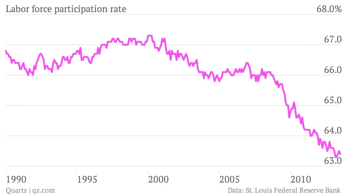
This trend isn’t new: The percentage of working-aged Americans who either have jobs or are looking for them—the so-called labor participation rate—has been dropping since 2000.

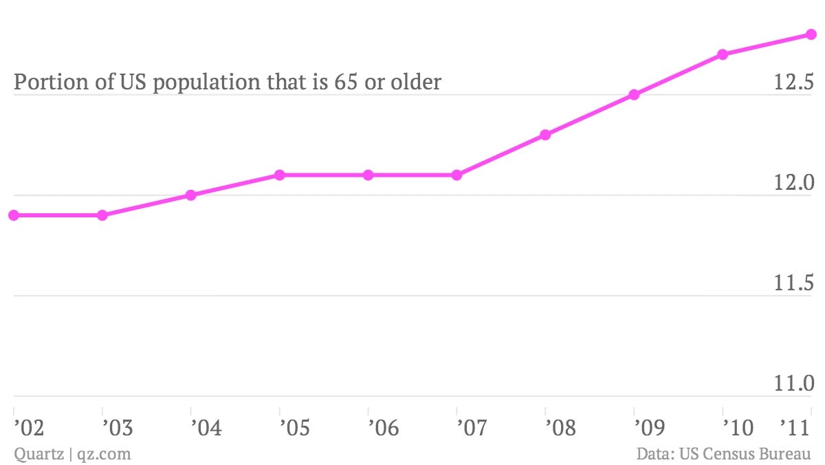
A lack of jobs, especially in the wake of the financial crisis, has nudged people out of the workforce, in some cases driving them back to school. Baby boomers are also starting to leave the workforce as they reach retirement age. In fact, the whole country has been getting steadily older since the early 2000s.

This is all to say that the unemployment rate is a murky measure. When it drops, it can indicate that people are getting work—a sign of a strengthening economy—or that people don’t want to work—which could mean a weakening economy, an aging population, or both. The muddle is concerning, because measuring unemployment is important for things like setting central bank policy. So what are the other options?
The jobs number
The raw number of jobs added to the economy every month is probably the best indicator there is of monthly performance (though not overall health). One thing to watch out for is that the figure comes with an enormous margin of error.
In fact, when the Bureau of Labor Statistics announced that the US added 169,000 jobs in August, what it was really saying was “we are 90% sure that the US added somewhere in between 69,000 jobs and 219,000 jobs in August.” This error is why the number of jobs added in July was revised to 104,000, even though that number was initially reported as 162,000.
The U6
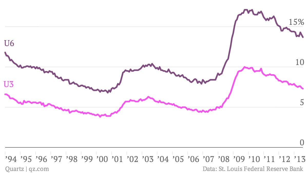
The U6 unemployment rate casts a broader net than the official rate (which is called the U3). It considers as unemployed both people who want a full-time job but are only working part-time and those who have stopped looking for a job within the past year. The latter group is not counted as part of the workforce as far as the U3 is concerned. So the U6 does a better job of taking into account the people on the margins, who could either slip out of the workforce altogether or resume the job search again.
But the U6 still suffers from the same fundamental problem as the U3: It drops not only when people find jobs, but when they leave the workforce. In fact, the two measures have historically tracked each other very closely.

The employment-population ratio
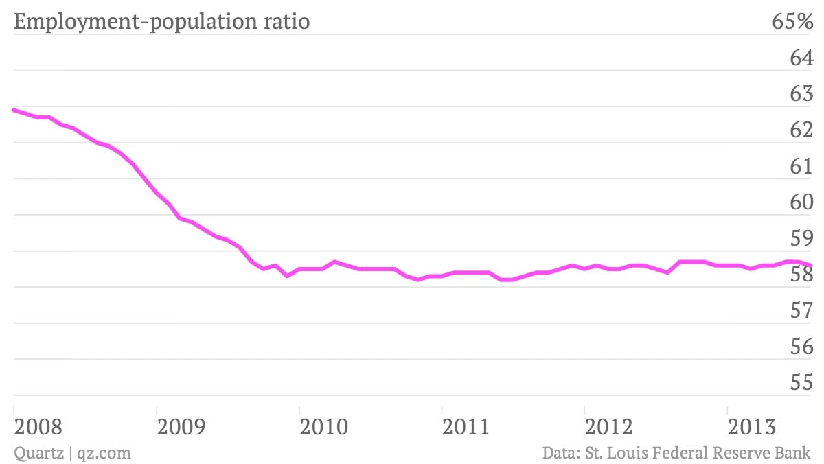
The employment-population ratio is the portion of the entire working-aged population—including students and retirees—that has a job. If you track this indicator over time, it looks like the US economy has been completely stalled since the end of the recession.

But that doesn’t tell the whole story, either. The US has been adding jobs, and more on average than 150,000 per month, the number often cited by economists as the bare minimum required to maintain the level of employment in the country.
So what’s going on here? Like the unemployment rate, the employment-population ratio is also affected by labor participation. Say a large number of baby-boomers retire and leave the workforce. The unemployment rate would go down, making the economy look better, even though it isn’t. Meanwhile, the employment-population ratio would also go down, making the economy look artificially worse. Both metrics are muddled: When labor participation is on the decline, the unemployment rate tends to make things look rosier than they are while the employment-population ratio makes them look bleaker.
So what’s the answer? Basically, the economy is increasingly complex and hard to capture in a single measure. So it’s important to be aware of the limitations of all of them.