A brief history of the scatter plot—data visualization’s greatest invention
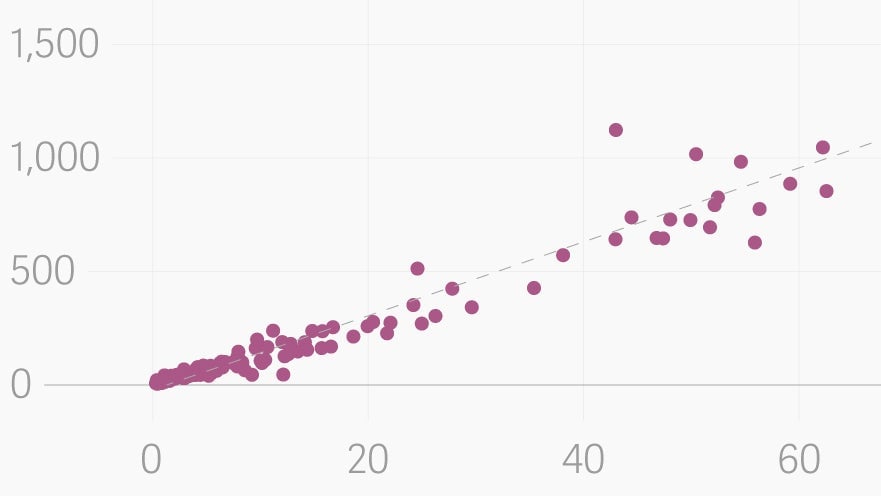
Scatter plots are glorious. Of all the major chart types, they are by far the most powerful. They allow us to quickly understand relationships that would be nearly impossible to recognize in a table or a different type of chart. (Take this visualization of the relationship of country religiosity and wealth, for example.) Michael Friendly and Daniel Denis, psychologists and historians of graphics, call the scatter plot the most “generally useful invention in the history of statistical graphics.”


Scatter plots are glorious. Of all the major chart types, they are by far the most powerful. They allow us to quickly understand relationships that would be nearly impossible to recognize in a table or a different type of chart. (Take this visualization of the relationship of country religiosity and wealth, for example.) Michael Friendly and Daniel Denis, psychologists and historians of graphics, call the scatter plot the most “generally useful invention in the history of statistical graphics.”
The origins of this invaluable invention, however, are not entirely clear.

Originally called scatter diagrams, scatter plots typically plot points on the cartesian coordinate system developed by René Descartes in the 17th century, with perpendicular lines representing the two axes. We call the horizontal one the x-axis and vertical one the y-axis—the use of those letters stems from their role in algebra. Descartes developed his coordinate system to demonstrate the link between geometry and algebra, and he likely did not imagine it would be used plot the relationship between real-world things.
The bar, line, and pie charts—the other most popular types of data visualizations—were all invented by Scottish political economist William Playfair at the turn of the 18th century. Playfair used his creations to visualize financial and demographic trends; at the time, the idea of conveying academic information through visuals was seen as amateurish. It was an act of incredible imagination and audacity.
Yet Playfair did not invent the scatter plot. That would come later. In their wonderful history on the scatter plot’s origins (pdf), Friendly and Denis suggest this was because Playfair was primarily interested in finding trends in economic data over time. For instance, he wanted to know if the cost of wheat was going up or down or if Britain’s trade deficit as growing. A line chart or bar char was generally suitable for his needs.
The scatter plot, by contrast, proved more useful for scientists. While line charts and bar charts are far more common in newspapers and business presentations, the scatter plot dominates science journals. The statistician Edward Tufte once estimated that more than 70% of all charts in scientific publications are scatter plots.
It’s no surprise, then, that what may be the earliest known scatter plot was created by a scientist. Although no physical evidence remains, Friendly and Denis think the original scatterplot was made in 1833 by the English scientist John Frederick W. Herschel.
For a study on the orbits of double stars, Herschel described in his notes making a plot of the positional angle of double stars in relation to the year the measurement was taken. This may sound like a line chart, given that one of the variables is time, but Friendly told Quartz that this was different because he was using the data to understand a fundamental relationship between two measurements, rather than just tracking a trend. “It’s always dangerous in historiography to make a claim that anything was the first instance of some particular development,” Friendly notes. Still, he thinks this is the one.
The scatter plot’s role in science grew in importance thanks to Francis Galton, the father of modern statistics. Galton is one of the creators of the statistical concept of correlation. He was particularly interested in genetics, and used correlation analysis to understand the relationship between the height of children and their parents (Galton was also a notorious eugenicist). Scatter plots are perfect for analyzing such relationships, and he began using them in the 1870s and 1880s. The chart type took off from there.
A century later, the scatter plot received another boost. In the 1980s, the statisticians William Cleveland and Robert McGill conducted research on which charts people perceive most accurately and quickly. The scatter plot was the big winner. The statisticians found that people are extremely adept at looking at a large number of points on a scale and understanding their relationship.
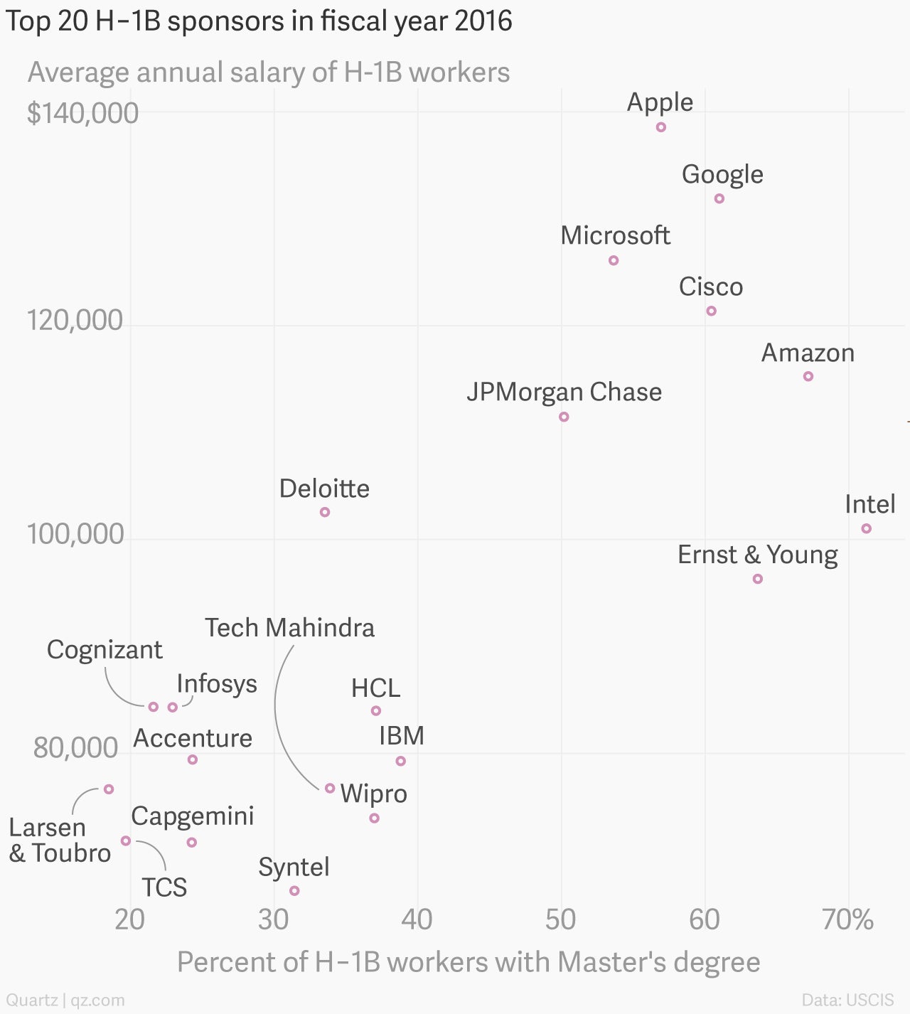
Today, in the golden age of data, the scatter plot is everywhere, from this great New York Times chart comparing Americans’ perceptions of which foods are healthy to the perception of nutritionists, to an illuminating chart on Instagram followers in the fashion industry by my colleagues David Yanofsky and Jenni Avins. You may not fully appreciate it, but the scatter plot has probably changed the way you think about the world.