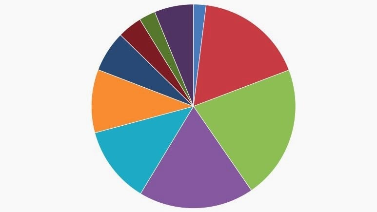
The pie chart: Why data visualization’s greatest villain will never die
The point of charts is to communicate data effectively. Or, at least, that is the point according to data-visualization experts. The truth about why people like and use charts is more complicated than that. For the regular person, it’s more about art than science. There is no better demonstration of this than the popularity of the pie chart.


The point of charts is to communicate data effectively. Or, at least, that is the point according to data-visualization experts. The truth about why people like and use charts is more complicated than that. For the regular person, it’s more about art than science. There is no better demonstration of this than the popularity of the pie chart.
The pie chart has long been reviled by data-visualization experts. “The circle with sectors is not a desirable form of presentation,” wrote the engineer and visualization researcher William Brinton in his 1914 book Graphical Methods. Brinton believed pie charts were difficult to decipher and that it was nearly always better to use a bar chart to convey information.
Over the following century, nearly every other serious chart maker came to the same conclusion. Experimental evidence also backed them up. In a paper published in 1984 (paywall), statisticians William Cleveland and Robert McGill showed that people are much more likely to accurately assess information when it’s put in a bar chart than in a pie chart. This is because people tend to underestimate the size of acute angles (<90°), and overestimate the size of obtuse ones (>90°).
Today, pie charts are anathema to most serious data visualizers. Leading experts like Edward Tufte suggest they should almost never be used. At Quartz, we so strongly discourage using pie charts that our chart-building tool doesn’t even offer them as an option.
Why, then, does the pie chart persist? In short, people love circles.
The truth is that charts aren’t only about communicating data effectively. They’re also about aesthetics and drawing in an audience.
In a 2011 article, statisticians Andrew Gelman and Anthony Unwin differentiate between “statistical graphics” and “information visualization.” Statistical graphics, they explain, are designed to clearly convey data to the interested reader. By contrast, information visualization “grabs the reader’s attention and draws him or her into the story.”
It is true that bar charts are almost always better as statistical graphics, but because humans seem to prefer circles to squares, pie charts are often better for information visualization. In Smithsonian Magazine, Megan Gambino points to a variety of studies that show people are more attracted to objects with curves. This may be because evolution led people to associate sharp angles with danger, while curves are a sign of health and life.
People just can’t help themselves. The pie chart will never die.