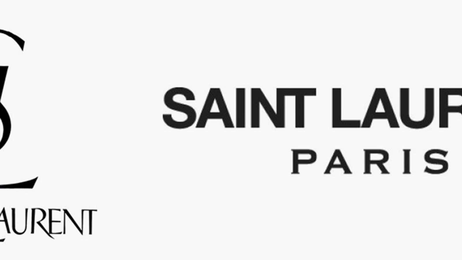
Over the past few years, Armin Vit, co-founder of the graphic design firm and publisher UnderConsideration, noticed something happening to the logos of luxury fashion brands.
“All of a sudden, all of them changed to the same thing in a span of two, three years,” he says. It may sound like a long period, Vit explains, but it’s nothing in corporate-years. “Changing a logo for a big company or a big fashion brand takes a big effort,” he says.
The latest trend in fashion branding has been toward all-caps logos that are about as plain and geometric as you can make them. At Yves Saint Laurent (first to the trend by years), Diane Von Furstenberg, Burberry, and Berluti, the old logos dropped their serifs.


At Balenciaga, Calvin Klein, and Céline, the simple logos became simpler still: Céline, for instance, is now Celine, without the pesky accent.


Though not a fashion brand itself, Rimowa, a luggage label owned by luxury powerhouse LVMH, fell in line too, abandoning its curves in favor of straight, clean lines.

These redesigns, which can be costly since they involve updating everything from clothing tags to store signs, tend to herald a new artistic director taking over at the house, allowing the new logo to signal a bigger brand refresh to shoppers.
But they also mark a break from the elaborate fonts many brands adopted in the 1980s and 1990s, according to Vit. “There’s been a big exodus from anything that had any personality to the most basic, simple, easiest typography to reproduce in as many digital mediums as possible,” he explains. “That has been one of the main drivers for the use of sans-serifs: They just perform better on digital devices and screens.”
Figures made of straight, thick lines tend to look better when rendered in pixels. Sweeping curves and thin lines, as nice as they may be on paper, can look jagged and janky when translated into a mosaic of tiny blocks on a smartphone screen.
Airbnb was among the leaders of this shift toward screen-friendly fonts with its 2014 redesign. Google followed, as have companies such as Pinterest. The world now seems awash in practically generic, sans-serif logos.
At fashion brands in particular, where a logo appears on clothes and accessories, utility is key. Peter Saville, the well-known designer who worked on the logo updates for Calvin Klein and Burberry, told Bloomberg that his aim at Burberry was to create something that would work as well on a raincoat as a chiffon blouse. Balenciaga noted (paywall) that it was “inspired by the clarity of public transportation signage.”
“I suspect that the idea behind these designs is as much about the logotype as an empty ‘container’ that can hold the brand anywhere in any medium, as much as it is about the actual design itself,” Mitch Goldstein, a professor at Rochester Institute of Technology’s College of Art and Design, told Hypebeast. The plain logos can do whatever the brand needs, wherever it needs it.
