The 2019 Pantone Color of the Year beams optimism
For the past 19 years, Pantone’s secret cabal of color experts have searched high and low to discern one color that captures the zeitgeist. This year’s search took them to the depths of the ocean. Unveiled tonight at Art Basel Miami, the color standards company named “Living Coral,” a peachy shade of orange with a golden undertone, as the 2019 Pantone Color of the Year.

For the past 19 years, Pantone’s secret cabal of color experts have searched high and low to discern one color that captures the zeitgeist. This year’s search took them to the depths of the ocean. Unveiled tonight at Art Basel Miami, the color standards company named “Living Coral,” a peachy shade of orange with a golden undertone, as the 2019 Pantone Color of the Year.
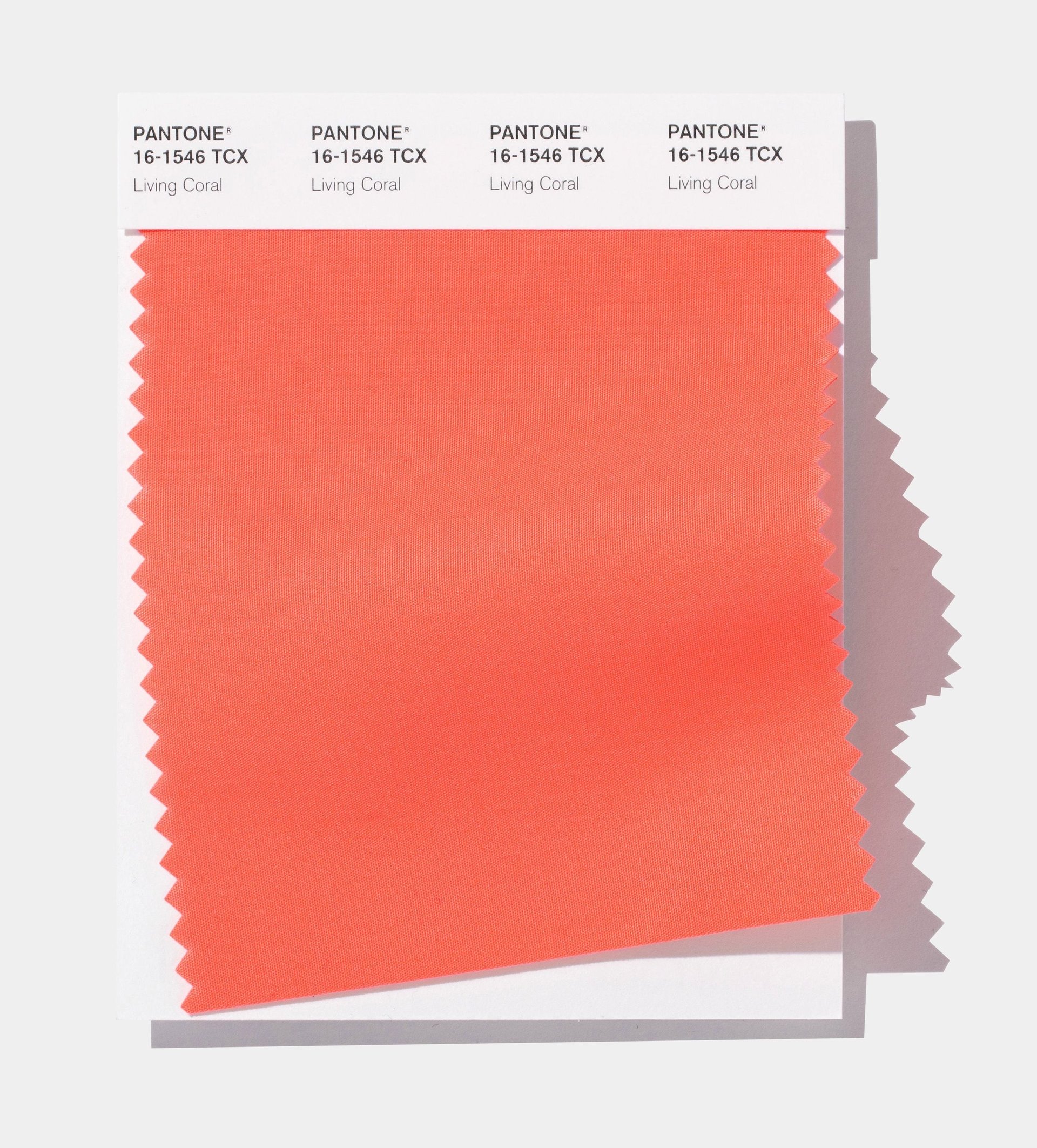
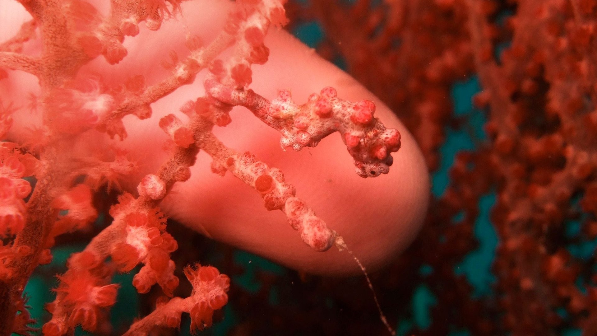
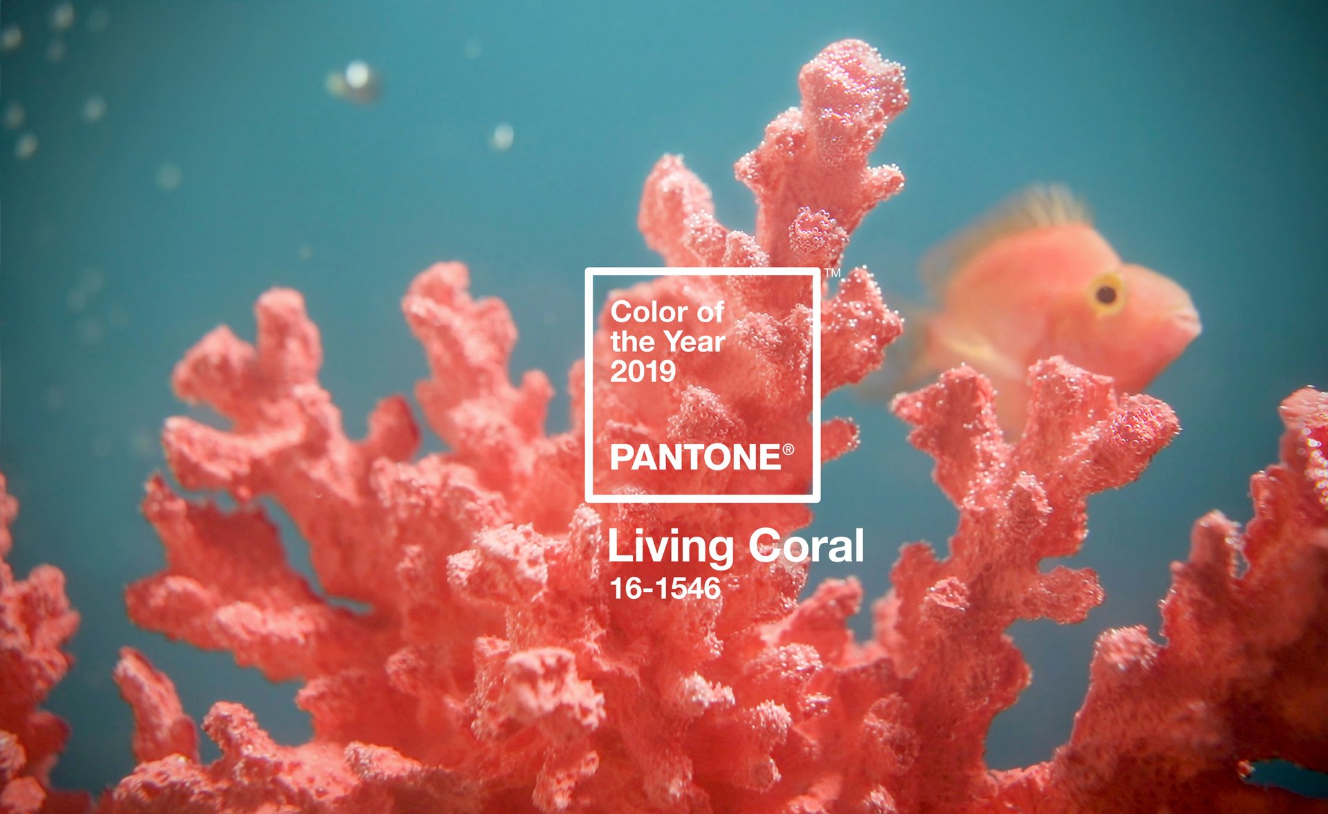
A departure from last year’s somber UltraViolet, Living Coral (Hex/HTML code: FA7268) embodies playfulness, energy, and a yearning to reconnect with nature. “The overriding influence [this year] was the environment,” explains Laurie Pressman, vice president of Pantone’s color consulting unit, to Quartz. “Top of mind was the arresting beauty we see in nature and the importance of preserving the environment…Think of coral reefs, they provide shelter and sustenance to marine life and here we are watching them disappear.”
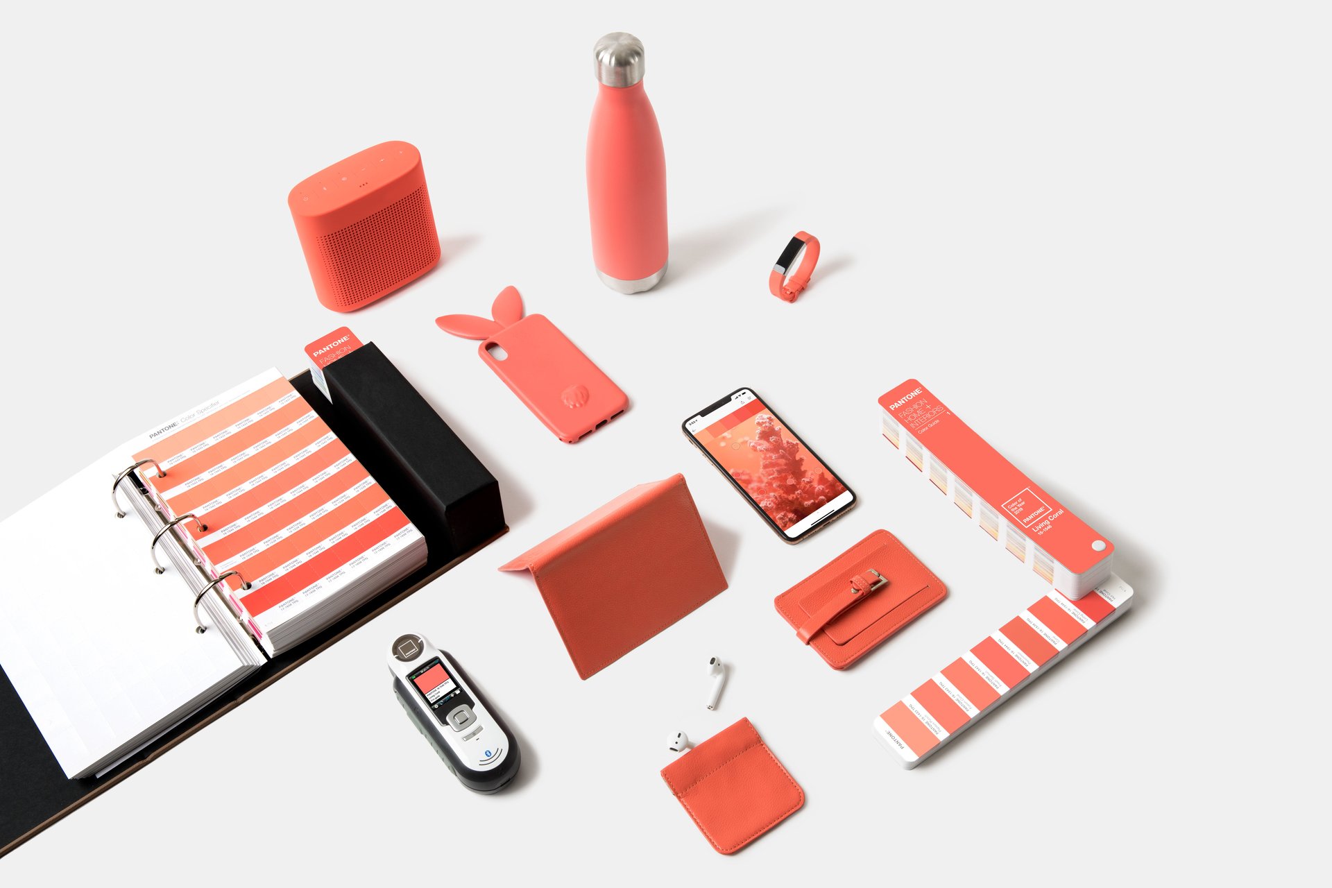
Contrary to popular belief, Pressman clarifies that Pantone Color of the Year isn’t a trends forecast. “It’s a reflection of what’s taking place. It’s a color snapshot symbolic of what’s taking place in the culture at a moment in time,” she says. Pressman notes that the peachy shade appeared in fashion runways, furniture, home interiors, corporate branding, websites and even tech gadgets in 2018.
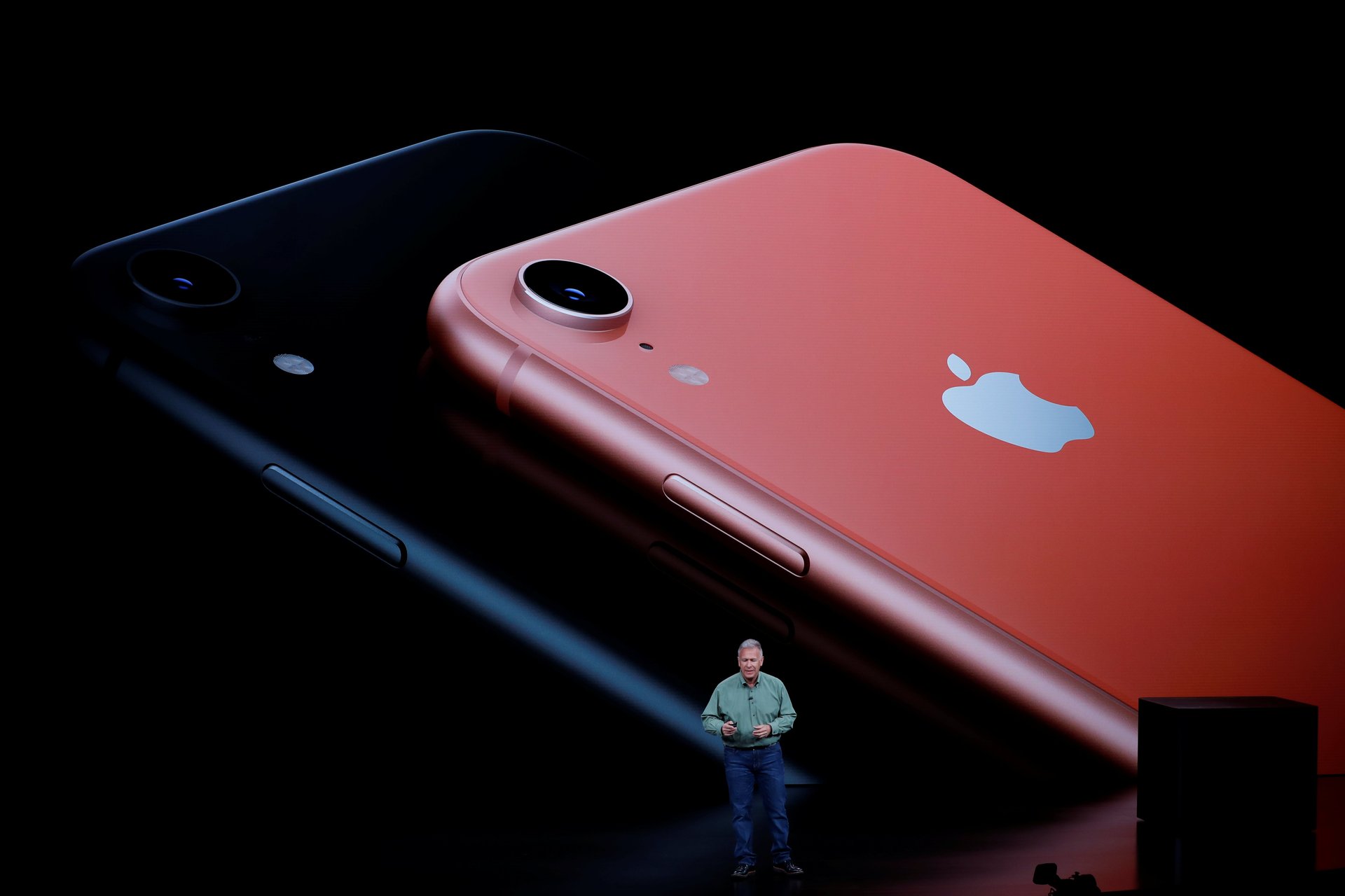
The iPhone XR’s coral variant particularly struck Pressman. “Here’s a company at the pinnacle of technology taking a color from nature. Are we fusing nature and technology? Or are they taking a color that could be construed as retro and introducing it in a modern equipment?,” she muses. “It was just so fascinating.”
Like Greenery, Pantone’s 2017 Color of the Year, Pressman says the pervasiveness of cheerful shades hearkens a clamor for optimism and positive human connections. Amid the doom-and-gloom tenor of world politics and corruption in the technology sector, people are turning to color to lift their moods, she explains. Pressman would know—she’s a product development and merchandising veteran who advises brands about color trends at the Pantone Color Institute. ”We’re looking for colors that embrace us with warmth and reassurance in our continually shifting environment,” she says.