The 2018 Pantone color of the year is definitely not purple
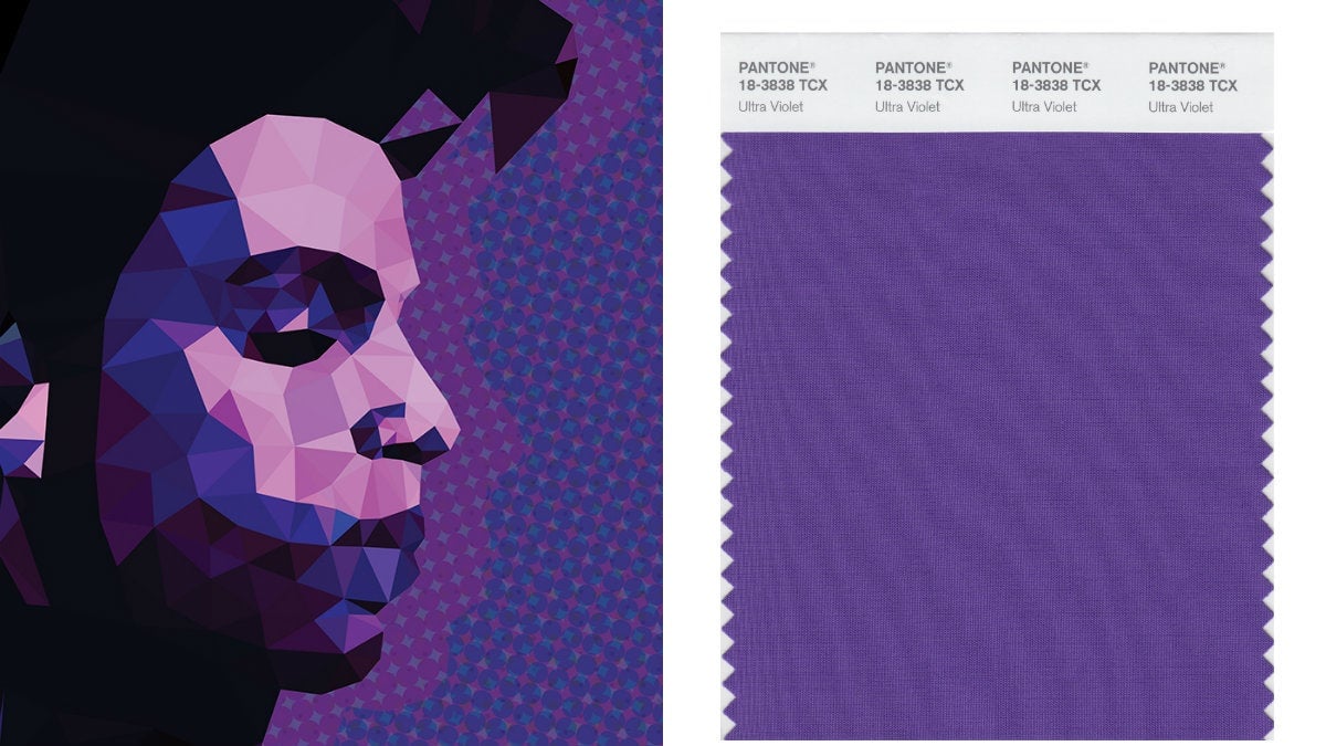
Get ready for a barrage of violet. Pantone unveiled today (Dec. 7) that 2018 will be the year of Ultra Violet.


Get ready for a barrage of violet. Pantone unveiled today (Dec. 7) that 2018 will be the year of Ultra Violet.
“From exploring new technologies and the greater galaxy, to artistic expression and spiritual reflection, intuitive Ultra Violet lights the way to what is yet to come,” says Leatrice Eiseman, executive director of Pantone’s color consulting division in a statement.
Whether you love or loathe it, it will be hard to escape the reign of Ultra Violet. Determined by a cabal of color experts, the Color of the Year program is as much a trends prediction as it is a self-fulfilling prophecy. Months before the announcement, the world’s most marketing-savvy color standardization company collaborates with popular brands to unleash an avalanche of products in the exact hue. Never mind if the products are particularly novel or flattering (let’s not forget Sephora’s ghastly Serenity blue lipstick of 2016), the point is to be on trend.
This year, Pantone partnered with cosmetics brand butter LONDON to formulate special edition make-up in Pantone Ultra Violet. It also worked with Saatchi Art to identify art works by color. If previous years are any indication, Ultra Violet-colored mugs, graphics, sweaters, ties, candy, chairs, hospital scrubs—a whole Pantone universe of stuff—will follow.
Starting with Cerulean in 2000, Pantone has been identifying the color of the zeitgeist. Cerulean, a steely blue gray, represented the angst of the post-Y2K era. The twin colors of 2016, Rose Quartz and Serenity, were a nod to gender equality, and last year’s Greenery was intended to lift our mood amid the dark upheavals in global politics.
“The Pantone Color of the Year has come to mean so much more than ‘what’s trending’ in the world of design, it’s truly a reflection of what’s needed in our world today,” according to Pantone Color Institute’s Laurie Pressman. Ultra Violet, Pantone explains, conjures mindfulness, spirituality, creativity, experimentation, and non-conformity.
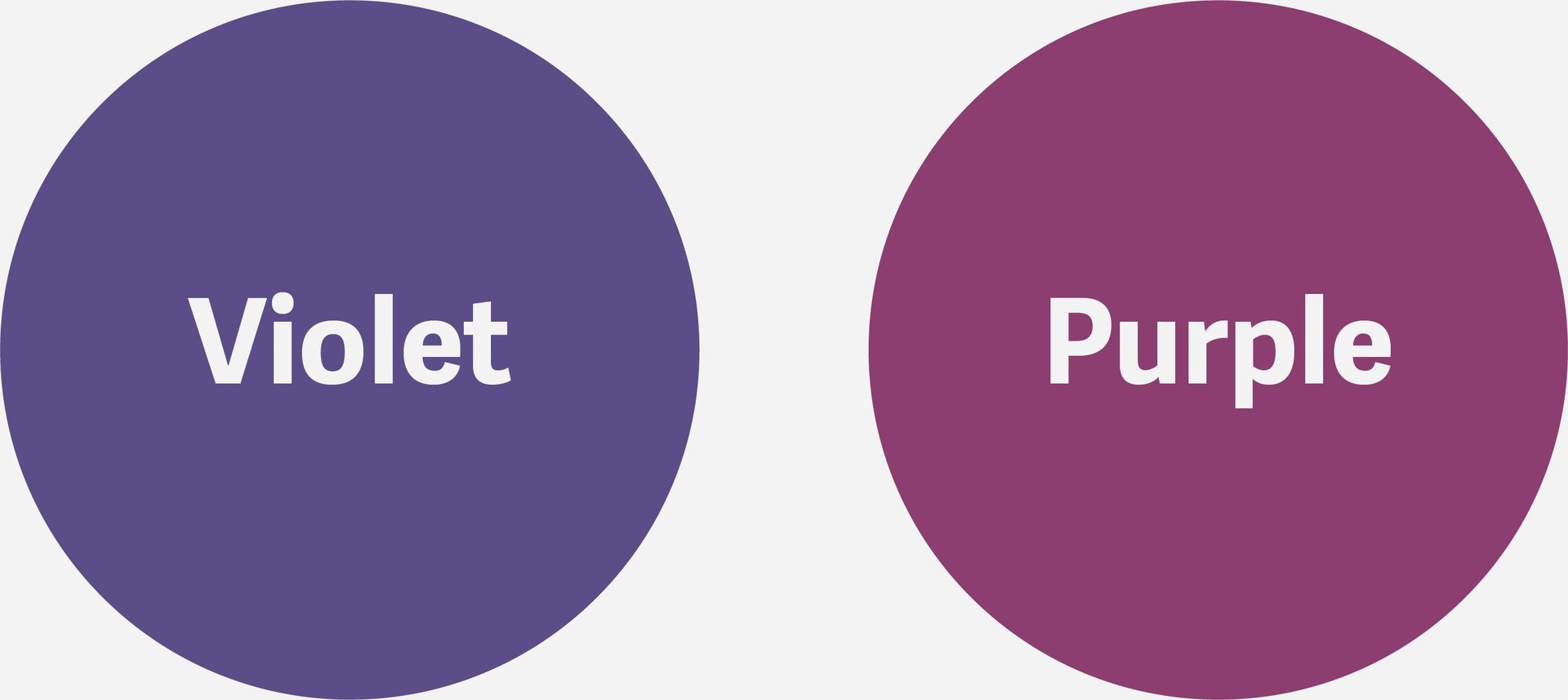
Violet is not purple
Since we’ll have to live with a lot of Ultra Violet next year, it’s worthwhile to make sure we’re pointing to the right color. Though they seem interchangeable, violet is not purple. Both colors are created by combining red and blue, but violet is deeper with more blue tones, compared to purple which has more red in its composition. Confusing the two is like confusing Cadbury’s trademark hue with the packaging of Australian chocolate bar Violet Crumble—close, but entirely different (eye) candy.


In optics, violet is considered a “spectral color,” which means it’s among the seven colors that the human eye can perceive in the electromagnetic spectrum. It has a wavelength of 380–450 nanometers. Purple, on the other hand, is a combination of two spectral colors, blue and red.
One of the pieces selected by Saatchi Art for Pantone offers a useful juxtaposition: Alexander Jowett’s abstract painting Night Sea 2 has a violet background and purple lines.

To further distinguish the two colors in Pantone’s spectrum, we had to ask: Was Ultra Violet inspired by the late singer Prince’s custom Pantone purple (Love Symbol #2)? Eiseman says they’re similar only in spirt. “Our selection for the Pantone Color of the Year 2018 had already been confirmed before the Prince estate came to us to develop a signature purple shade that was exactly the same as his purple piano,” she explains. “However, Prince and other musical icons like David Bowie and Jimi Hendrix have brought shades of Ultra Violet to the forefront as expressions of individuality and creativity.”
Marketing a misnomer?
Technically speaking, Pantone’s 2018 marquee color’s name is a misnomer. Ultraviolet is not a color that most humans can see because it’s outside the visible spectrum.
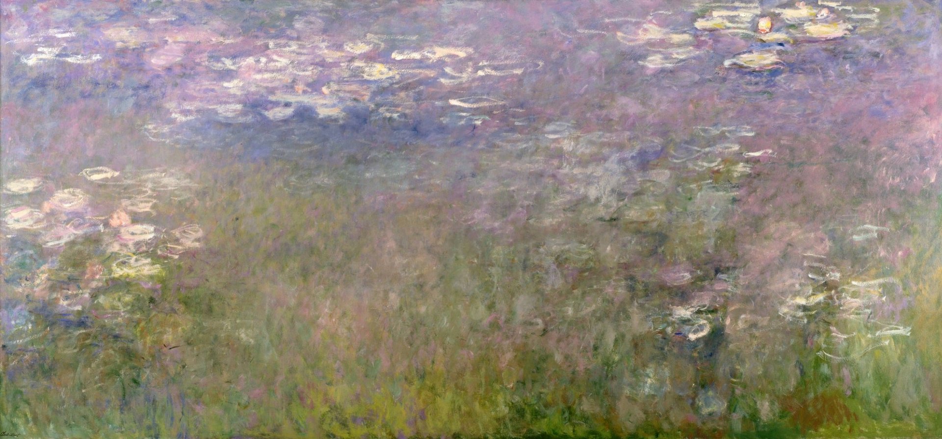
Only individuals with a condition called aphakia (the absence of eye lens) can perceive ultraviolet as a color. French painter Claude Monet is the most famous of these rare seers. Known for a spectacular amount of violet-toned paintings, scientists conjecture that Monet was able to see ultraviolet after undergoing a surgical procedure to remove the entire lens of his left eye at age 82.

Computer engineer Alek Komarnitsky also experienced Monet’s “violettomania.” In a very detailed account after his cataract surgery in 2011, Komarnitsky said seeing ultraviolet added “a faint blue/violet sheen” to his surroundings.
Scientific accuracy didn’t deter Pantone from choosing the zippy moniker. “The name is always a factor in our selection because it’s a part of what evokes the emotion of the color,” Eiseman says. “‘Ultra’ connotes added importance and excitement within the name, also reinforcing the ‘out of this world’ characteristic of the color.”