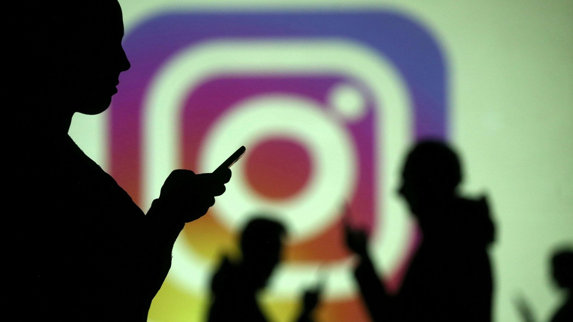
Instagram sent the internet into a panic spiral today (Dec. 27) by rolling out a new interface that invited users to tap through posts or scroll horizontally. The crisis was brief and quickly contained; within an hour of the initial alarm, Instagram head of product Adam Mosseri tweeted that the rollout was “a very small test that went broad by accident,” and had already been rescinded. But in the process, the outrage machine taught Instagram a valuable lesson: Don’t mess with vertical scrolling.
Vertical scrolling is built into our internet DNA. It’s been a common user behavior since the advent of longer web pages in the late 1990s. As Jakob Nielson of the Nielson Norman Group put it in 2005: ”On the web, users expect vertical scrolling. As with all standard design elements, it’s better to meet user expectations than to deviate.”
It’s no surprise, then, that a gesture made intuitive by desktop internet users became the default for smartphones and tablets. Consider the audience response Apple $AAPL founder Steve Jobs got while scrolling on an iPhone at the device’s launch in 2007: laughter, clapping, and even a few whistles. It just made sense.
A 2018 report from Nielsen Norman also points out that, while conventional wisdom held that people are disinclined to keep scrolling down a page for very long, “designers are doing a good job of creating signifiers to counteract the illusion of completeness and to invite people to scroll.” Illusion-combating design elements include cutting off text partway through, so that users know that there is still more to see.
By contrast, horizontal scrolling is frowned upon, in part, as user experience expert Brian Sullivan notes on Medium, because it’s associated with being an annoyance on desktops. Sullivan also cites the Nielson Norman Group’s 2005 post, which explains, “We know from user testing that users hate horizontal scrolling and always comment negatively when they encounter it.” The US Department of Health & Human Services, in its web and new media guidelines, describes horizontal scrolling as “a slow and tedious way to view an entire screen.” (You know there’s a problem with a web-design feature when even the government dislikes it.)
Horizontal mode does have its proponents—including Sullivan, who points out that it mimics the way that many people read. Tinder has used horizontal swiping to much success. As Instagram itself noted, the social network already uses tapping instead of scrolling to move people through Stories, and it’s been testing horizontal mode in its Explore tab for several months.
There’s another potential benefit to the horizontal option: Because we’re so comfortable with vertical scrolling, the endless vertical-scroll feature encourages us to keep moving through our social feeds, well, endlessly. As Adam Alter, an assistant professor of marketing and psychology at New York University’s Stern School of Business and the author of Irresistible, told Wired in 2017, features that are a little bit less intuitive and user-friendly can actually help us break free of addictive patterns.
Explaining the benefit of looking at social media on a computer instead of a smartphone, Alter said, “You have to scroll the mouse or do something that requires a little extra effort, and even that little bit of extra effort can have an effect on how we experience the world.” Or, as Tristan Harris, former Google $GOOGL Design ethicist and director and co-founder of The Center for Humane Technology, put it: ”When scrolling is frictionless, we don’t think before we flick to see what’s next.”
Most redesigns can be expected to provoke a certain amount of backlash. As Gizmodo’s Mario Aguilar explains, consumers place a premium on familiarity and comfort, and tend to be satisfied with whatever they currently have, while product designers tend to overestimate the necessity and utility of their update. Many of the quibbles that we have with site redesigns are eventually forgotten. Still, if Instagram wants to keep users happy, it should probably take a lesson from today’s mishap. As Snapchat’s failed redesign shows, people aren’t afraid to abandon platforms that fail to take their preferences into account.