The reason every book about Africa has the same cover—and it’s not pretty
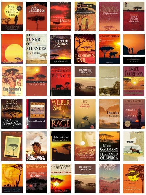
Last week, Africa Is a Country, a blog that documents and skewers Western misconceptions of Africa, ran a fascinating story about book design. It posted a collage of 36 covers of books that were either set in Africa or written by African writers. The texts of the books were as diverse as the geography they covered: Nigeria, Zimbabwe, South Africa, Botswana, Zambia, Mozambique. They were written in wildly divergent styles, by writers that included several Nobel Prize winners. Yet all of books’ covers featured an acacia tree, an orange sunset over the veld, or both.


Last week, Africa Is a Country, a blog that documents and skewers Western misconceptions of Africa, ran a fascinating story about book design. It posted a collage of 36 covers of books that were either set in Africa or written by African writers. The texts of the books were as diverse as the geography they covered: Nigeria, Zimbabwe, South Africa, Botswana, Zambia, Mozambique. They were written in wildly divergent styles, by writers that included several Nobel Prize winners. Yet all of books’ covers featured an acacia tree, an orange sunset over the veld, or both.
“In short,” the post said, “the covers of most novels ‘about Africa’ seem to have been designed by someone whose principal idea of the continent comes from The Lion King.”

Image by Simon Stevens
What makes the persistence of these tired and inaccurate images even worse is that we’re living in an era of brilliant book design (including this lovely, type-only cover for Chimamanda Ngozi Adichie’s Americanah; her novel Half of a Yellow Sun begins the collage above). So why is it so hard for publishers of African authors to rise beyond cliché?
I asked Peter Mendelsund—who is an associate art director of Knopf, a gifted cover designer, and the author of a forthcoming book on the complex alliances between image and text—to help me understand how the publishing industry got to a place where these crude visual stereotypes are recycled ad nauseam. (Again and again, that acacia tree!)
He points first to “laziness, both individual or institutionalized.” Like most Americans, book designers tend not to know all that much about the rest of the world, and since they don’t always have the time to respond to a book on its own terms, they resort to visual clichés. Meanwhile, editors sometimes forget what made a manuscript unique to begin with. In the case of non-Western novels, they often fall back on framing it with “a vague, Orientalist sense of place,” Mendelsund says, and they’re enabled by risk-averse marketing departments.
“By the time the manuscript is ready to be produced, there’s a really strong temptation to follow a path that’s already been trod,” he says. “If someone goes out on a limb and tries something different, and the book doesn’t sell, you know who to blame: the guy who didn’t put the acacia tree on the cover.”
He adds that the underlying issue can be more pernicious: “Of course, there are the deeply ingrained problems of post-colonialist and Orientalist attitudes. We’re comfortable with this visual image of Africa because it’s safe. It presents ‘otherness’ in a way that’s easy to understand. That’s ironic, because what is fiction if not a way for you to stretch your empathetic muscles?”
That’s a reasonable diagnosis. But how to solve the underlying problem? Certain books are allowed to stand on their own; others—too often those by African, Muslim, or female authors—are assigned genre stereotypes. Mendelsund suggests that designers should start by initiating conversations with editors about what makes a book unique, so that they have something to respond to visually. And if that fails, and designers are pressured to use an offensive stereotype, Mendelsund says, “We can tell them that it’s racist, xenophobic, whatever.”
But change comes slowly. One day, Mendelsund predicts, there will be a best-selling novel by an African writer that happens to use a different visual aesthetic, and its success will introduce a new set of arbitrary images to represent Africa in Western eyes. “But right now, we’re in the age of the tree,” he says. “For that vast continent, in all its diversity, you get that one fucking tree.”