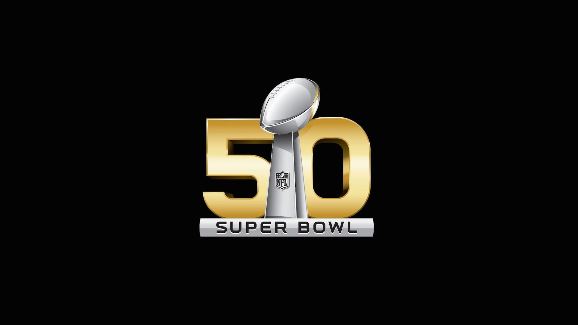
The National Football League announced on Wednesday that the Super Bowl, the American sports world’s annual tribute to Spartacus and capitalism, is abandoning its gladiatorial pretensions. While this year’s game was Super Bowl XLVIII and next year’s will be Super Bowl XLIX, the 2016 game will drop Roman numerals from its logo—it’ll be Super Bowl 50, not Super Bowl L.
The reason the league gave: a solitary L is no icon. Instead, the NFL designed a blocky gold “50” (set in Endzone Tech, the league’s proprietary typeface) with a smudge of mobile-app-style gloss. “We think what we have makes a very powerful statement for the NFL brand,” Jaime Weston, the league’s vice president of brand and creative, told ESPN.
But is it a good gamble to abandon the brand’s tradition when as much as $200 million in merchandising alone is at stake? We asked Michael Bierut, a partner at the design firm Pentagram and the co-designer of the logo for the Big Ten Conference, the leading association for university sports, how he would have solved the problem.
Bierut’s first impulse would have been to preserve the Roman numeral by incorporating it into the game’s name—spelling out “Super Bowl,” but highlighting the final “L” in a different color, for instance. He worries that would have been too subtle, though. Another option would have been to use the Arabic “50” the NFL chose—Bierut likes that it evokes both game stats and the numbers on players’ uniforms—but incorporate some visual remnant of Greco-Roman tradition. That, however, could easily devolve into pastiche.
His last idea was to develop a larger visual language that could be adapted every year, like the Olympic rings. But that involves some risks, and as the NFL has demonstrated in some of its recent logos—recycling the unlovely Vince Lombardi trophy—it’s quite visually conservative.
Quartz journalist David Yanofsky proposed his own solution:
The Super Bowl didn’t start out using Roman numerals—it wasn’t even called the Super Bowl at first. The first world championship game between the (then) American Football League and National Football League was called, well, the AFL-NFL First World Championship Game. It was Lamar Hunt, the Texas oil heir turned owner of the Kansas City Chiefs, who coined the name after the first two games. Later, on a lark, he suggested adding Roman numerals to give the game “more dignity.”
As branding became more widespread, the league even designed backdated Super Bowl logos for the first games, complete with Roman numerals. “Early on, the logo wasn’t so important—the players didn’t wear it as a patch on their jerseys, and there wasn’t as much merchandising,” says Paul Lukas, a journalist who covers the visual side of sports for ESPN and his own long-running blog, Uni Watch.
After Super Bowl 50, it’ll be back to Roman numerals for the game: LI, LII, and so on. Whether the gap year proves to be a wise move for the NFL, the one-off logo is unlikely to throw anyone for a loop, Bierut says. “The world will navigate their way around it without too much confusion.”